


骰子的布局(一个点)
<!DOCTYPE html>
<html>
<head>
    <meta charset="UTF-8">
    <meta name="viewport" content="width=device-width, initial-scale=1.0, minimum-scale=1.0, maximum-scale=1.0, user-scalable=no">
    <title>骰子的布局(flex)</title>
    <style type="text/css">
        body{margin: 0}

        .m-container{margin: 5px; padding: 5px; width:100px;height: 100px;border:1px solid green;}
        .m-item {margin: 5px; width: 20px;height: 20px;border-radius: 10px;background-color: black;}

        .box1 {display: flex;justify-content: center;}  /*水平居中*/
        .box2 {display: flex;justify-content: flex-end;}  /*水平靠右*/
        .box3 {display: flex;align-items: center;}  /*垂直居中*/
        .box4 {display: flex;justify-content: center;align-items: center;}  /*水平垂直居中*/
        .box5 {display: flex;justify-content: center;align-items: flex-end;}  /*水平居中,垂直靠下*/
    </style>
</head>
<body>

<div class="m-container box1">
  <span class="m-item"></span>
</div>

<div class="m-container box2">
  <span class="m-item"></span>
</div>

<div class="m-container box3">
  <span class="m-item"></span>
</div>

<div class="m-container box4">
  <span class="m-item"></span>
</div>

<div class="m-container box5">
  <span class="m-item"></span>
</div>

</body>
</html> 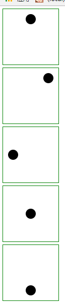
骰子的布局(两个点)
<!DOCTYPE html>
<html>
<head>
    <meta charset="UTF-8">
    <meta name="viewport" content="width=device-width, initial-scale=1.0, minimum-scale=1.0, maximum-scale=1.0, user-scalable=no">
    <title>骰子的布局(flex)</title>
    <style type="text/css">
        body{margin: 0}

        .m-container{margin: 5px; padding: 5px; width:100px;height: 100px;border:1px solid green;}
        .m-item {margin: 5px; width: 20px;height: 20px;border-radius: 10px;background-color: black;}

        .box1 {display: flex;justify-content: space-between;}  /*底部两端对齐*/
        .box2 {display: flex;flex-direction: column; justify-content: space-between;}  /*靠左两端对齐*/
        .box3 {display: flex;flex-direction: column; justify-content: space-between;align-items: center;}  /*水平居中,两端对齐*/
        .box4 {display: flex;flex-direction: column; justify-content: space-between;align-items: flex-end;}  /*水平靠右,两端对齐*/
        .box5 {display: flex;}
        .box5 .m-item:nth-child(2) {align-self: center;}
        .box6 {display: flex;justify-content: space-between;}
        .box6 .m-item:nth-child(2) {align-self: flex-end;}
    </style>
</head>
<body>

<div class="m-container box1">
  <span class="m-item"></span>
  <span class="m-item"></span>
</div>

<div class="m-container box2">
  <span class="m-item"></span>
  <span class="m-item"></span>
</div>

<div class="m-container box3">
  <span class="m-item"></span>
  <span class="m-item"></span>
</div>

<div class="m-container box4">
  <span class="m-item"></span>
  <span class="m-item"></span>
</div>

<div class="m-container box5">
  <span class="m-item"></span>
  <span class="m-item"></span>
</div>

<div class="m-container box6">
  <span class="m-item"></span>
  <span class="m-item"></span>
</div>

</body>
</html> 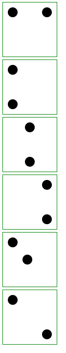
备注:欢迎加入web前端求职招聘qq群:668352707


 扫一扫
扫一扫
 2194
2194

 被折叠的 条评论
为什么被折叠?
被折叠的 条评论
为什么被折叠?
 到【灌水乐园】发言


