


需求:
请基于pyecharts,用一张独立画布,柱形图和折线图融合在同一个坐标系展示表1数据
表1. 2014-2021年中国中医类医疗卫生机构诊疗量
| 年份(年) | 诊疗量(万人次) | 同比增速(%) |
| 2014 | 87430 | 7.40 |
| 2015 | 90912 | 4.00 |
| 2016 | 96225 | 5.83 |
| 2017 | 101885 | 5.81 |
| 2018 | 107147 | 5.16 |
| 2019 | 116390 | 8.63 |
| 2020 | 105764 | -9.13 |
| 2021 | 120215 | 13.66 |
from pyecharts import options as opts
from pyecharts.charts import Bar, Grid, Line

Bar(init_opts=opts.InitOpts(width='950px', height='600px'))#指定画布大小
x_data = ["{}年".format(i) for i in range(2014, 2022)]#设置x轴
bar = (
    Bar()
    .add_xaxis(x_data)
    .add_yaxis(
        "诊疗量(万人次)",#设置柱形图的Y轴标题
        [87430, 90912, 96225, 101885, 107147, 116390, 105764, 120215],#导入数据
        yaxis_index=1,
        label_opts=opts.LabelOpts(is_show=False),#数据是否显示
        color="blue",
    )
    .extend_axis(
        yaxis=opts.AxisOpts(
            name="诊疗量(万人次)",
            type_="value",
            min_=0,
            max_=150000,
            position="left",
        )
    )
    .extend_axis(
        yaxis=opts.AxisOpts(
            type_="value",
            name="同比增速(%)",
            min_=-10,
            max_=15,
            position="right",
            axisline_opts=opts.AxisLineOpts(
                linestyle_opts=opts.LineStyleOpts(color="red")
            ),
            axislabel_opts=opts.LabelOpts(formatter="{value} %"),
            splitline_opts=opts.SplitLineOpts(
                is_show=True, linestyle_opts=opts.LineStyleOpts(opacity=1)
            ),
        )
    )
)
#设置标题和图例
bar.set_global_opts(
                    title_opts=opts.TitleOpts(title="2014-2021年中国中医类医疗卫生机构诊疗量"),
    legend_opts=opts.LegendOpts(pos_left='42%' ),#图例距离标题边距:42%
)

line = (
    Line()
    .add_xaxis(x_data)
    .add_yaxis(
        "同比增速(%)",
        [7.40, 4.00, 5.83, 5.81, 5.16, 8.63, -9.13, 13.66],#导入数据
        yaxis_index=2,
        color="red",#设置颜色为红色
        z=2
    )
)

#bar.overlap(line)
bar.overlap(line).render_notebook()#渲染到notebook中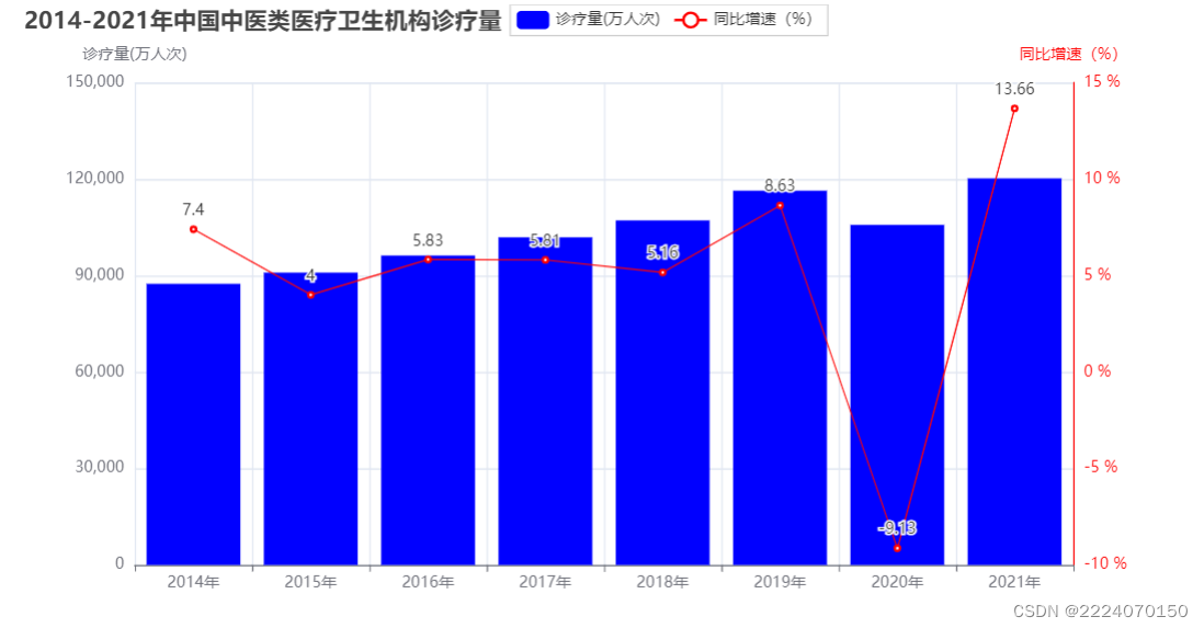


 95
95


 被折叠的 条评论
为什么被折叠?
被折叠的 条评论
为什么被折叠?
 到【灌水乐园】发言


