


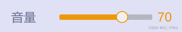
效果图:
浅色:
深色:

滑动条部分代码:
 <Style x:Key="RepeatButtonTransparent" TargetType="{x:Type RepeatButton}">
     <Setter Property="OverridesDefaultStyle" Value="true"/>
     <Setter Property="Background" Value="Transparent"/>
     <Setter Property="Focusable" Value="false"/>
     <Setter Property="IsTabStop" Value="false"/>
     <Setter Property="Template">
         <Setter.Value>
             <ControlTemplate TargetType="{x:Type RepeatButton}">
                 <Rectangle RadiusX="5" RadiusY="5" Fill="{TemplateBinding Background}" Height="{TemplateBinding Height}" Width="{TemplateBinding Width}"/>
             </ControlTemplate>
         </Setter.Value>
     </Setter>
 </Style>
 <SolidColorBrush x:Key="SliderThumb.Static.Background" Color="#FFF0F0F0"/>
 <SolidColorBrush x:Key="SliderThumb.Static.Border" Color="#FFACACAC"/>
 <SolidColorBrush x:Key="SliderThumb.Static.Foreground" Color="#FFE5E5E5"/>
 <SolidColorBrush x:Key="SliderThumb.MouseOver.Background" Color="#FFDCECFC"/>
 <SolidColorBrush x:Key="SliderThumb.MouseOver.Border" Color="#FF7Eb4EA"/>
 <SolidColorBrush x:Key="SliderThumb.Pressed.Background" Color="#FFDAECFC"/>
 <SolidColorBrush x:Key="SliderThumb.Pressed.Border" Color="#FF569DE5"/>
 <SolidColorBrush x:Key="SliderThumb.Disabled.Background" Color="#FFF0F0F0"/>
 <SolidColorBrush x:Key="SliderThumb.Disabled.Border" Color="#FFD9D9D9"/>
 <SolidColorBrush x:Key="SliderThumb.Track.Background" Color="#FFE7EAEA"/>
 <SolidColorBrush x:Key="SliderThumb.Track.Border" Color="#FFD6D6D6"/>
 <ControlTemplate x:Key="SliderThumbHorizontalDefault" TargetType="{x:Type Thumb}">
     <Grid HorizontalAlignment="Center" UseLayoutRounding="True" VerticalAlignment="Center">
         <Path x:Name="grip" Width="40" Height="40" Margin="-2,-2,-2,-2" Fill="{StaticResource SliderThumb.Static.Background}" Stroke="#ED9805" SnapsToDevicePixels="True" Stretch="Fill" StrokeThickness="3" UseLayoutRounding="True" VerticalAlignment="Center">
                 <Path.Data>
                     <EllipseGeometry Center="30,30" RadiusX="30" RadiusY="30"></EllipseGeometry>
                 </Path.Data>
             </Path>
         </Grid>
     <ControlTemplate.Triggers>
         <Trigger Property="IsMouseOver" Value="true">
             <Setter Property="Fill" TargetName="grip" Value="{StaticResource SliderThumb.MouseOver.Background}"/>
             <Setter Property="Stroke" TargetName="grip" Value="{StaticResource SliderThumb.MouseOver.Border}"/>
         </Trigger>
         <Trigger Property="IsDragging" Value="true">
             <Setter Property="Fill" TargetName="grip" Value="{StaticResource SliderThumb.Pressed.Background}"/>
             <Setter Property="Stroke" TargetName="grip" Value="{StaticResource SliderThumb.Pressed.Border}"/>
         </Trigger>
         <Trigger Property="IsEnabled" Value="false">
             <Setter Property="Fill" TargetName="grip" Value="{StaticResource SliderThumb.Disabled.Background}"/>
             <Setter Property="Stroke" TargetName="grip" Value="{StaticResource SliderThumb.Disabled.Border}"/>
         </Trigger>
     </ControlTemplate.Triggers>
 </ControlTemplate>
 <ControlTemplate x:Key="SliderThumbHorizontalTop" TargetType="{x:Type Thumb}">
     <Grid HorizontalAlignment="Center" UseLayoutRounding="True" VerticalAlignment="Center">
         <Path x:Name="grip" Data="M 0,6 C0,6 5.5,0 5.5,0 5.5,0 11,6 11,6 11,6 11,18 11,18 11,18 0,18 0,18 0,18 0,6 0,6 z" Fill="{StaticResource SliderThumb.Static.Background}" Stroke="{StaticResource SliderThumb.Static.Border}" SnapsToDevicePixels="True" Stretch="Fill" StrokeThickness="1" UseLayoutRounding="True" VerticalAlignment="Center"/>
     </Grid>
     <ControlTemplate.Triggers>
         <Trigger Property="IsMouseOver" Value="true">
             <Setter Property="Fill" TargetName="grip" Value="{StaticResource SliderThumb.MouseOver.Background}"/>
             <Setter Property="Stroke" TargetName="grip" Value="{StaticResource SliderThumb.MouseOver.Border}"/>
         </Trigger>
         <Trigger Property="IsDragging" Value="true">
             <Setter Property="Fill" TargetName="grip" Value="{StaticResource SliderThumb.Pressed.Background}"/>
             <Setter Property="Stroke" TargetName="grip" Value="{StaticResource SliderThumb.Pressed.Border}"/>
         </Trigger>
         <Trigger Property="IsEnabled" Value="false">
             <Setter Property="Fill" TargetName="grip" Value="{StaticResource SliderThumb.Disabled.Background}"/>
             <Setter Property="Stroke" TargetName="grip" Value="{StaticResource SliderThumb.Disabled.Border}"/>
         </Trigger>
     </ControlTemplate.Triggers>
 </ControlTemplate>
 <ControlTemplate x:Key="SliderThumbHorizontalBottom" TargetType="{x:Type Thumb}">
     <Grid HorizontalAlignment="Center" UseLayoutRounding="True" VerticalAlignment="Center">
         <Path x:Name="grip" Data="M 0,12 C0,12 5.5,18 5.5,18 5.5,18 11,12 11,12 11,12 11,0 11,0 11,0 0,0 0,0 0,0 0,12 0,12 z" Fill="{StaticResource SliderThumb.Static.Background}" Stroke="{StaticResource SliderThumb.Static.Border}" SnapsToDevicePixels="True" Stretch="Fill" StrokeThickness="1" UseLayoutRounding="True" VerticalAlignment="Center"/>
     </Grid>
     <ControlTemplate.Triggers>
         <Trigger Property="IsMouseOver" Value="true">
             <Setter Property="Fill" TargetName="grip" Value="{StaticResource SliderThumb.MouseOver.Background}"/>
             <Setter Property="Stroke" TargetName="grip" Value="{StaticResource SliderThumb.MouseOver.Border}"/>
         </Trigger>
         <Trigger Property="IsDragging" Value="true">
             <Setter Property="Fill" TargetName="grip" Value="{StaticResource SliderThumb.Pressed.Background}"/>
             <Setter Property="Stroke" TargetName="grip" Value="{StaticResource SliderThumb.Pressed.Border}"/>
         </Trigger>
         <Trigger Property="IsEnabled" Value="false">
             <Setter Property="Fill" TargetName="grip" Value="{StaticResource SliderThumb.Disabled.Background}"/>
             <Setter Property="Stroke" TargetName="grip" Value="{StaticResource SliderThumb.Disabled.Border}"/>
         </Trigger>
     </ControlTemplate.Triggers>
 </ControlTemplate>
 <ControlTemplate x:Key="SliderHorizontal" TargetType="{x:Type Slider}">
     <Border x:Name="border" Background="{TemplateBinding Background}" BorderBrush="{TemplateBinding BorderBrush}" BorderThickness="{TemplateBinding BorderThickness}" SnapsToDevicePixels="True">
         <Grid>
             <Grid.RowDefinitions>
                 <RowDefinition Height="Auto"/>
                 <RowDefinition Height="Auto" MinHeight="{TemplateBinding MinHeight}"/>
                 <RowDefinition Height="Auto"/>
             </Grid.RowDefinitions>
             <TickBar x:Name="TopTick" Fill="{TemplateBinding Foreground}" Height="4" Margin="0,0,0,2" Placement="Top" Grid.Row="0" Visibility="Collapsed"/>
             <TickBar x:Name="BottomTick" Fill="{TemplateBinding Foreground}" Height="4" Margin="0,2,0,0" Placement="Bottom" Grid.Row="2" Visibility="Collapsed"/>
             <Border x:Name="TrackBackground" Background="Transparent"  BorderBrush="Transparent" BorderThickness="1" Height="4.0" Margin="5,0" Grid.Row="1" VerticalAlignment="center">
                 <Canvas Margin="-6,-1">
                     <Rectangle x:Name="PART_SelectionRange" Fill="{DynamicResource {x:Static SystemColors.HighlightBrushKey}}" Height="4.0" Visibility="Hidden"/>
                 </Canvas>
             </Border>
             <Track x:Name="PART_Track" Grid.Row="1">
                 <Track.DecreaseRepeatButton>
                     <RepeatButton Height="18" Margin="0,0,-5,0" Background="#ED9805" Command="{x:Static Slider.DecreaseLarge}" Style="{StaticResource RepeatButtonTransparent}"/>
                 </Track.DecreaseRepeatButton>
                 <Track.IncreaseRepeatButton>
                     <RepeatButton Height="18" Margin="-5,0,0,0" Background="#99999999" Command="{x:Static Slider.IncreaseLarge}" Style="{StaticResource RepeatButtonTransparent}"/>
                 </Track.IncreaseRepeatButton>
                 <Track.Thumb>
                     <Thumb x:Name="Thumb" Focusable="False"  OverridesDefaultStyle="True" Template="{StaticResource SliderThumbHorizontalDefault}" VerticalAlignment="Center" />
                 </Track.Thumb>
             </Track>
         </Grid>
     </Border>
     <ControlTemplate.Triggers>
         <Trigger Property="TickPlacement" Value="TopLeft">
             <Setter Property="Visibility" TargetName="TopTick" Value="Visible"/>
             <Setter Property="Template" TargetName="Thumb" Value="{StaticResource SliderThumbHorizontalTop}"/>
             <Setter Property="Margin" TargetName="TrackBackground" Value="5,2,5,0"/>
         </Trigger>
         <Trigger Property="TickPlacement" Value="BottomRight">
             <Setter Property="Visibility" TargetName="BottomTick" Value="Visible"/>
             <Setter Property="Template" TargetName="Thumb" Value="{StaticResource SliderThumbHorizontalBottom}"/>
             <Setter Property="Margin" TargetName="TrackBackground" Value="5,0,5,2"/>
         </Trigger>
         <Trigger Property="TickPlacement" Value="Both">
             <Setter Property="Visibility" TargetName="TopTick" Value="Visible"/>
             <Setter Property="Visibility" TargetName="BottomTick" Value="Visible"/>
         </Trigger>
         <Trigger Property="IsSelectionRangeEnabled" Value="true">
             <Setter Property="Visibility" TargetName="PART_SelectionRange" Value="Visible"/>
         </Trigger>
         <Trigger Property="IsKeyboardFocused" Value="true">
             <Setter Property="Foreground" TargetName="Thumb" Value="Blue"/>
         </Trigger>
     </ControlTemplate.Triggers>
 </ControlTemplate>
 <ControlTemplate x:Key="SliderThumbVerticalDefault" TargetType="{x:Type Thumb}">
     <Grid HorizontalAlignment="Center" UseLayoutRounding="True" VerticalAlignment="Center">
         <Path x:Name="grip" Data="M0.5,0.5 L18.5,0.5 18.5,11.5 0.5,11.5z" Fill="{StaticResource SliderThumb.Static.Background}" Stroke="{StaticResource SliderThumb.Static.Border}" Stretch="Fill"/>
     </Grid>
     <ControlTemplate.Triggers>
         <Trigger Property="IsMouseOver" Value="true">
             <Setter Property="Fill" TargetName="grip" Value="{StaticResource SliderThumb.MouseOver.Background}"/>
             <Setter Property="Stroke" TargetName="grip" Value="{StaticResource SliderThumb.MouseOver.Border}"/>
         </Trigger>
         <Trigger Property="IsDragging" Value="true">
             <Setter Property="Fill" TargetName="grip" Value="{StaticResource SliderThumb.Pressed.Background}"/>
             <Setter Property="Stroke" TargetName="grip" Value="{StaticResource SliderThumb.Pressed.Border}"/>
         </Trigger>
         <Trigger Property="IsEnabled" Value="false">
             <Setter Property="Fill" TargetName="grip" Value="{StaticResource SliderThumb.Disabled.Background}"/>
             <Setter Property="Stroke" TargetName="grip" Value="{StaticResource SliderThumb.Disabled.Border}"/>
         </Trigger>
     </ControlTemplate.Triggers>
 </ControlTemplate>
 <ControlTemplate x:Key="SliderThumbVerticalLeft" TargetType="{x:Type Thumb}">
     <Grid HorizontalAlignment="Center" UseLayoutRounding="True" VerticalAlignment="Center">
         <Path x:Name="grip" Data="M 6,11 C6,11 0,5.5 0,5.5 0,5.5 6,0 6,0 6,0 18,0 18,0 18,0 18,11 18,11 18,11 6,11 6,11 z" Fill="{StaticResource SliderThumb.Static.Background}" Stroke="{StaticResource SliderThumb.Static.Border}" Stretch="Fill"/>
     </Grid>
     <ControlTemplate.Triggers>
         <Trigger Property="IsMouseOver" Value="true">
             <Setter Property="Fill" TargetName="grip" Value="{StaticResource SliderThumb.MouseOver.Background}"/>
             <Setter Property="Stroke" TargetName="grip" Value="{StaticResource SliderThumb.MouseOver.Border}"/>
         </Trigger>
         <Trigger Property="IsDragging" Value="true">
             <Setter Property="Fill" TargetName="grip" Value="{StaticResource SliderThumb.Pressed.Background}"/>
             <Setter Property="Stroke" TargetName="grip" Value="{StaticResource SliderThumb.Pressed.Border}"/>
         </Trigger>
         <Trigger Property="IsEnabled" Value="false">
             <Setter Property="Fill" TargetName="grip" Value="{StaticResource SliderThumb.Disabled.Background}"/>
             <Setter Property="Stroke" TargetName="grip" Value="{StaticResource SliderThumb.Disabled.Border}"/>
         </Trigger>
     </ControlTemplate.Triggers>
 </ControlTemplate>
 <ControlTemplate x:Key="SliderThumbVerticalRight" TargetType="{x:Type Thumb}">
     <Grid HorizontalAlignment="Center" UseLayoutRounding="True" VerticalAlignment="Center">
         <Path x:Name="grip" Data="M 12,11 C12,11 18,5.5 18,5.5 18,5.5 12,0 12,0 12,0 0,0 0,0 0,0 0,11 0,11 0,11 12,11 12,11 z" Fill="{StaticResource SliderThumb.Static.Background}" Stroke="{StaticResource SliderThumb.Static.Border}" Stretch="Fill"/>
     </Grid>
     <ControlTemplate.Triggers>
         <Trigger Property="IsMouseOver" Value="true">
             <Setter Property="Fill" TargetName="grip" Value="{StaticResource SliderThumb.MouseOver.Background}"/>
             <Setter Property="Stroke" TargetName="grip" Value="{StaticResource SliderThumb.MouseOver.Border}"/>
         </Trigger>
         <Trigger Property="IsDragging" Value="true">
             <Setter Property="Fill" TargetName="grip" Value="{StaticResource SliderThumb.Pressed.Background}"/>
             <Setter Property="Stroke" TargetName="grip" Value="{StaticResource SliderThumb.Pressed.Border}"/>
         </Trigger>
         <Trigger Property="IsEnabled" Value="false">
             <Setter Property="Fill" TargetName="grip" Value="{StaticResource SliderThumb.Disabled.Background}"/>
             <Setter Property="Stroke" TargetName="grip" Value="{StaticResource SliderThumb.Disabled.Border}"/>
         </Trigger>
     </ControlTemplate.Triggers>
 </ControlTemplate>
 <ControlTemplate x:Key="SliderVertical" TargetType="{x:Type Slider}">
     <Border x:Name="border" Background="{TemplateBinding Background}" BorderBrush="{TemplateBinding BorderBrush}" BorderThickness="{TemplateBinding BorderThickness}" SnapsToDevicePixels="True">
         <Grid>
             <Grid.ColumnDefinitions>
                 <ColumnDefinition Width="Auto"/>
                 <ColumnDefinition MinWidth="{TemplateBinding MinWidth}" Width="Auto"/>
                 <ColumnDefinition Width="Auto"/>
             </Grid.ColumnDefinitions>
             <TickBar x:Name="TopTick" Grid.Column="0" Fill="{TemplateBinding Foreground}" Margin="0,0,2,0" Placement="Left" Visibility="Collapsed" Width="4"/>
             <TickBar x:Name="BottomTick" Grid.Column="2" Fill="{TemplateBinding Foreground}" Margin="2,0,0,0" Placement="Right" Visibility="Collapsed" Width="4"/>
             <Border x:Name="TrackBackground" Background="{StaticResource SliderThumb.Track.Background}" BorderBrush="{StaticResource SliderThumb.Track.Border}" BorderThickness="1" Grid.Column="1" HorizontalAlignment="center" Margin="0,5" Width="4.0">
                 <Canvas Margin="-1,-6">
                     <Rectangle x:Name="PART_SelectionRange" Fill="{DynamicResource {x:Static SystemColors.HighlightBrushKey}}" Visibility="Hidden" Width="4.0"/>
                 </Canvas>
             </Border>
             <Track x:Name="PART_Track" Grid.Column="1">
                 <Track.DecreaseRepeatButton>
                     <RepeatButton Command="{x:Static Slider.DecreaseLarge}" Style="{StaticResource RepeatButtonTransparent}"/>
                 </Track.DecreaseRepeatButton>
                 <Track.IncreaseRepeatButton>
                     <RepeatButton Command="{x:Static Slider.IncreaseLarge}" Style="{StaticResource RepeatButtonTransparent}"/>
                 </Track.IncreaseRepeatButton>
                 <Track.Thumb>
                     <Thumb x:Name="Thumb" Focusable="False" OverridesDefaultStyle="True" Template="{StaticResource SliderThumbVerticalDefault}" VerticalAlignment="Top"/>
                 </Track.Thumb>
             </Track>
         </Grid>
     </Border>
     <ControlTemplate.Triggers>
         <Trigger Property="TickPlacement" Value="TopLeft">
             <Setter Property="Visibility" TargetName="TopTick" Value="Visible"/>
             <Setter Property="Template" TargetName="Thumb" Value="{StaticResource SliderThumbVerticalLeft}"/>
             <Setter Property="Margin" TargetName="TrackBackground" Value="2,5,0,5"/>
         </Trigger>
         <Trigger Property="TickPlacement" Value="BottomRight">
             <Setter Property="Visibility" TargetName="BottomTick" Value="Visible"/>
             <Setter Property="Template" TargetName="Thumb" Value="{StaticResource SliderThumbVerticalRight}"/>
             <Setter Property="Margin" TargetName="TrackBackground" Value="0,5,2,5"/>
         </Trigger>
         <Trigger Property="TickPlacement" Value="Both">
             <Setter Property="Visibility" TargetName="TopTick" Value="Visible"/>
             <Setter Property="Visibility" TargetName="BottomTick" Value="Visible"/>
         </Trigger>
         <Trigger Property="IsSelectionRangeEnabled" Value="true">
             <Setter Property="Visibility" TargetName="PART_SelectionRange" Value="Visible"/>
         </Trigger>
         <Trigger Property="IsKeyboardFocused" Value="true">
             <Setter Property="Foreground" TargetName="Thumb" Value="Blue"/>
         </Trigger>
     </ControlTemplate.Triggers>
 </ControlTemplate>
 <Style x:Key="SliderStyle1" TargetType="{x:Type Slider}">
     <Setter Property="Width" Value="300"/>
     <Setter Property="Height" Value="40"/>
     <Setter Property="Maximum" Value="100"/>
     <Setter Property="IsMoveToPointEnabled" Value="True"/>
     <Setter Property="Stylus.IsPressAndHoldEnabled" Value="false"/>
     <Setter Property="Background" Value="Transparent"/>
     <Setter Property="BorderBrush" Value="Transparent"/>
     <Setter Property="Foreground" Value="{StaticResource SliderThumb.Static.Foreground}"/>
     <Setter Property="Template" Value="{StaticResource SliderHorizontal}"/>
     <Style.Triggers>
         <Trigger Property="Orientation" Value="Vertical">
             <Setter Property="Template" Value="{StaticResource SliderVertical}"/>
         </Trigger>
     </Style.Triggers>
 </Style>
如果要改滑块颜色,可以查找SliderThumbHorizontalDefault,修改其中的Stroke属性
如果要更改滑动条颜色,可以查找SliderHorizontal,修改其中的RepeatButton的Background
将上面代码放入资源文件中,使用时:
<Slider Style="{StaticResource SliderStyle1}" />


 7519
7519


 被折叠的 条评论
为什么被折叠?
被折叠的 条评论
为什么被折叠?
 到【灌水乐园】发言


