


前言
本篇是《C# wpf ScrollBar自定义详解》的示例。按照文中的方法实现一个移动端的常规滚动条。移动的常规滚动条有3个特点:细长、灰色、圆角,这些在wpf中都很好实现。
一、步骤
1.确定参数
对于一个仿移动端滚动条,可以定义的参数是:
(1)滚动条宽度
(2)滚动条背景色
(3)滑块颜色
(4)滑块圆角
2.定义style
style的名称就叫ScrollStyle_Mobile,其他与《C# wpf ScrollBar自定义详解》中通用模板一致。
3.定义template
在template中显示滚动条的样式。在《C# wpf ScrollBar自定义详解》中通用模板的基础上,去除行按钮,页按钮透明,滑块设为圆角矩形。绑定滚动条背景色、滑块颜色、滑块圆角参数。
二、完整代码
<ResourceDictionary
    xmlns="http://schemas.microsoft.com/winfx/2006/xaml/presentation"
    xmlns:x="http://schemas.microsoft.com/winfx/2006/xaml"
    xmlns:sys="clr-namespace:System;assembly=mscorlib">
    <!--  1.确定参数  -->
    <!--纵向滚动条宽度-->
    <sys:Double   x:Key="VerticalScrollBarThickness">4</sys:Double>
    <!--纵向轨道背景色-->
    <SolidColorBrush x:Key="VerticalTrackBackgroundBrush" Color="Transparent" />
    <!--纵向滑块颜色-->
    <SolidColorBrush x:Key="VerticalTrackThumbBackgroundBrush" Color="#cccccc" />
    <!--纵向滑块圆角-->
    <CornerRadius x:Key="VerticalThumbCornerRadius"  >2</CornerRadius>
    <!--横向滚动条宽度-->
    <sys:Double x:Key="HorizontalScrollBarThickness">4</sys:Double>
    <!--横向轨道背景色-->
    <SolidColorBrush x:Key="HorizontalTrackBackgroundBrush" Color="Transparent" />
    <!--横向滑块颜色-->
    <SolidColorBrush x:Key="HorizontalTrackThumbBackgroundBrush" Color="#cccccc" />
    <!--横向滑块圆角-->
    <CornerRadius x:Key="HorizontalThumbCornerRadius" >2</CornerRadius>

    <!-- 2.定义Style  -->
    <Style x:Key="ScrollStyle_Mobile" TargetType="ScrollBar">
        <Style.Triggers>
            <Trigger Property="Orientation" Value="Horizontal">
                <Setter Property="Width" Value="Auto" />
                <Setter Property="Height" Value="{DynamicResource HorizontalScrollBarThickness}" />
                <Setter Property="Template" Value="{DynamicResource HorizontalScrollBar}" />
            </Trigger>
            <Trigger Property="Orientation" Value="Vertical">
                <Setter Property="Width" Value="{DynamicResource VerticalScrollBarThickness}" />
                <Setter Property="Height" Value="Auto" />
                <Setter Property="Template" Value="{DynamicResource VerticalScrollBar}" />
            </Trigger>
        </Style.Triggers>
    </Style>

    <!-- 3.定义template  -->
    <!-- 纵向滚动条template  -->
    <ControlTemplate x:Key="VerticalScrollBar" TargetType="{x:Type ScrollBar}">
        <Border Width="{DynamicResource VerticalScrollBarThickness}" Background="{DynamicResource VerticalTrackBackgroundBrush}">
            <Track
                Name="PART_Track"
                IsDirectionReversed="true">
                <Track.DecreaseRepeatButton>
                    <RepeatButton Command="ScrollBar.PageUpCommand" Focusable="False">
                        <RepeatButton.Template>
                            <ControlTemplate>
                                <Border Background="Transparent"></Border>
                            </ControlTemplate>
                        </RepeatButton.Template>
                    </RepeatButton>
                </Track.DecreaseRepeatButton>
                <Track.Thumb>
                    <Thumb Width="{TemplateBinding Width}"  Focusable="False">
                        <Thumb.Template>
                            <ControlTemplate>
                                <Border Background="{DynamicResource VerticalTrackThumbBackgroundBrush}"   CornerRadius="{DynamicResource VerticalThumbCornerRadius}" />
                            </ControlTemplate>
                        </Thumb.Template>
                    </Thumb>
                </Track.Thumb>
                <Track.IncreaseRepeatButton>
                    <RepeatButton Command="ScrollBar.PageDownCommand" Focusable="False">
                        <RepeatButton.Template>
                            <ControlTemplate>
                                <Border Background="Transparent"></Border>
                            </ControlTemplate>
                        </RepeatButton.Template>
                    </RepeatButton>
                </Track.IncreaseRepeatButton>
            </Track>
        </Border>
    </ControlTemplate>
    <!-- 横向滚动条template  -->
    <ControlTemplate x:Key="HorizontalScrollBar" TargetType="{x:Type ScrollBar}">
        <Grid Background="{DynamicResource HorizontalTrackBackgroundBrush}">
            <Track
                Name="PART_Track"
                Grid.Column="1"
                IsDirectionReversed="False">
                <Track.DecreaseRepeatButton>
                    <RepeatButton Command="ScrollBar.PageLeftCommand" Focusable="False">
                        <RepeatButton.Template>
                            <ControlTemplate>
                                <Border Background="Transparent"></Border>
                            </ControlTemplate>
                        </RepeatButton.Template>
                    </RepeatButton>
                </Track.DecreaseRepeatButton>
                <Track.Thumb>
                    <Thumb Height="{TemplateBinding Height}" >
                        <Thumb.Template>
                            <ControlTemplate>
                                <Border Background="{DynamicResource HorizontalTrackThumbBackgroundBrush}"   CornerRadius="{DynamicResource HorizontalThumbCornerRadius}" />
                            </ControlTemplate>
                        </Thumb.Template>
                    </Thumb>
                </Track.Thumb>
                <Track.IncreaseRepeatButton>
                    <RepeatButton Command="ScrollBar.PageRightCommand" Focusable="False">
                        <RepeatButton.Template>
                            <ControlTemplate>
                                <Border Background="Transparent"></Border>
                            </ControlTemplate>
                        </RepeatButton.Template>
                    </RepeatButton>
                </Track.IncreaseRepeatButton>
            </Track>
        </Grid>
    </ControlTemplate>
</ResourceDictionary>
三、效果预览
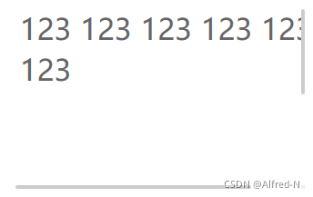
1.默认参数
<Window x:Class="WpfApp1.MainWindow"
        xmlns="http://schemas.microsoft.com/winfx/2006/xaml/presentation"
        xmlns:x="http://schemas.microsoft.com/winfx/2006/xaml"
        xmlns:d="http://schemas.microsoft.com/expression/blend/2008"
        xmlns:mc="http://schemas.openxmlformats.org/markup-compatibility/2006"
          xmlns:sys="clr-namespace:System;assembly=mscorlib"
        xmlns:local="clr-namespace:WpfApp1"
        mc:Ignorable="d"
        Title="MainWindow" Height="720" Width="1280">
    <Window.Resources>
        <ResourceDictionary>
            <ResourceDictionary.MergedDictionaries>
                <ResourceDictionary Source="ScrollStyle_Mobile.xaml" />
            </ResourceDictionary.MergedDictionaries>
        </ResourceDictionary>
    </Window.Resources>
    <Grid>
        <ListBox Width="320" Height="200"  BorderThickness="0" >
            <ListBox.Resources>
                <Style TargetType="ScrollBar" BasedOn="{StaticResource ScrollStyle_Mobile}"></Style>
            </ListBox.Resources>
            <ListBox.ItemsPanel>
                <ItemsPanelTemplate>
                    <WrapPanel Width="380" Height="400"></WrapPanel>
                </ItemsPanelTemplate>
            </ListBox.ItemsPanel>
            <ListBox.ItemTemplate>
                <DataTemplate>
                    <TextBlock FontSize="32" Foreground="#666666" Text="123"></TextBlock>
                </DataTemplate>
            </ListBox.ItemTemplate>
            <ListBox.Items>
                <Control/>
                <Control/>
                <Control/>
                <Control/>
                <Control/>
                <Control/>
            </ListBox.Items>
        </ListBox>
    </Grid>
</Window>
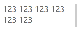
2.设置宽度
<Window x:Class="WpfApp1.MainWindow"
        xmlns="http://schemas.microsoft.com/winfx/2006/xaml/presentation"
        xmlns:x="http://schemas.microsoft.com/winfx/2006/xaml"
        xmlns:d="http://schemas.microsoft.com/expression/blend/2008"
        xmlns:mc="http://schemas.openxmlformats.org/markup-compatibility/2006"
          xmlns:sys="clr-namespace:System;assembly=mscorlib"
        xmlns:local="clr-namespace:WpfApp1"
        mc:Ignorable="d"
        Title="MainWindow" Height="720" Width="1280">
    <Window.Resources>
        <ResourceDictionary>
            <ResourceDictionary.MergedDictionaries>
                <ResourceDictionary Source="ScrollStyle_Mobile.xaml" />
            </ResourceDictionary.MergedDictionaries>
        </ResourceDictionary>
    </Window.Resources>
    <Grid>
        <ListBox Width="320" Height="200"  BorderThickness="0" >
            <ListBox.Resources>
                <Style TargetType="ScrollBar" BasedOn="{StaticResource ScrollStyle_Mobile}"></Style>
                 <!--纵向滚动条宽度-->
                <sys:Double   x:Key="VerticalScrollBarThickness">10</sys:Double>
                <!--纵向滑块圆角-->
                <CornerRadius x:Key="VerticalThumbCornerRadius"  >5</CornerRadius>
            </ListBox.Resources>
            <ListBox.ItemsPanel>
                <ItemsPanelTemplate>
                    <WrapPanel Width="300" Height="400"></WrapPanel>
                </ItemsPanelTemplate>
            </ListBox.ItemsPanel>
            <ListBox.ItemTemplate>
                <DataTemplate>
                    <TextBlock FontSize="32" Foreground="#666666" Text="123"></TextBlock>
                </DataTemplate>
            </ListBox.ItemTemplate>
            <ListBox.Items>
                <Control/>
                <Control/>
                <Control/>
                <Control/>
                <Control/>
                <Control/>
            </ListBox.Items>
        </ListBox>
    </Grid>
</Window>
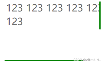
3.设置颜色
<Window x:Class="WpfApp1.MainWindow"
        xmlns="http://schemas.microsoft.com/winfx/2006/xaml/presentation"
        xmlns:x="http://schemas.microsoft.com/winfx/2006/xaml"
        xmlns:d="http://schemas.microsoft.com/expression/blend/2008"
        xmlns:mc="http://schemas.openxmlformats.org/markup-compatibility/2006"
          xmlns:sys="clr-namespace:System;assembly=mscorlib"
        xmlns:local="clr-namespace:WpfApp1"
        mc:Ignorable="d"
        Title="MainWindow" Height="720" Width="1280">
    <Window.Resources>
        <ResourceDictionary>
            <ResourceDictionary.MergedDictionaries>
                <ResourceDictionary Source="ScrollStyle_Mobile.xaml" />
            </ResourceDictionary.MergedDictionaries>
        </ResourceDictionary>
    </Window.Resources>
    <Grid>
        <ListBox Width="320" Height="200"  BorderThickness="0" >
            <ListBox.Resources>
                <Style TargetType="ScrollBar" BasedOn="{StaticResource ScrollStyle_Mobile}"></Style>
                <!--纵向滑块颜色-->
                <SolidColorBrush x:Key="VerticalTrackThumbBackgroundBrush" Color="Green" />
                <!--横向滑块颜色-->
                <SolidColorBrush x:Key="HorizontalTrackThumbBackgroundBrush" Color="Green" />
            </ListBox.Resources>
            <ListBox.ItemsPanel>
                <ItemsPanelTemplate>
                    <WrapPanel Width="380" Height="400"></WrapPanel>
                </ItemsPanelTemplate>
            </ListBox.ItemsPanel>
            <ListBox.ItemTemplate>
                <DataTemplate>
                    <TextBlock FontSize="32" Foreground="#666666" Text="123"></TextBlock>
                </DataTemplate>
            </ListBox.ItemTemplate>
            <ListBox.Items>
                <Control/>
                <Control/>
                <Control/>
                <Control/>
                <Control/>
                <Control/>
            </ListBox.Items>
        </ListBox>
    </Grid>
</Window>
总结
wpf自定义的ScrollBar界面效果还是很不错的,而且灵活度也比较高,像上述的滚动条就是去掉了行按钮的(上下箭头),配合绑定机制,可以设置不同的参数,基本解决了曾经Windows上滚动条难做的痛点。


 扫一扫
扫一扫


 1239
1239

 被折叠的 条评论
为什么被折叠?
被折叠的 条评论
为什么被折叠?
 到【灌水乐园】发言


