


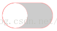
效果图:

html:
<label class="switch"> <input type="checkbox"> <span></span> </label>
css:
.switch{
    width:100px;
    height:50px;
    border-radius:30px;
    overflow: hidden;
    vertical-align:middle;
    position:relative;
    display: inline-block;
    background:#ccc;
    box-shadow: 0 0 1px red;
}.switch input{
    visibility: hidden;
}.switch span{
    position:absolute;
    top:0;
    left:0;
    border-radius: 50%;
    background:#fff;
    width:50%;
    height:100%;
    transition:all linear 0.2s;
}.switch span::before{
    position: absolute;
    top:0;
    left:-100%;
    content:'';
    width:200%;
    height:100%;
    border-radius: 30px;
    background:red;
}.switch span::after{
    content:'';
    position:absolute;
    left:0;
    top:0;
    width:100%;
    height:100%;
    border-radius: 50%;
    background:#fff;
}.switch input:checked +span{
    transform:translateX(100%);}


 6583
6583


 被折叠的 条评论
为什么被折叠?
被折叠的 条评论
为什么被折叠?
 到【灌水乐园】发言


