


先看效果图:


代码如下:
- <span style="font-size:14px;"><!DOCTYPE html PUBLIC "-//W3C//DTD XHTML 1.0 Transitional//EN" "http://www.w3.org/TR/xhtml1/DTD/xhtml1-transitional.dtd">
- <html xmlns="http://www.w3.org/1999/xhtml">
- <head>
- <title>图表统计</title>
- <meta http-equiv="Content-Type" content="text/html; charset=UTF-8">
- <script type="text/javascript" src="JS/jquery.js"></script>
- <script type="text/javascript" src="highcharts/highcharts.js"></script>
- <script type="text/javascript">
- var chart;
- $(document).ready(function () {
- //曲线图初始化
- chart = new Highcharts.Chart({
- chart: {
- renderTo: 'container1',
- type: 'line',
- marginRight: 220,
- marginBottom: 25
- },
- title: {
- text: '数据曲线图表',
- x: -20 //center
- },
- subtitle: {
- text: 'jqddsjfx',
- x: -20
- },
- xAxis: {
- categories: ['02年', '02年', '02年', '04年', '05年', '06年',
- '07年', '08年', '09年', '20年', '22年', '22年']
- },
- yAxis: {
- title: {
- text: '数据'
- },
- plotLines: [{
- value: 0,
- width: 2,
- color: '#808080'
- }]
- },
- tooltip: {
- formatter: function () {
- return '<b>' + this.series.name + '</b><br/><br/>' +
- this.x + ': ' + this.y + '单位';
- }
- },
- legend: {
- layout: 'vertical',
- align: 'right',
- verticalAlign: 'top',
- x: -20,
- y: 200,
- borderWidth: 0
- },
- series: [{
- name: '用户1',
- data: [22, 22, 95, 245, 282, 225, 252, 265, 222, 282, 229, 96]
- }, {
- name: '用户2',
- data: [02, 08, 57, 222, 270, 220, 248, 242, 202, 242, 86, 25]
- }, {
- name: '用户3',
- data: [9, 06, 25, 84, 225, 270, 286, 279, 242, 90, 29, 20]
- }, {
- name: '用户4',
- data: [29, 42, 57, 85, 229, 252, 270, 266, 242, 202, 66, 48]
- }]
- });
- //柱形图初始化
- chart = new Highcharts.Chart({
- chart: {
- renderTo: 'container2',
- type: 'column'
- },
- title: {
- text: '数据柱形图表'
- },
- subtitle: {
- text: 'jqddsjfx'
- },
- xAxis: {
- categories: [
- '01年',
- '02年',
- '03年',
- '04年',
- '05年',
- '06年',
- '07年',
- '08年',
- '09年',
- '10年',
- '11年',
- '12年'
- ]
- },
- yAxis: {
- min: 0,
- title: {
- text: '数据'
- }
- },
- legend: {
- layout: 'vertical',
- backgroundColor: '#FFFFFF',
- align: 'left',
- verticalAlign: 'top',
- x: 100,
- y: 70,
- floating: true,
- shadow: true
- },
- tooltip: {
- formatter: function () {
- return '' +
- this.x + ': ' + this.y + ' 单位';
- }
- },
- plotOptions: {
- column: {
- pointPadding: 0.2,
- borderWidth: 0
- }
- },
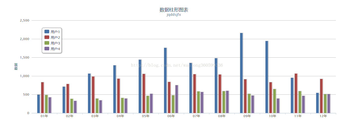
- series: [{
- name: '用户1',
- data: [499, 715, 1064, 1292, 1440, 1760, 1356, 1485, 2164, 1941, 956, 544]
- }, {
- name: '用户2',
- data: [836, 788, 985, 934, 1060, 845, 1050, 1043, 912, 835, 1066, 923]
- }, {
- name: '用户3',
- data: [489, 388, 393, 414, 470, 483, 590, 596, 524, 652, 593, 512]
- }, {
- name: '用户4',
- data: [424, 332, 345, 397, 526, 755, 574, 604, 476, 391, 468, 511]
- }]
- });
- //饼状图初始化
- chart = new Highcharts.Chart({
- chart: {
- renderTo: 'container3',
- plotBackgroundColor: null,
- plotBorderWidth: null,
- plotShadow: false
- },
- title: {
- text: '数据饼状图表'
- },
- tooltip: {
- formatter: function () {
- return '<b>' + this.point.name + '</b>: ' + this.percentage.toFixed(2) + ' %';
- }
- },
- plotOptions: {
- pie: {
- allowPointSelect: true,
- cursor: 'pointer',
- dataLabels: {
- enabled: true,
- color: '#000000',
- connectorColor: '#000000',
- formatter: function () {
- return '<b>' + this.point.name + '</b>: ' + this.percentage.toFixed(2) + ' %';
- }
- }
- }
- },
- series: [{
- type: 'pie',
- name: 'pie',
- data: [
- ['圆通快递', 55.0],
- ['中通快递', 26.8],
- {
- name: 'EMS',
- y: 12.8,
- sliced: true,
- selected: true
- },
- ['申通快递', 7.5]
- ]
- }]
- });
- });
- </script>
- </head>
- <body>
- <div style="margin: 0 2em">
- <div id="container1" style="min-width: 400px; height: 400px; margin: 0 auto"></div><br />
- <div id="container2" style="min-width: 400px; height: 400px; margin: 0 auto"></div><br />
- <div id="container3" style="min-width: 400px; height: 400px; margin: 0 auto"></div>
- </div>
- </body>
- </html></span>


 198
198

 被折叠的 条评论
为什么被折叠?
被折叠的 条评论
为什么被折叠?
 到【灌水乐园】发言


