


目录
重点总结:(总结基于探究)
1.脱标元素居中结果都一样,不分原来是block元素脱标的,还是inline元素脱标
2.当父盒子是block元素时,不设置宽,自动有宽,此宽默认为其父亲的宽,如果父盒子的父亲是网页,默认为网页的宽
3.当父盒子是inline元素或是脱标元素,不设置宽,宽度都默认为盒子内容的宽,text-align自然在此种情况下无效。
4.line-height自己能够撑出来高,在父盒子的任何情况下都有效。
以下所有情况都默认包裹单行文本的标签是块级标签,例如:<p>
父盒子有宽高
父盒子为标准流元素
-
当父盒子为block元素时
- 单行文本,左右居中(水平居中):
    <div class="father">
        <p>我是单行文本</p>
    </div>
<style>
* {
margin: 0;
padding: 0;
}
div.father {
width: 600px;
height: 600px;
background-color: pink;
text-align: center;
}
</style>结果为:

- 2单行文本上下居中:
    <div class="father">
        <p>我是单行文本</p>
    </div>
<style>
* {
margin: 0;
padding: 0;
}
div.father {
width: 600px;
height: 600px;
background-color: pink;
line-height:60px;
}
</style>结果为:

- 3单行文本水平竖直居中:
    <div class="father">
        <p>我是单行文本</p>
    </div>
<style>
* {
margin: 0;
padding: 0;
}
div.father {
width: 600px;
height: 600px;
background-color: pink;
line-height:60px;
text-align:center;
}
</style>结果为:

-
当父盒子为inline元素时
- 单行文本左右居中:
<body>
    <a class="father">
        <p>我是单行文本</p>
    </a>
</body>
<style>
* {
margin: 0;
padding: 0;
}
a.father {
width: 600px;
height: 600px;
background-color: pink;
text-align: center;
}
</style>结果为:

- 2单行文本上下居中:
<body>
    <a class="father">
        <p>我是单行文本</p>
    </a>
</body>
<style>
* {
margin: 0;
padding: 0;
}
a.father {
width: 600px;
height: 600px;
background-color: pink;
line-height: 600px;
}
</style>结果为:

- 3单行文本水平竖直垂直居中
<body>
    <a class="father">
        <p>我是单行文本</p>
    </a>
</body>
<style>
* {
margin: 0;
padding: 0;
}
a.father {
width: 600px;
height: 600px;
background-color: pink;
line-height: 600px;
text-align:center;
}
</style>结果为:

父盒子为脱离标准流元素
-
当父盒子为block元素转化为脱标元素时
1.单行文本左右居中(水平居中)
    <div class="father">
        <p>我是单行文本</p>
    </div>
<style>
* {
margin: 0;
padding: 0;
}
div.father {
float:left;
width: 600px;
height: 600px;
background-color: pink;
text-align:center;
}
</style>结果为:

1.2单行文本上下居中
    <div class="father">
        <p>我是单行文本</p>
    </div>
<style>
* {
margin: 0;
padding: 0;
}
div.father {
float:left;
width: 600px;
height: 600px;
background-color: pink;
line-height:600px;
}
</style>结果为:

1.3单行文本水平竖直垂直居中
    <div class="father">
        <p>我是单行文本</p>
    </div>
<style>
* {
margin: 0;
padding: 0;
}
div.father {
float:left;
width: 600px;
height: 600px;
background-color: pink;
line-height:600px;
text-align: center;
}
</style>结果为:

-
当父盒子为inline元素转化为脱标元素时
1.单行文本左右居中(水平居中)
<body>
    <a class="father">
        <p>我是单行文本</p>
    </a>
</body>
<style>
* {
margin: 0;
padding: 0;
}
div.father {
float:left;
width:600px;
height: 600px;
background-color: pink;
text-align:center;
}
</style>结果为:

1.2单行文本上下居中
<body>
    <a class="father">
        <p>我是单行文本</p>
    </a>
</body>
<style>
* {
margin: 0;
padding: 0;
}
div.father {
float:left;
width:600px;
height: 600px;
background-color: pink;
line-height:600px;
}
</style>结果为:

1.3单行文本水平竖直垂直居中
<body>
    <a class="father">
        <p>我是单行文本</p>
    </a>
</body>
<style>
* {
margin: 0;
padding: 0;
}
div.father {
float:left;
width:600px;
height: 600px;
background-color: pink;
text-align:center;
line-height:600px;
}
</style>结果为:

父盒子有高无宽
父盒子为标准流元素
-
当父盒子为block元素时
- 单行文本左右居中:
    <div class="father">
        <p>我是单行文本</p>
    </div>
<style>
* {
margin: 0;
padding: 0;
}
div.father {
height: 600px;
background-color: pink;
text-align:center;
}
</style>结果为:

- 2单行文本上下居中:
    <div class="father">
        <p>我是单行文本</p>
    </div>
<style>
* {
margin: 0;
padding: 0;
}
div.father {
height: 600px;
background-color: pink;
line-height:600px
}
</style>结果为:

- 3当单行文本水平竖直垂直居中:
    <div class="father">
        <p>我是单行文本</p>
    </div>
<style>
* {
margin: 0;
padding: 0;
}
div.father {
height: 600px;
background-color: pink;
line-height:60px;
text-align:center;
}
</style>结果为:

-
当父盒子为inline元素时
- 单行文本左右居中
<body>
    <a class="father">
        <p>我是单行文本</p>
    </a>
</body>
<style>
* {
margin: 0;
padding: 0;
}
a.father {
height: 600px;
background-color: pink;
text-align:center;
}
</style>结果为:

- 2单行文本上下居中
<body>
    <a class="father">
        <p>我是单行文本</p>
    </a>
</body>
<style>
* {
margin: 0;
padding: 0;
}
a.father {
height: 600px;
background-color: pink;
line-height: 600px;
}
</style>结果为:

1.3单行文本水平竖直垂直居中:
<body>
    <a class="father">
        <p>我是单行文本</p>
    </a>
</body>
<style>
* {
margin: 0;
padding: 0;
}
a.father {
height: 600px;
background-color: pink;
line-height: 600px;
text-align:center;
}
</style>结果为:

父盒子为脱离标准流元素
-
当父盒子为block元素转化为脱标元素时
1.单行文本左右居中(水平居中)
    <div class="father">
        <p>我是单行文本</p>
    </div>
<style>
* {
margin: 0;
padding: 0;
}
div.father {
float:left;
height: 600px;
background-color: pink;
text-align:center;
}
</style>结果为:

1.2单行文本上下居中
    <div class="father">
        <p>我是单行文本</p>
    </div>
<style>
* {
margin: 0;
padding: 0;
}
div.father {
float:left;
height: 600px;
background-color: pink;
line-height:600px;
}
</style>结果为:

1.3单行文本水平竖直垂直居中
    <div class="father">
        <p>我是单行文本</p>
    </div>
<style>
* {
margin: 0;
padding: 0;
}
div.father {
float:left;
height: 600px;
background-color: pink;
line-height:60px;
text-align:center;
}
</style>结果为:

-
当父盒子为inline元素转化为脱标元素时
1.单行文本左右居中(水平居中)
<body>
    <a class="father">
        <p>我是单行文本</p>
    </a>
</body>
<style>
* {
margin: 0;
padding: 0;
}
div.father {
float:left;
height: 600px;
background-color: pink;
text-align:center;
}
</style>结果为:
1.2单行文本上下居中
<body>
    <a class="father">
        <p>我是单行文本</p>
    </a>
</body>
<style>
* {
margin: 0;
padding: 0;
}
div.father {
float:left;
height: 600px;
background-color: pink;
line-height:600px;
}
</style>结果为:

1.3单行文本水平竖直垂直居中
<body>
    <a class="father">
        <p>我是单行文本</p>
    </a>
</body>
<style>
* {
margin: 0;
padding: 0;
}
div.father {
float:left;
height: 600px;
background-color: pink;
text-align:center;
line-height:600px;
}
</style>结果为:

父盒子有宽无高
父盒子为标准流元素
-
当父盒子为block元素时
- 单行文本左右居中:
    <div class="father">
        <p>我是单行文本</p>
    </div>
<style>
* {
margin: 0;
padding: 0;
}
div.father {
width: 600px;
background-color: pink;
text-align:center;
}
</style>结果为:

- 2单行文本上下居中:
    <div class="father">
        <p>我是单行文本</p>
    </div>
<style>
* {
margin: 0;
padding: 0;
}
div.father {
width: 600px;
background-color: pink;
line-height:400px
}
</style>结果为:(当没有设置高,但是设置了line-height的数值后,自动撑起了一个高)

- 3单行文本水平竖直垂直居中:
    <div class="father">
        <p>我是单行文本</p>
    </div>
<style>
* {
margin: 0;
padding: 0;
}
div.father {
width: 600px;
background-color: pink;
line-height:400px;
text-align:center;
}
</style>结果为:

-
当父盒子为inline元素时
1.单行文本左右居中(水平居中):
<body>
    <a class="father">
        <p>我是单行文本</p>
    </a>
</body>
<style>
* {
margin: 0;
padding: 0;
}
a.father {
width: 600px;
background-color: pink;
text-align:center;
}
</style>结果为:

1.2单行文本上下居中:
<body>
    <a class="father">
        <p>我是单行文本</p>
    </a>
</body>
<style>
* {
margin: 0;
padding: 0;
}
a.father {
width: 600px;
background-color: pink;
line-height: 600px;
}
</style>结果为:

1.3单行文本水平竖直居中:
<body>
    <a class="father">
        <p>我是单行文本</p>
    </a>
</body>
<style>
* {
margin: 0;
padding: 0;
}
a.father {
width: 600px;
background-color: pink;
line-height: 600px;
text-align:center;
}
</style>结果为:

父盒子为脱离标准流元素
-
当父盒子为block元素转化为脱标元素时
1.单行文本左右居中(水平居中)
    <div class="father">
        <p>我是单行文本</p>
    </div>
<style>
* {
margin: 0;
padding: 0;
}
div.father {
float:left;
width: 600px;
background-color: pink;
text-align:center;
}
</style>结果为:

1.2单行文本上下居中
    <div class="father">
        <p>我是单行文本</p>
    </div>
<style>
* {
margin: 0;
padding: 0;
}
div.father {
float:left;
width: 600px;
background-color: pink;
line-height:600px;
}
</style>结果为:

1.3单行文本水平竖直垂直居中
    <div class="father">
        <p>我是单行文本</p>
    </div>
<style>
* {
margin: 0;
padding: 0;
}
div.father {
float:left;
width: 600px;
background-color: pink;
line-height:600px
text-align:center;
}
</style>结果为:

-
当父盒子为inline元素转化为脱标元素时
1.单行文本左右居中(水平居中)
<body>
    <a class="father">
        <p>我是单行文本</p>
    </a>
</body>
<style>
* {
margin: 0;
padding: 0;
}
div.father {
float:left;
width:600px;
background-color: pink;
text-align:center;
}
</style>结果为:

1.2单行文本上下居中
<body>
    <a class="father">
        <p>我是单行文本</p>
    </a>
</body>
<style>
* {
margin: 0;
padding: 0;
}
div.father {
float:left;
width:600px;
background-color: pink;
line-height:600px;
}
</style>结果为:

1.3单行文本水平竖直垂直居中
<body>
    <a class="father">
        <p>我是单行文本</p>
    </a>
</body>
<style>
* {
margin: 0;
padding: 0;
}
div.father {
float:left;
width:600px;
background-color: pink;
text-align:center;
line-height:600px;
}
</style>结果为:

父盒子无宽无高
父盒子为标准流元素
-
当父盒子为block元素时
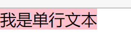
- 单行文本左右对齐:
    <div class="father">
        <p>我是单行文本</p>
    </div>
<style>
* {
margin: 0;
padding: 0;
}
div.father {
background-color: pink;
text-align:center;
}
</style>结果为:

- 2单行文本上下对齐:
    <div class="father">
        <p>我是单行文本</p>
    </div>
<style>
* {
margin: 0;
padding: 0;
}
div.father {
background-color: pink;
line-height:400px;
}
</style>结果为:

- 3单行文本水平竖直垂直居中:
    <div class="father">
        <p>我是单行文本</p>
    </div>
<style>
* {
margin: 0;
padding: 0;
}
div.father {
background-color: pink;
line-height:400px;
text-align:center;
}
</style>结果为:

-
当父盒子为inline元素时
1.单行文本左右居中(水平居中):
<body>
    <a class="father">
        <p>我是单行文本</p>
    </a>
</body>
<style>
* {
margin: 0;
padding: 0;
}
a.father {
background-color: pink;
text-align:center;
}
</style>结果为:

1.2单行文本上下居中:
<body>
    <a class="father">
        <p>我是单行文本</p>
    </a>
</body>
<style>
* {
margin: 0;
padding: 0;
}
a.father {
background-color: pink;
line-height: 600px;
}
</style>结果为:

1.3单行文本水平竖直居中:
<body>
    <a class="father">
        <p>我是单行文本</p>
    </a>
</body>
<style>
* {
margin: 0;
padding: 0;
}
a.father {
background-color: pink;
line-height: 600px;
text-align:center;
}
</style>结果为:

父盒子为脱离标准流元素
-
当父盒子为block元素转化为脱标元素时
1.单行文本左右居中(水平居中)
    <div class="father">
        <p>我是单行文本</p>
    </div>
<style>
* {
margin: 0;
padding: 0;
}
div.father {
float:left;
background-color: pink;
text-align:center;
}
</style>结果为:
1.2单行文本上下居中
    <div class="father">
        <p>我是单行文本</p>
    </div>
<style>
* {
margin: 0;
padding: 0;
}
div.father {
float:left;
background-color: pink;
line-height:600px;
}
</style>结果为:

1.3单行文本水平竖直垂直居中
    <div class="father">
        <p>我是单行文本</p>
    </div>
<style>
* {
margin: 0;
padding: 0;
}
div.father {
float:left;
background-color: pink;
line-height:600px;
text-align:center;
}
</style>结果为:

-
当父盒子为inline元素转化为脱标元素时
1.单行文本左右居中(水平居中)
<body>
    <a class="father">
        <p>我是单行文本</p>
    </a>
</body>
<style>
* {
margin: 0;
padding: 0;
}
div.father {
float:left;
background-color: pink;
text-align:center;
}
</style>结果为:

1.2单行文本上下居中
<body>
    <a class="father">
        <p>我是单行文本</p>
    </a>
</body>
<style>
* {
margin: 0;
padding: 0;
}
div.father {
float:left;
background-color: pink;
line-height:600px;
}
</style>结果为:

1.3单行文本水平竖直垂直居中
<body>
    <a class="father">
        <p>我是单行文本</p>
    </a>
</body>
<style>
* {
margin: 0;
padding: 0;
}
div.father {
float:left;
background-color: pink;
text-align:center;
line-height:600px;
}
</style>结果为:


 602
602


 被折叠的 条评论
为什么被折叠?
被折叠的 条评论
为什么被折叠?
 到【灌水乐园】发言


