


两张图片的自定义CheckBox
使用场景,某些特定的场景,需要选中高亮,不选中置灰的效果,通常的做法是改变背景如下:
  <CheckBox
            android:id="@+id/ck"
            android:layout_width="60dp"
            android:layout_height="60dp"
            android:layout_marginStart="20dp"
            android:layout_marginTop="200dp"
            android:background="@drawable/check_box_style"
            android:button="@null"
            app:layout_constraintStart_toStartOf="parent"
            app:layout_constraintTop_toTopOf="parent" />
check_box_style.xml
<?xml version="1.0" encoding="utf-8"?>
<selector xmlns:android="http://schemas.android.com/apk/res/android">
<!-- 选中状态-->
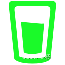
<item android:drawable="@mipmap/behavior_green" android:state_checked="true" />
<!-- 不选中状态-->
<item android:drawable="@mipmap/behavior" android:state_checked="false" />
<!-- 点击态-->
<item android:drawable="@mipmap/behavior_green" android:state_pressed="true" />
<!-- 默认状态-->
<item android:drawable="@mipmap/behavior" />
</selector>
因为有很多这样的按钮,写很多这样的布局,就显得很麻烦。然后就想到了自定义控件,新增两个图片属性。
在attrs.xml中,新增两个自定义属性
<?xml version="1.0" encoding="utf-8"?>
<resources>
    <declare-styleable name="BothSidesCheckBox">
        <attr name="onCheckSrc" format="reference" />
        <attr name="offCheckSrc" format="reference" />
    </declare-styleable>

</resources>
继承AppCompatCheckBox,初始化的时候,获取两个属性,根据isChecked属性选择当前背景。
重写setChecked()方法,当状态发生改变的时候修改背景图
class BothSidesCheckBox : androidx.appcompat.widget.AppCompatCheckBox {
    private var onCheckSrc: Drawable? = null
    private var offCheckSrc: Drawable? = null
    constructor(context: Context) : super(context) {}
    constructor(context: Context, attrs: AttributeSet?) : super(context, attrs) {  init(context,attrs,0)}
    constructor(context: Context, attrs: AttributeSet?, defStyleAttr: Int) : super(context,
        attrs,
        defStyleAttr) {
        init(context,attrs,defStyleAttr)
    }
    @SuppressLint("Recycle")
    private fun init(context: Context, attrs: AttributeSet?, defStyleAttr: Int) {
        val attributes =
            context.obtainStyledAttributes(attrs, R.styleable.BothSidesCheckBox, defStyleAttr, 0)
        onCheckSrc =
            attributes.getDrawable(R.styleable.BothSidesCheckBox_onCheckSrc)
        offCheckSrc =
            attributes.getDrawable(R.styleable.BothSidesCheckBox_offCheckSrc)
        buttonDrawable=null

        background = if (isChecked) {
            onCheckSrc
        } else {
            offCheckSrc
        }
    }
    override fun setChecked(checked: Boolean) {
        super.setChecked(checked)
        background = if (checked) {
            onCheckSrc
        } else {
            offCheckSrc
        }
    }
}
使用如下,原生控件的使用方式,只需要增加两张图片即可:
       <ui.view.BothSidesCheckBox
            android:id="@+id/ck_drinking"
            style="@style/BothSidesCheckBox"
            android:checked="@={viewModel.drinkingLiveData}"
            app:layout_constraintStart_toEndOf="@+id/ck_smoking"
            app:layout_constraintTop_toBottomOf="@+id/swh_dms_switch"
            app:offCheckSrc="@mipmap/behavior_drinking"
            app:onCheckSrc="@mipmap/behavior_drinking_green" />

一个简单的控件就完成了。


 2296
2296


 被折叠的 条评论
为什么被折叠?
被折叠的 条评论
为什么被折叠?
 到【灌水乐园】发言


