


<!DOCTYPE html>
<html>
    <head>
        <meta charset="utf-8" />
        <title>响应式发光按钮</title>
        <link rel="stylesheet" href="indexCss.css">
    </head>
    <body>
        <div class="con">
            <a href="#">
                <span>button</span>
            </a>
        </div>
    </body>
</html>
*{
    margin: 0;
    padding: 0;
    box-sizing: border-box;

}

/* body{
    display: flex;
    justify-content: center;
    align-items: center;
    min-height: 100vh;
    background: #0e1538;
} */
.con{
    display: flex;
    position: relative;
    left: 300px;
    top: 300px;
    /* width: 200px;
    height: 100px; */
    flex-direction: column;
    background-color: #0e1;
}
.con a{
    position: absolute;
    width: 200px;
    height: 100px;
    display: inline-block;
}

.con a:before,
.con a:after{
    content: '';
    position: absolute;
    inset: 0;
    transition: 0.5s;
    background: #f00;
}
.con a:hover:before{
    inset: -3px;
}
.con a:hover:after{
    inset: -3px;
    filter: blur(5px);/*之前颜色延伸的阴影大小*/
}

.con a span{
    position: absolute;
    top: 0;
    left: 0;
    width: 100%;
    height: 100%;
    display: inline-block;
    background: #0e1538;
    z-index: 10;
    display: flex;
    justify-content: center;
    align-items: center;
    font-size: 1.2em;
    text-transform: uppercase;/*将数字转换成大写*/
    letter-spacing: 2px;/*调整字与字之间的距离*/
    color: #fff;
}
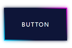
这个css首先是让按键呈现出移动到光标上显示红色背景的动态效果
主要有
设计背景的颜色(红色)必须是在button字的元素上面进行before和after操作
tranition:是动画效果时间,但没有insert:0是没有动画效果的
.con a:hover:before里的inset:-3px改变了效果,且必须负数
其实这就完成了,想要完成 炫酷的效果就要用到linear-gradient()就行了:
.con a:nth-child(1):before,
.con a:nth-child(1):after{
    background: linear-gradient(45deg,#00ccff,#0e1538,#0e1538,#d400d4);
}
效果为:


 939
939


 被折叠的 条评论
为什么被折叠?
被折叠的 条评论
为什么被折叠?
 到【灌水乐园】发言


