


antd——实现徽标功能
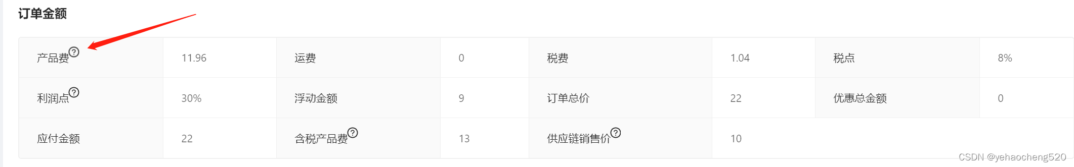
前一段时间在写后台管理系统时,用的
antdesign的框架。需要实现下面的效果。其实内容很简单,此处仅做一下记录。
1.descriptions描述列表组件的label插槽的使用
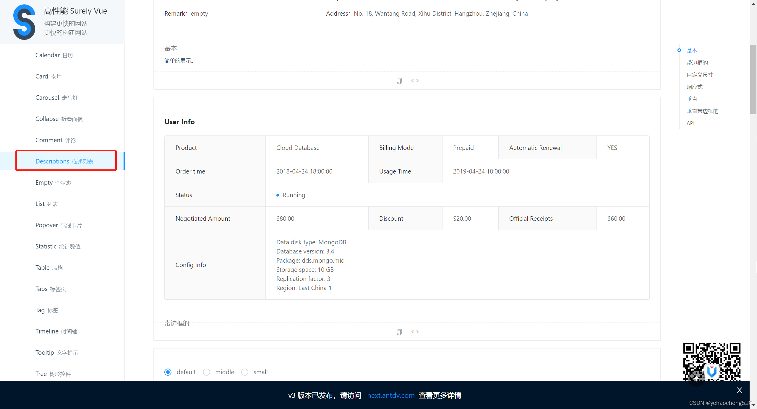
首先,我这边是用的descriptions描述列表组件。
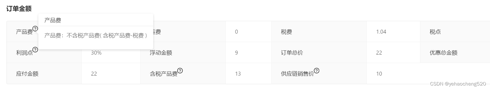
现在要将描述列表组件中的label字段改为一个自定义的形式:
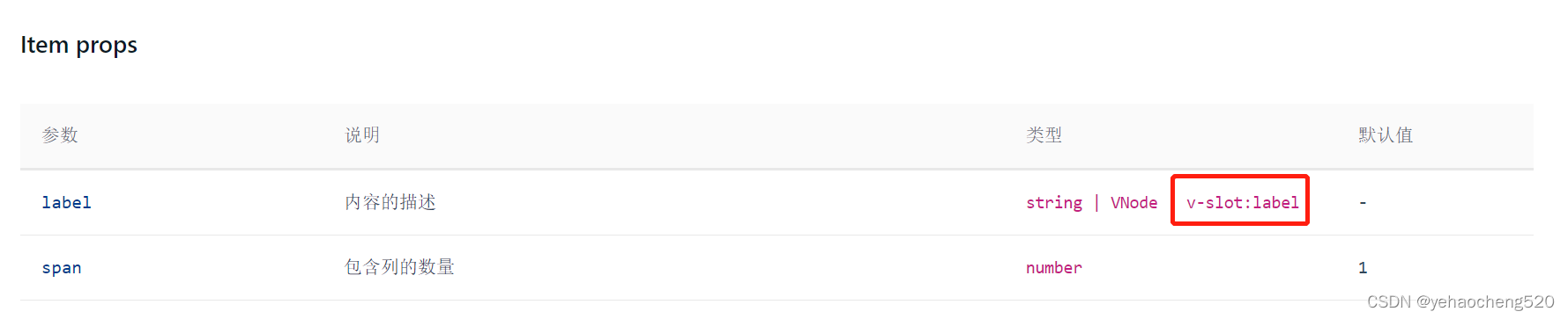
在描述列表组件的api中,有个关于label的插槽。
2.popover气泡卡片——多个方位均可设置
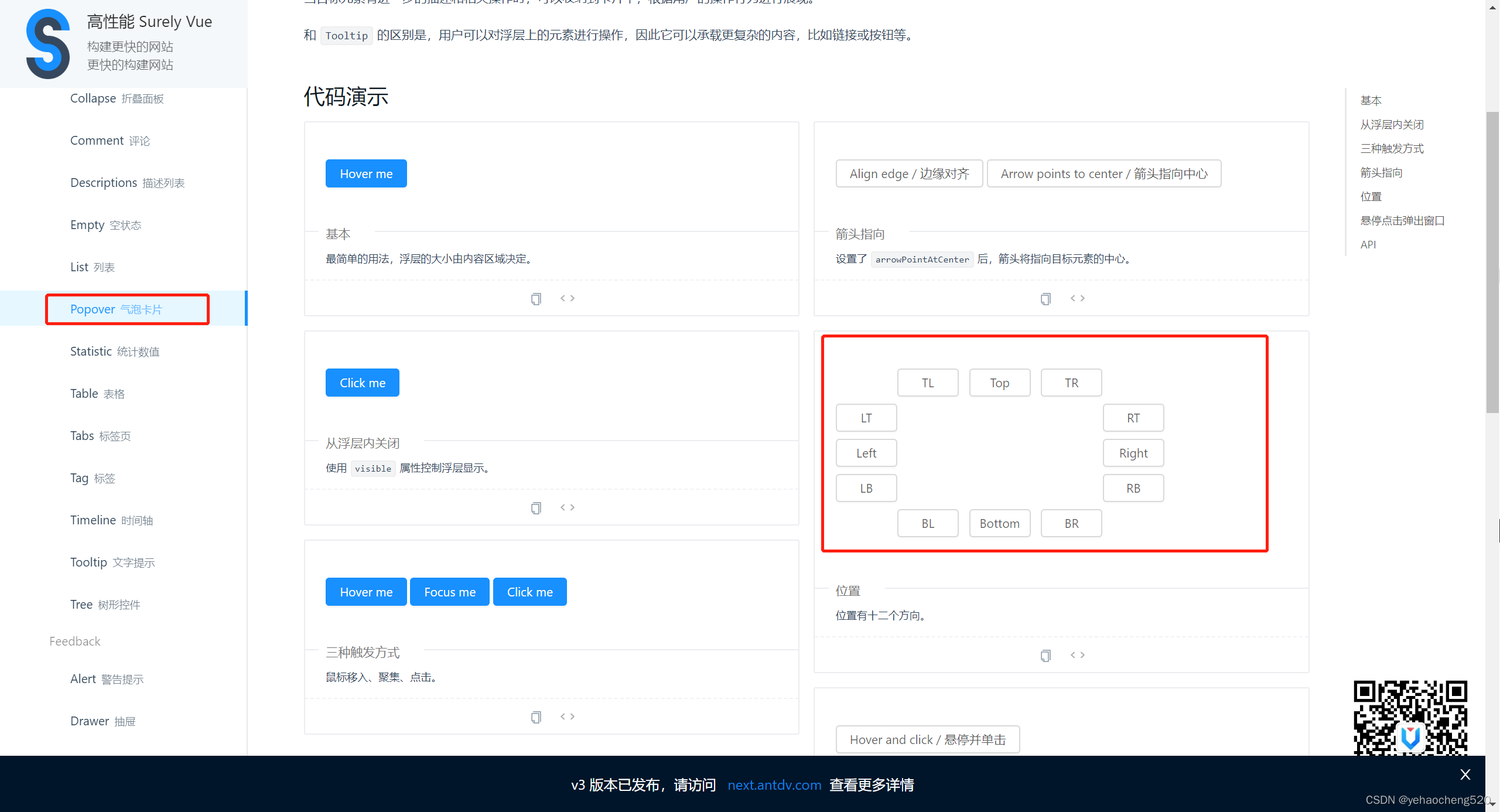
<a-popover title="产品费" placement="left">
  <template slot="content">
    鼠标移入后展示的内容
  </template>
  页面展示的内容
</a-popover>
3.badge徽标组件——图标类型的徽标
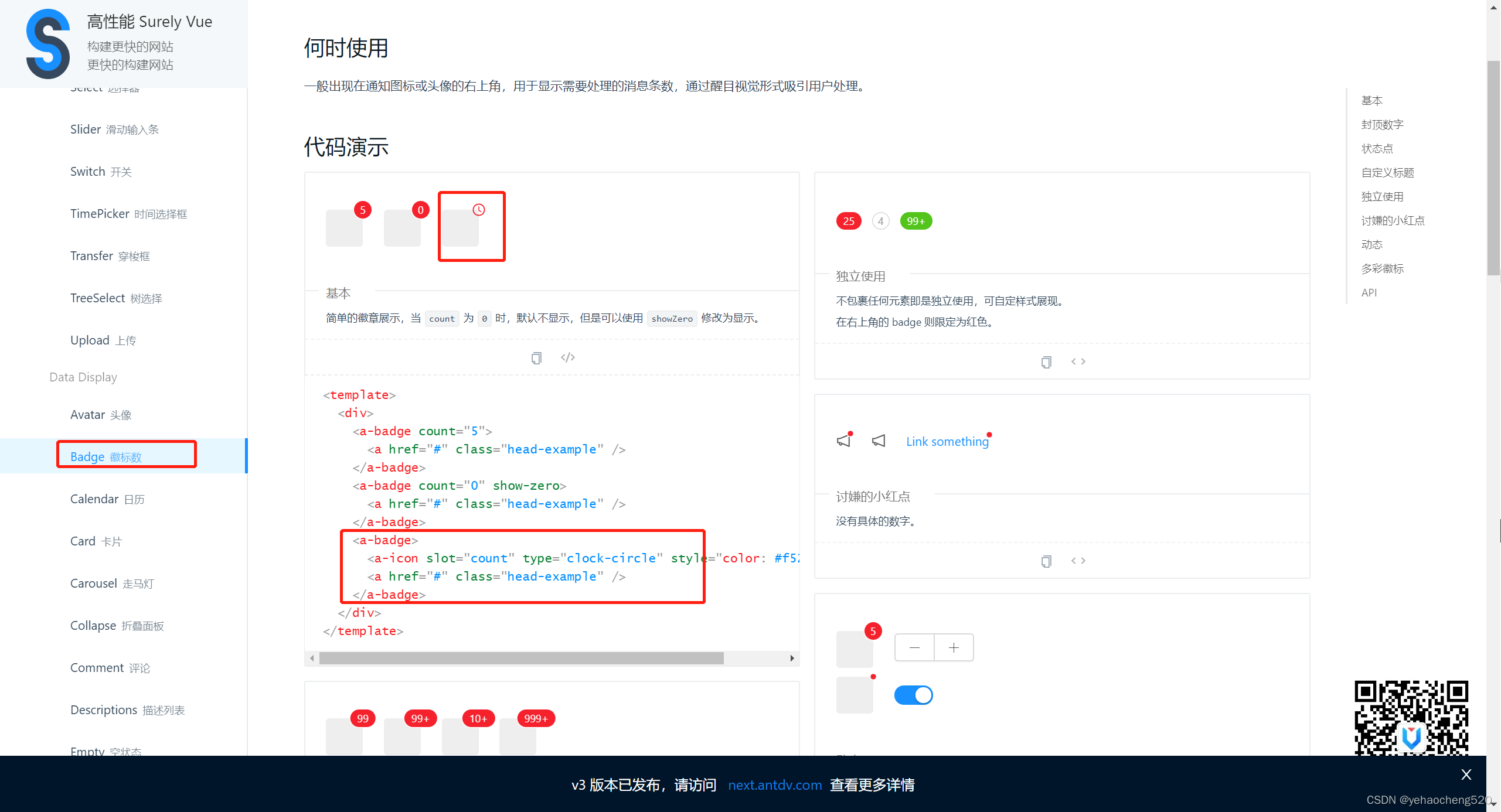
<a-badge :offset="[6, 0]">
  <a-icon slot="count" type="question-circle" />
  <span>产品费</span>
</a-badge>
4.汇总代码如下:
...
<a-descriptions-item>
  <template v-slot:label>
    <a-popover title="产品费" placement="left">
      <template slot="content">
        <p>产品费:不含税产品费( 含税产品费-税费 )</p>
      </template>
      <a-badge :offset="[6, 0]">
        <a-icon slot="count" type="question-circle" />
        <span>产品费</span>
      </a-badge>
    </a-popover>
  </template>
  {{ detailObj.orderCost.proMoney }}
</a-descriptions-item>
...


 扫一扫
扫一扫


 388
388

 被折叠的 条评论
为什么被折叠?
被折叠的 条评论
为什么被折叠?
 到【灌水乐园】发言


