


有些东西坚持下来,几年后你会发现它的价值
之前一节讲了一些布局的基本知识,这节继续。
Android中的布局种类还是比较丰富多彩的,为了体验一下各种布局,我们新开一个工程:ManyLayout。我们先弄出一个MainActivity,在里面放一个Button,给Button绑定一个Listener,这些都是之前的,应该很熟了吧。
然后我们再创建一个TestLinearActivity的Activity,给它一个testlinear.xml的布局文件,下面我们要做一件事情,就是点击Button后,让程序跳转到我们的TestLinearActivity中来。我们在Listener中写下如下代码:
Intent intent = new Intent();
intent.setClass(MainActivity.this, TestLinearActivity.class);
startActivity(intent);
稍微解释下,首先我们申明一个Intent,这个Intent可是android的重头戏,但是这里我们先买个官子,不说它,就知道它是在各个组件中传递数据的就行,然后我们调用它的setClass方法,将本身Activity的引用传进去,再把要跳转的Activity的class传进去,然后调用startActivity就能实现啦,我们可以试一下,别忘了在AndroidManifest.xml中加入Activity的申明。
<activity
	android:name=".MainActivity"
	android:label="@string/app_name"
	>
	<intent-filter>
		<action android:name="android.intent.action.MAIN" />
		<category android:name="android.intent.category.LAUNCHER" />
	</intent-filter>
</activity>

<activity
	android:name=".TestLinearActivity"
	android:label="@string/app_name"
	></activity>
我已经成功了哦,你呢?
下面我们来重点学习布局了。我们先在布局文件中写上:
<?xml version="1.0" encoding="utf-8"?>
<LinearLayout xmlns:android="http://schemas.android.com/apk/res/android"
    android:layout_width="match_parent"
    android:layout_height="match_parent"
    android:orientation="vertical" >

    <LinearLayout
        android:layout_width="match_parent"
        android:layout_height="0dp"
        android:layout_weight="1"
        android:background="@color/red"
        ></LinearLayout>

    <LinearLayout
        android:layout_width="match_parent"
        android:layout_height="0dp"
        android:layout_weight="1"
        android:background="@color/green"
        ></LinearLayout>

    <LinearLayout
        android:layout_width="match_parent"
        android:layout_height="0dp"
        android:layout_weight="1"
        android:background="@color/blue"
        ></LinearLayout>

    <LinearLayout
        android:layout_width="match_parent"
        android:layout_height="0dp"
        android:layout_weight="1"
        android:background="@color/black"
        ></LinearLayout>

</LinearLayout>
不解释,先看下结果:
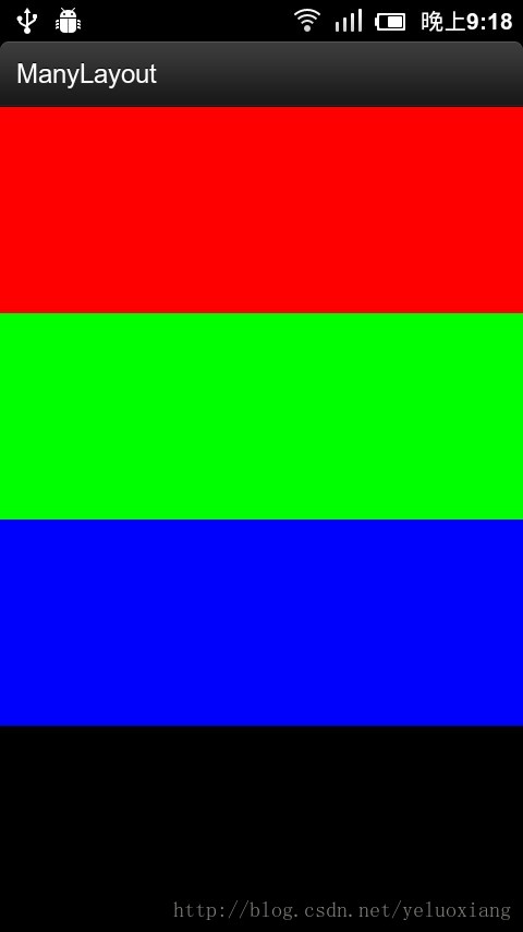
哈哈,是不是深切地感受到这就是线性布局呢?线性布局就是这样按顺序排列,这里面有一个颜色要说下,我在res/values下建立了一个color.xml文件,内容如下:
<?xml version="1.0" encoding="utf-8" ?>
<resources>
    <color name="red">#FF0000</color>
    <color name="green">#00FF00</color>
    <color name="blue">#0000FF</color>
    <color name="black">#000000</color>
</resources>
所以我们可以引用颜色,下面我们把最后一个LinearLayout改一下:
<LinearLayout
	android:layout_width="match_parent"
	android:layout_height="0dp"
	android:layout_weight="1"
	android:orientation="horizontal"
	>
	<LinearLayout
		android:layout_width="0dp"
		android:layout_height="match_parent"
		android:layout_weight="1"
		android:background="@color/red"></LinearLayout>
	<LinearLayout
		android:layout_width="0dp"
		android:layout_height="match_parent"
		android:layout_weight="1"
		android:background="@color/green"></LinearLayout>
	<LinearLayout
		android:layout_width="0dp"
		android:layout_height="match_parent"
		android:layout_weight="1"
		android:background="@color/blue"></LinearLayout>
	<LinearLayout
		android:layout_width="0dp"
		android:layout_height="match_parent"
		android:layout_weight="1"
		android:background="@color/black"></LinearLayout>
</LinearLayout>
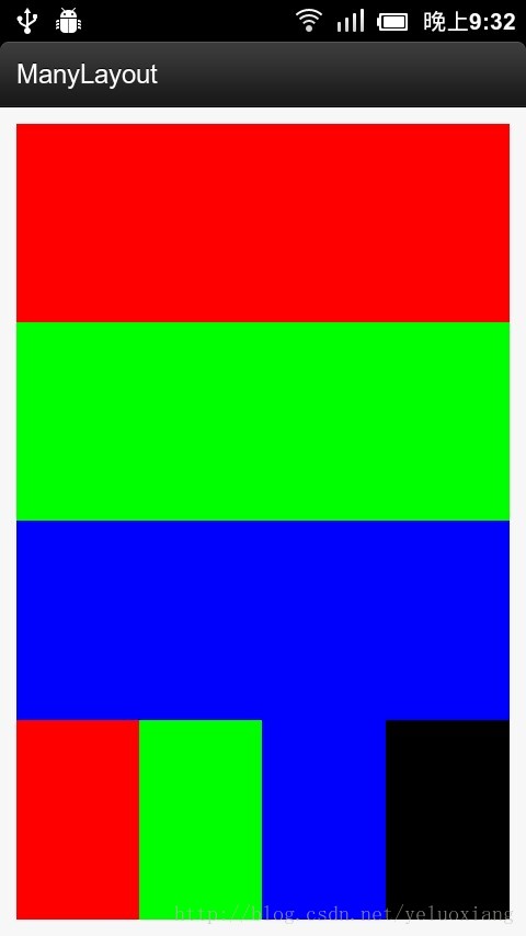
这下我们再来看下:

看到没有,最有一列变成了什么样?是不是在意料之中,注意我们这里改变了orientation,在使用LinearLayout的时候,不要忘记指定它的orientation。
但是东西满满地填充了屏幕,我们希望上下左右都留点缝隙,这时我们可以设置父LinearLayout的padding,android:padding="10dp",看看效果:
这时候,我们的Linearlayout就不是紧紧地贴着屏幕了,而是有一定间隙,还有一种方法,也能增加间隙,就是margin,但是它是用在子元素中的:android:layout_margin="10dp",下面是我在第一个LinearLayout中设置margin的效果:

请注意margin和padding的区别,padding是设置在父元素中的,让它的子元素距离它的内边框有一定距离,而margin是设置在子元素中,让其他元素距离它的外边框有一定距离。希望你能够理解上图效果的原因。
下面我们来看看另外一种布局,FrameLayout,帧布局,其实它比较简单,我们看下例子
<?xml version="1.0" encoding="utf-8"?>
<FrameLayout xmlns:android="http://schemas.android.com/apk/res/android"
    android:layout_width="match_parent"
    android:layout_height="match_parent"
    android:orientation="vertical" >

    <LinearLayout
        android:layout_width="300dp"
        android:layout_height="300dp"
        android:background="@color/red"
        ></LinearLayout>

    <LinearLayout
        android:layout_width="200dp"
        android:layout_height="200dp"
        android:background="@color/green"
        ></LinearLayout>

    <LinearLayout
        android:layout_width="100dp"
        android:layout_height="100dp"
        android:background="@color/blue"
        ></LinearLayout>

</FrameLayout>
在FrameLayout中,我们有3个不同大小的LinearLayout,猜猜它们会怎么显示呢?

哈哈,这就是FrameLayout,它会重叠地显示里面的子元素。FrameLayout真的很简单啦,但是还是比较常用的,因为手机上的布局也不一定就很复杂嘛,有时候用FrameLayout还是很管用的。
下面再来说一说RelativeLayout,相对布局,这可是比较复杂的一种布局了。比如我想弄一个楼梯:
<?xml version="1.0" encoding="utf-8"?>
<RelativeLayout xmlns:android="http://schemas.android.com/apk/res/android"
    android:layout_width="match_parent"
    android:layout_height="match_parent"
    android:paddingTop="10dp" >

    <LinearLayout
        android:id="@+id/l1"
        android:layout_width="40dp"
        android:layout_height="20dp"
        android:background="@color/red"
        android:orientation="horizontal"
        ></LinearLayout>

    <LinearLayout
        android:id="@+id/l2"
        android:layout_width="40dp"
        android:layout_height="20dp"
        android:background="@color/green"
        android:orientation="horizontal"
        android:layout_toRightOf="@id/l1"
        android:layout_below="@id/l1"
        ></LinearLayout>

    <LinearLayout
        android:id="@+id/l3"
        android:layout_width="40dp"
        android:layout_height="20dp"
        android:background="@color/blue"
        android:orientation="horizontal"
        android:layout_toRightOf="@id/l2"
        android:layout_below="@id/l2"
        ></LinearLayout>

</RelativeLayout>
效果如下:

这里我们指定第二个LinearLayout在第一个的右下方,第三个LinearLayout在第二个的右下方,这里关键是android:layout_toRightOf="@id/l1"和android:layout_below="@id/l1"。首先注意,要用相对布局,控件就要指定ID,不然怎么知道相对谁呢?
相对布局还有一个对齐的功能,请看:
<LinearLayout
	android:id="@+id/l4"
	android:layout_width="10dp"
	android:layout_height="20dp"
	android:background="@color/red"
	android:orientation="horizontal"
	android:layout_alignRight="@id/l3"
	android:layout_below="@id/l3"
	></LinearLayout>

<LinearLayout
	android:id="@+id/l5"
	android:layout_width="10dp"
	android:layout_height="20dp"
	android:background="@color/red"
	android:orientation="horizontal"
	android:layout_alignLeft="@id/l3"
	android:layout_below="@id/l3"
	></LinearLayout>
效果如下:

这里的关键是android:layout_alignLeft="@id/l3",它指定和某个控件左对齐等等,在相对布局中使用margin还可以控制控件之间距离。
刚刚说的都是相对布局控件之间位置约束,其实还有子控件与父控件的约束,下面来看一看:
<LinearLayout
	android:id="@+id/l6"
	android:layout_width="10dp"
	android:layout_height="20dp"
	android:background="@color/black"
	android:orientation="horizontal"
	android:layout_alignParentRight="true"
	android:layout_alignParentTop="true"
	></LinearLayout>
运行看下效果:

看到右边黑色的小块了吧?这就是l6,但是我们明明是设置靠到右上端,为什么上面还有一点空白呢?别忘了父控件设置了android:paddingTop="10dp"。还可以居中显示,我们来看看:
<LinearLayout
	android:id="@+id/l7"
	android:layout_width="10dp"
	android:layout_height="20dp"
	android:background="@color/black"
	android:orientation="horizontal"
	android:layout_centerHorizontal="true"
	android:layout_alignParentTop="true"
	></LinearLayout>
效果是:
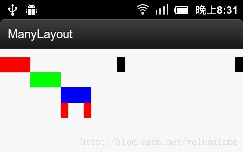
看到中间的方块了吧?这就是android:layout_centerHorizontal="true"的效果了。
其他的一些参数大家自己试试吧,有些东西只有自己动手试试才能体会到哦!
好了,我们来总结一下:
1、 Activity的跳转
2、 LinearLayout、FrameLayout和RelativeLayout
3、 嵌套布局
4、 color.xml
5、 margin和padding
这节的例子在:http://download.csdn.net/detail/yeluoxiang/7299357。欢迎大家下载,有什么问题请大家在评论中回复,非常感谢!


 652
652

 被折叠的 条评论
为什么被折叠?
被折叠的 条评论
为什么被折叠?
 到【灌水乐园】发言


