


简述
谷歌Material Design推出了许多非常好用的兼容性控件,尤其是在appcompat-V7里面有很多为兼容而生的控件,这样就可以做到高低版本和不同的ROM之间体验一致!还可以配合appcompat的主题使用达到体验一致性。例如:
1、android.support.v7.app.AlertDialog
2、进度条样式设置 style="@style/Widget.AppCompat.ProgressBar.Horizontal"
3、SwipeRefreshLayout下拉刷新
4、PopupWindow、ListPopupWindow、PopupMenu、Button、EditText等等
5、android.support.v7.widget.LinearLayoutCompat
这里主要来探究一下LinearLayoutCompat:
以前要在LinearLayout布局之间的子View之间添加分割线,还需要自己去自定义控件进行添加或者就是在子View之间写很多个分割线View;LinearLayoutCompat的出现轻松解决了LinearLayout添加分割线的问题,我们从以下两个方面来对LinearLayoutCompat进行介绍:
1、LinearLayoutCompat的使用
2、 LinearLayoutCompat的源码分析
LinearLayoutCompat的使用
LinearLayoutCompat位于support-v7包中,LinearLayoutCompat其实就是LinerLayout组件的升级,为了兼容低版本,使用前提:
1、需要引入 compile 'com.android.support:appcompat-v7:26.1.0'
2、使用LinearLayoutCompat需要自定义命名空间xmlns:app=”http://schemas.android.com/apk/res-auto”
这样就可以使用如下LinearLayoutCompat特有的功能了:
app:divider=”@drawable/line”给分隔线设置自定义的drawable,这里你需要在drawable在定义shape资源,否则将没有效果。
app:dividerPadding 给分隔线设置距离左右边距的距离。
app:showDividers="beginning|middle|end"属性。
beginning,middle,end属性值分别指明将在何处添加分割线。
beginning表示从该LinearLayoutCompat布局的最顶一个子view的顶部开始。
middle表示在此LinearLayoutCompat布局内的子view之间添加。
end表示在此LinearLayoutCompat最后一个子view的底部添加分割线。
none表示不设置间隔线。
示例代码:
<?xml version="1.0" encoding="utf-8"?>
<android.support.v7.widget.LinearLayoutCompat xmlns:android="http://schemas.android.com/apk/res/android"
xmlns:app="http://schemas.android.com/apk/res-auto"
android:layout_width="match_parent"
android:layout_height="match_parent"
android:background="@color/white"
android:orientation="vertical"
app:showDividers="middle"
app:divider="@drawable/line_diver_gray"
app:dividerPadding="15dp">
<TextView
android:layout_width="match_parent"
android:layout_height="wrap_content"
android:text="收藏"
android:padding="15dp"/>
<TextView
android:layout_width="match_parent"
android:layout_height="wrap_content"
android:text="相册"
android:padding="15dp"/>
<TextView
android:layout_width="match_parent"
android:layout_height="wrap_content"
android:text="卡包"
android:padding="15dp"/>
<TextView
android:layout_width="match_parent"
android:layout_height="wrap_content"
android:text="设置"
android:padding="15dp"/>
</android.support.v7.widget.LinearLayoutCompat>
line_diver_gray.xml:
<?xml version="1.0" encoding="utf-8"?>
<shape xmlns:android="http://schemas.android.com/apk/res/android"
android:shape="rectangle">
<solid android:color="@color/color_dddddd" />
<size android:height="0.5dp" />
</shape>
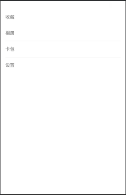
效果图如下:
LinearLayoutCompat的源码分析
看源码需要有目的去看,分析实现的原理:LinearLayoutCompat是如何做到给里面的所有的child之间添加间隔线的?
观看源码,首先可以知道 LinearLayoutCompat继承了ViewGroup,我们知道View的绘制会经过三个方法:
1、onMearsue(测量自身和里面的所有子控件)
2、onLayout(摆放里面所有的子控件),
3、onDraw(绘制)
猜想:
1、mearsuredWidth,mearsuredHeight会变大(加上分割线)
2、摆放子控件位置会有一定的体现(childView: left/top/right/bottom)
3、onDraw绘制的时候也会有体现(childView: left/top/right/bottom)
1、首先
我们查看它的构造函数:
1、从构造函数中,首先会把LinearLayoutCompat的所有风格属性的值保存到一个TintTypedArray数组中,然后从中取出用户给LinearLayoutCompat设置的orientation, gravity,baselineAligned的值,如果这些值存在,就给LinearLayoutCompat设置这些值。
2、当然还会从TintTypedArray中取出weightSum,baselineAlignedChildIndex,measureWithLargestChild等属性
3、setDividerDrawable方法
设置分割线的Drawable,非常明显和分割线有关系
4、接着是从TintTypedArray中继续获取mShowDividers和mDividerPadding的值,分别用于判断显示分割线的模式和分割线的Padding值为多少。
public LinearLayoutCompat(Context context, AttributeSet attrs, int defStyleAttr) {
super(context, attrs, defStyleAttr);
final TintTypedArray a = TintTypedArray.obtainStyledAttributes(context, attrs,
R.styleable.LinearLayoutCompat, defStyleAttr, 0);
int index = a.getInt(R.styleable.LinearLayoutCompat_android_orientation, -1);
if (index >= 0) {
setOrientation(index);
}
index = a.getInt(R.styleable.LinearLayoutCompat_android_gravity, -1);
if (index >= 0) {
setGravity(index);
}
boolean baselineAligned = a.getBoolean(R.styleable.LinearLayoutCompat_android_baselineAligned, true);
if (!baselineAligned) {
setBaselineAligned(baselineAligned);
}
mWeightSum = a.getFloat(R.styleable.LinearLayoutCompat_android_weightSum, -1.0f);
mBaselineAlignedChildIndex =
a.getInt(R.styleable.LinearLayoutCompat_android_baselineAlignedChildIndex, -1);
mUseLargestChild = a.getBoolean(R.styleable.LinearLayoutCompat_measureWithLargestChild, false);
setDividerDrawable(a.getDrawable(R.styleable.LinearLayoutCompat_divider));
mShowDividers = a.getInt(R.styleable.LinearLayoutCompat_showDividers, SHOW_DIVIDER_NONE);
mDividerPadding = a.getDimensionPixelSize(R.styleable.LinearLayoutCompat_dividerPadding, 0);
a.recycle();
}
我们查看setDividerDrawable方法的内部实现:
1、可以看到,该方法中传进来一个Drawable,然后会进行if判断,是否和原有的Drawable相等,如果为true则return,不执行下面的语句,如果不是,则将该Drawable设置给全局的mDivider,
2、又是if判断,如果传进来的divider!= null,则获取它的固有宽高并设置给mDivider,否则mDivider的宽高设为0,然后会执行setWillNotDraw和requestLayout方法
public void setDividerDrawable(Drawable divider) {
if (divider == mDivider) {
return;
}
mDivider = divider;
if (divider != null) {
mDividerWidth = divider.getIntrinsicWidth();
mDividerHeight = divider.getIntrinsicHeight();
} else {
mDividerWidth = 0;
mDividerHeight = 0;
}
setWillNotDraw(divider == null);
requestLayout();
}
2、查看分析View的绘制会经过三个方法
onMeasure、onLayout、onDraw
下面我们就查看一下这几个方法的源码进行分析,看看分割线是如何进行绘制的。
1、首先查看一下onMeasure方法:
内部就是根据Orientation的不同,调用不同的方法:
@Override
protected void onMeasure(int widthMeasureSpec, int heightMeasureSpec) {
if (mOrientation == VERTICAL) {
measureVertical(widthMeasureSpec, heightMeasureSpec);
} else {
measureHorizontal(widthMeasureSpec, heightMeasureSpec);
}
}
onMeasure分为了水平和竖直的情况,我们这次以竖直情况为例分析。我们猜想可以知道,在测量的时候,肯定加了分隔线的高度(只看核心代码):
void measureVertical(int widthMeasureSpec, int heightMeasureSpec) {
for (int i = 0; i < count; ++i) {
final View child = getVirtualChildAt(i);
//如果有分隔线,那么测量的时候就加上分割线的Drawable的高度
if (mTotalLength > 0 && hasDividerBeforeChildAt(count)) {
mTotalLength += mDividerHeight;
}
}
}
--measureVertical方法最后是通过setMeasuredDimension方法对测量的值进行设置的;
--至于 maxWidth的值在源码的前面有相应的判断进行赋值;
--所以整个measure的方法基本围绕maxWidth和mTotalLength值的确定展开的;
--其中如果hasDividerBeforeChildAt返回的值为true,mTotalLength会加上分割线的高度;
--
最后通过setMeasuredDimension赋值。
2、其次查看一下
onLayout方法:
@Override
protected void onLayout(boolean changed, int l, int t, int r, int b) {
if (mOrientation == VERTICAL) {
layoutVertical(l, t, r, b);
} else {
layoutHorizontal(l, t, r, b);
}
}
看一下layoutVertical的逻辑,里面基本围绕以下两个值展开的:
int childTop;
int childLeft;
循环遍历子View,根据不同的gravity对childLeft和childTop进行赋值,如果存在分割线childTop会加上分割线的高度mDividerHeight,最后是通过setChildFrame方法进行layout的完成的
for (int i = 0; i < count; i++) {
final View child = getVirtualChildAt(i);
if (child == null) {
childTop += measureNullChild(i);
} else if (child.getVisibility() != GONE) {
final int childWidth = child.getMeasuredWidth();
final int childHeight = child.getMeasuredHeight();
final LinearLayoutCompat.LayoutParams lp =
(LinearLayoutCompat.LayoutParams) child.getLayoutParams();
int gravity = lp.gravity;
if (gravity < 0) {
gravity = minorGravity;
}
final int layoutDirection = ViewCompat.getLayoutDirection(this);
final int absoluteGravity = GravityCompat.getAbsoluteGravity(gravity,
layoutDirection);
switch (absoluteGravity & Gravity.HORIZONTAL_GRAVITY_MASK) {
case Gravity.CENTER_HORIZONTAL:
childLeft = paddingLeft + ((childSpace - childWidth) / 2)
+ lp.leftMargin - lp.rightMargin;
break;
case Gravity.RIGHT:
childLeft = childRight - childWidth - lp.rightMargin;
break;
case Gravity.LEFT:
default:
childLeft = paddingLeft + lp.leftMargin;
break;
}
if (hasDividerBeforeChildAt(i)) {
childTop += mDividerHeight;
}
childTop += lp.topMargin;
setChildFrame(child, childLeft, childTop + getLocationOffset(child),
childWidth, childHeight);
childTop += childHeight + lp.bottomMargin + getNextLocationOffset(child);
i += getChildrenSkipCount(child, i);
}
}
3、最后看一下onDraw方法:
onDraw方法内部逻辑是,判断mDivider是否为空,然后是根据mOrientation的属性,来调用不同的方法进行横或者竖的分割线绘制。
@Override
protected void onDraw(Canvas canvas) {
if (mDivider == null) {
return;
}
if (mOrientation == VERTICAL) {
drawDividersVertical(canvas);
} else {
drawDividersHorizontal(canvas);
}
}
#查看drawDividersVertical方法内部:
1、循环遍历所有子孩子,进行是否为空和是否为不可见的判断;
2、然后调用hasDividerBeforeChildAt(i),如果为true,则通过获取child的LayoutParams进行计算;
3、然后就可以计算出分割线的top距离;
4、然后调用drawHorizontalDivider(canvas,top)方法。
void drawDividersVertical(Canvas canvas) {
final int count = getVirtualChildCount();
for (int i = 0; i < count; i++) {
final View child = getVirtualChildAt(i);
if (child != null && child.getVisibility() != GONE) {
if (hasDividerBeforeChildAt(i)) {
final LayoutParams lp = (LayoutParams) child.getLayoutParams();
final int top = child.getTop() - lp.topMargin - mDividerHeight;
drawHorizontalDivider(canvas, top);
}
}
}
if (hasDividerBeforeChildAt(count)) {
final View child = getVirtualChildAt(count - 1);
int bottom = 0;
if (child == null) {
bottom = getHeight() - getPaddingBottom() - mDividerHeight;
} else {
final LayoutParams lp = (LayoutParams) child.getLayoutParams();
bottom = child.getBottom() + lp.bottomMargin;
}
drawHorizontalDivider(canvas, bottom);
}
}
#查看一下hasDividerBeforeChildAt方法的内部逻辑:
1、基本就是根据子孩子的位置进行相应的判断,第一个位置,最后一个位置,还有中间所有位置,返回一个boolean值;
2、会根据这个值来判断是否画分割线;
3、然后回到drawDividersVertical方法中,它会在遍历子View的;
4、最后调用drawHorizontalDivider方法。
protected boolean hasDividerBeforeChildAt(int childIndex) {
if (childIndex == 0) {
return (mShowDividers & SHOW_DIVIDER_BEGINNING) != 0;
} else if (childIndex == getChildCount()) {
return (mShowDividers & SHOW_DIVIDER_END) != 0;
} else if ((mShowDividers & SHOW_DIVIDER_MIDDLE) != 0) {
boolean hasVisibleViewBefore = false;
for (int i = childIndex - 1; i >= 0; i--) {
if (getChildAt(i).getVisibility() != GONE) {
hasVisibleViewBefore = true;
break;
}
}
return hasVisibleViewBefore;
}
return false;
}
#查看一下
drawHorizontalDivider方法:
分割线是如何绘制上去的:
1、发现分割线其实是通过Drawable的setBounds方法进行设置的,
2、然后会调用Drawable的draw方法对分割线进行绘制。
3、drawDividersHorizontal方法的逻辑跟drawDividersVertical方法差不多,它最后调用的是drawVerticalDivider方法。
void drawHorizontalDivider(Canvas canvas, int top) {
mDivider.setBounds(getPaddingLeft() + mDividerPadding, top,
getWidth() - getPaddingRight() - mDividerPadding, top + mDividerHeight);
mDivider.draw(canvas);
}
为什么要看分割线绘制的源码,因为在很多控件中并没有分割线,我们可以通过学习谷歌的源码,仿照着进行分割线的绘制,比如recyclerView就没有分割线,但我们可以自己写一个分割线,对于recyclerView分割线设置


 扫一扫
扫一扫
 476
476

 被折叠的 条评论
为什么被折叠?
被折叠的 条评论
为什么被折叠?
 到【灌水乐园】发言


