


HTML5已经不是流行的话题了,现在让我们来看看大牛们都利用html5做了什么
<!DOCTYPE html>
<html>
<head>
<meta charset="UTF-8">
<title>CSS Only
iPhone 6</title>
<style>
/* No images in this pen :D */
@font-face {
font-family: Helvetica;
src: url(https://s3-us-west- 2.amazonaws.com/s.cdpn.io/164210/HelveticaNeue-UltraLight.otf) format
('TrueType');
font-weight: 300;
}
body {
font-family: 'Helvetica', sans-
serif;
background: #f5f5f5;
color: #333;
letter-spacing: 1px;
}
html,body
{
height: 100%;
margin: 0;
padding: 0;
overflow: hidden;
}
#wrapper {
height: 520px;
width: 800px;
margin-left: -400px;
margin-top: -260px;
position: absolute;
-webkit-perspective: 6000px;
perspective:
6000px;
top: 50%;
left: 50%;
}
#iphone {
height: 760px;
width: 372px;
border-radius: 50px;
position: absolute;
background: none;
box-shadow:
none;
left: 206px;
top: -140px;
-webkit-transform: rotateX(54deg)
rotateZ(-46deg);
transform: rotateX(54deg) rotateZ(-46deg);
-
webkit-transform-style: preserve-3d;
transform-style: preserve-
3d;
}
#side {
background: #CDD0D5;
width: 393px;
height: 780px;
border-
top-left-radius: 77px;
border-bottom-left-radius: 49px;
border-bottom-
right-radius: 86px;
border-top-right-radius: 70px;
position: absolute;
top: 5px;
left: -26px;
box-shadow: inset #3D3E42 0 0 15px 9px;
}
#front {
width: 362px;
height: 750px;
border-radius: 49px;
position: absolute;
background-image: -webkit-linear-gradient(-27deg,#444,#000 10%, #000 42%, #333, #000 57%, #000 91%, #444);
left: 5px;
top: 5px;
box-shadow: inset
#000 0 0 0 4px, #555 0px 0 3px 0px, #222 -3px 2px, #000 -5px 5px, #E0E0E0
-7px 6px 1px, #6D6D6D -7px 6px 9px;
-webkit-transform: translateZ(1px);
transform: translateZ(1px);
}
#front-cover {
width: 344px;
height: 734px;
background: #000;
border-radius: 39px;
position:
absolute;
top: 8px;
left: 9px;
}
#home {
position: absolute;
width:
52px;
height: 52px;
border-radius: 50%;
background: -webkit-linear-
gradient(58deg, #666, #000, #666);
background: linear-gradient
(32deg,#666,#000,#666);
top: 684px;
left: 160px;
}
#home div {
background: #000;
border-radius: 50%;
width: 46px;
height: 46px;
position: absolute;
left: 3px;
top: 3px;
}
#camera {
width: 11px;
height: 11px;
background: #000;
position: absolute;
top: 35px;
left:
124px;
border-radius: 50%;
box-shadow: inset #666 -5px 2px 9px -2px;
}
#camera div {
width: 6px;
height: 6px;
background: -webkit-radial-
gradient(#E1E4F5, #0D2B69 33%);
background: radial-gradient
(#E1E4F5,#0D2B69 33%);
background-position: -1px -1px;
position:
absolute;
top: 3px;
left: 3px;
border-radius: 50%;
}
#speaker {
width:
50px;
height: 4px;
border-radius: 2px;
background: #555;
position:
absolute;
top: 39px;
left: 156px;
box-shadow: inset #222 0 0px 4px;
}
#volume {
height: 128px;
width: 11px;
border-radius: 10px;
position:
absolute;
background: #F9F9FA;
top: 171px;
left: -20px;
-webkit-
transform: rotateY(95deg);
transform: rotateY(95deg);
-webkit-
transform-style: preserve-3d;
transform-style: preserve-3d;
box-shadow: inset #292A2F 4px 0 8px 1px, #D5D5D5 -1px 0px 2px;
}
#volume div
{
width: 8px;
height: 55px;
background: #BBBCC0;
border-radius: 10px;
position: absolute;
box-shadow: #eee -1px 1px, #777 -1px 3px, #505057 -
3px 3px, inset #909197 -3px 0 3px;
}
#volume div:first-child {
top: 2px;
left: 4px;
}
#volume div:last-child {
top: 69px;
left: 4px;
}
#toggler {
height: 34px;
width: 8px;
border-radius: 10px;
position: absolute;
background: #2B2C31;
top: 105px;
left: -20px;
-webkit-transform:
rotateY(95deg);
transform: rotateY(95deg);
-webkit-transform-
style: preserve-3d;
transform-style: preserve-3d;
box-shadow:
inset #292A2F 4px 0 8px 1px, #D5D5D5 -1px 0px 2px;
}
#toggler div {
width:
4px;
height: 31px;
background: #BBBCC0;
border-radius: 10px;
position:
absolute;
box-shadow: #eee -1px 1px, #777 -2px 3px, #505057 -3px 3px,
inset #909197 -3px 0 3px;
top: -1px;
left: 3px;
}
#aux {
width: 19px;
height: 19px;
background: #3B3B3B;
border-radius: 50%;
-webkit-
transform: rotateX(90deg) translateZ(1px);
transform: rotateX
(90deg) translateZ(1px);
-webkit-transform-style: preserve-3d;
transform-style: preserve-3d;
position: absolute;
top: 766px;
left:
45px;
box-shadow: inset #000 6px -3px 10px 1px, #C7C7C7 1px 0px 1px;
}
#lightning {
width: 48px;
height: 12px;
border-radius: 10px;
background: #3F3F3F;
-webkit-transform: rotateX(90deg) translate3d
(0px,1px,0px);
transform: rotateX(90deg) translate3d
(0px,1px,0px);
top: 771px;
position: absolute;
left: 139px;
box-
shadow: inset #8E8F94 -1px 1px 0px 2px, #515258 0px 0px 0 1px, inset #000
0 -3px 10px, #DADADA 1px 0 0 1px;
}
#bottom-speaker {
position: absolute;
-webkit-transform: rotateX(90deg);
transform: rotateX(90deg);
top: 781px;
left: 70px;
}
#bottom-speaker div {
width: 8px;
height: 8px;
border-radius: 50%;
background: #6C6D72;
position: absolute;
box-
shadow: inset #000 1px -1px 4px 1px, #DADADA 1px 0px;
}
#bottom-speaker
div:nth-child(2) { left: 150px; }
#bottom-speaker div:nth-child(3) { left:
162px; }
#bottom-speaker div:nth-child(4) { left: 174px; }
#bottom-speaker
div:nth-child(5) { left: 186px; }
#bottom-speaker div:nth-child(6) { left:
198px; }
#bottom-speaker div:nth-child(7) { left: 210px; }
#skrews {
position: absolute;
top: 780px;
left: 120px;
-webkit-transform:
rotateX(90deg);
transform: rotateX(90deg);
}
#skrews div {
position: absolute;
width: 8px;
height: 8px;
background: rgb(95, 92, 92);
border-radius: 50%;
top: 0;
z-index: 4;
box-shadow: inset #999AA0
0 0 0px 2px, #444 1px 0px;
}
#skrews div:last-child {
left: 70px;
}
#lines {
position: absolute;
top: 82px;
left: -32px;
}
#lines > div:last-child {
top: 634px;
}
#lines div {
width: 7px;
height: 11px;
position: absolute;
-webkit-transform-style: preserve-3d;
transform-style: preserve-
3d;
-webkit-transform-origin: 100% 100%;
-ms-transform-origin: 100%
100%;
transform-origin: 100% 100%;
}
#lines > div {
background: -
webkit-linear-gradient(right, #393A3C, #5A595E);
background: linear-
gradient(right,#393A3C,#5A595E);
-webkit-transform: rotateY(90deg);
transform: rotateY(90deg);
}
#lines > div > div {
background: -webkit-
linear-gradient(right, #5A595E, #87868A);
background: linear-gradient
(right,#5A595E,#87868A);
-webkit-transform: rotateY(17deg);
transform: rotateY(17deg);
left: -6px;
}
#lines > div > div > div {
background: -webkit-linear-gradient(right, #87868A, #A8A6AD);
background:
linear-gradient(right,#87868A,#A8A6AD);
-webkit-transform: rotateY
(17deg);
transform: rotateY(17deg);
left: -6px;
}
#shadow {
width: 350px;
height: 755px;
background: black;
position: absolute;
top: 5px;
left: 0;
-webkit-transform: translateZ(-17px);
transform: translateZ(-17px);
-webkit-transform-style: preserve-3d;
transform-style: preserve-3d;
box-shadow: #000 0 0 10px 15px;
opacity: 0.4;
border-top-left-radius: 76px;
border-top-right-radius:
200px;
border-bottom-left-radius: 40px;
border-bottom-right-radius:
56px;
}
#screen {
background: -webkit-linear-gradient(#A1E5E5, #1987AA);
background: linear-gradient(#A1E5E5,#1987AA);
width: 336px;
height:
589px;
position: absolute;
top: 80px;
left: 13px;
font-weight: 300;
color: #fff;
background-size: 200% 100%;
overflow: hidden;
}
#time {
font-size: 86px;
left: 57px;
top: 37px;
position: absolute;
}
#date {
font-size: 20px;
left: 85px;
top: 130px;
position: absolute;
}
#bottom {
width: 37px;
height: 7px;
border-radius: 5px;
background: #2AB1DB;
position: absolute;
top: 573px;
left: 149px;
}
#top {
width: 37px;
height: 7px;
border-radius: 5px;
background: #D7FFFF;
position:
absolute;
top: 10px;
left: 149px;
}
#slide {
position: absolute;
top:
489px;
left: 88px;
font-size: 28px;
color: #2AB1DB;
background: -
webkit-linear-gradient(left, #2EC4F3 30%, #fff, #2EC4F3 70%);
background:
linear-gradient(left,#2EC4F3 30%,#fff,#2EC4F3 70%);
-webkit-background-
clip: text;
-webkit-text-fill-color: transparent;
background-size:
350px;
-webkit-animation: slide 5s linear infinite;
animation:
slide 5s linear infinite;
}
@-webkit-keyframes slide {
0% { background-
position: 100px 0; }
40% { background-position: 440px 0; }
100% {
background-position: 440px 0; }
}
@keyframes slide {
0% { background-
position: 100px 0; }
40% { background-position: 440px 0; }
100% {
background-position: 440px 0; }
}
#slide div {
-webkit-transform: rotate
(135deg);
-ms-transform: rotate(135deg);
transform: rotate
(135deg);
border-left: 2px solid #2AB1DB;
border-top: 2px solid #2AB1DB;
width: 15px;
height: 15px;
position: absolute;
left: -29px;
top:
10px;
}
#signal {
position: absolute;
top: 9px;
left: 7px;
}
#signal div {
width: 6px;
height: 6px;
border-radius: 50%;
background: #fff;
border:
1px solid #fff;
position: absolute;
}
#signal div:nth-child(2) {
left:
9px;
}
#signal div:nth-child(3) {
left: 18px;
}
#signal div:nth-child(4) {
left: 27px;
}
#signal div:nth-child(5) {
left: 36px;
background: none;
}
#battery {
position: absolute;
top: 3px;
left: 270px;
font-size:
13px;
}
#battery > div:last-child {
width: 27px;
height: 9px;
border: 1px
solid #fff;
position: absolute;
top: 4px;
left: 27px;
border-radius:
2px;
}
#battery div div:first-child {
width: 21px;
height: 7px;
background: #fff;
position: absolute;
top: 1px;
left: 1px;
}
#battery div
div:last-child {
width: 1px;
height: 6px;
background: #FFF;
position:
absolute;
left: 29px;
top: 2px;
border-radius: 0 1px 1px 0;
}
#fabrizio {
border-top: 100px solid black;
border-right: 63px solid transparent;
width: 0;
-webkit-transform: scale(.33);
-ms-transform: scale
(.33);
transform: scale(.33);
-webkit-transform-origin: 0 0;
-ms-transform-origin: 0 0;
transform-origin: 0 0;
margin:
20px;
opacity:.6;
position: absolute;
bottom: -130px;
}
#fabrizio:before
{
background: black;
width: 20px;
height: 30px;
content:
'';
display: block;
-webkit-transform: skewX(-32deg);
-ms-
transform: skewX(-32deg);
transform: skewX(-32deg);
position: relative;
top: -65px;
left: 29px;
}
#fabrizio:after {
background: black;
width: 40px;
height: 36px;
content: '';
display: block;
-webkit-transform: skewX(-32deg);
-ms-transform:
skewX(-32deg);
transform: skewX(-32deg);
position:
relative;
top: -130px;
left: 49px;
}
#circle {
width: 50px;
height: 50px;
background: none;
border-radius: 50%;
box-shadow: rgba
(255,255,255,0.1) 160px 335px,rgba(255,255,255,0.1) 120px 275px 0
12px,rgba(255,255,255,0.1) 60px 355px 0 23px,rgba(255,255,255,0.1) 230px
445px 0 -8px,rgba(255,255,255,0.1) 60px 125px,rgba(255,255,255,0.1) 260px
145px 0 12px,rgba(255,255,255,0.1) 300px 145px 0 23px,rgba
(255,255,255,0.1) 100px 85px 0 -8px,rgba(255,255,255,0.1) 50px 155px,rgba
(255,255,255,0.1) 150px 273px 0 -2px,rgba(255,255,255,0.1) 50px 555px 0
23px,rgba(255,255,255,0.1) 180px 5px 0 -8px;
-webkit-animation: circle
30s linear infinite alternate;
animation: circle 30s linear
infinite alternate;
}
@-webkit-keyframes circle {
0%{
box-shadow: rgba
(255,255,255,0.1) 160px 335px,rgba(255,255,255,0.1) 120px 275px 0
12px,rgba(255,255,255,0.1) 60px 355px 0 23px,rgba(255,255,255,0.1) 230px
445px 0 -8px,rgba(255,255,255,0.1) 60px 125px,rgba(255,255,255,0.1) 260px
145px 0 12px,rgba(255,255,255,0.1) 300px 145px 0 23px,rgba
(255,255,255,0.1) 100px 85px 0 -8px,rgba(255,255,255,0.1) 350px
555px,rgba(255,255,255,0.1) 350px 273px 0 -2px,rgba(255,255,255,0.1) 150px
355px 0 23px,rgba(255,255,255,0.1) 180px 205px 0 -8px,rgba
(255,255,255,0.1) 0px 0px 0 -8px,rgba(255,255,255,0.1) 100px 555px 0 10px;
}
100%{
box-shadow: rgba(255,255,255,0.1) 70px 10px,rgba
(255,255,255,0.1) 300px 205px 0 12px,rgba(255,255,255,0.1) 0px 155px 0
23px,rgba(255,255,255,0.1) 330px 45px 0 -8px,rgba(255,255,255,0.1) 460px
325px,rgba(255,255,255,0.1) 0px 445px 0 12px,rgba(255,255,255,0.1) 300px
145px 0 23px,rgba(255,255,255,0.1) 100px 85px 0 -8px,rgba(255,255,255,0.1)
50px 155px,rgba(255,255,255,0.1) 150px 273px 0 -2px,rgba(255,255,255,0.1)
0px 555px 0 23px,rgba(255,255,255,0.1) 180px 5px 0 -8px,rgba
(255,255,255,0.1) 300px 555px 0 -8px,rgba(255,255,255,0.1) 350px 355px 0
10px;
}
}
@keyframes circle {
0%{
box-shadow: rgba(255,255,255,0.1)
160px 335px,rgba(255,255,255,0.1) 120px 275px 0 12px,rgba(255,255,255,0.1)
60px 355px 0 23px,rgba(255,255,255,0.1) 230px 445px 0 -8px,rgba
(255,255,255,0.1) 60px 125px,rgba(255,255,255,0.1) 260px 145px 0
12px,rgba(255,255,255,0.1) 300px 145px 0 23px,rgba(255,255,255,0.1) 100px
85px 0 -8px,rgba(255,255,255,0.1) 350px 555px,rgba(255,255,255,0.1) 350px
273px 0 -2px,rgba(255,255,255,0.1) 150px 355px 0 23px,rgba
(255,255,255,0.1) 180px 205px 0 -8px,rgba(255,255,255,0.1) 0px 0px 0 -
8px,rgba(255,255,255,0.1) 100px 555px 0 10px;
}
100%{
box-shadow:
rgba(255,255,255,0.1) 70px 10px,rgba(255,255,255,0.1) 300px 205px 0
12px,rgba(255,255,255,0.1) 0px 155px 0 23px,rgba(255,255,255,0.1) 330px
45px 0 -8px,rgba(255,255,255,0.1) 460px 325px,rgba(255,255,255,0.1) 0px
445px 0 12px,rgba(255,255,255,0.1) 300px 145px 0 23px,rgba
(255,255,255,0.1) 100px 85px 0 -8px,rgba(255,255,255,0.1) 50px 155px,rgba
(255,255,255,0.1) 150px 273px 0 -2px,rgba(255,255,255,0.1) 0px 555px 0
23px,rgba(255,255,255,0.1) 180px 5px 0 -8px,rgba(255,255,255,0.1) 300px
555px 0 -8px,rgba(255,255,255,0.1) 350px 355px 0 10px;
}
}
#reminder {
position: absolute;
top: 230px;
left: 40px;
width: 296px;
height: 50px;
border-top: 1px solid #86E2F0;
border-bottom: 1px solid #86E2F0;
line-
height: 50px;
font-weight: 400;
opacity: 0;
-webkit-animation: reminder
.1s linear forwards 15s;
animation: reminder .1s linear forwards
15s;
}
#reminder div:first-child {
background: #fff;
width: 16px;
height:
16px;
border-radius: 3px;
position: absolute;
top: 18px;
}
#reminder
div:nth-child(2) {
position: absolute;
left: 30px;
}
#reminder div:last-
child{
position: absolute;
left: 251px;
font-size: 11px;
color: #86E2F0;
}
@-webkit-keyframes reminder {
100% {
opacity: 1;
}
}
@keyframes
reminder {
100% {
opacity: 1;
}
}
#awwwards {
position: absolute;
bottom: 30px;
left: 70px;
}
#awwwards a {
color: #444;
text-decoration:
none;
border-bottom: 1px solid #888;
}
#coolors {
position: absolute;
bottom: 30px;
right: 30px;
color: #444;
text-decoration: none;
border-bottom: 1px solid #888;
-webkit-animation: coolors 1s infinite;
animation: coolors 1s infinite;
opacity: 1;
}
@-webkit-keyframes
coolors {
50% { right: 40px; }
}
@keyframes coolors {
50% { right: 40px;
}
}
</style>
<script>
window.console = window.console || function(t)
{};
window.open = function(){ console.log('window.open is disabled.');
};
window.print = function(){ console.log('window.print is disabled.');
};
// Support hover state for mobile.
if (false) {
window.ontouchstart = function(){};
}
</script>
</head>
<body>
<div
id="wrapper">
<div id="iphone">
<div id="side"></div>
<div
id="lines">
<div>
<div>
<div></div>
</div>
</div>
<div>
<div>
<div></div>
</div>
</div>
</div>
<div id="toggler">
<div></div>
</div>
<div
id="aux"></div>
<div id="lightning"></div>
<div id="bottom-speaker">
<div></div>
<div></div>
<div></div>
<div></div>
<div></div>
<div></div>
<div></div>
</div>
<div
id="skrews">
<div></div>
<div></div>
</div>
<div
id="volume">
<div></div>
<div></div>
</div>
<div
id="front">
<div id="front-cover"></div>
<div id="camera">
<div></div>
</div>
<div id="speaker"></div>
<div
id="screen">
<div id="reminder">
<div></div>
<div>Made by @_fbrz</div>
<div>now</div>
</div>
<div id="circle"></div>
<div id="time">12:42</div>
<div
id="date">Saturday, January 4</div>
<div id="bottom"></div>
<div id="top"></div>
<div id="slide">
<div></div>
slide to unlock
</div>
<div id="signal">
<div></div>
<div></div>
<div></div>
<div></div>
<div></div>
</div>
<div id="battery">
<div>86%</div>
<div>
<div></div>
<div></div>
</div>
</div>
</div>
<div id="home">
<div></div>
</div>
</div>
<div id="shadow"></div>
</div>
</div>
<script
src='http://codepen.io/fbrz/pen/9a3e4ee2ef6dfd479ad33a2c85146fc1.js'></scr
ipt>
<script>
if (document.location.search.match(/type=embed/gi)) {
window.parent.postMessage('resize', "*");
}
</script>
<script
src="//assets.codepen.io/assets/common/stopExecutionOnTimeout-
6c99970ade81e43be51fa877be0f7600.js"></script>
<script>
//You may also
like Plugin
/*alsolike(
"LwlqI", "100 followers jelly cake!",
"nKCsI",
"Semantic Sandwich",
"whxbF", "CSS Only Bending Effect"
);*/
//@
sourceURL=pen.js
</script>
</body>
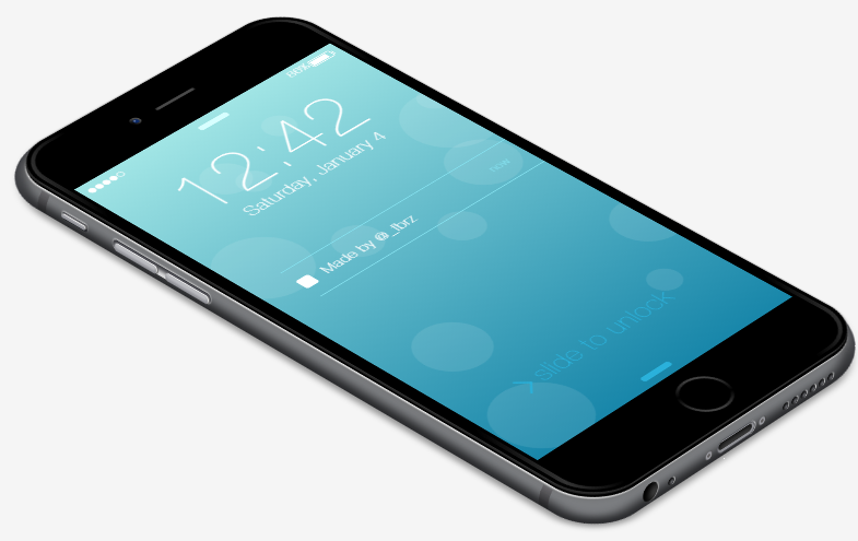
</html>运行起来简直逼真,好了,送你一个iphone吧,不客气。
效果图如下:
如需转载,请标明本文链接。谢谢


 扫一扫
扫一扫
 6510
6510

 被折叠的 条评论
为什么被折叠?
被折叠的 条评论
为什么被折叠?
 到【灌水乐园】发言


