


功能简介
自古以来其实都是前人种树,后人乘凉,第一个吃螃蟹的人少之又少。话不多说,开始我们今天的主题,密码强度验证组件。本组件是基于ElementUI套件中的Progress 进度条加以改造的,使用正则表达式去实时验证密码的强度,讲真话,效果体验还是不错的。项目中只需要引入该组件集成到自己的项目中即可,因为作者太懒了,还没有开源到组件库中,不然小手npm安装一下即可,不过无伤大雅。哈哈,以上全是废话,先放个图震慑一下吃瓜群众,免得说我刷流量。
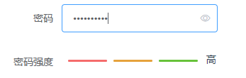
怎么样,是不是很香呢?香是很香,来耐着性子一探究竟吧。哈哈,继续扯皮。
实战开发
- 贴上我渣的一匹的代码
<template>
    <div id="container">
        <el-row>
            <el-col :span="6" :offset="1">
                <el-progress :percentage="onePercentage" :color="oneCustomColors" :format="oneFormat" :stroke-width="3"></el-progress>
            </el-col>
            <el-col :span="6" :offset="1">
                <el-progress :percentage="twoPercentage" :color="twoCustomColors" :format="twoFormat" :stroke-width="3"></el-progress>
            </el-col>
            <el-col :span="6" :offset="1">
                <el-progress :percentage="ThreePercentage" :color="ThreeCustomColors" :format="ThreeFormat" :stroke-width="3"></el-progress>
            </el-col>
            <el-col :span="2" :offset="1" style="line-height: 15px;">
                {{content}}
            </el-col>
        </el-row>
    </div>
</template>

<script>
    export default {
        name: "PasswordStrength",
        model: {
            event: 'change',
            prop: 'password'
        },
        props: {
            //密码
            password: {
                type: [String,Boolean,Number,Object],
                required: true,
                default: "",
            },
        },
        watch:{
            password(newValue){
                const mode = this.checkPasswordStrength(newValue);
                //逻辑处理
                switch (mode) {
                    //初始化状态
                    case 0:
                        this.content = '';
                        this.onePercentage = 0;
                        this.twoPercentage = 0;
                        this.ThreePercentage = 0;
                        break;
                    case 1:
                        this.content = '弱';
                        this.onePercentage = 100;
                        this.twoPercentage = 0;
                        this.ThreePercentage = 0;
                        break;
                    case 2:
                        this.content = '中';
                        this.onePercentage = 100;
                        this.twoPercentage = 100;
                        this.ThreePercentage = 0;
                        break;
                    case 3:
                        this.content = '中';
                        this.onePercentage = 100;
                        this.twoPercentage = 100;
                        this.ThreePercentage = 0;
                        break;
                    default:
                        this.content = '高';
                        this.onePercentage = 100;
                        this.twoPercentage = 100;
                        this.ThreePercentage = 100;
                        break;
                }
            }
        },
        data(){
            return{
                content:"",
                onePercentage:0,
                twoPercentage:0,
                ThreePercentage:0,
                oneCustomColors: [
                    {color: '#f56c6c', percentage: 100}
                ],
                twoCustomColors: [
                    {color: '#e6a23c', percentage: 100}
                ],
                ThreeCustomColors: [
                    {color: '#67c23a', percentage: 100}
                ]
            }
        },
        methods:{
            oneFormat() {
                return "";
            },
            twoFormat() {
                return "";
            },
            ThreeFormat() {
                return "";
            },
            //密码强度验证
            checkPasswordStrength(value) {
                let mode = 0;
                //正则表达式验证符合要求的
                if (value.length < 1) return mode;
                if (/\d/.test(value)) mode++; //数字
                if (/[a-z]/.test(value)) mode++; //小写
                if (/[A-Z]/.test(value)) mode++; //大写
                if (/\W/.test(value)) mode++; //特殊字符
                return mode;
            }
        }
    }
</script>

<style>
    .el-progress__text {
        display: none;
    }
    .el-progress-bar {
        padding-right: 0px;
        margin: 0px;
    }
</style>
2.听我渣的一匹强行解释
- 首先使用progress组件实现密码强度的渲染效果,这里密码的强度分为强、中、弱三级,分别对应三种颜色,固使用三个进度条组件progress实现。通过控制进度条的
percentage值进行颜色的控制。 使用vue的watch函数监控组件值password的变化,这个值通过父子组件传值的方式实现数据的动态绑定。传递给子组件,watch观察器监控到password的变化就通过密码验证函数去验证密码的强度值,根据强度值去控制进度条的percentage值,从而达到密码强度的渲染效果。-
最最关键的是密码强度的验证函数,这里参考了网上大多数人的做法,使用大小写字母、数字、特殊符号去做正则匹配,都不包含当然就是初始状态,包含以上一种就是弱,2-3种就是中,4种就是强,这里可按自己的需求自行定义,当然再配合一些长度的验证就更香了,有木有?哈哈,又在吹牛逼了。
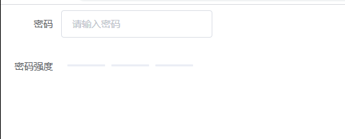
3.这样子一个vue的组件就封装好了,是不是很easy呢。当然用法也就很简单了。请看我的helleworld。
<template>
    <div class="container">
        <el-form label-width="80px" style="width:300px;">
            <el-form-item label="密码">
                <el-input placeholder="请输入密码" v-model="password" show-password></el-input>
            </el-form-item>
            <el-form-item label="密码强度">
                <password-strength v-model="password" style="padding-top: 10px;"></password-strength>
            </el-form-item>
        </el-form>
    </div>
</template>

<script>
    //引入我们上面定义的组件
    import PasswordStrength from "@/components/drag/PasswordStrength";
    export default {
        name: 'HelloWorld',
        //注册组件
        components:{PasswordStrength},
        data(){
            return {
                password:'',
            };
        },
        methods:{

        }
    }
</script>
<style scope>
    .el-icon-check:before {
        content: "\e6da";
    }
</style>
组件注册好之后,就可以在项目中引用了,到这里的时候是不是就真的香了。当然再来个动态的效果图,这下子彻底可以收尾了,请说真香。哈哈。
写在最后
虽然是很简单的一个组件开发,但过程也是蛮艰辛的,也是很辛苦的去整理了前辈们的一些创意想法,结合自己的一点点想法,才实现了这样的一个小功能。主要是组件的样式对于我这个前端菜鸟来说是吃尽了苦头,不过总算是有所收获。距离上次码字已经过去了很久了,本来以为就要放弃,还是又码了一篇,希望能对各位有幸看到的读者有些许的帮助吧。文章如有不妥之处,恳请斧正。


 3223
3223


 被折叠的 条评论
为什么被折叠?
被折叠的 条评论
为什么被折叠?
 到【灌水乐园】发言


