


flex的兼容性
- iOS7.0 开始支持最新
- Android4.4 开始兼容
- IE10+ 兼容
flex如何实现布局
个人总结:
flex布局涉及到12个css属性,主要涉及到容器和轴的概念,父容器和子容器,主轴以及交叉轴
典型应用(水平垂直居中):
    .parent{
        display: flex;
        justify-content: center;
        align-content: center;
    }
- 父容器
【flex-direction】—— row | column | row-reverse | column-reverse

【flex-wrap】—— wrap | nowrap | wrap-reverse

-
【flex-flow】—— flex-direction flex-wrap组合 -
【justify-content】—— flex-start | flex-end | center | space-round | space-between

【algin-items】—— flex-start | flex-end | center | baseline | stretch

【algin-content】—— flex-start | flex-end | center | space-round | space-between | stretch


- 子容器
【flex】

【align-self】—— flex-start | flex-end | center | stretch | baseline

【order】—— 数字

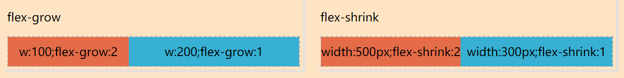
【algin-items】—— 同父元素,设置后会覆盖父元素【justify-content】—— 同父元素,设置后会覆盖父元素【flex-grow】—— 设置剩余空间的伸展比例以及【flex-shrink】—— 设置超出空间的缩小比例


 1576
1576


 被折叠的 条评论
为什么被折叠?
被折叠的 条评论
为什么被折叠?
 到【灌水乐园】发言


