


概念
弹性盒子是一种用于按行或者按列布局的一维布局方法,元素可以膨胀以填充额外的空间,缩小以适应更小的空间
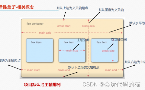
以下属性是给父元素添加的
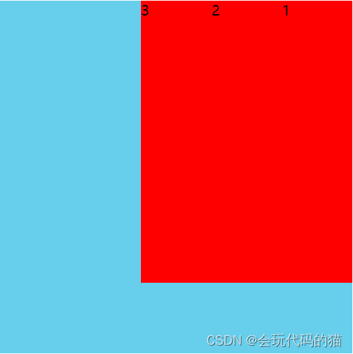
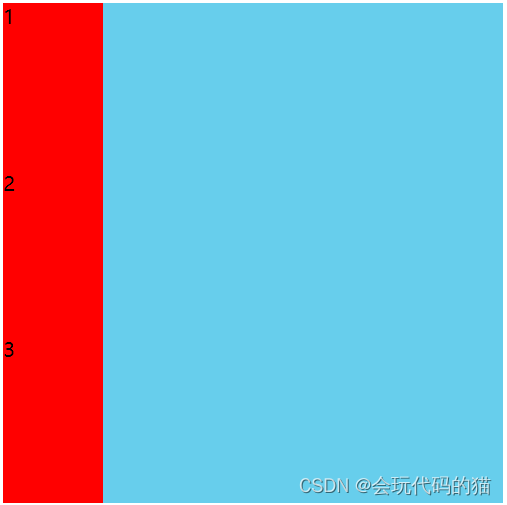
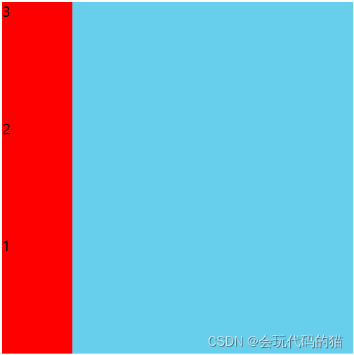
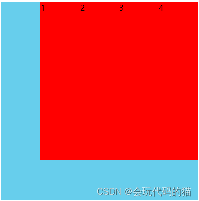
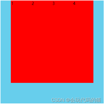
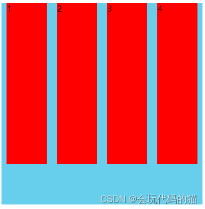
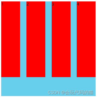
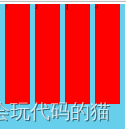
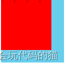
1.flex-direction --改变轴的方向
- row 默认值 默认沿着x轴排版(横向从左到右排列(左对齐),默认的排列方式。)
- row-reverse --沿着x轴右边排版(反转横向排列(右对齐),从后往前排,最后一项排在最前面。)
- column --沿着xy轴从上到下排版(纵向排列。)
- column-reverse --沿着xy轴从下到上排版(反转纵向排列,从后往前排,最后一项排在最上面。)
<style>
        .main{
            width: 500px;
            height: 500px;
            background: skyblue;
            /* 变成弹性盒子,让元素沿着主轴排列(水平排列)
            1.如果盒子变成了弹性盒子,浮动属性会失效 */
            display: flex;
            /* 默认值是row */
            flex-direction: row;
            /* 沿着x轴右边排版 */
            flex-direction: row-reverse;
            /* 沿着xy轴从上到下排版 */
            flex-direction: column;
            /* 沿着xy轴从下到上排版 */
            flex-direction: column-reverse;
        }
        .main div{
            width: 100px;
            height: 400px;
            background-color: red;
            font-size: 20px;
        }
    </style>
</head>
<body>
    <div class="main">
        <div>1</div>
        <div>2</div>
        <div>3</div>
    </div>
</body>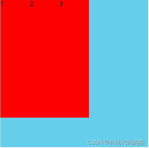
总结:
1、给父元素添加 display: flex; 子元素就具备了弹性盒的功能
2、给父元素设置 flex-direction 可以更改子元素排版的主轴是x轴还是 y 轴
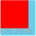
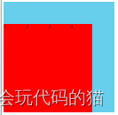
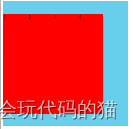
2.flex-wrap 换行与缩写
注意:弹性盒子的宽度是自动变化的,如果不做设置,弹性盒子元素不会溢出,只有在足够多的情况下才溢出。
属性值:
- nowrap 默认值 不换行(默认, 弹性容器为单行。该情况下弹性子项可能会溢出容器。)
- wrap 换行加入的是两行,会把父元素氛围对等的两部分,子元素在每一个部分中都是顶端对齐。依次类推( 弹性容器为多行。该情况下弹性子项溢出的部分会被放置到新行,子项内部会发生断行)
- wrap-reverse:反转折行(反转 wrap 排列。)
<style>
        .main{
            width: 500px;
            height: 500px;
            background: skyblue;
            display: flex;

            flex-wrap: nowrap;
            /* flex-wrap: wrap; */
            /* flex-wrap: wrap-reverse; */
        }
        .main div{
            width: 100px;
            height: 400px;
            background-color: red;
            font-size: 20px;
        }
    </style>
</head>
<body>
    <div class="main">
        <div>1</div>
        <div>2</div>
        <div>3</div>
        <div>4</div>
        <div>5</div>
        <div>6</div>
        <div>7</div>
    </div>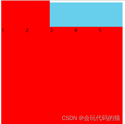
1、如果子元素有高度 子元素正常显示高度 如果子元素没有高度,
那么,子元素的高度就是父元素的高度(平均分配的时候,是父元素中每一份的高度)
2、如果子元素没有宽度,子元素的宽度就是内容撑开的宽度
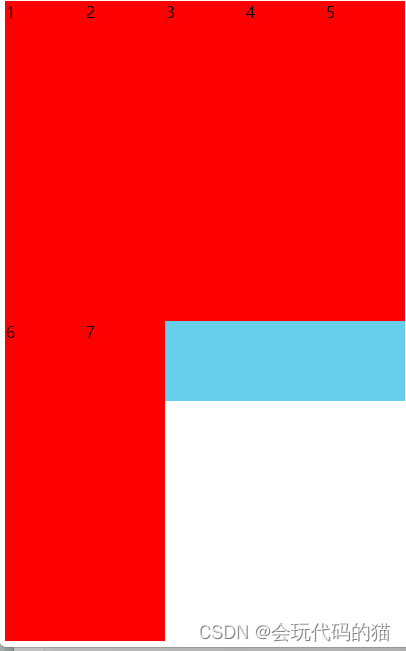
2.1改变轴和换行结合起来使用
.main {
    width: 500px;
    height: 500px;
    background: skyblue;
    display: flex;
    /* 主轴和换行结合使用 */
    flex-direction: column-reverse;
    flex-wrap: wrap;
    // 注意:并不适合列的自适应
}
简写
/* 简写 */
flex-flow: column-reverse wrap;
3.justify-content -主轴的对齐方式 --针对某一个元素
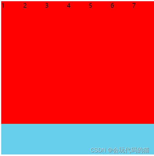
内容对齐(justify-content)属性应用在弹性容器上,把弹性项沿着弹性容器的主轴线(main axis)对齐。
- flex-start 默认 在主轴的默认对齐方式
- flex-end 在主轴的末尾开始对齐
- center 在主轴的中间对齐
- space-round 在主轴上平均分配空间
- space-between 在主轴上的两端拥有两个元素分别对齐,剩余元素平均分配剩余空间
- space-evenly 所有的元素平均分配剩余空间

<style>
        .main {
            width: 500px;
            height: 500px;
            background: skyblue;
            display: flex;

            /* - flex-start 默认 在主轴的默认对齐方式  */
            justify-content: flex-start;

            /* - flex-end 在主轴的末尾开始对齐  */
            /* justify-content: flex-end; */

            /* - center 在主轴的中间对齐  */
            /* justify-content: center; */

            /* - space-round 在主轴上平均分配空间  */
            /* justify-content: space-around; */

            /* - space-between 在主轴上的两端有两个元素分别对齐,剩余元素平均分配剩余空间  */
            /* justify-content: space-between; */

            /* - space-evenly 所有的元素平均分配剩余空间  */
            /* justify-content: space-evenly; */

        }
        .main div{
            width: 100px;
            height: 400px;
            background-color: red;
            font-size: 20px;
        }
    </style>
</head>

<body>
    <div class="main">
        <div>1</div>
        <div>2</div>
        <div>3</div>
        <div>4</div>
    </div>
</body> 
4.交叉轴对齐 --align-content --针对的是整体
align-content 属性用于修改 flex-wrap 属性的行为。类似于 align-items, 但它不是设置弹性子元素的对齐,而是设置各个行的对齐。
- stretch 默认值(默认。各行将会伸展以占用剩余的空间。)
- flex-start 在主轴默认对齐方式(各行向弹性盒容器的起始位置堆叠。)
- flex-end在主轴的末尾开始对齐(各行向弹性盒容器的结束位置堆叠。)
- center 在主轴的中间对齐(各行向弹性盒容器的中间位置堆叠。)
- space-round 在主轴上平均分配空间(各行在弹性盒容器中平均分布。)
- space-between 在主轴上的两端有两个元素分别对齐,剩余元素平均分配剩余空间(各行在弹性盒容器中平均分布,两端保留子元素与子元素之间间距大小的一半。)
- space-evenly 所有元素平均分配剩余空间
 <style>
        .main {
            width: 500px;
            height: 500px;
            background: skyblue;
            display: flex;

            flex-wrap: wrap;
            /* 只有一行不换行的情况下,align-content是不生效的  其实就是一个多行的排列的方式 */
            /* - stretch  默认值  */
            align-content: stretch;
            /* - flex-start  在主轴默认对齐方式 */
            /* align-content: flex-start; */

            /* - flex-end 在主轴的末尾开始对齐 */
            /* align-content: flex-end; */

            /* - center  在主轴的中间对齐 */
            /* align-content: center; */

            /* - space-round  在主轴上平均分配空间 */
            /* align-content: space-around; */

            /* - space-between 在主轴上的两端有两个元素分别对齐,剩余元素平均分配剩余空间 */
            /* align-content: space-between; */

            /* - space-evenly  所有的元素平均分配剩余空间 */
            /* align-content: space-evenly; */

        }
        .main div{
            width: 100px;
            height: 400px;
            background-color: red;
            font-size: 20px;
        }
    </style>
</head>

<body>
    <div class="main">
        <div>1</div>
        <div>2</div>
        <div>3</div>
        <div>4</div>
        <div>5</div>
        <div>6</div>
    </div>
</body> 

5.algin-items --针对行
align-items 设置或检索弹性盒子元素在侧轴(纵轴)方向上的对齐方式。
- stretch 默认值
- flex-start 在主轴默认对齐方式
- flex-end 在主轴的末尾开始对齐
- center 在主轴的中间对齐
- baseline 基线对齐
.main {
    width: 500px;
    border: 1px solid #000;
    display: flex;

    /* 注意:不换行也是不生效的 */
    /* - stretch  默认值  */
    /* align-items: stretch; */
    /* - flex-start  在主轴默认对齐方式 */
    /* align-items: flex-start; */
    /* - flex-end 在主轴的末尾开始对齐 */
    /* align-items: flex-end; */
    /* - center  在主轴的中间对齐 */
    /* align-items: center; */
    /* - baseline  基线对齐 */
    align-items: baseline;
}
6、内联(行元素)与块的上下左右居中布局
内联元素居中
- flex 布局(父级 justify-content: center 和 align-items: center 即可)
.box{
    width: 300px;
    height: 300px;
    background-color: skyblue;
    display: flex;
    align-items: center;
}
.box{
width: 300px;
height: 300px;
background-color: skyblue;
display: flex;
flex-wrap: wrap;
align-content: center;
}2.行高line-height,设置与盒子高度一样的行高
.box{
    width: 300px;
    height: 300px;
    background-color: skyblue;
    line-height: 300px;
}
3.vertical-align 用来指定行内元素(inline)或表格单元格(table-cell)元素的垂直对齐方式。
.box {
    width: 300px;
    height: 300px;
    background-color: skyblue;
    display: table-cell;
    vertical-align: middle;
}
块元素居中
4.
.box{
    width: 300px;
    height: 200px;
    background-color: skyblue;
    display: flex;
    justify-content: center;
    align-items: center;
}
.box div{
    width: 100px;
    height: 100px;
    background-color: blue;
}
5.
.box {
    width: 300px;
    height: 200px;
    background-color: skyblue;
    display: flex;
    position: relative;
}

.box div {
    width: 100px;
    height: 100px;
    background-color: blue;
    margin: auto;
}
6.
.box {
    width: 300px;
    height: 200px;
    background-color: skyblue;
    position: relative;
}

.box div {
    width: 100px;
    height: 100px;
    background-color: blue;
   position: absolute;
   top: 0;
   left: 0;
   right: 0;
   bottom: 0;
   margin: auto;
}
7. 定位+外边距
定位+动画中的位移
<style>
/* 第一种 文字水平剧中 */
/*  .box{
    width: 300px;
    height: 300px;
    background-color: skyblue;
    display: flex;
    align-items: center;
} */

/* 第二种方式 */
/* .box{
    width: 300px;
    height: 300px;
    background-color: skyblue;
    display: flex;
    flex-wrap: wrap;
    align-content: center;
}
*/
/* 第三种 行高  -- 针对一行比较好用  多行不合适 */
/*  .box{
    width: 300px;
    height: 300px;
    background-color: skyblue;
    line-height: 300px;
}
*/

/* 第四种 display: table-cell; */
/*  .box {
    width: 300px;
    height: 300px;
    background-color: skyblue;
    display: table-cell;
    vertical-align: middle;
} */

/* 块元素剧中 */
/*  .box{
    width: 300px;
    height: 200px;
    background-color: skyblue;
    display: flex;
    justify-content: center;
    align-items: center;
}
.box div{
    width: 100px;
    height: 100px;
    background-color: blue;
} */

/*  .box {
    width: 300px;
    height: 200px;
    background-color: skyblue;
    display: flex;
    position: relative;
}

.box div {
    width: 100px;
    height: 100px;
    background-color: blue;
    margin: auto;
} */


.box {
    width: 300px;
    height: 200px;
    background-color: skyblue;
    position: relative;
}

.box div {
    width: 100px;
    height: 100px;
    background-color: blue;
   position: absolute;
   top: 0;
   left: 0;
   right: 0;
   bottom: 0;
   margin: auto;
}

/* 定位+外边距
定位+动画中的位移 */
</style>
</head>

<body>
<!--  <div class="box">
测试文字测试文字测试
测试文字测试文字测试
测试文字测试文字测试
测试文字测试文字测试
测试文字测试文字测试
测试文字测试文字测试
测试文字测试文字测试
测试文字测试文字测试
测试文字测试文字测试
测试文字测试文字测试
测试文字测试文字测试

</div> -->

<div class="box">
<div></div>
</div>
</body>
7、不定向居中布局
<style>
/* 弹性盒 */
/*    .box{
    width: 300px;
    height: 150px;
    background-color: skyblue;
    display: flex;
    justify-content: center;
    align-items: flex-end;
}
.box div{
    width: 30px;
    height: 30px;
    background-color: red;
    border-radius: 50%;
    margin: 5px;
} */

/* 普通方式 */
.box {
    width: 300px;
    height: 150px;
    background-color: skyblue;
    position: relative;
}
.box section{
    text-align: center;
    width: 100%;
    position: absolute;
    bottom: 0;
}

.box div {
    width: 30px;
    height: 30px;
    background-color: red;
    border-radius: 50%;
    display: inline-block;
    margin: 5px;
}
</style>
</head>

<body>
<!--  <div class="box">
<div>1</div>
<div>2</div>
<div>3</div>
</div> -->

<div class="box">
<section>
    <div>1</div>
    <div>2</div>
    <div>3</div>
    <div>1</div>
    <div>2</div>
    <div>3</div>
</section>
</div>
</body>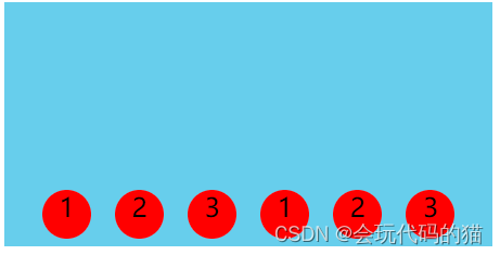
8.均分列布局
比如微信聊天窗口列表的菜单布局
<style>
/* 弹性盒 */
/*  .main{
    height: 200px;
    background-color: skyblue;
    display: flex;
    justify-content: space-between;
    align-items: flex-end;
    padding: 0 20px;
}
.main div{
    width: 30px;
    height: 30px;
    background-color: red;
    border-radius: 50%;
} */

/* 普通方式 -- 微调*/
.main {
    width: 500px;
    height: 200px;
    background-color: skyblue;
    overflow: hidden;
    padding: 0 20px;
    box-sizing: border-box;
}

.main section {
    width: 600px;
}

.main div {
    width: 30px;
    height: 30px;
    background-color: red;
    border-radius: 50%;
    float: left;
    margin-right: 70px;
}
</style>
</head>

<body>
<!--  <div class="main">
<div></div>
<div></div>
<div></div>
<div></div>
<div></div>
<div></div>
</div> -->

<div class="main">
<section>
    <div></div>
    <div></div>
    <div></div>
    <div></div>
    <div></div>
    <div></div>
</section>
</div>
</body>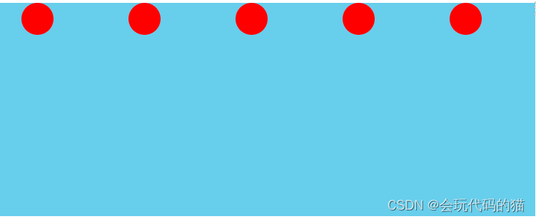
9.子项分组布局
<style>
/*  .main{
    height: 200px;
    background-color: skyblue;
    display: flex;
    justify-content: space-between;
    align-items: center;
}

.main div:nth-of-type(2){
    display: flex;
    margin-left: 10px;
}
.main .box{
    width: 50px;
    height: 100px;
    background-color: blue;
} */


.main {
    height: 200px;
    background-color: skyblue;
    display: flex;
    align-items: center;
}
.main div{
    width: 50px;
    height: 50px;
    background-color: red;
    margin-right: 10px;
}
.main div:nth-of-type(3){
    margin-right: auto;
}

.main div:nth-of-type(6){
    margin-right: auto;
}


</style>
</head>

<body>
<!-- <div class="main">
<div class="box">1</div>
<div>
    <div class="box">2</div>
    <div class="box">3</div>
</div>
</div> -->


<div class="main">
<div>1</div>
<div>2</div>
<div>3</div>
<div>4</div>
<div>5</div>
<div>6</div>
<div>7</div>
<div>8</div>
</div>
</body>


 11万+
11万+


 被折叠的 条评论
为什么被折叠?
被折叠的 条评论
为什么被折叠?
 到【灌水乐园】发言


