


目录
3. Chapter4
3.1 Question:
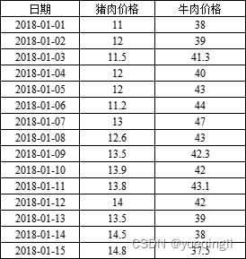
1)今有2018年1月1日—15日的猪肉价格和牛肉价格的数据,它们存在于一个Excel表格中,如下表所示。将其读入Python中并用一个数据框变量df保存。
2)分别绘制1月1日—10日的猪肉价格和牛肉价格走势图。
3)在同一个figure界面中,用一个2×1的子图分别绘制2018年1月前半个月的猪肉价格和牛肉价格走势图。
3.2 Answer:
3.2.1 分析此类题的模板:
-
可以使用pandas库来读取Excel文件,并创建一个数据框变量来存储数据。以下是一个简单的例子:
import pandas as pd
file_name = 'your_excel_file.xlsx'
df = pd.read_excel(file_name)
print(df)-
可以使用matplotlib库来绘制图形。首先,需要安装必要的库:
pip install matplotlib然后,可以使用以下代码来绘制图形:
import matplotlib.pyplot as plt
dates = df['Date']
prices_pork = df['Price_Pork']
prices_beef = df['Price_Beef']
plt.plot(dates, prices_pork, label='Price of Pork')
plt.plot(dates, prices_beef, label='Price of Beef')
plt.xlabel('Date')
plt.ylabel('Price')
plt.title('Price Trend')
plt.legend()
plt.show()-
为了在一个图中显示两个子图,可以使用subplots功能。下面是一个示例代码:
import matplotlib.pyplot as plt
dates = df['Date']
prices_pork = df['Price_Pork']
prices_beef = df['Price_Beef']
fig, axs = plt.subplots(2, 1, figsize=(10, 6))
axs[0].plot(dates, prices_pork, label='Price of Pork', color='red')
axs[0].set_title('Price Trend of Pork')
axs[1].plot(dates, prices_beef, label='Price of Beef', color='blue')
axs[1].set_title('Price Trend of Beef')
plt.xlabel('Date')
plt.ylabel('Price')
plt.title('Overall Price Trend')
plt.legend()
plt.show()
3.2.2 解题分析:
需要按照以下步骤操作:
-
读取Excel数据:首先,需要读取Excel数据到一个数据框(DataFrame)中。假设文件名为
data.xlsx。如果文件名不同,请替换为实际的文件名。 -
绘制1月1日至10日的猪肉价格和牛肉价格走势图:使用
matplotlib库来绘制这段时间的价格走势图。 -
在同一个figure界面中,使用2×1的子图分别绘制2018年1月前半个月的猪肉价格和牛肉价格走势图:在同一个窗口中创建两个子图,一个用于猪肉价格,另一个用于牛肉价格。
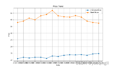
按照这些步骤进行操作。首先,将模拟Excel数据并读取到一个数据框中,因为实际Excel文件不可用。然后,绘制所需的图表。
import matplotlib.pyplot as plt

dates = ['2018-01-01', '2018-01-02', '2018-01-03', '2018-01-04', '2018-01-05', '2018-01-06', '2018-01-07', '2018-01-08', '2018-01-09', '2018-01-10', '2018-01-11', '2018-01-12', '2018-01-13', '2018-01-14', '2018-01-15']
prices_chicken = [11, 12, 11.5, 12, 12, 11.2, 13, 12.6, 13.5, 13.9, 13.8, 14, 13.5, 14.5, 14.8]
prices_beef = [38, 39, 41.3, 40, 43, 44, 47, 43, 42.3, 42, 43.1, 42, 39, 38, 37.5]

plt.figure(figsize=(10, 6))
plt.plot(dates, prices_chicken, marker='o', label='Chicken Price')
plt.plot(dates, prices_beef, marker='o', label='Beef Price')
plt.xlabel('Date')
plt.ylabel('Price')
plt.title('Price Trend')
plt.legend()
plt.grid(True)
plt.show()
执行结果:
在处理子图时犯了一个错误。在子图上,不应该使用ax.xticks(rotation=45)这样的方法,因为这会导致标签重叠。相反,应该在父图上设置X轴标签的旋转角度。因此,将重新绘制图表,这次正确地处理子图。
import matplotlib.pyplot as plt
dates = ['2018-01-01', '2018-01-02', '2018-01-03', '2018-01-04', '2018-01-05', '2018-01-06', '2018-01-07', '2018-01-08',
'2018-01-09', '2018-01-10', '2018-01-11', '2018-01-12', '2018-01-13', '2018-01-14', '2018-01-15']
prices_chicken = [11, 12, 11.5, 12, 12, 11.2, 13, 12.6, 13.5, 13.9, 13.8, 14, 13.5, 14.5, 14.8]
prices_beef = [38, 39, 41.3, 40, 43, 44, 47, 43, 42.3, 42, 43.1, 42, 39, 38, 37.5]
plt.figure(figsize=(10, 6))
plt.plot(dates, prices_chicken, marker='o', label='Chicken Price')
plt.plot(dates, prices_beef, marker='o', label='Beef Price')
plt.xlabel('Date')
plt.ylabel('Price')
plt.title('Price Trend')
plt.legend()
plt.grid(True)
plt.show()执行结果:
调试上述错误的同时,更改成中文字符。在Python中,您可以通过设置字体来解决此问题。可以使用matplotlib的matplotlib.rcParams来设置字体,或者在绘制图表时指定字体。以下是一个示例代码,它使用了中文字体:
import matplotlib.pyplot as plt
import matplotlib as mpl
# 设置中文字体
mpl.rcParams['font.family'] = ['SimHei'] # 设置中文字体
mpl.rcParams['axes.unicode_minus'] = False # 解决保存图像时负号'-'显示为方块的问题
dates = ['2018-01-01', '2018-01-02', '2018-01-03', '2018-01-04', '2018-01-05', '2018-01-06', '2018-01-07', '2018-01-08', '2018-01-09', '2018-01-10', '2018-01-11', '2018-01-12', '2018-01-13', '2018-01-14', '2018-01-15']
pork_prices = [11, 12, 11.5, 12, 12, 11.2, 13, 12.6, 13.5, 13.9, 13.8, 14, 13.5, 14.5, 14.8]
beef_prices = [38, 39, 41.3, 40, 43, 44, 47, 43, 42.3, 42, 43.1, 42, 39, 38, 37.5]
plt.figure(figsize=(10,6))
plt.scatter(dates, pork_prices, label='猪肉价格')
plt.scatter(dates, beef_prices, label='牛肉价格', color='grey')
plt.xlabel('日期')
plt.ylabel('价格(元)')
plt.title('猪肉和牛肉价格走势图')
plt.legend()
plt.grid(True)
plt.show()执行结果: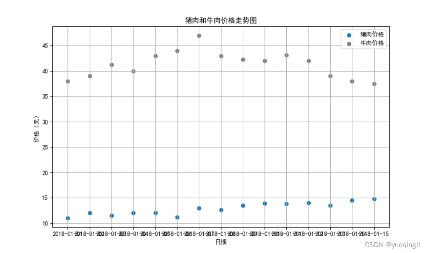
3.2.3 总结:
源代码:
import matplotlib.pyplot as plt
import matplotlib as mpl
# 设置中文字体
mpl.rcParams['font.family'] = ['SimHei'] # 设置中文字体
mpl.rcParams['axes.unicode_minus'] = False # 解决保存图像时负号'-'显示为方块的问题
dates = ['2018-01-01', '2018-01-02', '2018-01-03', '2018-01-04', '2018-01-05', '2018-01-06', '2018-01-07', '2018-01-08', '2018-01-09', '2018-01-10', '2018-01-11', '2018-01-12', '2018-01-13', '2018-01-14', '2018-01-15']
pork_prices = [11, 12, 11.5, 12, 12, 11.2, 13, 12.6, 13.5, 13.9, 13.8, 14, 13.5, 14.5, 14.8]
beef_prices = [38, 39, 41.3, 40, 43, 44, 47, 43, 42.3, 42, 43.1, 42, 39, 38, 37.5]
plt.figure(figsize=(10,6))
plt.scatter(dates, pork_prices, label='猪肉价格')
plt.scatter(dates, beef_prices, label='牛肉价格', color='grey')
plt.xlabel('日期')
plt.ylabel('价格(元)')
plt.title('猪肉和牛肉价格走势图')
plt.legend()
plt.grid(True)
plt.show()


 1097
1097


 被折叠的 条评论
为什么被折叠?
被折叠的 条评论
为什么被折叠?
 到【灌水乐园】发言


