


 本文介绍了如何基于Android L的Material Design设计风格创建引导页,重点在于利用ViewPager和Fragment实现页面滑动时的背景颜色过渡效果。通过添加support libraries,创建引导页Activity和Theme,设置上一页和下一页Button,以及圆点指示器,实现了类似Google Drive引导页的过渡动画。文中还提到了Fragment界面设计和ViewPager的背景色调整,以及监听和按钮点击事件的处理。
前言
Material Design 是在 Android L 推出的设计风格,因此本文中的引导页制作也是基于 Android L 进行。我们先看下 Google Drive 的引导页。

可以看出,当进行页面滑动时,背景颜色由前一页过渡到下一页,我们也将要实现类似的效果,使用 ViewPager + Fragment (共3页) 。
创建
- 添加 support libraries
dependencies {
    compile 'com.android.support:appcompat-v7:25.3.1'
    compile 'com.android.support:design:25.3.1'
    ...
}- 新建引导页 Activity (本文 GuideActivity) 及相关 Theme。如
<style name="GuideTheme"
parent="Theme.AppCompat.DayNight.NoActionBar">
    //沉浸状态栏,将状态栏填充
    <item name="android:windowIsTranslucent">true</item>
    <item name="android:windowTranslucentStatus">true</item>
</style>
底部导航样式
1.上一页 Button(第一页时隐藏);
2.圆点指示器;
3.下一页 Button 及 进入登录界面 Button(默认隐藏)。Activity Layout

<?xml version="1.0" encoding="utf-8"?>
<android.support.constraint.ConstraintLayout
    xmlns:android="http://schemas.android.com/apk/res/android"
    xmlns:tools="http://schemas.android.com/tools"
    android:layout_width="match_parent"
    android:layout_height="match_parent"
    xmlns:app="http://schemas.android.com/apk/res-auto"
    tools:context="com.snow.guidepage.GuideActivity">

    <android.support.v4.view.ViewPager
        android:id="@+id/view_pager"
        android:layout_width="0dp"
        android:layout_height="0dp"
        android:overScrollMode="never"
        android:paddingBottom="?attr/actionBarSize"
        app:layout_constraintBottom_toBottomOf="parent"
        app:layout_constraintLeft_toLeftOf="parent"
        app:layout_constraintRight_toRightOf="parent"
        app:layout_constraintTop_toTopOf="parent"/>

    <View
        android:layout_width="0dp"
        android:layout_height="1dp"
        android:background="@android:color/white"
        android:alpha="0.2"
        app:layout_constraintBottom_toTopOf="@+id/frameLayout"
        app:layout_constraintEnd_toEndOf="parent"
        app:layout_constraintStart_toStartOf="parent"/>

    <FrameLayout
        android:id="@+id/frameLayout"
        android:layout_width="0dp"
        android:layout_height="?attr/actionBarSize"
        app:layout_constraintBottom_toBottomOf="parent"
        app:layout_constraintLeft_toLeftOf="parent"
        app:layout_constraintRight_toRightOf="parent">

        <!--Left-->
        <ImageButton
            android:id="@+id/guide_left"
            style="@style/Widget.AppCompat.Button.Borderless"
            android:layout_width="wrap_content"
            android:layout_height="wrap_content"
            android:layout_gravity="start|center"
            android:contentDescription="@null"
            android:src="@drawable/ic_guide_left_black"
            android:tint="@android:color/white"
            android:visibility="gone"/>

        <!--指示器-->
        <LinearLayout
            android:layout_width="wrap_content"
            android:layout_height="wrap_content"
            android:layout_gravity="center"
            android:orientation="horizontal">

            <TextView
                android:id="@+id/guide_indicator_1"
                android:layout_width="10dp"
                android:layout_height="10dp"
                android:background="@drawable/guide_indicator_shape_true"/>

            <TextView
                android:id="@+id/guide_indicator_2"
                android:layout_width="10dp"
                android:layout_height="10dp"
                android:layout_marginEnd="16dp"
                android:layout_marginStart="16dp"
                android:background="@drawable/guide_indicator_shape_false"/>

            <TextView
                android:id="@+id/guide_indicator_3"
                android:layout_width="10dp"
                android:layout_height="10dp"
                android:background="@drawable/guide_indicator_shape_false"/>

        </LinearLayout>

        <!--Right-->
        <ImageButton
            android:id="@+id/guide_right"
            style="@style/Widget.AppCompat.Button.Borderless"
            android:layout_width="wrap_content"
            android:layout_height="wrap_content"
            android:layout_gravity="end|center"
            android:contentDescription="@null"
            android:src="@drawable/ic_guide_right_black"
            android:tint="@android:color/white"/>

        <!--进入-->
        <android.support.v7.widget.AppCompatButton
            android:id="@+id/guide_finish"
            style="@style/Widget.AppCompat.Button.Borderless"
            android:layout_width="wrap_content"
            android:layout_height="wrap_content"
            android:layout_gravity="end|center"
            android:text="点击进入"
            android:textColor="@android:color/white"
            android:visibility="invisible"/>

    </FrameLayout>
</android.support.constraint.ConstraintLayout>- 圆点指示器 shape
当前页
<?xml version="1.0" encoding="utf-8"?>
<shape xmlns:android="http://schemas.android.com/apk/res/android"
       android:shape="oval">

    <corners android:radius="30dp"/>
    <solid android:color="@android:color/white"/>

</shape>
其他页
<?xml version="1.0" encoding="utf-8"?>
<shape xmlns:android="http://schemas.android.com/apk/res/android"
    android:shape="oval">

    <corners android:radius="30dp"/>
    <solid android:color="#30000000"/>

</shape>
Fragment 界面设计
如 :(图片引自网络)
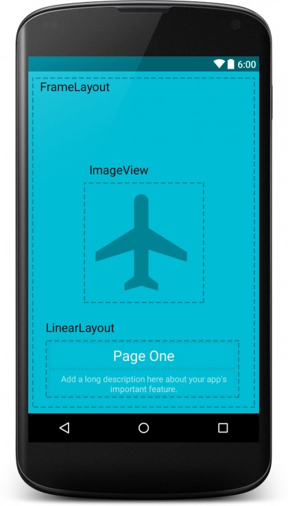
这里只使用 TextView 代替,显示当前页。ViewPager 背景色
mBgColors = new int[]{ContextCompat.getColor(this, R.color.background_color_1),
            ContextCompat.getColor(this, R.color.background_color_2),
            ContextCompat.getColor(this, R.color.background_color_3)};
ViewPager 添加监听 mViewPager.addOnPageChangeListener(this);
重写如下方法
  @Override
  public void onPageScrolled(int position, float positionOffset, int positionOffsetPixels)
  {
    //ViewPager 滑动时,通过 ArgbEvaluator 计算出颜色值,并更新ViewPager 背景色
    // position == 2时,即为最后一页
    int colorUpdate = (Integer) mEvaluator.evaluate(positionOffset, mBgColors[position],
            mBgColors[position == 2 ? position : position + 1]);
    mViewPager.setBackgroundColor(colorUpdate);
  }

  @Override
  public void onPageSelected(int position)
  {
    mIndex = position;

    //跟新指示器
    updateIndicator(position);

    mViewPager.setBackgroundColor(mBgColors[position]);
    // 第一页时,上一页 Button 不可见,其余时可见
    mPrevious.setVisibility(position == 0 ? View.GONE : View.VISIBLE);
    //最后一页时,下一页Button 隐藏
    mNext.setVisibility(position == 2 ? View.GONE : View.VISIBLE);
    //最后一页时,进入登录界面的 Button 显示
    mButton.setVisibility(position == 2 ? View.VISIBLE : View.GONE);
  }


//更新圆点指示器
private void updateIndicator(int position)
  {
    for (int i = 0; i < mViews.size(); i++)
    {
      // mViews 圆点 View 集合,跟进 position 设置圆点指示器背景样式
      mViews.get(i).setBackgroundResource(i == position ? R.drawable.guide_indicator_shape_true :
              R.drawable.guide_indicator_shape_false);
    }
}- Button 点击事件(上一页,下一页,进入登录)
  @Override
  public void onClick(View view)
  {
    switch (view.getId())
    {
      case R.id.guide_left:
      // 上一页时,将 mIndex 减 1
        mViewPager.setCurrentItem(--mIndex);//上一页
        break;
      case R.id.guide_right:
      //下一页时,将 mIndex 加 1
        mViewPager.setCurrentItem(++mIndex);//下一页
        break;
      case R.id.guide_finish:
        Toast.makeText(this, "进入登录页", Toast.LENGTH_SHORT).show();
        break;
      default:
        break;
    }
  }
Fragment 及其 Adapter 用法和平时使用相同,这里暂不贴出。
以上就是引导页实现的全部思路,核心思想就是在滑动时,通过 ArgbEvaluator 、开始 Colro 、结束 Color 计算出 当前颜色,即
int colorUpdate = (Integer) mEvaluator.evaluate(positionOffset, mBgColors[position],
            mBgColors[position == 2 ? position : position + 1]);
看下我们实现的效果

基本上满足我们的需求了,Fragmnet 中的界面大家在实现的时候,可以根据自己的需求去实现,这里比较简单。
- 结尾
文章写得比较简单,如果大家有不明白的及错误的地方,欢迎大家指出,共同和大家探讨,一起学习进步。
参考文档 Onboarding with Android ViewPager: The Google Way
详细可查看 Demo


 扫一扫
扫一扫


 1209
1209

 被折叠的 条评论
为什么被折叠?
被折叠的 条评论
为什么被折叠?
 到【灌水乐园】发言


