


结构选择器
-
style> ul li:first-child {//选出第一个孩子进行变色 background-color: blue; } </style> <ul> <li>我是第1个孩子</li> <li>我是第2个孩子</li> <li>我是第3个孩子</li> <li>我是第4个孩子</li> <li>我是第5个孩子</li> <li>我是第6个孩子</li> </ul> -
选择某个父元素的一个或多个特定的子元素
-
nth-child(n) ul li: nth-child(even) {//选偶数的孩子,选奇数就(odd) background-color: #ccc; } -
直接写n则全选所有的孩子

-
<style> //执行时会首先看nth-child(1)之后回去看前面div,是否与之匹配,匹配执行 section div:nth-child(1) { background-color: red; } //先前面的div,在body里面的位置,直接依据div找孩纸 section div:nth-of-type(1) { } </style> <section> <p>1</p> <div>2</div> <div>3</div> </section> 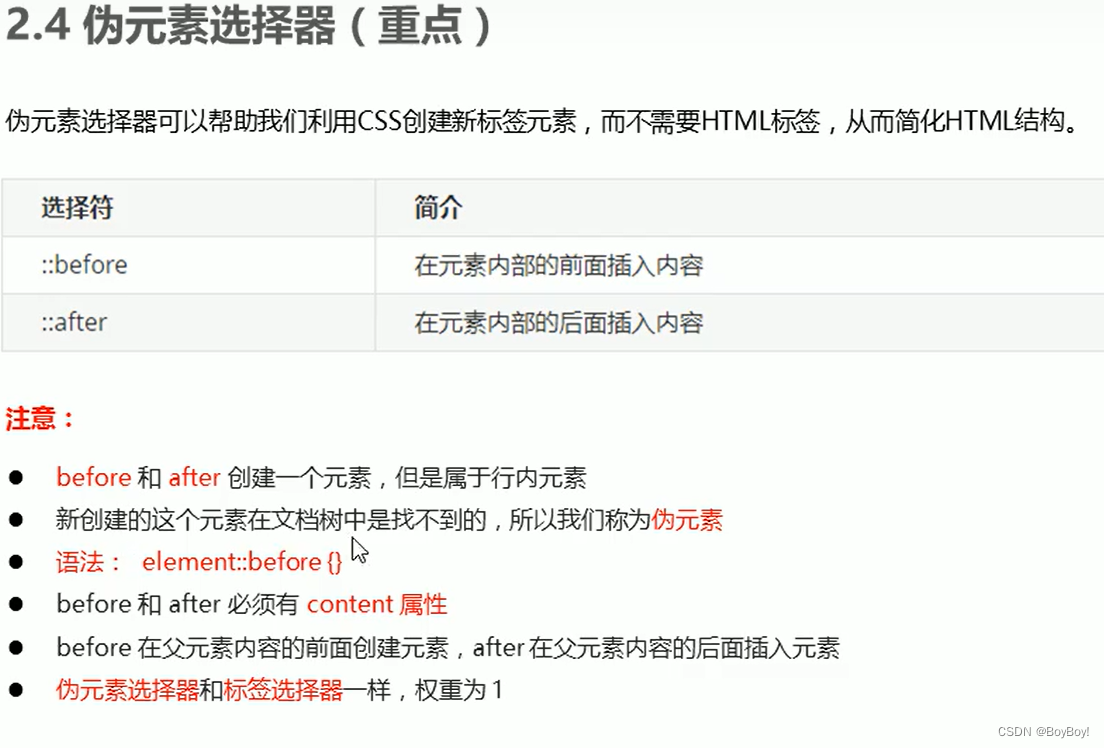
-
这里的前面后面是相对body里面的内容的左边和右边
-
<style> div { width: 200px; height: 35px; border: 1px solid red; } div::after { content: '1'; } </style> <div></div> -
要使用图例的图案,需要给其方框添加声明,在style.css文件中,然后还要在放font文件放到,该根目录中
-
接上边土豆的盒子的做法,
-
.tudou { position: relative; width: 264px; height: 140px; background-color: pink; margin: 0 auto; } /* .hei { display: none; position: absolute; top: 0; left: 0; width: 100%; height: 100%; background: rgba(0, 0, 0, .4); } */ .hei::before { // display: none; content: ''; position: absolute; top: 0; left: 0; width: 100%; height: 100%; background: rgba(0, 0, 0, .4); } /* .tudou:hover .hei { display: block; } */ .tudou:hover::before { display: block; </style> </head> <body> <div class="tudou"> // <div class="hei"></div> <img src="trans.png" alt=""> </div> -
将黑屏幕设置仿元素后,用content设置隐藏层,
-
清除浮动是插入的元素是块元素
-
如果想将盒子加入padding和border不改变盒子的大小
-
box-sizing:context-box; -
让图片的越模糊
-
img { //blur是一个函数小括号里面的数值越大,图片越模糊注意数值要加上px单位 filter: blur(5); } <body> <img src="图片的地址" alt="" > -
用公式将宽度进行删减
-
width: calc(100% - 30px); -
过度的语法:
-
div { width: 100%; height: 100%; background: rgba(0, 0, 0, .4); //transition: 变化的属性 花费的时间 运动曲线 何时开始 transition: width .5s ease 1s , height .2 ease 2s; } div: hover { width: 400px; } -
既想修改宽也想修改高,则在其后边添加逗号接上值即可,切勿另起transition。也可以这样修改
-
transition: all .3s;


 739
739


 被折叠的 条评论
为什么被折叠?
被折叠的 条评论
为什么被折叠?
 到【灌水乐园】发言


