


一、圆形关闭按钮
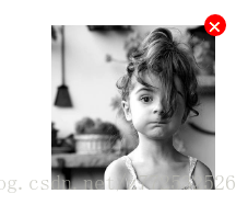
注:这个×受line-height影响,垂直方向并不是完全居中。
<div>
	<img src="./IMG_0349.jpg" alt="">
</div>
div{
	width: 150px;
	height: 150px;
	position: relative;
}
div::after{
	content: '×'; /*这个乘号×,不是字母x*/
	position: absolute;
	top: -10px;
	right: -10px;
	width: 20px;
	height: 20px;
	font-size: 20px;
	line-height: 20px; /*刚才说垂直不完全对齐,这里适当调一下*/
	text-align: center;
	color: #fff;
	background-color: #f00;
	border-radius: 50%;
	cursor: pointer;
}
img{
	width: 100%;
}
二、大于号箭头
注:实际上就是一个正方形,上和右带边线旋转45度而已。
<span class='gt'>查看更多</span>
.gt::after{
	content: '';
	display: inline-block;
	width: 10px;
	height: 10px;
	border-top: 2px solid #BBBBBB;
	border-right: 2px solid #BBBBBB;
	transform: rotate(45deg);
	margin-left: 7px;
}
三、可旋转三角箭头
注:三角箭头实际上做成伪元素的方式不好,这里只是举例,关注样式即可。
它的原理是 一个没有内容的元素,把border变大,也能形成一个正方形,其中一个边有颜色,旁边两边透明,就形成了三角箭头。
<div class="arrow">请选择</div>
.arrow{
/*这个元素本身的样式不重要*/
	position: relative;
	width: 130px;
	height: 30px;
	line-height: 30px;
	text-indent: 10px;
	border-radius: 5px;
	border: 1px solid #ccc;
}
.arrow::after{
	/*形成三角*/
	content: '';
	border-top: 7px solid #ccc;
	border-left: 7px solid transparent;
	border-right: 7px solid transparent;
	/*位置居中*/
	position: absolute;
	right: 15px;
	top: 50%;
	transform: translateY(-25%);
	/*定义变形中心点及过渡效果*/
	transform-origin: 50% 25%;
	transition: transform .5s;
}
.active::after {
	/*旋转180度*/
    transform: rotate(180deg);
}
$('.arrow').on('click',function(){
	$(this).toggleClass('active');
})


 205
205


 被折叠的 条评论
为什么被折叠?
被折叠的 条评论
为什么被折叠?
 到【灌水乐园】发言


