


目录
css解释
CSS(层叠样式表,Cascading Style Sheets)是一种用来描述文档(如 HTML 文档或 XML 应用)样式(如字体、颜色、间距等)的语言。它是一种标记语言,用来控制网页的表现方式,包括布局、字体、颜色、大小等。
@charset "utf-8";
/* CSS Document */
html,body,div,h1,h2,h3,h4,h5,h6,pre,a,li,ul{margin:0;padding:0}
body{font:normal normal normal 14px/24px Arial,"微软雅黑",Microsoft YaHei,simsun;text-align:center;word-break:break-all;background:#fff;min-width:1024px;overflow:hidden}
a{text-decoration:none;color:#333}
a:hover{color:#333}
a:active{outline:none}
li{list-style-type:none}
ul,li{list-style:none}
div{text-align:left}
.fr{float:right}
.h55{height:55%!important}
.h45{height:45%!important}

/*栅格化*/
.pure-g{letter-spacing:-.31em;text-rendering:optimizespeed;display:-webkit-box;display:-webkit-flex;display:-ms-flexbox;display:flex;-webkit-flex-flow:row wrap;-ms-flex-flow:row wrap;flex-flow:row wrap;-webkit-align-content:flex-start;-ms-flex-line-pack:start;align-content:flex-start}
.pure-u,.pure-u-1,.pure-u-1-1,.pure-u-1-12,.pure-u-1-2,.pure-u-1-24,.pure-u-1-3,.pure-u-1-4,.pure-u-1-5,.pure-u-1-6,.pure-u-1-8,.pure-u-10-24,.pure-u-11-12,.pure-u-11-24,.pure-u-12-24,.pure-u-13-24,.pure-u-14-24,.pure-u-15-24,.pure-u-16-24,.pure-u-17-24,.pure-u-18-24,.pure-u-19-24,.pure-u-2-24,.pure-u-2-3,.pure-u-2-5,.pure-u-20-24,.pure-u-21-24,.pure-u-22-24,.pure-u-23-24,.pure-u-24-24,.pure-u-3-24,.pure-u-3-4,.pure-u-3-5,.pure-u-3-8,.pure-u-4-24,.pure-u-4-5,.pure-u-5-12,.pure-u-5-24,.pure-u-5-5,.pure-u-5-6,.pure-u-5-8,.pure-u-6-24,.pure-u-7-12,.pure-u-7-24,.pure-u-7-8,.pure-u-8-24,.pure-u-9-24{letter-spacing:normal;word-spacing:normal;vertical-align:top;text-rendering:auto;display:inline-block;zoom:1}
.pure-g [class*=pure-u]{font-family:sans-serif}
.pure-u-1-24{width:4.1667%}
.pure-u-1-12,.pure-u-2-24{width:8.3333%}
.pure-u-1-8,.pure-u-3-24{width:12.5%}
.pure-u-1-6,.pure-u-4-24{width:16.6667%}
.pure-u-1-5{width:20%}
.pure-u-5-24{width:20.8333%}
.pure-u-1-4,.pure-u-6-24{width:25%}
.pure-u-7-24{width:29.1667%}
.pure-u-1-3,.pure-u-8-24{width:33.3333%}
.pure-u-3-8,.pure-u-9-24{width:37.5%}
.pure-u-2-5{width:40%}
.pure-u-10-24,.pure-u-5-12{width:41.6667%}
.pure-u-11-24{width:45.8333%}
.pure-u-1-2,.pure-u-12-24{width:50%}
.pure-u-13-24{width:54.1667%}
.pure-u-14-24,.pure-u-7-12{width:58.3333%}
.pure-u-3-5{width:60%}
.pure-u-15-24,.pure-u-5-8{width:62.5%}
.pure-u-16-24,.pure-u-2-3{width:66.6667%}
.pure-u-17-24{width:70.8333%}
.pure-u-18-24,.pure-u-3-4{width:75%}
.pure-u-19-24{width:79.1667%}
.pure-u-4-5{width:80%}
.pure-u-20-24,.pure-u-5-6{width:83.3333%}
.pure-u-21-24,.pure-u-7-8{width:87.5%}
.pure-u-11-12,.pure-u-22-24{width:91.6667%}
.pure-u-23-24{width:95.8333%}
.pure-u-1,.pure-u-1-1,.pure-u-24-24,.pure-u-5-5{width:100%}

/*主体框架*/
html,body{width:100%;height:100%;color:#333}
.warp{margin:0 auto;width:100%}.w100p{width:100%}

/*头部*/
.header{height:56px;position:relative;overflow:hidden;text-align:center}
.sysName{display:inline-block;height:56px;width:382px;left:calc(50% - 191px);color:#007fff;position:fixed;border-bottom:1px solid #333}
.sysName:before,.sysName:after{content:"";position:absolute;border-top:58px solid transparent;border-left:25px solid #333;top:-1px;left:0;}
.sysName:after{border-left-color:#fff;left:-1px;top:-1px;}
.sysName .tit{display:block;height:100%;width:100%;text-align:center;line-height:56px;color:#333;font-size:22px}
.sysName .tit:before,.sysName .tit:after{content:"";position:absolute;border-top:58px solid transparent;border-right:25px solid #333;top:-1px;right:0;}
.sysName .tit:after{border-right-color:#fff;right:-1px;top:-1px;}

/*菜单*/
.menu{height:100%;margin:0 auto;display:inline-block}
.menu li{float:left;height:100%;height:56px;line-height:56px;font-size:15px;position:relative}
.menu li:before,.menu li:after{content:"";border-bottom:32px solid #ccc;position:absolute;top:18px;left:5px;border-right:15px solid transparent}
.menu li:after{border-bottom-color:#fff;left:4px;top:19px}
.menu li a{display:block;height:32px;margin:17px 4px 0;width:115px;text-align:center;font-size:13px;line-height:34px;overflow:hidden;color:#999;border:1px solid #ccc;font-weight:700}
.menu li a:before,.menu li a:after{content:"";border-top:32px solid #ccc;position:absolute;top:18px;right:5px;border-left:15px solid transparent}
.menu li a:after{border-top-color:#fff;right:4px;top:17px}
.menu li:nth-child(n+3):before,.menu li:nth-child(n+3):after{
	border-top:32px solid #ccc;position:absolute;top:18px;left:5px;border-right:15px solid transparent;border-bottom:0}
.menu li:nth-child(n+3):after{border-top-color:#fff;left:4px;top:17px}
.menu li:nth-child(n+3) a:before,.menu li:nth-child(n+3) a:after{border-bottom:32px solid #ccc;position:absolute;top:18px;right:5px;border-left:15px solid transparent;border-top:0;}
.menu li:nth-child(n+3) a:after{border-bottom-color:#fff;right:4px;top:19px}
.menu li.sysnameN{width:382px}
.menu li.sysnameN:before,.menu li.sysnameN:after{display:none}
.menu li a:hover{color:#333}
.menu li.on a{background-color:#ddd;color:#333}

/**/
.chartWarp{padding:25px 0 10px;height:calc(100% - 91px)}

.toal-row1{height:30%}
.toal-row1 .chartBlock{height:calc(100% - 53px);position:relative}
.toal-row1 .chartBlock .chartDiv{position:absolute!important;top:30%;left:0}
.toal-row2{height:calc(40% - 15px);margin-bottom: 15px;}
.toal-row3{height:30%}

.saleWarp .sale-row1{height:38%}
.saleWarp .sale-row2{height:62%}
.saleWarp .sale-row2 .tSel{height:calc(100% - 50px);margin-top: 20px;}

.inventoryWarp .int-row1{height:100%}
.int-row1 .h55{height:calc(55% - 20px)!important;margin-bottom:20px}
.int-row1 .tSel{height:calc(55% - 70px)!important;margin-top:20px}

.userWarp .user-row1{height:67%}
.userWarp .user-row2{height:33%}
.userWarp .user-row1 .col2 .chartBlock{height:calc(50% - 10px);margin-bottom:20px}
.userWarp .user-row1 .col2 .chartBlock:last-child{margin-bottom:0}

.pure-g [class*="pure-u-"],.pure-g [class^=pure-u-]{box-sizing:border-box;height:100%;padding:10px 10px}
.chartDiv{position:relative;z-index:10;width:100%;height:100%;display:block}

/**/
.chartBlock{width:100%;height:100%;position:relative}
.chartBlock .hd{height:32px;width:100%;text-align:center;position:absolute;top:-15px;z-index:1}
.chartBlock .hd .chartTit{display:inline-flex;background:#fff;}
.chartTit{display:inline-block;height:32px;line-height:32px;width:60%;padding:0 15px;position:relative;margin:0 auto}
.chartTit:after,.chartTit:before{content:"";position:absolute;left:-1px;border-right:16px solid #ccc;border-top:16px solid transparent;border-bottom:16px solid transparent;top:0px}
.chartTit:after{border-width:15px;border-right-color:#f5f5f5;left:0px;top:1px}
.chartTit .titContent{font-weight:700;height:30px;font-size:13px;display:block;color:#333;text-align:center;width:100%;min-width:8em;white-space:nowrap;border:1px solid #ccc;border-width:1px 0;background-color:#f5f5f5}
.chartTit .titContent:after,.chartTit .titContent:before{content:"";position:absolute;right:-1px;border-left:16px solid #ccc;border-top:16px solid transparent;border-bottom:16px solid transparent;top:0px}
.chartTit .titContent:after{border-width:15px;border-left-color:#f5f5f5;right:0px;top:1px}
.chartBlock .bd{border:1px solid #ccc;height:calc(100% - 32px);position:relative;width:calc(100% - 32px);padding:15px}

.subBlock{position:relative;border:1px solid #ccc;border-top:0}
.subBlock .subCon{height:32px;line-height:32px}
.subBlock .subtxt{float:left;margin-left:10px;height:32px;font-size:12px;color:#333}
.subBlock .subNum{font-weight:bold;font-size:15px;float:right;margin-right:10px}

.toal-row1 .pure-u-1-5:nth-child(1) .subBlock .subNum{color:#1779d9}
.toal-row1 .pure-u-1-5:nth-child(2) .subBlock .subNum{color:#30b761}
.toal-row1 .pure-u-1-5:nth-child(3) .subBlock .subNum{color:#d04a4b}
.toal-row1 .pure-u-1-5:nth-child(4) .subBlock .subNum{color:#ca841e}
.toal-row1 .pure-u-1-5:nth-child(5) .subBlock .subNum{color:#00a7c2}了解无人售货机数据情况

我们可以将数据分为四个大部分:
整体情况分析
无人售货机各特征数据.josn
售货机销售金额及销售金额增长率数据.json
商品销售金额前5名.json
不同地点售货机销售数据json
不同支付方式用户人数json
销售分析
不同区域的各指标数据.json
商品销售数量前10名.json
商品销量数量和价格数据.json
销售金额实际值与预测值.json
库存分析
不同地点售货机库存数量和缺货数量.json
不同类型的商品库存数量.json
商品库存数量和销售数量.json
商品滞销数据.json
各类商品存货周转天数.json
用户分析
用户消费地点数据.json
用户消费时段数据.json
近5天新增和流失用户数据.json
用户分群数据.json
不同类型用户的人数.json
用户购买的商品名称和商品数量数据.json
可视化展示销售情况总分析
做完就是如下图

仪表盘
因为我们是总数据所以前五个可以用仪表盘直观的观察数据

在编写js时我们需要json的数据是对应的,还有id也要对应,要不然它是找不到东西的,会编写错误
双y轴
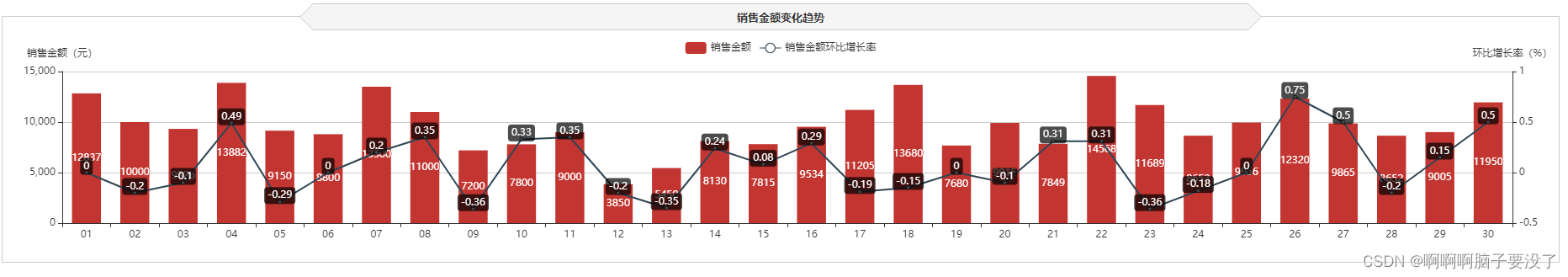
销售金额的变化趋势我们可以用柱状图或条形图来直观的观察
//销售金额变化趋势
//初始化图表
var saleRate = echarts.init(document.getElementById('saleRate'));
//设置图表option值
$.get("data/售货机销售金额及其环比增长率.json").done(function (data) {
    //data = JSON.parse(data);
	saleRate.setOption({
    tooltip: {
        trigger: 'axis',
        axisPointer: {
            type: 'cross'
        }
    },
    grid: {
        //用网格定位图表四边留空及顶部避开标题位置
        x: 10,
        y: 50,
        x2: 10,
        y2: 10,
        //使坐标轴数据能完整显示
        containLabel: true
    },
    //设置legend位置及数据,位于图表右上方
    legend: {
        data:['销售金额','销售金额环比增长率'],
        top: 10
    },
    barCategoryGap:'40%',
    xAxis: [
        {
            type: 'category',
            //日期数据
            data: data.日期,
            axisPointer: {
                type: 'shadow'
            },
            //运用eCharts内置方法格式化日期,使x轴日期数据更简洁,同时不影响原数据在鼠标交互时的完整展现
            axisLabel: {
                formatter: function(value){
                    return echarts.format.formatTime('dd', value);
                }
            }
        }
    ],
    yAxis: [
        {
            type: 'value',
            name: '销售金额(元)',
            //设置Y坐标轴最小值
            min: 0,
            //设置Y坐标轴最大值
            max: 15000,
            //设置Y坐标轴值间隔值
            interval: 5000
        },
        //定义Y轴右侧坐标轴
        {
            type: 'value',
            name: '环比增长率(%)',
            min: -0.5,
            max: 1,
            interval: 0.5
        }
    ],
    series: [
        {
            name:'销售金额',
            type:'bar',
            //设置显示坐标点数值
            label:{
                show:'true'
            },
            //销售金额数据
            data:data.销售金额
        },
        {
            name:'销售金额环比增长率',
            type:'line',
            //设置“销售金额环比增长率”数值样式,圆角矩形黑底白字,位于数据点上方
            label:{
                //设置显示坐标点数值
                show:'true',
                color:'#fff',
                backgroundColor:'rgba(0,0,0,0.7)',
                verticalAlign:'middle',
                padding:4,
                borderRadius:4,
                position:'top'
            },
            //设置“销售金额环比增长率”在坐标轴右侧显示
            yAxisIndex: 1,
            //销售金额环比增长率数据
            data:data.销售金额环比增长率
        }
    ]
		})
});
条形图
商品销售前五,这有多种图形可用,这里我们用的条形图
//商品销售金额Top5
var saleMtop5 = echarts.init(document.getElementById('saleMtop5'));
$.get("data/商品销售金额前5名.json").done(function (data) {
    //data = JSON.parse(data);
	saleMtop5.setOption({
    tooltip: {
        trigger: 'axis',
        axisPointer: {
            type: 'shadow'
        }
    },
    grid: {
        x: 10,
        y: 20,
        x2: 10,
        y2: 10,
        containLabel: true
    },
    barCategoryGap:'40%',
    xAxis: {
        type: 'value',
        boundaryGap: [0, 0.01],
        axisLine:{lineStyle:{width:0}},
    },
    yAxis: {
        type: 'category',
        splitLine:{lineStyle:{width:0}},
        data: data.商品名称
    },
    series: [
        {
            name: '售出总数量',
            type: 'bar',
            label:{
                position:'right',
                verticalAlign:'middle',
            },
            data: data.销售金额
        }
    ]
		})
});
簇状柱形图
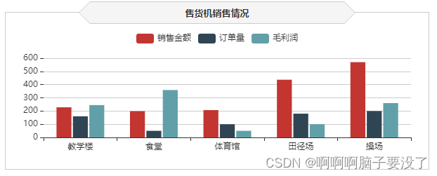
货机的销售情况,因为我们要看每个地点的多种数据,所以我们可用簇状柱状图来观察分析
//售货机销售情况
var saleOrder = echarts.init(document.getElementById('saleOrder'));
$.get("data/不同地点售货机销售数据.json").done(function (data) {
    //data = JSON.parse(data);
	saleOrder.setOption({
    tooltip: {
        trigger: 'axis',
        axisPointer: {
            type: 'cross',
            crossStyle: {
                color: '#999'
            }
        }
    },
    grid: {
        x: 10,
        y: 50,
        x2: 10,
        y2: 10,
        containLabel: true
    },
    toolbox: {
        show:false,
        feature: {
            dataView: {show: true, readOnly: false},
            magicType: {show: true, type: ['line', 'bar']},
            restore: {show: true},
            saveAsImage: {show: true}
        }
    },
    legend: {
        top:10
    },
    barGap:'10%',
    barCategoryGap:'35%',
    xAxis: [
        {
            type: 'category',
            data: data.地点,
            axisPointer: {
                type: 'shadow'
            },
            splitLine:{lineStyle:{width:0}},
        }
    ],
    yAxis: [
        {
            type: 'value',
            name: '',
            min: 0,
            axisLabel: {
                formatter: '{value}'
            },
            axisLine:{lineStyle:{width:0}},
        }
    ],
    series: [
        {
            name:'销售金额',
            type:'bar',
            data:data.销售金额
        },
        {
            name:'订单量',
            type:'bar',
            data:data.订单量
        },
        {
            name:'毛利润',
            type:'bar',
            data:data.毛利润
        }
    ]
		})
});
饼图
支付方式就显而易见的用饼图就可以了
//支付方式占比
var payWay = echarts.init(document.getElementById('payWay'));
$.get("data/不同支付方式用户人数.json").done(function (data) {
    //data = JSON.parse(data);
	payWay.setOption({
    tooltip : {
        trigger: 'item',
        formatter: "{a} <br/>{b} : {c} ({d}%)"
    },
    legend: {
        data: data.支付方式,
        orient:'vertical',
        left:0,
        top:"25%"
    },
    grid: {
        left: '0%',
        right: '0%',
        bottom: '0%',
        containLabel: true
    },
    series : [
        {
            name: '支付方式占比',
            type: 'pie',
            radius : '62%',
            center: ['65%', '50%'],
            label:{
                formatter:"{b}\n{a|{d}%}",
                rich: {
                    a: {
                        padding:6,
                        align:'left',
                        color:'#999',
                    }
                }
            },
            data:data.data,
            itemStyle: {
                emphasis: {
                    shadowBlur: 10,
                    shadowOffsetX: 0,
                    shadowColor: 'rgba(0, 0, 0, 0.5)'
                }
            }
        }
    ]
		})
});

可视化展现销售分析
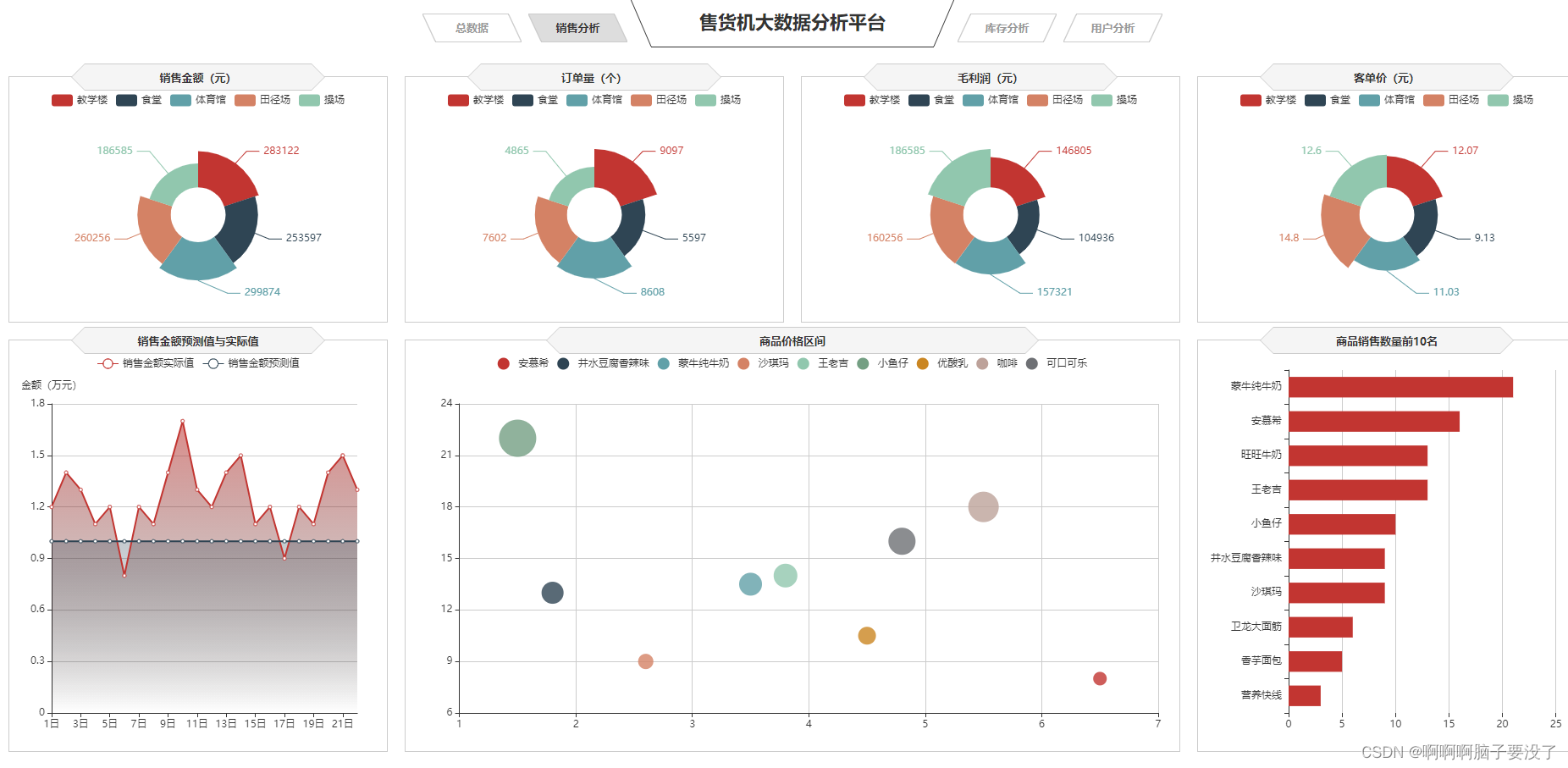
这里面的条形图和第一个是一样的这就不多说了
南丁格尔图
1.南丁格尔图以圆形为基础,将圆周划分成多个扇区,每个扇区的大小代表了相应数据的比例或数量。与传统的饼图不同,南丁格尔图使用了极坐标系,使得每个扇区的中心都位于圆心,而不是基于传统的直角坐标系。
南丁格尔图的特点包括:
-
清晰展示比例:通过扇形的大小和角度来表示数据的比例,直观地展示不同类别之间的比较。
-
可视化数据分布:南丁格尔图可以有效地展示数据的分布情况,使得观察者能够快速理解数据的特征。
-
易于比较:通过比较扇形的大小和角度,观察者可以直观地比较不同类别的数据,从而发现数据之间的关联和趋势。
-
适用于周期性数据:由于南丁格尔图使用了极坐标系,因此特别适用于展示周期性数据,如一年中每个月的销售额或季节性变化等。
-
美观易懂:南丁格尔图的美观性和易懂性使得它成为了展示统计数据的一种常用方式,尤其在医疗、环境和社会科学等领域得到广泛应用。
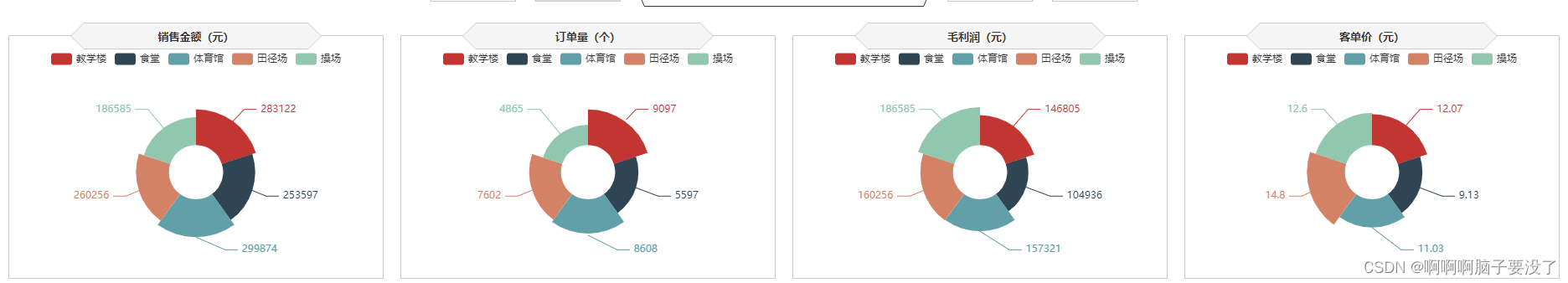
// 销售金额
var saleM_Site = echarts.init(document.getElementById('saleM_Site'));
$.get("data/不同区域的各指标数据.json").done(function (data) {
    //data = JSON.parse(data),
	saleM_Site.setOption({
    tooltip : {
        trigger: 'item',
        formatter: "{b}:<br/>{c} 元<br/>({d}%)"
    },
    legend: {
        type:'scroll',
        data:data.where
    },
    toolbox: {
        show : false,
        feature : {
            mark : {show: true},
            dataView : {show: true, readOnly: false},
            magicType : {
                show: true,
                type: ['pie', 'funnel']
            },
            restore : {show: true},
            saveAsImage : {show: true}
        }
    },
    calculable : true,
    series : [
        {
            name:'地点',
            type:'pie',
            radius : ["25%", '60%'],
            center : ['50%', '57%'],
            roseType : 'area',
            label:{
                show:true,
                formatter:'{c}'
            },
            data:data.sale
        },
        {
            type:'pie',radius:'25%',center:['50%','57%'],
            label: {normal:{position:'center',color:'#fff'}},
            labelLine:{normal:{show:false}},itemStyle:{color:'transparent'},
            data:[{value:1,name:'地点',tooltip:{formatter:' ',backgroundColor:'none'}}]
        },
    ]
		})
});


// 订单量
var orderQ_Site = echarts.init(document.getElementById('orderQ_Site'));
$.get("data/不同区域的各指标数据.json").done(function (data) {
    //data = JSON.parse(data),
	orderQ_Site.setOption({
    tooltip : {
        trigger: 'item',
        formatter:  "{b}:<br/>{c} 个<br/>({d}%)"
    },
    legend: {
        type:'scroll',
        data:data.where
    },
    toolbox: {
        show : false,
        feature : {
            mark : {show: true},
            dataView : {show: true, readOnly: false},
            magicType : {
                show: true,
                type: ['pie', 'funnel']
            },
            restore : {show: true},
            saveAsImage : {show: true}
        }
    },
    calculable : true,
    series : [
        {
            name:'地点',
            type:'pie',
            radius : ["25%", '60%'],
            center : ['50%', '57%'],
            roseType : 'area',
            label:{
                show:true,
                formatter:'{c}'
            },
            data:data.order
        },
        {
            type:'pie',radius:'25%',center:['50%','57%'],
            label: {normal:{position:'center',color:'#fff'}},
            labelLine:{normal:{show:false}},itemStyle:{color:'transparent'},
            data:[{value:1,name:'地点',tooltip:{formatter:' ',backgroundColor:'none'}}]
        },
    ]
		})
});


// 毛利润
var grossM_Site = echarts.init(document.getElementById('grossM_Site'));
$.get("data/不同区域的各指标数据.json").done(function (data) {
    //data = JSON.parse(data),
	grossM_Site.setOption({
    tooltip : {
        trigger: 'item',
        formatter:  "{b}:<br/>{c} 元<br/>({d}%)"
    },
    legend: {
        type:'scroll',
        data:data.where
    },
    toolbox: {
        show : false,
        feature : {
            mark : {show: true},
            dataView : {show: true, readOnly: false},
            magicType : {
                show: true,
                type: ['pie', 'funnel']
            },
            restore : {show: true},
            saveAsImage : {show: true}
        }
    },
    calculable : true,
    series : [
        {
            name:'地点',
            type:'pie',
            radius : ["25%", '60%'],
            center : ['50%', '57%'],
            roseType : 'area',
            label:{
                show:true,
                formatter:'{c}'
            },
            data:data.gross
        },
        {
            type:'pie',radius:'25%',center:['50%','57%'],
            label: {normal:{position:'center',color:'#fff'}},
            labelLine:{normal:{show:false}},itemStyle:{color:'transparent'},
            data:[{value:1,name:'地点',tooltip:{formatter:' ',backgroundColor:'none'}}]
        },
    ]
		})
});


// 客单价平均值
var unitP_Site = echarts.init(document.getElementById('unitP_Site'));
$.get("data/不同区域的各指标数据.json").done(function (data) {
    //data = JSON.parse(data),
	unitP_Site.setOption({
    tooltip : {
        trigger: 'item',
        formatter:  "{b}:<br/>{c} 元<br/>({d}%)"
    },
    legend: {
        type:'scroll',
        data:data.where
    },
    toolbox: {
        show : false,
        feature : {
            mark : {show: true},
            dataView : {show: true, readOnly: false},
            magicType : {
                show: true,
                type: ['pie', 'funnel']
            },
            restore : {show: true},
            saveAsImage : {show: true}
        }
    },
    calculable : true,
    series : [
        {
            name:'地点',
            type:'pie',
            radius : ["25%", '60%'],
            center : ['50%', '57%'],
            roseType : 'area',
            label:{
                show:true,
                formatter:'{c}'
            },
            data:data.unit
        },
        {
            type:'pie',radius:'25%',center:['50%','57%'],
            label: {normal:{position:'center',color:'#fff'}},
            labelLine:{normal:{show:false}},itemStyle:{color:'transparent'},
            data:[{value:1,name:'地点',tooltip:{formatter:' ',backgroundColor:'none'}}]
        },
    ]
		})
});
气泡图
2.在气泡图中,横轴和纵轴通常表示两个变量的值,而气泡的位置由对应的两个变量的值确定,气泡的大小则由第三个变量的值决定。气泡越大代表的是第三个变量的值越大,反之亦然。这种可视化方式使得观察者可以直观地理解三个变量之间的关系,同时也能够在图表中看出数据的分布和趋势。
气泡图常用于以下情况:
-
多变量比较:通过比较不同数据点的气泡大小和位置,可以快速识别出数据集中的模式和趋势。
-
数据聚类:通过观察气泡的分布情况,可以发现数据中的聚类结构,帮助理解数据的分布情况。
-
趋势分析:气泡图可以帮助分析数据之间的相关性和趋势,从而发现隐藏在数据背后的规律。
-
视觉效果:相较于普通的散点图,气泡图具有更好的视觉吸引力,能够更好地吸引观众的注意力。

// 商品价格区间
var priceRange = echarts.init(document.getElementById('priceRange'));
$.get("data/商品销量数量和价格数据.json").done(function (data) {
    //data = JSON.parse(data),
	priceRange.setOption({
    grid: {
        left: '3%',
        right: '10',
        bottom: '10',
        containLabel: true
    },
    tooltip : {
        showDelay : 0,
        formatter : function (params) {
                return params.seriesName + '<br/>'
                + '单价:' + params.value[0] + '<br/>'
                + '销量:' + params.value[1];
        },
        axisPointer:{
            show: true,
            type : 'cross',
            lineStyle: {
                type : 'dashed',
                width : 1
            }
        }
    },

    legend: {
        type:'scroll',
    },
    xAxis :{ scale:true},
    yAxis :{ scale:true},
	})
});
$.get("data/商品销量数量和价格数据.json").done(function (data) {
    //data = JSON.parse(data);
    var series=[];
    for(var i = 0;i < data.data.length;i++){
        series.push({
            name: data.data[i].name,
            type: 'scatter',
            data: [data.data[i].value],
            symbolSize:data.data[i].value[1]*2
        });
    }
    priceRange.setOption({
        series:series
    });
});
折线图
3.使用折线图展示每小时或每日的销售额变化趋势,帮助管理员实时监控销售情况。
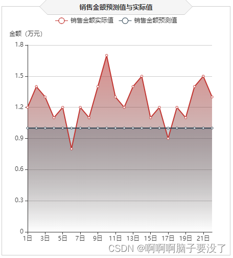
// 销售金额预测值与实际值
var saleAll = echarts.init(document.getElementById('saleAll'));
$.get("data/销售金额实际值与预测值.json").done(function (data) {
    //data = JSON.parse(data),
	saleAll.setOption({
    tooltip: {
        trigger: 'axis'
    },
    legend: {
        type:'scroll'
    },
    grid: {
        left: '10',
        right: '20',
        bottom: '10',
        containLabel: true
    },
    xAxis:  {
        type: 'category',
        boundaryGap: false,
        data: ['1日','2日','3日','4日','5日','6日','7日','8日','9日','10日',
		'11日','12日','13日','14日','15日','16日','17日','18日','19日','20日','21日','22日']
    },
    yAxis: {
        type: 'value',
        name: '金额(万元)',
        axisLabel: {
            formatter: '{value}'
        }
    },
    series: [
        {
            name:'销售金额实际值',
            type:'line',
            data:data.T,
            areaStyle: {
                normal: {
                    color: new echarts.graphic.LinearGradient(0, 0, 0, 1, [{
                        offset: 0,
                        color: 'rgba(194, 53, 49,.8)'
                    }, {
                        offset: 1,
                        color: 'transparent'
                    }])
                }
            },
        },
        {
            type:'line',
            name:'销售金额预测值',
            data:data.Y,
            areaStyle:{
                normal: {
                    color: new echarts.graphic.LinearGradient(0, 0, 0, 1, [{
                        offset: 0,
                        color: 'rgba(47, 69, 84,.4)'
                    }, {
                        offset: 1,
                        color: 'transparent'
                    }])
                }
            }
        },
    ]
		})
});
可视化展现库存分析

这大部分也是在前面介绍过,只有环形图和矩形树图没有,如下
环形图
1.使用环形图对不同类型的商品库存数量进行展示
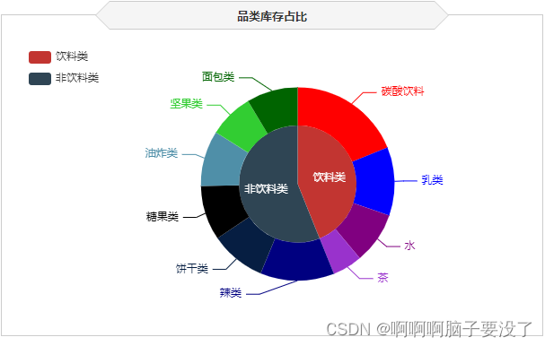
//品类库存占比
var categoryStock = echarts.init(document.getElementById('categoryStock'));
$.get("data/不同类型的商品库存数量.json").done(function (data) {
	//data = JSON.parse(data),
	categoryStock.setOption({
    tooltip: {
        trigger: 'item',
        formatter: "{a} <br/>{b}: {c} ({d}%)"
    },
    legend: {
        orient: 'vertical',
        data:data.类型,
        left: 10,
        top: 20,
    },
    series: [
        {
            name:'品类',
            type:'pie',
            radius: [0, '40%'],
            center : ['55%', '53%'],
            label: {
                normal: {
                    position: 'inner'
                }
            },
            labelLine: {
                normal: {
                    show: false
                }
            },
            data:data.一级商品
        },
        {
            name:'品类',
            type:'pie',
            color:['LimeGreen', 'DarkGreen', 'red', 'blue', 'Purple',
                'DarkOrchid', 'Navy', '#061e42', 'black', '#4f8fa8'],
            radius: ['40%', '66%'],
            center : ['55%', '53%'],
            selectedMode: 'multiple',
            itemStyle:{
                borderWidth:'2',
                borderColor:'none'
            },
            label: {
            },
            data:data.二级商品
        }
    ]
		})
});
矩形树图
2.矩形树图是一种常见的数据可视化图表,用于展示层次结构数据的分布和关系。在矩形树图中,父节点会被表示为一个大矩形,而子节点则嵌套在父节点内部,以小矩形的形式呈现。矩形的大小通常代表着节点所包含的数值大小,而颜色或其他视觉属性可以用来表示节点的其他属性。
矩形树图常用于以下情况:
-
层次结构展示:矩形树图能够清晰地展示数据的层次结构,帮助用户理解数据的组织关系。
-
数据分布:通过矩形的大小或颜色等视觉属性,可以直观地了解节点的数值大小或其他属性,帮助用户分析数据分布情况。
-
交互性:矩形树图通常支持交互操作,用户可以通过点击或悬停在节点上获取更多信息,提高了用户对数据的探索性。
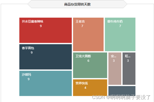
// 商品存货周转天数
var formatUtil = echarts.format;
var turnaround = echarts.init(document.getElementById('turnaround'));
$.get("data/各类商品存货周转天数.json").done(function (data) {
    //data = JSON.parse(data),
    turnaround.setOption({
        tooltip:{
        formatter: '{b}:{c}'
    },
    series: [{
        type: 'treemap',
        label:{
            show:true,
            position:'insideTopLeft',
            distance:0,
            padding:10,
            formatter:"{b}\n{a|{c}}",
            rich: {
                a: {
                    padding:6,
                    align:'right',
                    verticalAlign:'bottom',
                    color:'#fff',
                }
            }
        },
        roam:false,
        nodeClick:false,
        breadcrumb:{show:false},
        itemStyle:{
            gapWidth:5,
            borderColor:'transparent'
        },
        data: data.data
    }]
        })
});
可视化展示用户分析

这我们可以看出其他的前面我们都介绍过了,只有雷达图和词云图没有。
雷达图
1.雷达图(Radar Chart)是一种用于显示多个定量变量之间关系的图表类型,也称为蜘蛛图或星形图。在雷达图中,每个变量通常由一个轴表示,这些轴围绕一个中心点展开,形成一个多边形,多边形的顶点连接在一起,表示不同变量的取值。这样的图表能够直观地展示不同变量之间的相对关系和比较。
雷达图常用于以下情况:
-
多变量比较:通过将多个变量的取值映射到不同的轴上,可以直观地比较各个变量之间的差异和相对重要性。
-
特征分析:在数据挖掘和机器学习领域,雷达图经常用于分析不同特征在样本中的分布情况,以及特征之间的相关性。
-
绩效评估:企业常用雷达图来评估团队或个人在多个指标上的绩效表现,从而发现优势和改进空间。
-
产品对比:在产品设计或市场竞争分析中,雷达图可以用来比较不同产品在各个指标上的表现,帮助决策者做出更加客观的决策。

// 用户分群
var userGroup = echarts.init(document.getElementById('userGroup'));
$.get("data/用户分群数据.json").done(function (data) {
    //data = JSON.parse(data);
	userGroup.setOption({
    tooltip: {},
    legend: {
    },
    radar: {
        name: {
            textStyle: {
                color: '#fff',
                borderRadius: 3,
                padding: [3, 5]
           }
        },
        center: ['50%', '58%'],
        splitArea: {
            areaStyle: {
                color:'transparent'
            }
        },
        axisLine: { lineStyle: {color: '#061e42' }},
        splitLine: { lineStyle: {color: '#061e42' }},
        indicator: [
           { name: '消费金额', max: 80,color:'black'},
           { name: '购买数量', max: 80,color:'black'},
           { name: '购买频率', max: 80,color:'black'},
           { name: '交易次数', max: 80,color:'black'},
           { name: '客单价', max: 80,color:'black' }
        ]
    },
    series: [{
        name: '用户分群',
        type: 'radar',

        areaStyle:{
            show:true,
            opacity:0.3
        },
        data : data.data
    }]
		})
});
词云图
2.词云图(Word Cloud)是一种用于展示文本数据中词语频率的可视化方式。在词云图中,文本中的每个词语根据其在文本中出现的频率和重要性,以不同大小和颜色的字体呈现在图表中。通常情况下,出现频率较高的词语会以较大的字体展示,而出现频率较低的词语则会以较小的字体展示。
词云图常用于以下情况:
-
文本摘要:通过词云图可以直观地展示文本中重要的关键词,帮助读者快速了解文本的主题和内容。
-
数据探索:在数据分析中,词云图可以帮助分析人员快速识别文本数据中的关键词和热门话题,为后续分析提供指导。
-
情感分析:词云图可以用来展示评论、新闻报道等文本数据中的情感倾向,通过词语的频率和重要性来判断整体情感色彩。
-
标签展示:在网站或应用程序中,词云图可以用来展示热门标签或关键词,帮助用户快速了解内容或主题的热度和相关性。

// 用户画像
var chart = echarts.init(document.getElementById('userHot'));
$.get("data/用户购买的商品名称和商品数量数据.json").done(function (data) {
    //data = JSON.parse(data);
    var option = {
        tooltip : {
            trigger: 'item',
            formatter:function(item){
                return item.name + ":" + item.value.toFixed(2);
            }
        },
        series: [ {
            type: 'wordCloud',
            sizeRange: [10,30],
            rotationRange: [0, 0],
            rotationStep: 180,
            gridSize: 0,
            autoSize: {enable:true, minSize:5},
            shape: 'roundRect',
            left: 'center',
            top: 'center',
            width: '100%',
            height: '100%',
            right: null,
            bottom: null,
            textStyle: {
                normal: {
                    color: function () {
                        return 'rgb(' + [
                            Math.round(Math.random() * 160),
                            Math.round(Math.random() * 160),
                            Math.round(Math.random() * 160)
                        ].join(',') + ')';
                    }
                },
                emphasis: {
                    shadowBlur: 26,
                    color:'#333',
                    shadowColor: '#ccc',
                    fontSize:20
                }
            },
            data: data.data.sort(function (a, b) {
                return b.value  - a.value;
            })
        } ]
    };
    chart.setOption(option);
});
可视化展示用户分析


 1240
1240


 被折叠的 条评论
为什么被折叠?
被折叠的 条评论
为什么被折叠?
 到【灌水乐园】发言


