


算是分享一个Flutter中的小技巧,当然这也不只适用flutter的,其他的像Android中也可以,就是为了快速实现xx设计的要求,我们可以拿出系统本有的widget来魔改成我们自己的,速度而又有格调,毕竟男人不能说不行啊!
先看图,图一为系统的效果,图二为我们需要实现的,比较简单,这个当时是我们公司网页上的加载效果,需要用flutter_web来现实,着急直接改的系统的控件,话说魔改了好几个了,但是都是说用简单的图片和切换状态就可以实现的,都没用上,好遗憾🐰
图一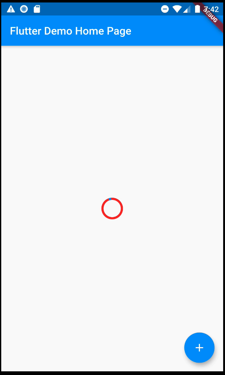
图二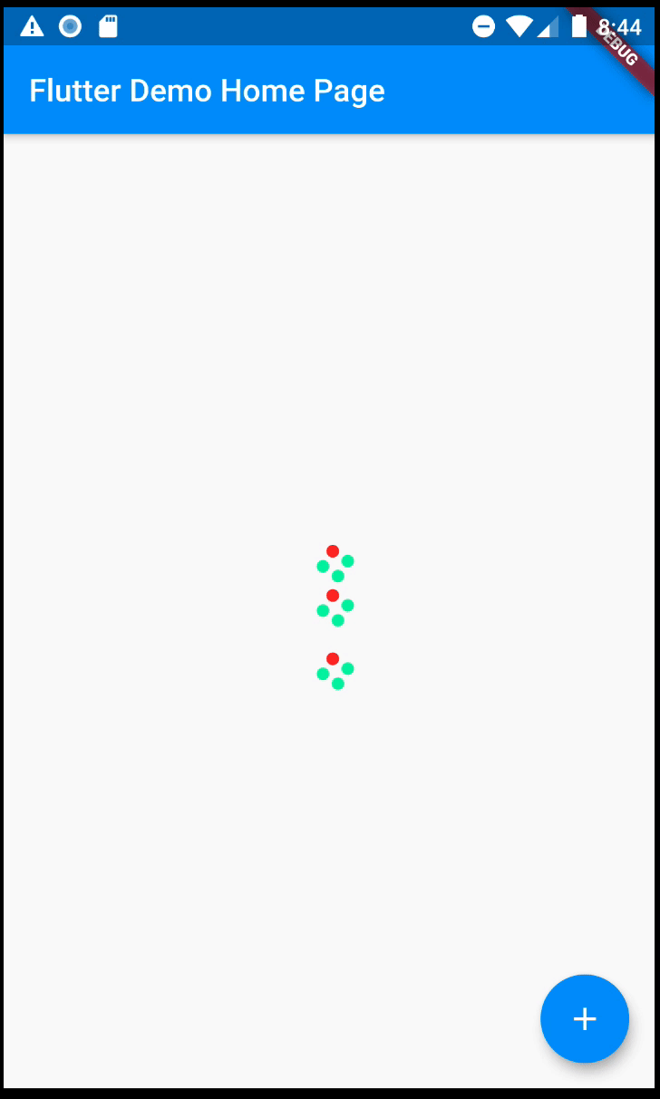
因为是录屏转gif,效果一般,请担待。
步骤
- 分析源码,系统的CircularProgressIndicator也是通过继承CustomPainter来画出来的,下面是关键的代码
//总的来说就是使用drawArc来画出图形,然后使用动画来更改初始角度和扇形
@override
  void paint(Canvas canvas, Size size) {
    final Paint paint = Paint()
      ..color = valueColor
      ..strokeWidth = strokeWidth
      ..style = PaintingStyle.stroke;
    if (backgroundColor != null) {
      final Paint backgroundPaint = Paint()
        ..color = backgroundColor
        ..strokeWidth = strokeWidth
        ..style = PaintingStyle.stroke;
      canvas.drawArc(Offset.zero & size, 0, _sweep, false, backgroundPaint);
    }

    if (value == null) // Indeterminate
      paint.strokeCap = StrokeCap.square;
    canvas.drawArc(Offset.zero & size, arcStart, arcSweep, false, paint);
  }
- 分析目标结构:看到上图,我们目标就是四个圆点在转动,那好,我们就先画出四个圆点。
@override
  void paint(Canvas canvas, Size size) {
    valueColorPaint = Paint()
      ..color = valueColor
      ..style = PaintingStyle.fill;

    if (backgroundColor != null) {
      valueColorPaint = Paint()
        ..color = backgroundColor
        ..style = PaintingStyle.fill;
    }

    if (oneLeadColor != null) {
      oneLeadCirclePaint = Paint()
        ..color = oneLeadColor
        ..style = PaintingStyle.fill;
    } else {
      oneLeadCirclePaint = valueColorPaint;
    }

    double dx1 = size.width + size.width * math.cos(arcSweepOne * math.pi / 180);
    double dy1 = size.height + size.width * math.sin(arcSweepOne * math.pi / 180);

    double dx2 = size.width + size.width * math.cos(arcSweepTwo * math.pi / 180);
    double dy2 = size.height + size.width * math.sin(arcSweepTwo * math.pi / 180);

    double dx3 = size.width + size.width * math.cos(arcSweepThree * math.pi / 180);
    double dy3 = size.height + size.width * math.sin(arcSweepThree * math.pi / 180);

    double dx4 = size.width + size.width * math.cos(arcSweepFour * math.pi / 180);
    double dy4 = size.height + size.width * math.sin(arcSweepFour * math.pi / 180);

    canvas.drawCircle(Offset(dx1, dy1), size.width / 2, valueColorPaint);
    canvas.drawCircle(Offset(dx2, dy2), size.width / 2, oneLeadCirclePaint);
    canvas.drawCircle(Offset(dx3, dy3), size.width / 2, valueColorPaint);
    canvas.drawCircle(Offset(dx4, dy4), size.width / 2, valueColorPaint);
  }
其中使用了三个Paint,分别来区分颜色,因为我们是来画圆的,就需要确定圆心坐标,最关键的代码就是这个了
double dx1 = size.width + size.width * math.cos(arcSweepOne * math.pi / 180);
double dy1 = size.height + size.width * math.sin(arcSweepOne * math.pi / 180);
来,不要客气,先看张图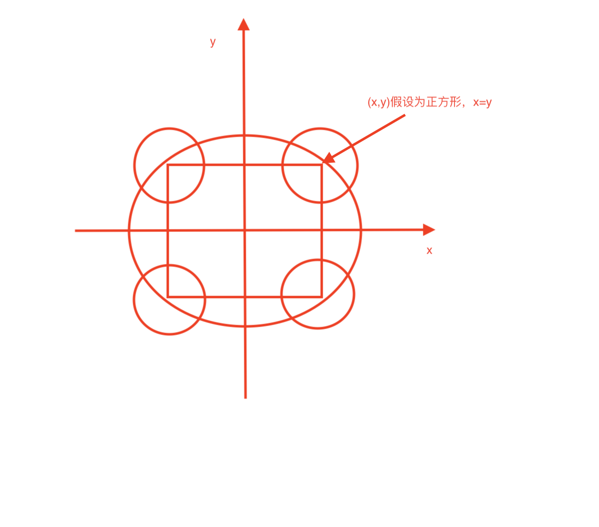
正方形为辅助图形,确定初始位置4个圆的位置,这个时候圆的位置是不动的,然后圆心的坐标为(x,y),位置已经确认,是时候让小圆动起来了,而小圆的圆心移动路径就是图中的那个大圆了,逻辑图示神马的都已经分析好,剩下的就都是数学计算了,我们是以正方形的一半为基础来进行计算的,而圆心的移动轨迹就是大圆半径扫过的轨迹,以大圆半径扫过的角度为变量,就可以轻松让小圆动起来,所以第一象限圆的圆心坐标就是(arcSweepOne是大圆扫过的角度)
double dx1 = size.width + size.width * math.cos(arcSweepOne * math.pi / 180);
double dy1 = size.height + size.width * math.sin(arcSweepOne * math.pi / 180);
然后结合Tween动画,动态的把变化的坐标传进去,小圆的位置就会实时改变啦
看一下完整代码,就不贴GitHub了,就是一个简单的小例子。
import 'dart:math' as math;

import 'package:flutter/material.dart';

const double _kMinCircularProgressIndicatorSize = 8.0;

class FlowerLoadingIndicator extends ProgressIndicator {
  /// Creates a Flower progress indicator.
  ///
  /// {@macro flutter.material.progressIndicator.parameters}
  const FlowerLoadingIndicator({
    Key key,
    double value,
    Color backgroundColor,
    Animation<Color> valueColor,
    this.oneLeadColor,
    this.milliseconds,
    String semanticsLabel,
    String semanticsValue,
  }) : super(
          key: key,
          value: value,
          backgroundColor: backgroundColor,
          valueColor: valueColor,
          semanticsLabel: semanticsLabel,
          semanticsValue: semanticsValue,
        );

  final Color oneLeadColor;
  final int milliseconds;

  Color getBackgroundColor(BuildContext context) => backgroundColor ?? Theme.of(context).backgroundColor;
  Color getValueColor(BuildContext context) => valueColor?.value ?? Theme.of(context).accentColor;
  Color getOneLeadColor(BuildContext context) => oneLeadColor ?? Theme.of(context).primaryColorLight;

  Widget _buildSemanticsWrapper({
    @required BuildContext context,
    @required Widget child,
  }) {
    String expandedSemanticsValue = semanticsValue;
    if (value != null) {
      expandedSemanticsValue ??= '${(value * 100).round()}%';
    }
    return Semantics(
      label: semanticsLabel,
      value: expandedSemanticsValue,
      child: child,
    );
  }

  @override
  State<StatefulWidget> createState() => _FlowerLoadingIndicator();
}

final Tween<double> _kRotationTweenOne = new Tween(begin: 0.0, end: 360.0);
final Tween<double> _kRotationTweenTwo = new Tween(begin: -90.0, end: 270.0);
final Tween<double> _kRotationTweenThree = new Tween(begin: 90, end: 450.0);
final Tween<double> _kRotationTweenFour = new Tween(begin: 180, end: 540.0);

class _FlowerLoadingIndicator extends State<FlowerLoadingIndicator> with SingleTickerProviderStateMixin {
  AnimationController _controller;

  @override
  void initState() {
    super.initState();
    _controller = AnimationController(
      duration: Duration(milliseconds: widget.milliseconds ?? 1500),
      vsync: this,
    );
    _controller.repeat();
  }

  @override
  void didUpdateWidget(FlowerLoadingIndicator oldWidget) {
    super.didUpdateWidget(oldWidget);
    _controller.repeat();
  }

  @override
  void dispose() {
    _controller.dispose();
    super.dispose();
  }

  @override
  Widget build(BuildContext context) {
    return _buildAnimation();
  }

  Widget _buildIndicator(BuildContext context, double arcSweepOne, double arcSweepTwo, double arcSweepThree, double arcSweepFour) {
    return widget._buildSemanticsWrapper(
      context: context,
      child: Container(
        constraints: const BoxConstraints(
          minWidth: _kMinCircularProgressIndicatorSize,
          minHeight: _kMinCircularProgressIndicatorSize,
        ),
        child: CustomPaint(
          painter: _FlowerLoadingIndicatorPainter(
            backgroundColor: widget.backgroundColor,
            valueColor: widget.getValueColor(context),
            oneLeadColor: widget.getOneLeadColor(context),
            arcSweepOne: arcSweepOne,
            arcSweepTwo: arcSweepTwo,
            arcSweepThree: arcSweepThree,
            arcSweepFour: arcSweepFour,
          ),
        ),
      ),
    );
  }

  Widget _buildAnimation() {
    return AnimatedBuilder(
      animation: _controller,
      builder: (BuildContext context, Widget child) {
        return _buildIndicator(
          context,
          _kRotationTweenOne.evaluate(_controller),
          _kRotationTweenTwo.evaluate(_controller),
          _kRotationTweenThree.evaluate(_controller),
          _kRotationTweenFour.evaluate(_controller),
        );
      },
    );
  }
}

class _FlowerLoadingIndicatorPainter extends CustomPainter {
  _FlowerLoadingIndicatorPainter({
    this.backgroundColor,
    this.valueColor,
    this.arcSweepOne,
    this.arcSweepTwo,
    this.arcSweepThree,
    this.arcSweepFour,
    this.oneLeadColor,
  });

  final Color backgroundColor;
  final Color valueColor;
  final Color oneLeadColor;
  final double arcSweepOne;
  final double arcSweepTwo;
  final double arcSweepThree;
  final double arcSweepFour;
  Paint valueColorPaint;
  Paint oneLeadCirclePaint;

  @override
  void paint(Canvas canvas, Size size) {
    valueColorPaint = Paint()
      ..color = valueColor
      ..style = PaintingStyle.fill;

    if (backgroundColor != null) {
      valueColorPaint = Paint()
        ..color = backgroundColor
        ..style = PaintingStyle.fill;
    }

    if (oneLeadColor != null) {
      oneLeadCirclePaint = Paint()
        ..color = oneLeadColor
        ..style = PaintingStyle.fill;
    } else {
      oneLeadCirclePaint = valueColorPaint;
    }

    double dx1 = size.width + size.width * math.cos(arcSweepOne * math.pi / 180);
    double dy1 = size.height + size.width * math.sin(arcSweepOne * math.pi / 180);

    double dx2 = size.width + size.width * math.cos(arcSweepTwo * math.pi / 180);
    double dy2 = size.height + size.width * math.sin(arcSweepTwo * math.pi / 180);

    double dx3 = size.width + size.width * math.cos(arcSweepThree * math.pi / 180);
    double dy3 = size.height + size.width * math.sin(arcSweepThree * math.pi / 180);

    double dx4 = size.width + size.width * math.cos(arcSweepFour * math.pi / 180);
    double dy4 = size.height + size.width * math.sin(arcSweepFour * math.pi / 180);

    canvas.drawCircle(Offset(dx1, dy1), size.width / 2, valueColorPaint);
    canvas.drawCircle(Offset(dx2, dy2), size.width / 2, oneLeadCirclePaint);
    canvas.drawCircle(Offset(dx3, dy3), size.width / 2, valueColorPaint);
    canvas.drawCircle(Offset(dx4, dy4), size.width / 2, valueColorPaint);
  }

  @override
  bool shouldRepaint(_FlowerLoadingIndicatorPainter oldPainter) {
    return true;
  }
}


 3783
3783


 被折叠的 条评论
为什么被折叠?
被折叠的 条评论
为什么被折叠?
 到【灌水乐园】发言


