


⒈旋转的风车特效:
<!DOCTYPE html>
<html>
    <head>
        <meta charset="UTF-8">
        <title></title>
        <style type="text/css">
            .box{
                width: 400px;
                height: 400px;
                transition: 5s linear;
                margin: 50px auto;
            }
            .box div{
                float: left;
                width: 180px;
                height: 180px;
                background: pink;
            }
            .box div:nth-child(1),.box div:nth-child(4){
                border-radius: 0 70%;
            }
            .box div:nth-child(2),.box div:nth-child(3){
                border-radius: 70% 0;
            }
            .box:hover{
                -webkit-transform: rotate(720deg);
            }
        </style>
    </head>
    <body>
        <div class="box">
            <div></div>
            <div></div>
            <div></div>
            <div></div>
        </div>
    </body>
</html>
运行效果图:

⒉背景图片制作的按钮
<!DOCTYPE html>
<html>
<head>
<meta charset="UTF-8">
<title></title>
<style type="text/css">
.box{
margin: 50px auto;
width: 300px;
height: 60px;
-webkit-border-image: url(bt_blue.png) 0 10;
border-left-width: 10px;
border-right-width: 10px;
font: bold 30px/60px "微软雅黑";
color: #fff;
text-align: center;
cursor: pointer;
}
</style>
</head>
<body>
<div class="box">点 我</div>
</body>
</html>运行效果:

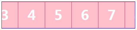
3.无缝滚动
<!DOCTYPE html>
<html>
    <head>
        <meta charset="UTF-8">
        <title></title>
        <style type="text/css">
            div,ul,li{
                margin: 0;
                padding: 0;
                list-style: none;
                border: 0;
            }
            .box{
                width: 500px;
                height: 100px;
                border: 1px solid #0000FF;
                position: relative;
                margin: 50px auto;
                overflow: hidden;
            }
            .list{
                position: absolute;
                top: 0;
                left: 0;
                width: 201%;
                -webkit-animation: 3s move infinite linear;
            }
            .list li{
                float: left;
                width: 98px;
                height: 98px;
                border: 1px solid #DB7093;
                background: pink;
                color: #fff;
                font: bold 50px/98px "微软雅黑";
                text-align: center;
            }
            .box:hover .list{
                -webkit-animation-play-state: paused;
            }
            @-webkit-keyframes move{
                0%{left: 0;}
                100%{left: -500px;}
            }
        </style>
    </head>
    <body>
        <div class="box">
            <ul class="list">
                <li>1</li>
                <li>2</li>
                <li>3</li>
                <li>4</li>
                <li>5</li>
                <li>6</li>
                <li>7</li>
                <li>8</li>
                <li>9</li>
                <li>10</li>
            </ul>
        </div>
    </body>
</html>
运行效果:
4.图片作背景的文字
<!DOCTYPE html>
<html>
    <head>
        <meta charset="UTF-8">
        <title></title>
        <style type="text/css">
            .box{
                font: bold 100px/100px "微软雅黑";
                text-align: center;
                border: 1px solid #000000;
                padding: 50px;
                background: url(pic.jpg) center;
                cursor: pointer;
                -webkit-background-clip: text;
                color: rgba(0,0,0,0);
                background-position: 50px 50px;
                transition: 2s;
            }
            .box:hover{
                background-position: 300px 300px;
            }
        </style>
    </head>
    <body>
    </body>
    <div class="box">前端开发</div>
</html>
运行效果:


 4828
4828


 被折叠的 条评论
为什么被折叠?
被折叠的 条评论
为什么被折叠?
 到【灌水乐园】发言


