


用CSS3写一个旋转轮播图
今天用css3写一个不一样的轮播图3D效果。
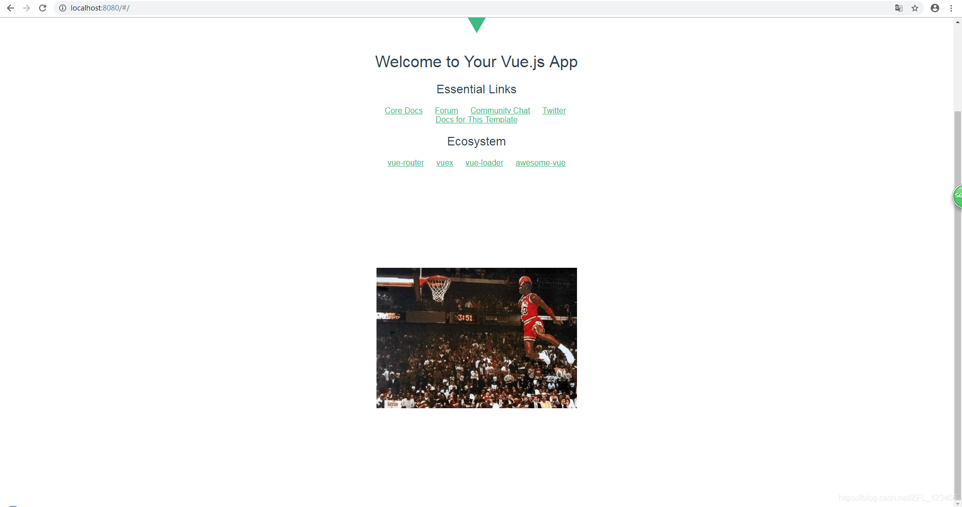
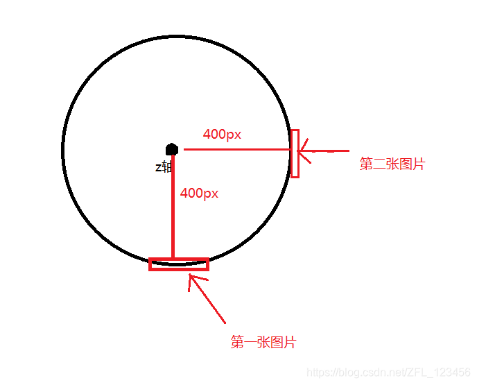
先看下最后效果吧
1.旋转轮播图结构制作
// html
<body>
	<section>
		<div></div>
		<div></div>
		<div></div>
		<div></div>
		<div></div>
		<div></div>
	</section>
</body>
// css
<style>
section { /*这里放的图片是正中间那张*/
	width: 400px;
	height: 300px;
	background: url("img/1.jpg") no-repeat; /*根据自己图片的路径,设置为背景图片*/
	margin: 200px auto;/*这里是为了让section居中对齐*/
}
</style>
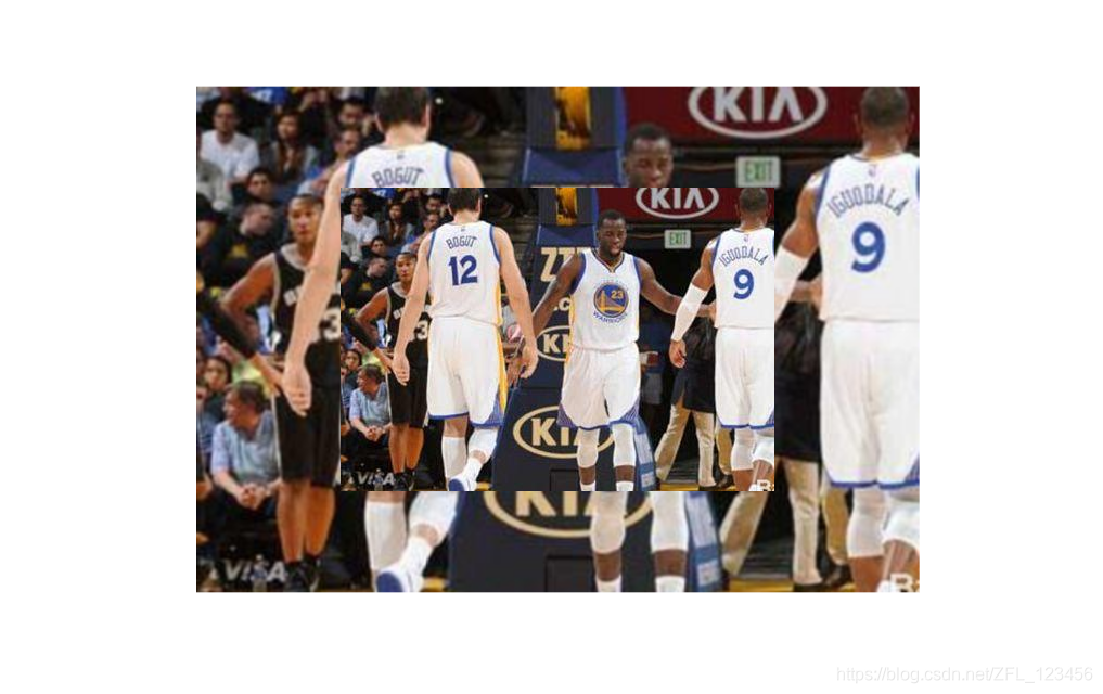
现在能看到的是这个效果
2.现在往每个div内设置背景图片
// css
section div {
	width: 100%;/*继承父盒子的宽度*/
	height: 100%;/*继承父盒子的高度*/
	background: url('img/2.jpg') no-repeat;/*暂且将每个div内的背景图片设置成一样,先看看效果*/
}
因为div是块级元素,所以现在的效果就是竖着排列,但是我们这些图片用到了定位,所以我们在 section div 中添加position: absolute;top:0;left:0;因为子盒子中用了绝对定位,所以我们要给父盒子添加相对定位 在 section 中添加position:relative;
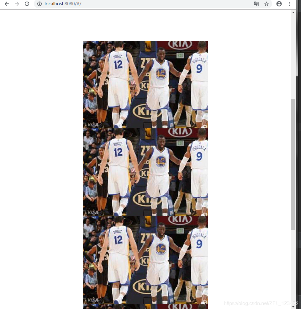
此时效果如下,所有图片都重叠在一起
我们知道事物都是近大远小的,这是我们就要用css3 的 transfrom:translateZ()
// css
section div:nth-child(1) {
	/*rotateY:沿着 Y 轴的 3D 旋转。第一张图片是正对着我们的,所以我们沿Y轴的旋转为0度*/
	/*translateZ(400px)这个什么意思呢? 以Y轴作为中心轴,第一张图片距离中心轴400px距离,后面图片都要距离中心轴400px*/
	transform: rotateY(0deg) translateZ(400px);
}
但我们发现写了transform: rotateY(0deg) translateZ(400px);之后,好像没有变化。
这时,我们要在 body 中添加一句代码 perspective: 1000px;
perspective是什么呢???
perspective 属性定义 3D 元素距视图的距离,以像素计。该属性允许您改变 3D 元素查看 3D 元素的视图。 当为元素定义 perspective 属性时,其子元素会获得透视效果,而不是元素本身。 注释:perspective 属性只影响 3D 转换元素。
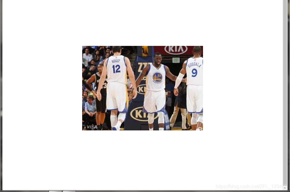
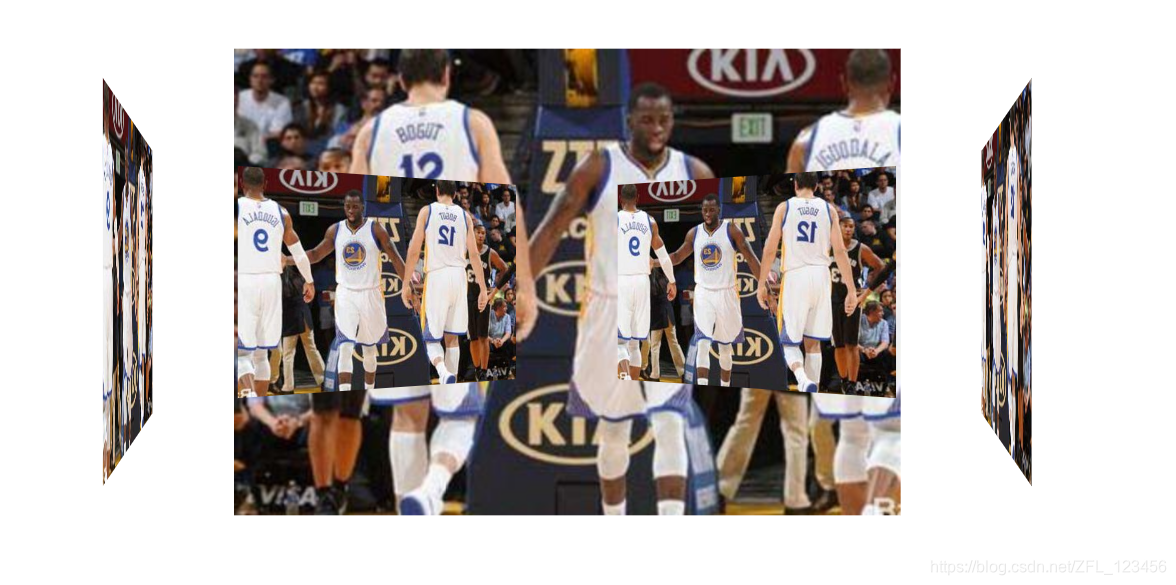
添加之后,效果如下
那同样,我们这时对剩下的图片实现3d效果
/*因为我们这里有6张图片,一个圆有360度,每张图片沿Y轴旋转的度数差为360/6,同理,如果只有5张,度数差为360/5*/
section div:nth-child(1) {
	transform: rotateY(0deg) translateZ(400px);
}
section div:nth-child(2) {
	transform: rotateY(60deg) translateZ(400px);
}
section div:nth-child(3) {
	transform: rotateY(120deg) translateZ(400px);
}
section div:nth-child(4) {
	transform: rotateY(180deg) translateZ(400px);
}
section div:nth-child(5) {
	transform: rotateY(240deg) translateZ(400px);
}
section div:nth-child(16) {
	transform: rotateY(300deg) translateZ(400px);
}
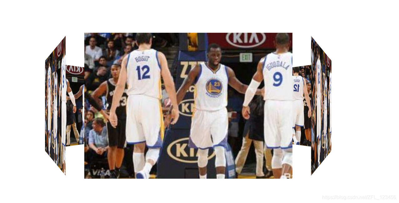
这时就已经有点3D的感觉了,但是看着很奇怪
这时我们又要添加代码了
section {
	...
	transfrom-style: preserve-3d;
}
transfrom-style: preserve-3d;
preserve-3d 表示 子元素将保留其 3D 位置。
这时候就美滋滋了
最后我们可以写鼠标经过,开始旋转的效果了。
// css
section {
	...
	transition: all 10s linear; /*linear表示匀速运动*/
}
section:hover { /*鼠标移入section盒子中,沿Y轴转360度*/
    transform: rotateY(360deg);
}
最后,我们整理一下,将代码写全。
// html
<body>
	<section>
		<div></div>
		<div></div>
		<div></div>
		<div></div>
		<div></div>
		<div></div>
	</section>
</body>
// css
body {
	perspective: 1000px;
}
section { /*这里放的图片是正中间那张*/
	width: 400px;
	height: 300px;
	background: url("img/1.jpg") no-repeat; /*根据自己图片的路径,设置为背景图片*/
	margin: 200px auto;/*这里是为了让section居中对齐*/
	transfrom-style: preserve-3d;
	position: relative;
    transition: all 10s linear;
}
section:hover { /*鼠标移入section盒子中,沿Y轴转360度*/
    transform: rotateY(360deg);
}
section div {
	width: 100%
	height: 100%
	background: url('img/2.jpg') no-repeat;/*暂且将每个div内的背景图片设置成一样,先看看效果*/
	position: absolute;
    top: 0;
    left: 0;
}
section div:nth-child(1) {
	/*background: url('img/3.jpg') no-repeat; 给每个div添加不同图片背景*/
	transform: rotateY(0deg) translateZ(400px);
}
section div:nth-child(2) {
	transform: rotateY(60deg) translateZ(400px);
}
section div:nth-child(3) {
	transform: rotateY(120deg) translateZ(400px);
}
section div:nth-child(4) {
	transform: rotateY(180deg) translateZ(400px);
}
section div:nth-child(5) {
	transform: rotateY(240deg) translateZ(400px);
}
section div:nth-child(16) {
	transform: rotateY(300deg) translateZ(400px);
}
finish!


 3633
3633


 被折叠的 条评论
为什么被折叠?
被折叠的 条评论
为什么被折叠?
 到【灌水乐园】发言


