


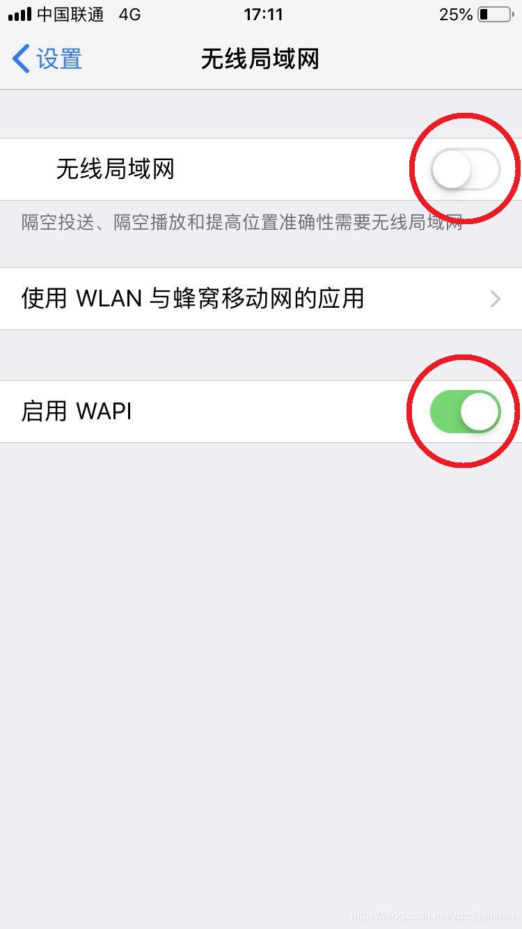
上图中的按钮是 iOS 中的自带的开关控件,Android 也有很多优秀的仿这个控件的开源库,自己也是模仿着实现了一下,下面记录一下实现过程。
1 思路
首先还是来进行分解动作,从静态样子来看,这个开关是一个圆角矩形的背景,然后中间有一个圆形的东西(姑且叫做按钮指示器)。点击该控件的时候会像 CheckBox 一样,会在开和关的状态之间切换,这个切换不是瞬间完成的,中间的指示器会有一个从左移动到右或从右移动到左的动画,背景也会慢慢过渡变化。
既然刚才说这个控件像 CheckBox 一样,会在两种状态之间切换,所以我们继承 CheckBox 就好。
2 圆角矩形背景
既然理清了思路,那么开始动手,从背景开始。
绘制一个圆角矩形的背景很简单,调用原生 api 即可:
public class SwitchButton extends android.support.v7.widget.AppCompatCheckBox {
    private static final String TAG = "SwitchButton";
    private static final int DEFAULT_WIDTH = 200;
    private static final int DEFAULT_HEIGHT = DEFAULT_WIDTH / 8 * 5;

    private Paint mPaint;
    private RectF mRectF;

    public SwitchButton(Context context) {
        this(context, null);
    }

    public SwitchButton(Context context, AttributeSet attrs) {
        this(context, attrs, 0);
    }

    public SwitchButton(Context context, AttributeSet attrs, int defStyleAttr) {
        super(context, attrs, defStyleAttr);
        setButtonDrawable(null);
        setBackgroundResource(0);

        mPaint = new Paint();
        mPaint.setAntiAlias(true);

        mRectF = new RectF();
    }

    @Override
    protected void onMeasure(int widthMeasureSpec, int heightMeasureSpec) {
        int widthMode = MeasureSpec.getMode(widthMeasureSpec);
        int widthSize = MeasureSpec.getSize(widthMeasureSpec);
        int heightMode = MeasureSpec.getMode(heightMeasureSpec);
        int heightSize = MeasureSpec.getSize(heightMeasureSpec);
        int width;
        int height;
        if (widthMode == MeasureSpec.EXACTLY) {
            width = widthSize;
        } else {
            width =  (getPaddingLeft() + DEFAULT_WIDTH + getPaddingRight());
        }

        if (heightMode == MeasureSpec.EXACTLY) {
            height = heightSize;
        } else {
            height = (getPaddingTop() + DEFAULT_HEIGHT + getPaddingBottom());
        }
        setMeasuredDimension(width, height);
    }

    @Override
    protected void onDraw(Canvas canvas) {
        super.onDraw(canvas);
        mPaint.setStrokeWidth((float) getMeasuredWidth() / 40);
        mPaint.setColor(0xFFCCCCCC);
        mRectF.set(mPaint.getStrokeWidth()
                , mPaint.getStrokeWidth()
                , getMeasuredWidth() - mPaint.getStrokeWidth()
                , getMeasuredHeight() - mPaint.getStrokeWidth());
        canvas.drawRoundRect(mRectF, getMeasuredHeight(), getMeasuredHeight(), mPaint);
    }
}
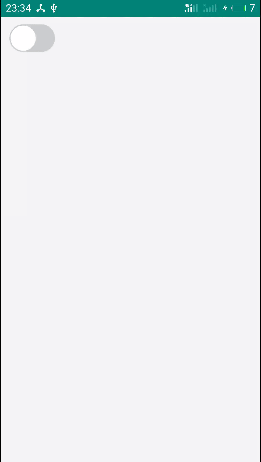
效果如下:
3 绘制按钮指示器
按钮指示器就是一个圆形,它的半径可以理解为就是控件高度的一半,不过为了好看一点可以让它有点内边距,多减去一个画笔宽度,在 onDraw 方法中增加如下代码:
mPaint.setColor(0xFFFFFFFF);
float radius = (getMeasuredHeight() - mPaint.getStrokeWidth() * 4) / 2;
float x = mPaint.getStrokeWidth() + mPaint.getStrokeWidth() + radius;
float y = (float) getMeasuredHeight() / 2;
canvas.drawCircle(x, y, radius, mPaint);
现在效果如下:
4 动起来
样子有了,现在我们来做功能。在点击这个控件的时候,因为它是继承自 CheckBox 的,所以它的 checked 属性会改变,我们根据这个属性就可以绘制不同 UI。主要是在绘制背景时根据不同状态给画笔设置不同颜色,还有在绘制按钮指示器时根据不同状态,圆心 x 坐标一个在左,一个在右,y 坐标不变,在左边的时候就是半径加上两个画笔宽度,在右边的时候就是控件宽度减去半径,再减去两个画笔宽度而已。
修改 onDraw 方法:
@Override
protected void onDraw(Canvas canvas) {
    super.onDraw(canvas);
    mPaint.setStrokeWidth((float) getMeasuredWidth() / 40);
    if (isChecked()) {
        mPaint.setColor(0xFF6495ED);
    } else {
        mPaint.setColor(0xFFCCCCCC);
    }
    mRectF.set(mPaint.getStrokeWidth()
            , mPaint.getStrokeWidth()
            , getMeasuredWidth() - mPaint.getStrokeWidth()
            , getMeasuredHeight() - mPaint.getStrokeWidth());
    canvas.drawRoundRect(mRectF, getMeasuredHeight(), getMeasuredHeight(), mPaint);

    mPaint.setColor(0xFFFFFFFF);
    float radius = (getMeasuredHeight() - mPaint.getStrokeWidth() * 4) / 2;
    float x;
    float y;
    if (isChecked()) {
        x = getMeasuredWidth() - radius - mPaint.getStrokeWidth() - mPaint.getStrokeWidth();
    } else {
        x = mPaint.getStrokeWidth() + radius + mPaint.getStrokeWidth();
    }
    y = (float) getMeasuredHeight() / 2;
    canvas.drawCircle(x, y, radius, mPaint);
}
在构造方法中添加一个 OnClickListener,在控件被点击时重新绘制 UI:
setOnClickListener(new OnClickListener() {
    @Override
    public void onClick(View v) {
        invalidate();
    }
});
现在效果如下:
如果不考虑动画的话,这个开关控件的基本效果已经有了。
5 动画
动画主要分两个部分,一个是按钮指示器位置(圆心)切换的动画,另一个就是背景颜色的过渡动画。这两个动画我都选择用属性动画来做。
我们可以计算按钮指示器在左右两边时的圆心的 x 坐标的差,然后通过属性动画让这个值慢慢变为 0,这个值可以看作是 x 坐标的偏移量,从左到右时 x 坐标减去这个偏移量,从右到左时 x 坐标加上这个偏移量。
背景颜色的过渡从度娘上找了一个方法:
private int getCurrentColor(float fraction, int startColor, int endColor) {
    int redStart = Color.red(startColor);
    int blueStart = Color.blue(startColor);
    int greenStart = Color.green(startColor);
    int alphaStart = Color.alpha(startColor);

    int redEnd = Color.red(endColor);
    int blueEnd = Color.blue(endColor);
    int greenEnd = Color.green(endColor);
    int alphaEnd = Color.alpha(endColor);

    int redDifference = redEnd - redStart;
    int blueDifference = blueEnd - blueStart;
    int greenDifference = greenEnd - greenStart;
    int alphaDifference = alphaEnd - alphaStart;

    int redCurrent = (int) (redStart + fraction * redDifference);
    int blueCurrent = (int) (blueStart + fraction * blueDifference);
    int greenCurrent = (int) (greenStart + fraction * greenDifference);
    int alphaCurrent = (int) (alphaStart + fraction * alphaDifference);

    return Color.argb(alphaCurrent, redCurrent, greenCurrent, blueCurrent);
}
这个方法可以获取一个过渡期中当前颜色,fraction 为过渡系数,取值范围 0f-1f,值越接近 1,颜色就越接近 endColor。我们仍然通过属性动画来修改过渡系数即可。
主要代码如下:
@Override
    protected void onDraw(Canvas canvas) {
        super.onDraw(canvas);
        mPaint.setStrokeWidth((float) getMeasuredWidth() / 40);
        if (isChecked()) {
            mPaint.setColor(getCurrentColor(mColorGradientFactor, 0xFFCCCCCC, 0xFF6495ED));
        } else {
            mPaint.setColor(getCurrentColor(mColorGradientFactor, 0xFF6495ED, 0xFFCCCCCC));
        }
        mRectF.set(mPaint.getStrokeWidth()
                , mPaint.getStrokeWidth()
                , getMeasuredWidth() - mPaint.getStrokeWidth()
                , getMeasuredHeight() - mPaint.getStrokeWidth());
        canvas.drawRoundRect(mRectF, getMeasuredHeight(), getMeasuredHeight(), mPaint);

        mPaint.setColor(0xFFFFFFFF);
        float radius = (getMeasuredHeight() - mPaint.getStrokeWidth() * 4) / 2;
        float x;
        float y;
        if (isChecked()) {
//            x = getMeasuredWidth() - radius - mPaint.getStrokeWidth() - mPaint.getStrokeWidth();
            x = getMeasuredWidth() - radius - mPaint.getStrokeWidth() - mPaint.getStrokeWidth() - mButtonCenterXOffset;
        } else {
//            x = radius + mPaint.getStrokeWidth() + mPaint.getStrokeWidth();
            x = radius + mPaint.getStrokeWidth() + mPaint.getStrokeWidth() + mButtonCenterXOffset;
        }
        y = (float) getMeasuredHeight() / 2;
        canvas.drawCircle(x, y, radius, mPaint);
    }

    private void startAnimate() {
        // 计算开关指示器的半径
        float radius = (getMeasuredHeight() - mPaint.getStrokeWidth() * 4) / 2;
        // 计算开关指示器的 X 坐标的总偏移量
        float centerXOffset = getMeasuredWidth() - mPaint.getStrokeWidth() - mPaint.getStrokeWidth() - radius
                - (mPaint.getStrokeWidth() + mPaint.getStrokeWidth() + radius);

        AnimatorSet animatorSet = new AnimatorSet();
        // 偏移量逐渐变化到 0
        ObjectAnimator objectAnimator = ObjectAnimator.ofFloat(this, "buttonCenterXOffset", centerXOffset, 0);
        objectAnimator.setDuration(2000);
        objectAnimator.addUpdateListener(new ValueAnimator.AnimatorUpdateListener() {
            @Override
            public void onAnimationUpdate(ValueAnimator animation) {
                invalidate();
            }
        });

        // 背景颜色过渡系数逐渐变化到 1
        ObjectAnimator objectAnimator2 = ObjectAnimator.ofFloat(this, "colorGradientFactor", 0, 1);
        objectAnimator2.setDuration(2000);

        // 同时开始修改开关指示器 X 坐标偏移量的动画和修改背景颜色过渡系数的动画
        animatorSet.play(objectAnimator).with(objectAnimator2);
        animatorSet.start();
    }

    private int getCurrentColor(float fraction, int startColor, int endColor) {
        int redStart = Color.red(startColor);
        int blueStart = Color.blue(startColor);
        int greenStart = Color.green(startColor);
        int alphaStart = Color.alpha(startColor);

        int redEnd = Color.red(endColor);
        int blueEnd = Color.blue(endColor);
        int greenEnd = Color.green(endColor);
        int alphaEnd = Color.alpha(endColor);

        int redDifference = redEnd - redStart;
        int blueDifference = blueEnd - blueStart;
        int greenDifference = greenEnd - greenStart;
        int alphaDifference = alphaEnd - alphaStart;

        int redCurrent = (int) (redStart + fraction * redDifference);
        int blueCurrent = (int) (blueStart + fraction * blueDifference);
        int greenCurrent = (int) (greenStart + fraction * greenDifference);
        int alphaCurrent = (int) (alphaStart + fraction * alphaDifference);

        return Color.argb(alphaCurrent, redCurrent, greenCurrent, blueCurrent);
    }
点击事件要修改成调用 startAnimate 方法,现在效果如下:
为了演示,所以把动画时长设置为 2000ms,实际上 300ms 的效果挺好的,然后上面只是部分代码,大家主要看思路。完整代码在最后贴出,我们还可以考虑封装一些 api 供外部方便的使用,如设置按钮颜色,背景颜色,动画时长等。
6 总结
这个控件在我刚开始工作的时候就差不多看到了,当时为了效果好一点,还找了好多类似的来优中选优,现在终于轮到自己实现一个。其实这也是我后来一直的习惯,当看到一个好看的控件或者优秀的框架时,不光是会拿来用,还要分析别人的思路,然后看看自己能不能实现,这样出了问题,可能更容易改。慢慢的最后就会变成接到一个新需求时,不再是去网上找第三方库,而是自己去实现。
7 完整代码
package com.qinshou.switchbuttondemo;

import android.animation.AnimatorSet;
import android.animation.ObjectAnimator;
import android.animation.ValueAnimator;
import android.content.Context;
import android.graphics.Canvas;
import android.graphics.Color;
import android.graphics.Paint;
import android.graphics.RectF;
import android.util.AttributeSet;
import android.view.View;

/**
 * Author: QinHao
 * Email:cqflqinhao@126.com
 * Date: 2019/6/1 16:56
 * Description:仿 iOS 风格的开关按钮
 */
public class SwitchButton extends android.support.v7.widget.AppCompatCheckBox {
    private static final String TAG = "SwitchButton";
    /**
     * 控件默认宽度
     */
    private static final int DEFAULT_WIDTH = 200;
    /**
     * 控件默认高度
     */
    private static final int DEFAULT_HEIGHT = DEFAULT_WIDTH / 8 * 5;
    /**
     * 画笔
     */
    private Paint mPaint;
    /**
     * 控件背景的矩形范围
     */
    private RectF mRectF;
    /**
     * 开关指示器按钮圆心 X 坐标的偏移量
     */
    private float mButtonCenterXOffset;
    /**
     * 颜色渐变系数
     */
    private float mColorGradientFactor = 1;
    /**
     * 状态切换时的动画时长
     */
    private long mAnimateDuration = 300L;
    /**
     * 开关未选中状态,即关闭状态时的背景颜色
     */
    private int mBackgroundColorUnchecked = 0xFFCCCCCC;
    /**
     * 开关选中状态,即打开状态时的背景颜色
     */
    private int mBackgroundColorChecked = 0xFF6495ED;
    /**
     * 开关指示器按钮的颜色
     */
    private int mButtonColor = 0xFFFFFFFF;

    public SwitchButton(Context context) {
        this(context, null);
    }

    public SwitchButton(Context context, AttributeSet attrs) {
        this(context, attrs, 0);
    }

    public SwitchButton(Context context, AttributeSet attrs, int defStyleAttr) {
        super(context, attrs, defStyleAttr);
        // 不显示 CheckBox 默认的 Button
        setButtonDrawable(null);
        // 不显示 CheckBox 默认的背景
        setBackgroundResource(0);
        // 默认 CheckBox 为关闭状态
        setChecked(false);

        mPaint = new Paint();
        mPaint.setAntiAlias(true);

        mRectF = new RectF();
        // 点击时开始动画
        setOnClickListener(new OnClickListener() {
            @Override
            public void onClick(View v) {
                startAnimate();
            }
        });
    }

    @Override
    protected void onMeasure(int widthMeasureSpec, int heightMeasureSpec) {
        int widthMode = MeasureSpec.getMode(widthMeasureSpec);
        int widthSize = MeasureSpec.getSize(widthMeasureSpec);
        int heightMode = MeasureSpec.getMode(heightMeasureSpec);
        int heightSize = MeasureSpec.getSize(heightMeasureSpec);
        int width;
        int height;
        if (widthMode == MeasureSpec.EXACTLY) {
            width = widthSize;
        } else {
            width = (getPaddingLeft() + DEFAULT_WIDTH + getPaddingRight());
        }

        if (heightMode == MeasureSpec.EXACTLY) {
            height = heightSize;
        } else {
            height = (getPaddingTop() + DEFAULT_HEIGHT + getPaddingBottom());
        }
        setMeasuredDimension(width, height);
    }

    @Override
    protected void onDraw(Canvas canvas) {
        super.onDraw(canvas);
        // 设置画笔宽度为控件宽度的 1/40,准备绘制控件背景
        mPaint.setStrokeWidth((float) getMeasuredWidth() / 40);
        // 根据是否选中的状态设置画笔颜色
        if (isChecked()) {
            // 选中状态时,背景颜色由未选中状态的背景颜色逐渐过渡到选中状态的背景颜色
            mPaint.setColor(getCurrentColor(mColorGradientFactor, mBackgroundColorUnchecked, mBackgroundColorChecked));
        } else {
            // 未选中状态时,背景颜色由选中状态的背景颜色逐渐过渡到未选中状态的背景颜色
            mPaint.setColor(getCurrentColor(mColorGradientFactor, mBackgroundColorChecked, mBackgroundColorUnchecked));
        }
        // 设置背景的矩形范围
        mRectF.set(mPaint.getStrokeWidth()
                , mPaint.getStrokeWidth()
                , getMeasuredWidth() - mPaint.getStrokeWidth()
                , getMeasuredHeight() - mPaint.getStrokeWidth());
        // 绘制圆角矩形作为背景
        canvas.drawRoundRect(mRectF, getMeasuredHeight(), getMeasuredHeight(), mPaint);

        // 设置画笔颜色,准备绘制开关按钮指示器
        mPaint.setColor(mButtonColor);
        /*
         * 获取开关按钮指示器的半径
         * 为了好看一点,开关按钮指示器在背景矩形中显示一点内边距,所以多减去两个画笔宽度
         */
        float radius = (getMeasuredHeight() - mPaint.getStrokeWidth() * 4) / 2;
        float x;
        float y;
        // 根据是否选中的状态来决定开关按钮指示器圆心的 X 坐标
        if (isChecked()) {
//            // 选中状态时开关按钮指示器在右边
//            x = getMeasuredWidth() - radius - mPaint.getStrokeWidth() - mPaint.getStrokeWidth();
            // 选中状态时开关按钮指示器圆心的 X 坐标从左边逐渐移到右边
            x = getMeasuredWidth() - radius - mPaint.getStrokeWidth() - mPaint.getStrokeWidth() - mButtonCenterXOffset;
        } else {
//            // 未选中状态时开关按钮指示器在左边
//            x = radius + mPaint.getStrokeWidth() + mPaint.getStrokeWidth();
            // 未选中状态时开关按钮指示器圆心的 X 坐标从右边逐渐移到左边
            x = radius + mPaint.getStrokeWidth() + mPaint.getStrokeWidth() + mButtonCenterXOffset;
        }
        // Y 坐标就是控件高度的一半不变
        y = (float) getMeasuredHeight() / 2;
        canvas.drawCircle(x, y, radius, mPaint);
    }

    /**
     * Author: QinHao
     * Email:qinhao@jeejio.com
     * Date:2019/6/3 9:45
     * Description:开始开关按钮切换状态和背景颜色过渡的动画
     */
    private void startAnimate() {
        // 计算开关指示器的半径
        float radius = (getMeasuredHeight() - mPaint.getStrokeWidth() * 4) / 2;
        // 计算开关指示器的 X 坐标的总偏移量
        float centerXOffset = getMeasuredWidth() - mPaint.getStrokeWidth() - mPaint.getStrokeWidth() - radius
                - (mPaint.getStrokeWidth() + mPaint.getStrokeWidth() + radius);

        AnimatorSet animatorSet = new AnimatorSet();
        // 偏移量逐渐变化到 0
        ObjectAnimator objectAnimator = ObjectAnimator.ofFloat(this, "buttonCenterXOffset", centerXOffset, 0);
        objectAnimator.setDuration(mAnimateDuration);
        objectAnimator.addUpdateListener(new ValueAnimator.AnimatorUpdateListener() {
            @Override
            public void onAnimationUpdate(ValueAnimator animation) {
                invalidate();
            }
        });

        // 背景颜色过渡系数逐渐变化到 1
        ObjectAnimator objectAnimator2 = ObjectAnimator.ofFloat(this, "colorGradientFactor", 0, 1);
        objectAnimator2.setDuration(mAnimateDuration);

        // 同时开始修改开关指示器 X 坐标偏移量的动画和修改背景颜色过渡系数的动画
        animatorSet.play(objectAnimator).with(objectAnimator2);
        animatorSet.start();
    }

    /**
     * Author: QinHao
     * Email:qinhao@jeejio.com
     * Date:2019/6/3 9:04
     * Description:获取一个过渡期中当前颜色,fraction 为过渡系数,取值范围 0f-1f,值越接近 1,颜色就越接近 endColor
     *
     * @param fraction   当前渐变系数
     * @param startColor 过渡开始颜色
     * @param endColor   过渡结束颜色
     * @return 当前颜色
     */
    private int getCurrentColor(float fraction, int startColor, int endColor) {
        int redStart = Color.red(startColor);
        int blueStart = Color.blue(startColor);
        int greenStart = Color.green(startColor);
        int alphaStart = Color.alpha(startColor);

        int redEnd = Color.red(endColor);
        int blueEnd = Color.blue(endColor);
        int greenEnd = Color.green(endColor);
        int alphaEnd = Color.alpha(endColor);

        int redDifference = redEnd - redStart;
        int blueDifference = blueEnd - blueStart;
        int greenDifference = greenEnd - greenStart;
        int alphaDifference = alphaEnd - alphaStart;

        int redCurrent = (int) (redStart + fraction * redDifference);
        int blueCurrent = (int) (blueStart + fraction * blueDifference);
        int greenCurrent = (int) (greenStart + fraction * greenDifference);
        int alphaCurrent = (int) (alphaStart + fraction * alphaDifference);

        return Color.argb(alphaCurrent, redCurrent, greenCurrent, blueCurrent);
    }

    public void setButtonCenterXOffset(float buttonCenterXOffset) {
        mButtonCenterXOffset = buttonCenterXOffset;
    }

    public void setColorGradientFactor(float colorGradientFactor) {
        mColorGradientFactor = colorGradientFactor;
    }

    public void setAnimateDuration(long animateDuration) {
        mAnimateDuration = animateDuration;
    }

    public void setBackgroundColorUnchecked(int backgroundColorUnchecked) {
        mBackgroundColorUnchecked = backgroundColorUnchecked;
    }

    public void setBackgroundColorChecked(int backgroundColorChecked) {
        mBackgroundColorChecked = backgroundColorChecked;
    }

    public void setButtonColor(int buttonColor) {
        mButtonColor = buttonColor;
    }
}


 扫一扫
扫一扫


 759
759

 被折叠的 条评论
为什么被折叠?
被折叠的 条评论
为什么被折叠?
 到【灌水乐园】发言


