


在实际开发过程中,经常能够遇到需要居中的布局,包括水平居中和垂直居中。在CSS中,水平居中还算比较容易解决,使用 text-align: center 和 margin: 0 auto 就能够解决大部分的需求,但是垂直居中比较麻烦一点儿,以为跟水平居中相对应的 vertical-align: middle 和 margin: auto 0 使用起来是很难有达到预期的效果的,尤其是 margin: auto 0 根本就起不到垂直居中的效果。对于居中的方案,我多少知道一些,但是却没有真正的总结过相关的知识和技巧。所以,本着为了巩固自己的基础知识的目的,特意在网上查阅了相关的资料,并亲自试验后,特意总结下来。
水平居中
行内元素和行内块元素——text-align: center
<!-- HTML -->
<div class="parent">
<span class="child">[span]居中居中居中居中居中居中居中居中居中</span>
<p class="child">[p]居中居中居中居中居中居中居中居中居中</p>
<div class="child">[div]居中居中居中居中居中居中居中居中居中</div>
<input type="text" name="text" value="[input]居中居中居中居中居中居中居中居中居中"><br>
<img src="img/1.jpg"/>
</div>
<!-- CSS -->
.parent {
height: 300px;
background-color: red;
text-align: center;
}
.child {
background-color: green;
}
.parent img {
width: 100px;
height: 100px;
}
div.child {
width: 100px;
height: 100px;
}
p.child {
width: 100px;
height: 100px;
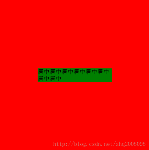
}效果图:
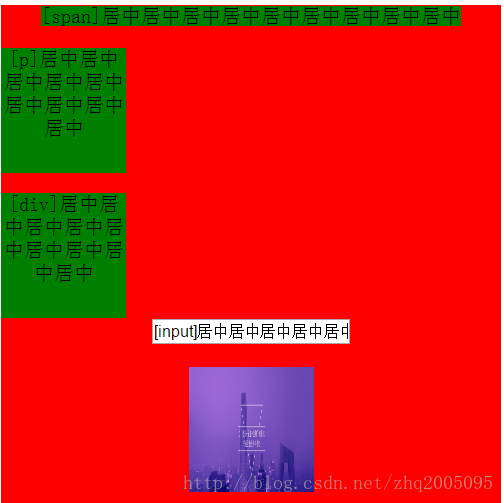
从图中可以看出来,text-align: center这一属性对于 span, input, img 三种行内和行内块元素都生效了。对于p 和 div 这种块级元素来说是无效的。
固定宽度的块级元素——margin: 0 auto
<!-- HTML -->
<div class="parent">
<span class="child">[span]居中居中居中居中居中居中居中居中居中</span>
<p class="child">[p]居中居中居中居中居中居中居中居中居中</p>
<div class="child">[div]居中居中居中居中居中居中居中居中居中</div>
<input type="text" name="text" value="[input]居中居中居中居中居中居中居中居中居中"><br>
<img src="img/1.jpg"/>
</div>
<!-- CSS -->
.parent {
height: 300px;
background-color: red;
}
.child {
background-color: green;
margin: 0 auto;
}
.parent img {
width: 100px;
height: 100px;
}
div.child {
width: 100px;
height: 100px;
}
p.child {
width: 100px;
height: 100px;
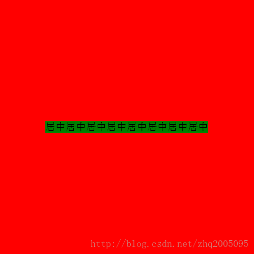
}效果如下:
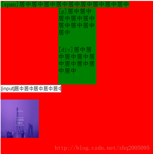
可以看出,对于块级元素 p 和 div 来说,水平居中了。
不固定宽度的块级元素——无法设置居中
因为在这种情况下,当块级元素没有设定宽度时,其宽度自动拉伸为父元素的宽度。
水平垂直居中
单行文本——line-height: height+text-align:center
高度固定的块级元素——绝对定位+margin设定负值
<!--HTML-->
<div class="parent">
    <div class="child">[div]居中</div>
</div>

<!--CSS-->
.parent {
    width: 400px;
    height: 400px;
    background-color: red;
    position: relative; // 父元素相对定位
}
.child {
    background-color: green;
    width: 100px;
    height: 100px;
    position: absolute;// 子元素绝对定位
    top: 50%; // 垂直位置设为50%
    left: 50%;// 水平位置设为50%
    margin-top: -50px; // margin-top设为高度的一半
    margin-left: -50px;// margin-left设为高度的一半
}
效果:
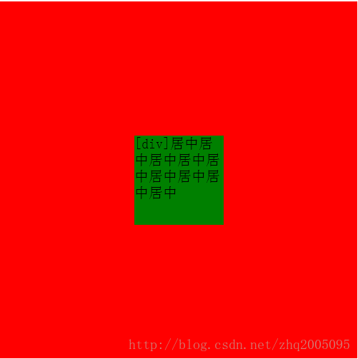
高度固定的块级元素——父元素设置display: table-cell和vertical-align: middle
<!--HTML-->
<div class="parent">
    <div class="child">[div]居中</div>
</div>

<!--CSS-->
.parent {
    width: 400px;
    height: 400px;
    background-color: red;
    display: table-cell;
    vertical-align: middle;
}
.child {
    background-color: green;
    width: 200px;
    height: 200px;
    margin: 0 auto;
}
高度固定的块级元素——绝对定位和margin: auto及left=right=top=bottom=0
<!--HTML-->
<div class="parent">
<div class="child">[div]居中</div>
</div>
<!--CSS-->
.parent {
width: 400px;
height: 400px;
background-color: red;
position: relatvie;
}
.child {
background-color: green;
width: 200px;
height: 200px;
position: relative;
margin: auto;
left: 0;
right: 0;
top: 0;
bottom: 0;
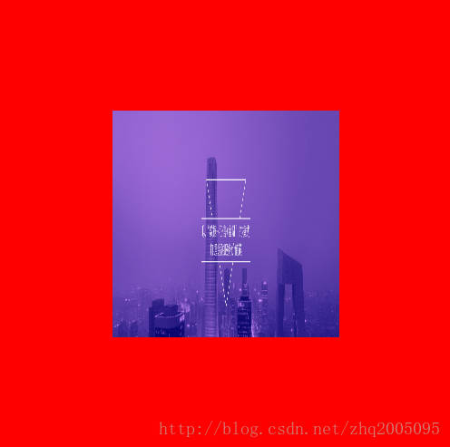
}图片——绝对定位+margin: auto
<!--HTML-->
<div class="parent">
    <img class="child" src="img/1.jpg" style="width: 200px;height: 200px">
</div>

<!--CSS-->
.parent {
    width: 400px;
    height: 400px;
    background-color: red;
    position: relative;
}
.child {
    position: absolute;
    top: 0;
    bottom: 0;
    left: 0;
    right: 0;
    margin:auto;
}
效果:
图片——父元素设置display: table-cell和vertical-align: middle
<!--HTML-->
<div class="parent">
    <img class="child" src="img/1.jpg" style="width: 200px;height: 200px">
</div>

<!--CSS-->
.parent {
    width: 400px;
    height: 400px;
    background-color: red;
    display: table-cell;
    vertical-align: middle;
}
效果同上。
高度不固定的块级元素—绝对定位和transform
<!--HTML-->
<div class="parent">
    <div class="child">居中居中居中居中居中居中居中居中</div>
</div>

<!--CSS-->
.parent {
    width: 400px;
    height: 400px;
    background-color: red;
    position: relative;
}
.child {
    background-color: green;
    position: absolute;
    top: 50%;
    left: 50%;
    transform: translate(-50%, -50%);
}
效果
高度不固定的块级元素—flex布局1
<!--HTML-->
<div class="parent">
    <div class="child">居中居中居中居中居中居中居中居中</div>
</div>

<!--CSS-->
.parent {
    width: 400px;
    height: 400px;
    background-color: red;
    display: flex;
}
.child {
    background-color: green;
    margin: auto;
}
效果

高度不固定的块级元素—flex布局2
<!--HTML-->
<div class="parent">
    <div class="child">居中居中居中居中居中居中居中居中</div>
</div>

<!--CSS-->
.parent {
    width: 400px;
    height: 400px;
    background-color: red;
    display: flex;
    justify-content: center;
    align-items: center;
}
.child {
    background-color: green;
}
暂时就这么多吧,以后有更好的办法,都会持续更新的。。。。


 扫一扫
扫一扫
 1万+
1万+

 被折叠的 条评论
为什么被折叠?
被折叠的 条评论
为什么被折叠?
 到【灌水乐园】发言


