


Flex 弹性布局
- Flex(弹性) 布局
- 1.概念
- 2. 容器的属性
- 设计在容器上的属性
- 注意:
- 1.flex-direction - 调整主轴方向
- 2.justify-content - 调整主轴方向对齐方式
- 3.align-items - 调整侧轴方向对齐方式
- 注意:
- 4.flex-wrap - 控制是否换行
- 5.align-content - 堆栈排列
- 6.flex-flow: flex-direction和flex-wrap的简写形式
- 7.flex - 控制子元素伸缩比例
- 8.align-self - 同align-items可覆盖父元素设置的algin-items
- 9.order - 控制子元素的顺序
- 10.flex-basis
- 11.flex-grow
- 12.flex-shrink
Flex(弹性) 布局
网页布局(layout)是CSS的一个重点应用。
布局的传统解决方案,基于盒状模型,依赖 display属性 + position属性 + float属性。它对于那些特殊布局非常不方便,比如,垂直居中就不容易实现。

2009年,W3C提出了一种新的方案—-Flex布局,可以简便、完整、响应式地实现各种页面布局。目前,它已经得到了所有浏览器的支持,这意味着,现在就能很安全地使用这项功能。

1.概念
弹性布局,又称“Flex布局”,是由W3C老大哥于2009年推出的一种布局方式。可以简便、完整、响应式地实现各种页面布局。而且已经得到所有主流浏览器的支持,我们可以放心大胆的使用。
传统布局比较
两端对齐布局:
传统布局:
- 需要精确计算宽度及外边距,会很麻烦
伸缩布局:
- 自动精确控制对齐,无需计算
容器和项目
采用Flex布局的元素,称为Flex容器(flex container),简称”容器”。它的所有子元素自动成为容器成员,称为Flex项目(flex item),简称”项目”
容器默认存在两根轴:水平的主轴(main axis)[x 轴] 和垂直的交叉轴(cross axis)[y 轴] 。主轴的开始位置(与边框的交叉点)叫做main start,结束位置叫做main end;交叉轴的开始位置叫做cross start,结束位置叫做cross end。
项目默认沿主轴排列。单个项目占据的主轴空间叫做main size,占据的交叉轴空间叫做cross size。
flex 容器中的所有 flex 元素都会有下列行为:
- 元素排列为一行 (
flex-direction属性的初始值是row)。 - 元素从主轴的起始线开始。
- 元素不会在主维度方向拉伸,但是可以缩小。
- 元素被拉伸来填充交叉轴大小。
flex-basis属性为auto。flex-wrap属性为nowrap。
两种容器
容器可以设置为两个值 flex,inlie-flex
区别
- felx:容器成为块元素
- inline-flex:容器成为行内块元素,不会占满全屏
flex
inline-flex

2. 容器的属性
设计在容器上的属性
- flex-direction - 调整主轴方向
- justify-content - 调整主轴方向对齐方式
- align-items - 调整侧轴方向对齐方式
- flex-wrap - 控制是否换行
- align-content - 堆栈排列
- flex-flow - flex-direction和flex-wrap的简写形式
- flex - 控制子元素伸缩比例
- align-self - 同align-items可覆盖父元素设置的algin-items
- order - 控制子元素的顺序
注意:
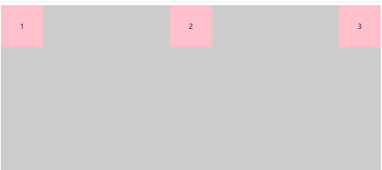
下面前3个方法的css代码都是基于此html代码所设计样式:
<div class="box">
	<div>1</div>
	<div>2</div>
	<div>3</div>
</div>
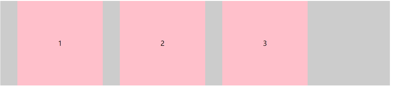
1.flex-direction - 调整主轴方向
调整主轴方向(默认为水平方向)包括
- row(主轴为水平方向,起点在左端)
- column(主轴为垂直方向,起点在上沿)
- row-reverse(主轴为水平方向,起点在右端)
- column-reverse(主轴为垂直方向,起点在下沿)
.box {
  flex-direction: row | row-reverse | column | column-reverse;
}
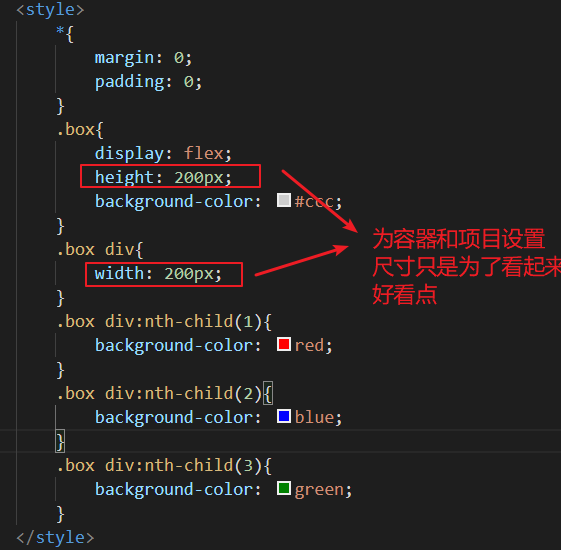
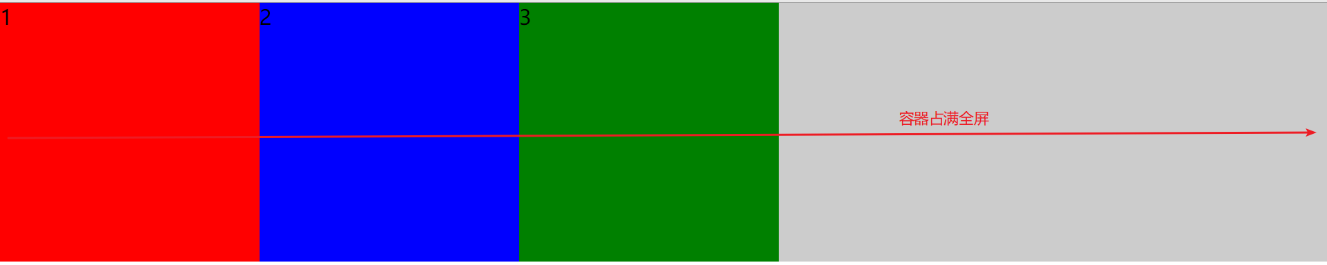
1.flex-direction : row
css代码:
.box{
	display: flex;
	/* 默认是水平排列,起点在左端 */
	flex-direction: row;
	background-color: #ccc;
}
.box div{
	width: 200px;
	height: 200px;
	text-align: center;
	line-height: 200px;
	background-color: pink;
	margin-left: 40px;
}
效果展示:
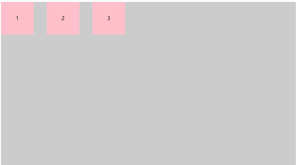
2.flex-direction : row-reverse
css代码:
.box{
	display: flex;
	/* 水平排列,起点在右端 */
	flex-direction: row-reverse;
	background-color: #ccc;
}
.box div{
	width: 200px;
	height: 200px;
	text-align: center;
	line-height: 200px;
	background-color: pink;
	margin-left: 40px;
}
效果展示:
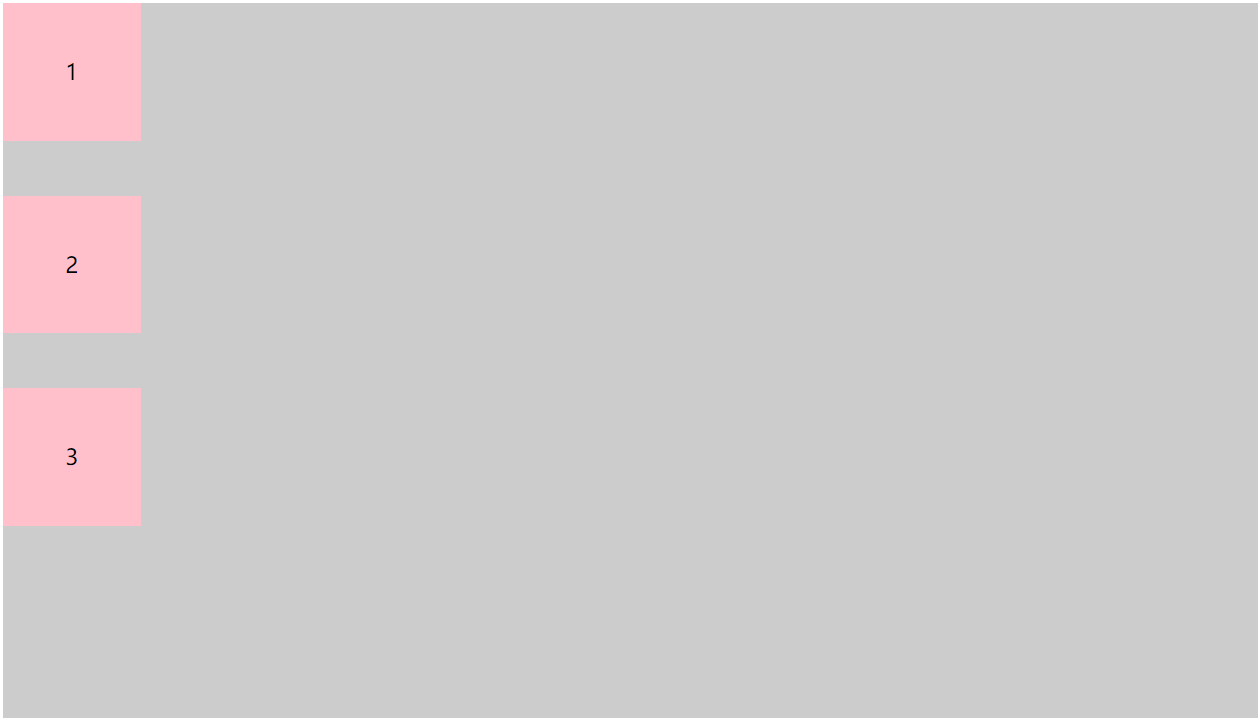
3.flex-direction : column
css代码:
.box{
	display: flex;
	/* 改变排列方向,起点在上 */
	flex-direction: column;
	background-color: #ccc;
	width: 100%;
	height: 520px;
}
.box div{
	width: 100px;
	height: 100px;
	text-align: center;
	line-height: 100px;
	background-color: pink;
}
.box div:nth-child(2)
,.box div:nth-child(3){
	margin-top: 40px;
}
效果展示:
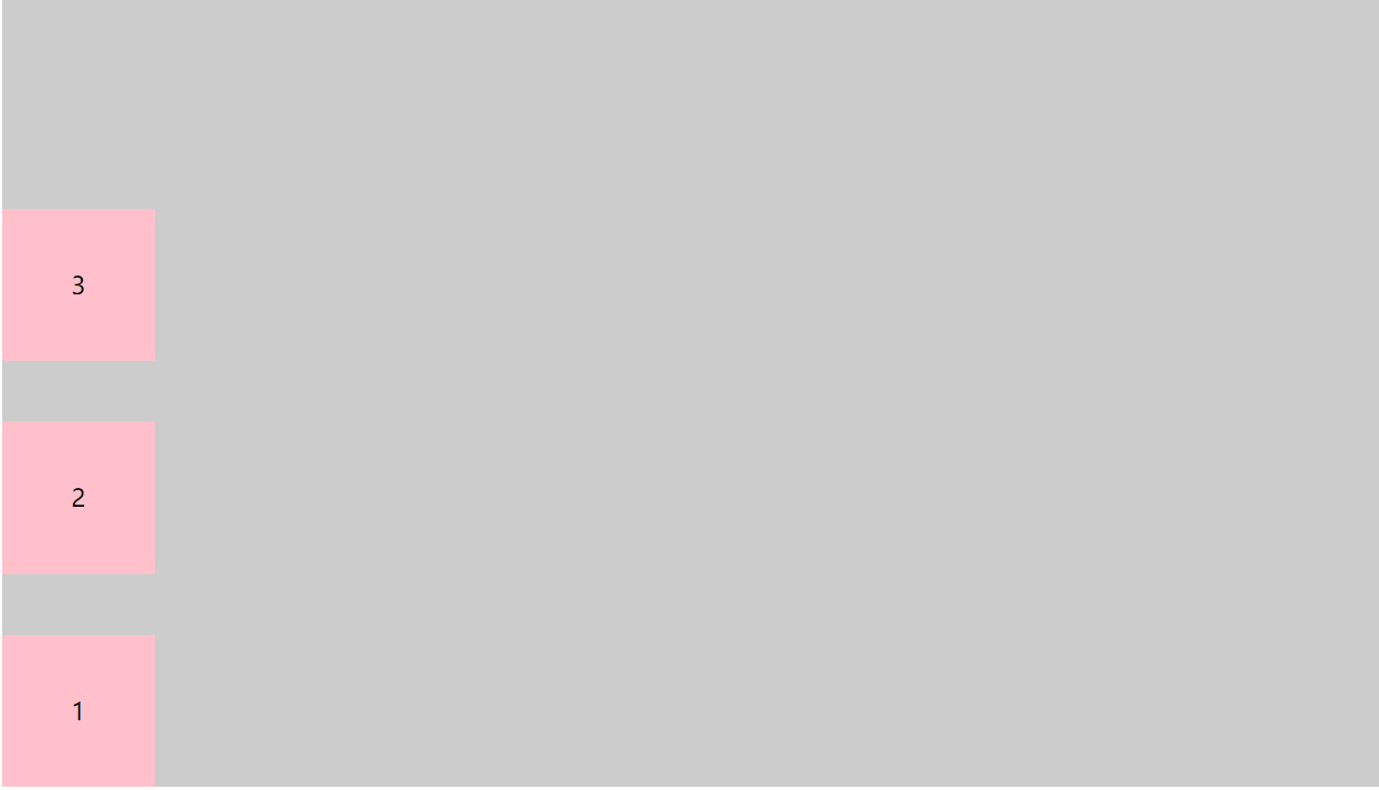
4.flex-direction : column-reverse
css代码:
.box{
	display: flex;
	/* 改变排列方向,起点在下 */
	flex-direction: column-reverse;
	background-color: #ccc;
	width: 100%;
	height: 520px;
}
.box div{
	width: 100px;
	height: 100px;
	text-align: center;
	line-height: 100px;
	background-color: pink;
}
.box div:nth-child(2)
,.box div:nth-child(3){
	margin-bottom: 40px;
}
效果展示:
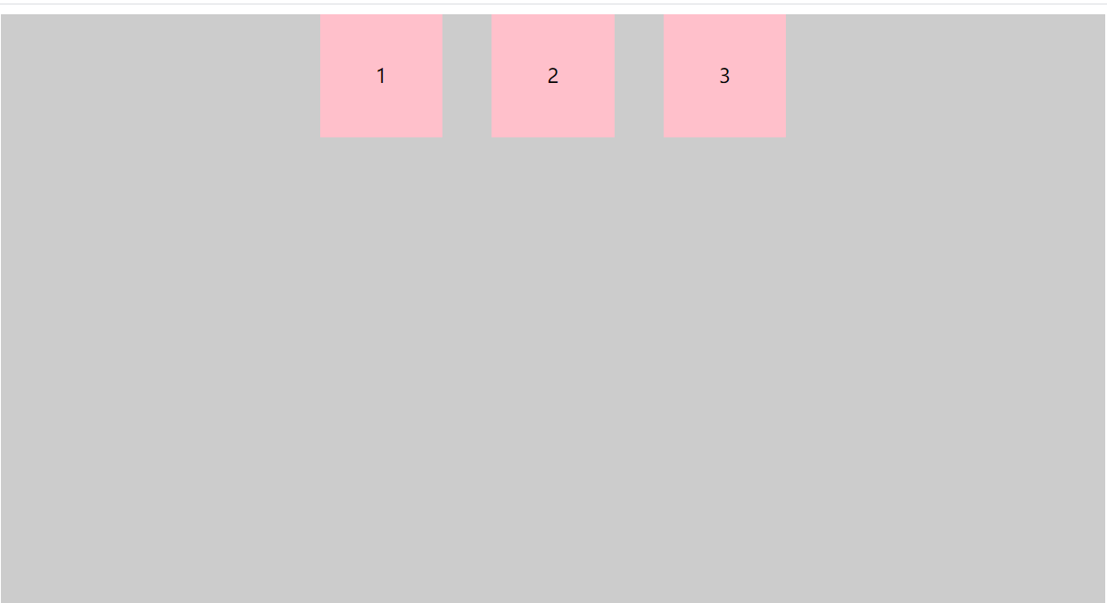
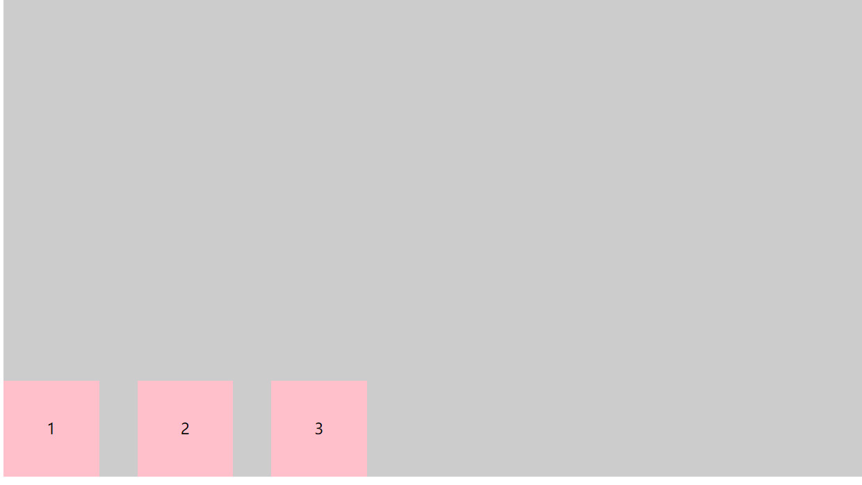
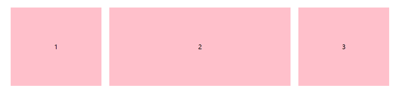
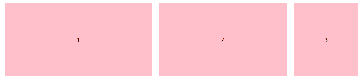
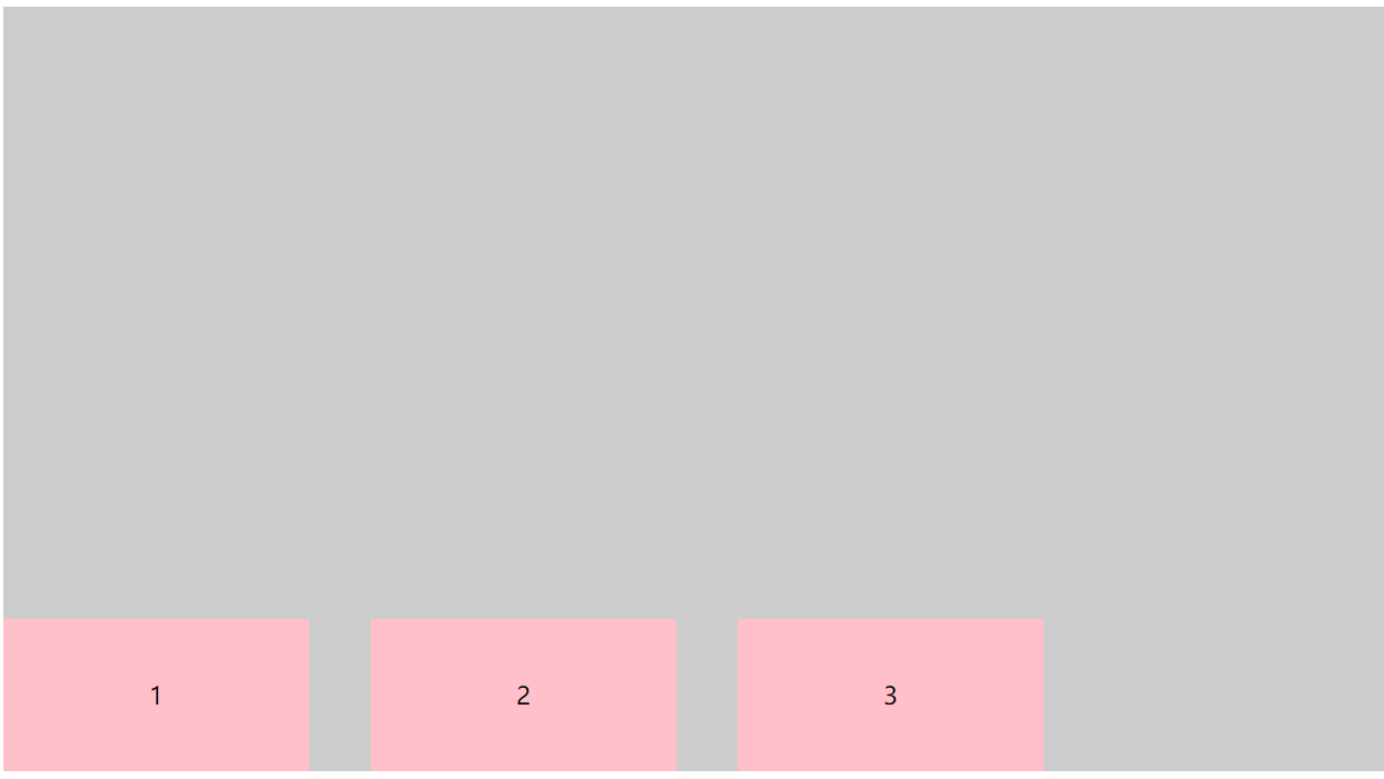
2.justify-content - 调整主轴方向对齐方式
主轴方向对齐,可以调整元素在主轴方向上的对齐方式,包括
- flex-start - 起始点对齐
- flex-end - 终止点对齐
- center - 居中对齐
- space-around - 四周环绕
- space-between - 两端对齐
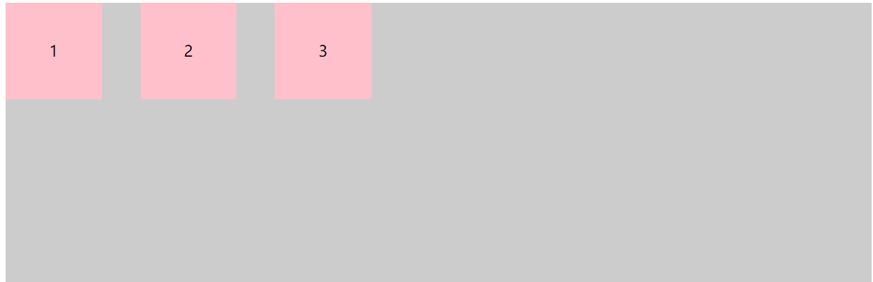
1.justify-content : flex-start
css代码:
.box {
	display: flex;
	/* 起始点对齐 */
	justify-content: flex-start;
	background-color: #ccc;
	width: 100%;
	height: 500px;
}

.box div {
	width: 100px;
	height: 100px;
	text-align: center;
	line-height: 100px;
	background-color: pink;
}

.box div:nth-child(2),
.box div:nth-child(3) {
	margin-left: 40px;
}
效果展示:
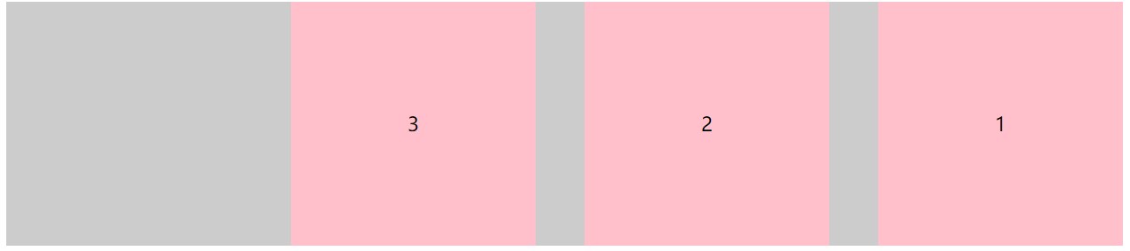
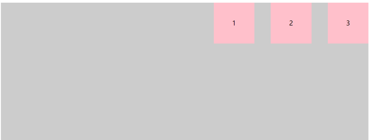
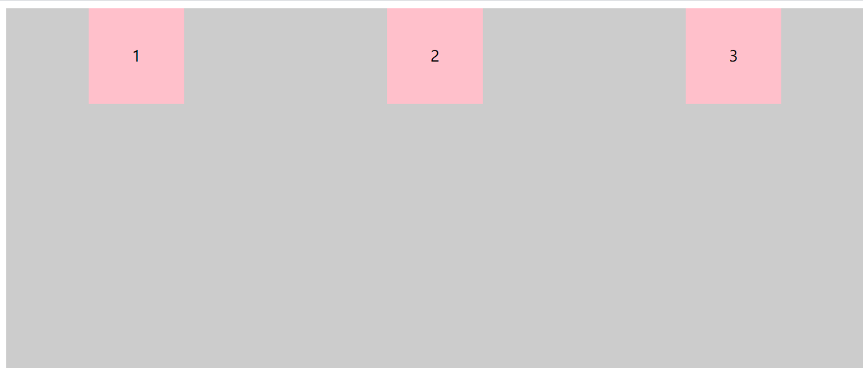
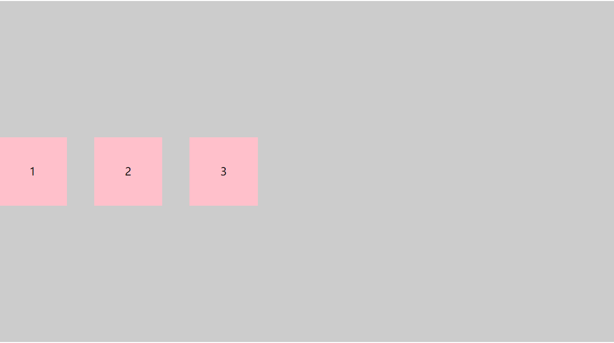
2.justify-content : flex-end
css代码:
.box {
	display: flex;
	/* 终止点对齐 */
	justify-content: flex-end;
	background-color: #ccc;
	width: 100%;
	height: 500px;
}

.box div {
	width: 100px;
	height: 100px;
	text-align: center;
	line-height: 100px;
	background-color: pink;
}

.box div:nth-child(2),
.box div:nth-child(3) {
	margin-left: 40px;
}
效果展示:
3.justify-content : center
css代码:
.box {
	display: flex;
	/* 居中对齐 */
	justify-content: center;
	background-color: #ccc;
	width: 100%;
	height: 500px;
}

.box div {
	width: 100px;
	height: 100px;
	text-align: center;
	line-height: 100px;
	background-color: pink;
}

.box div:nth-child(2),
.box div:nth-child(3) {
	margin-left: 40px;
}
效果展示:
4.justify-content : space-around
css代码:
.box {
	display: flex;
	/* 四周环绕 */
	justify-content: space-around;
	background-color: #ccc;
	width: 100%;
	height: 500px;
}

.box div {
	width: 100px;
	height: 100px;
	text-align: center;
	line-height: 100px;
	background-color: pink;
}

.box div:nth-child(2),
.box div:nth-child(3) {
	margin-left: 40px;
}
效果展示:
5.justify-content : space-between
css代码:
.box {
	display: flex;
	/* 两端对齐 */
	justify-content: space-between;
	background-color: #ccc;
	width: 100%;
	height: 500px;
}

.box div {
	width: 100px;
	height: 100px;
	text-align: center;
	line-height: 100px;
	background-color: pink;
}

.box div:nth-child(2),
.box div:nth-child(3) {
	margin-left: 40px;
}
效果展示:
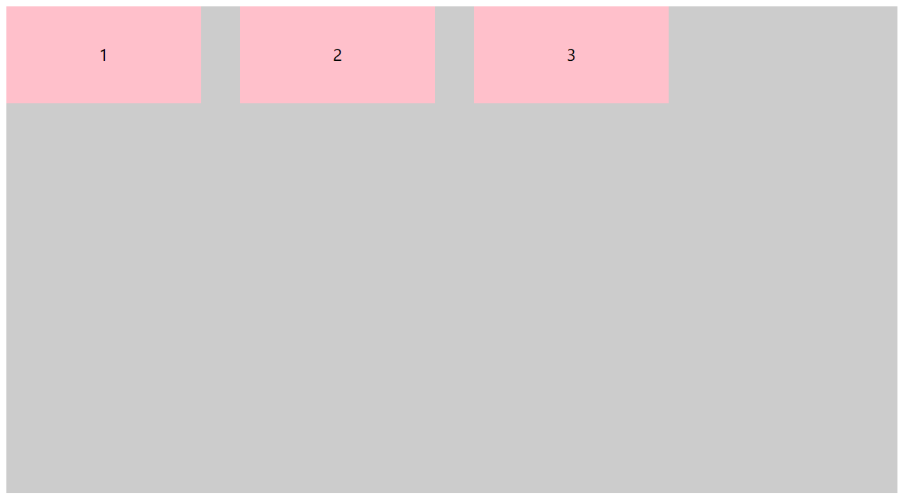
3.align-items - 调整侧轴方向对齐方式
调整侧轴方向对齐方式,包括:
- flex-start - 侧轴起始点对齐
- flex-end - 侧轴终止点对齐
- center - 侧轴居中对齐
- stretch - 拉伸项目
1.align-items : flex-start
css代码:
.box {
	display: flex;
	/* 侧轴起始点对齐 */
	align-items: flex-start;
	background-color: #ccc;
	width: 100%;
	height: 500px;
}

.box div {
	width: 100px;
	height: 100px;
	text-align: center;
	line-height: 100px;
	background-color: pink;
}

.box div:nth-child(2),
.box div:nth-child(3) {
	margin-left: 40px;
}
效果展示:
2.align-items : flex-end;
css代码:
.box {
	display: flex;
	/* 侧轴终点点对齐 */
	align-items: flex-end;
	background-color: #ccc;
	width: 100%;
	height: 500px;
}

.box div {
	width: 100px;
	height: 100px;
	text-align: center;
	line-height: 100px;
	background-color: pink;
}

.box div:nth-child(2),
.box div:nth-child(3) {
	margin-left: 40px;
}
效果展示:
3.align-items : center;
css代码:
.box {
	display: flex;
	/* 侧轴居中对齐 */
	align-items: center;
	background-color: #ccc;
	width: 100%;
	height: 500px;
}

.box div {
	width: 100px;
	height: 100px;
	text-align: center;
	line-height: 100px;
	background-color: pink;
}

.box div:nth-child(2),
.box div:nth-child(3) {
	margin-left: 40px;
}
效果展示:
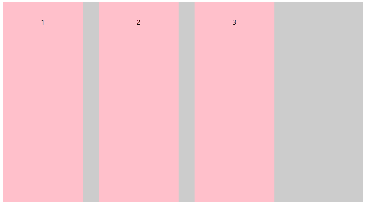
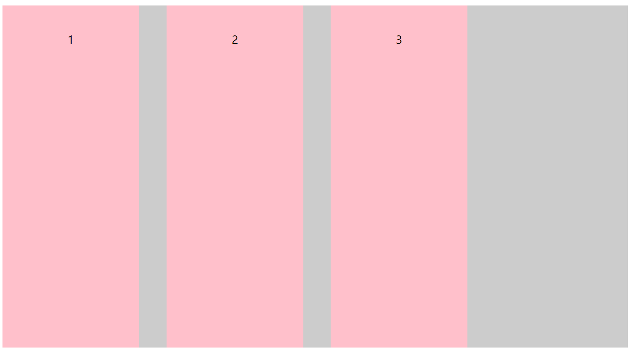
4.align-items : stretch;
注意:弹性盒子侧轴为水平,如果其项目没有宽度,则会拉伸至弹性盒子一样的宽,如果侧轴为垂直,如果其项目没有高度,则会拉伸至弹性弹性盒子一样高
css代码:
.box {
	display: flex;
	/* 拉伸项目 */
	align-items: stretch;
	background-color: #ccc;
	width: 100%;
	height: 500px;
}
/** 默认值,项目被拉伸以适应容器
	 * 让子元素的高度拉伸适用父容器
	 * 子元素不给高度的前提下 */
.box div {
	width: 100px;
	text-align: center;
	line-height: 100px;
	background-color: pink;
}

.box div:nth-child(2),
.box div:nth-child(3) {
	margin-left: 40px;
}
效果展示:
注意:
下面3个方法的css代码都是基于此html代码所设计样式:
<div class="box">
    <div>1</div>
    <div>2</div>
    <div>3</div>
    <div>4</div>
	<div>5</div>
	<div>6</div>
	<div>7</div>
	<div>8</div>
	<div>9</div>
	<div>10</div>
</div>
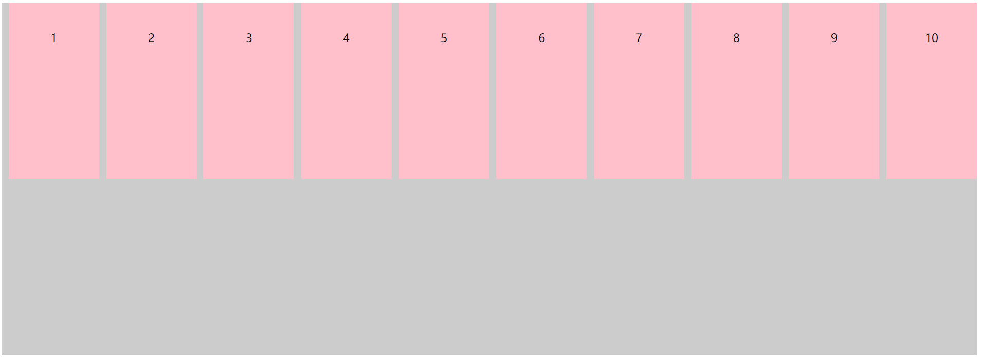
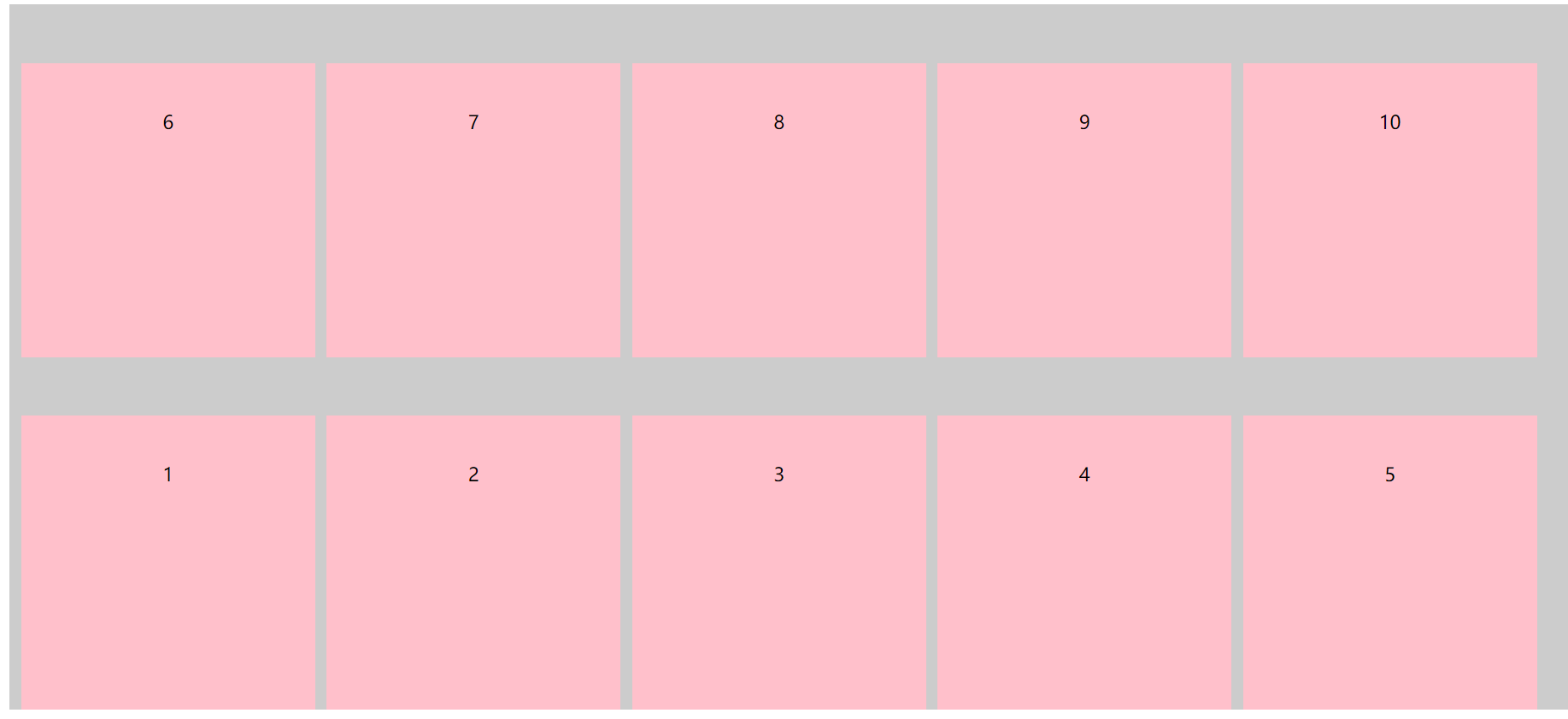
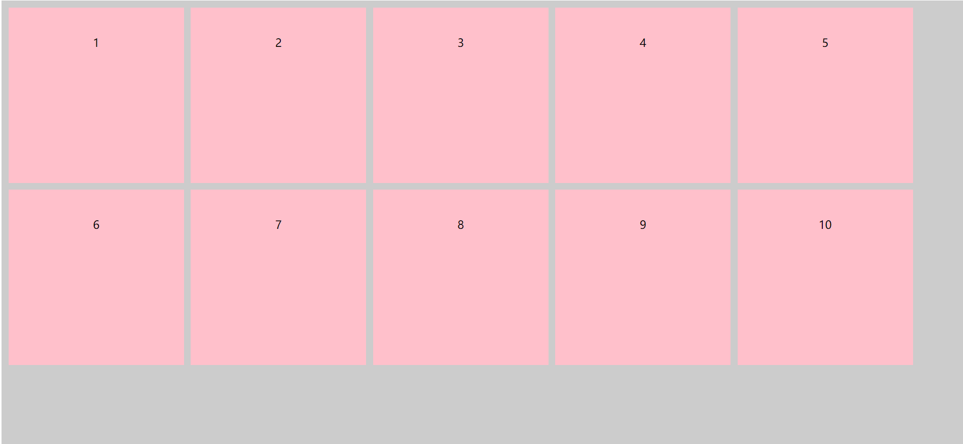
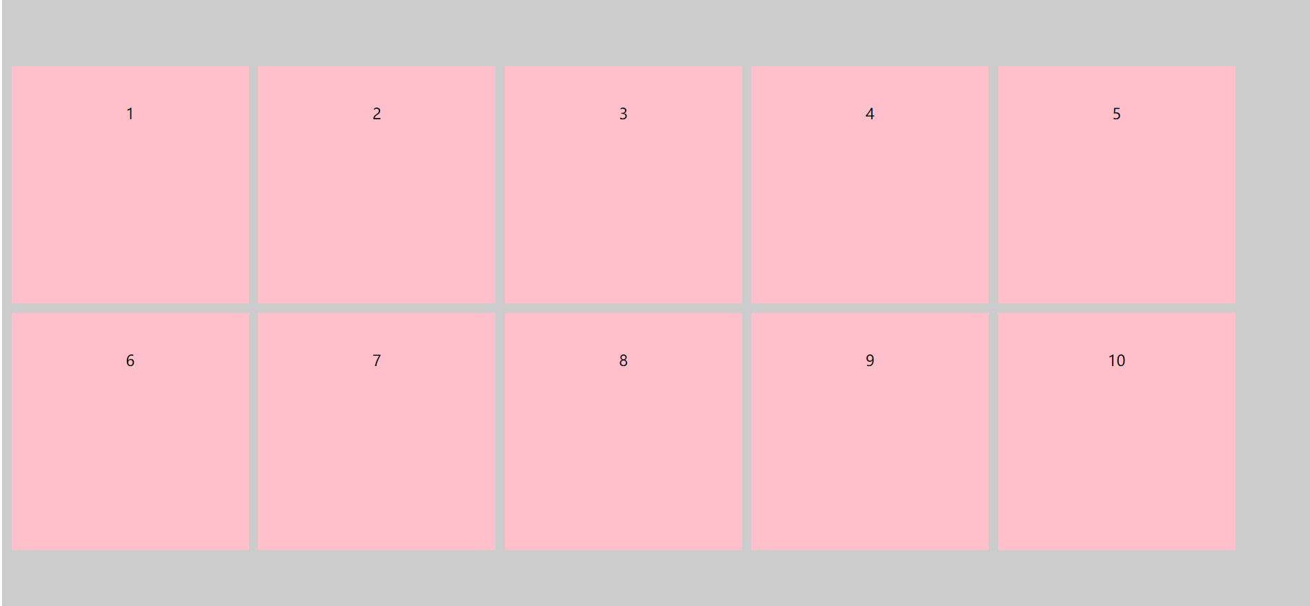
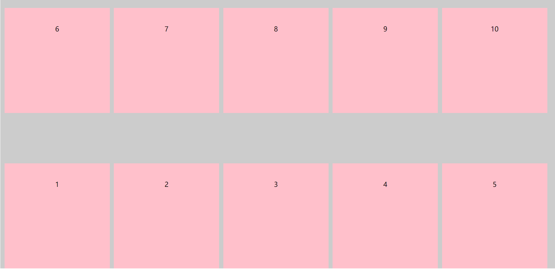
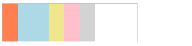
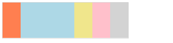
4.flex-wrap - 控制是否换行
控制是否换行,包括:
- nowrap - 不换行
- wrap - 自动换行
- wrap-reverse - 在反方向,自动换行
1.flex-wrap : nowrap
css代码:
.box {
	display: flex;
	/* 不换行,默认是不换行 */
	flex-wrap: nowrap;
	background-color: #ccc;
	width: 100%;
	height: 500px;
}

.box div {
	width: 200px;
	height: 250px;
	text-align: center;
	line-height: 100px;
	background-color: pink;
	margin-left: 10px;
}
效果展示:
2.flex-wrap : wrap
css代码:
.box {
	display: flex;
	/* 当内容超出父盒子的宽度换行 */
	flex-wrap: wrap;
	background-color: #ccc;
	width: 100%;
	height: 600px;
}

.box div {
	width: 250px;
	height: 250px;
	text-align: center;
	line-height: 100px;
	background-color: pink;
	margin-left: 10px;
	margin-top: 10px;
}
效果展示:
3.flex-wrap : wrap-reverse
css代码:
.box {
	display: flex;
	/* 反向进行换行 */
	flex-wrap: wrap-reverse;
	background-color: #ccc;
	width: 100%;
	height: 600px;
}

.box div {
	width: 250px;
	height: 250px;
	text-align: center;
	line-height: 100px;
	background-color: pink;
	margin-left: 10px;
	margin-top: 10px;
}
效果展示:
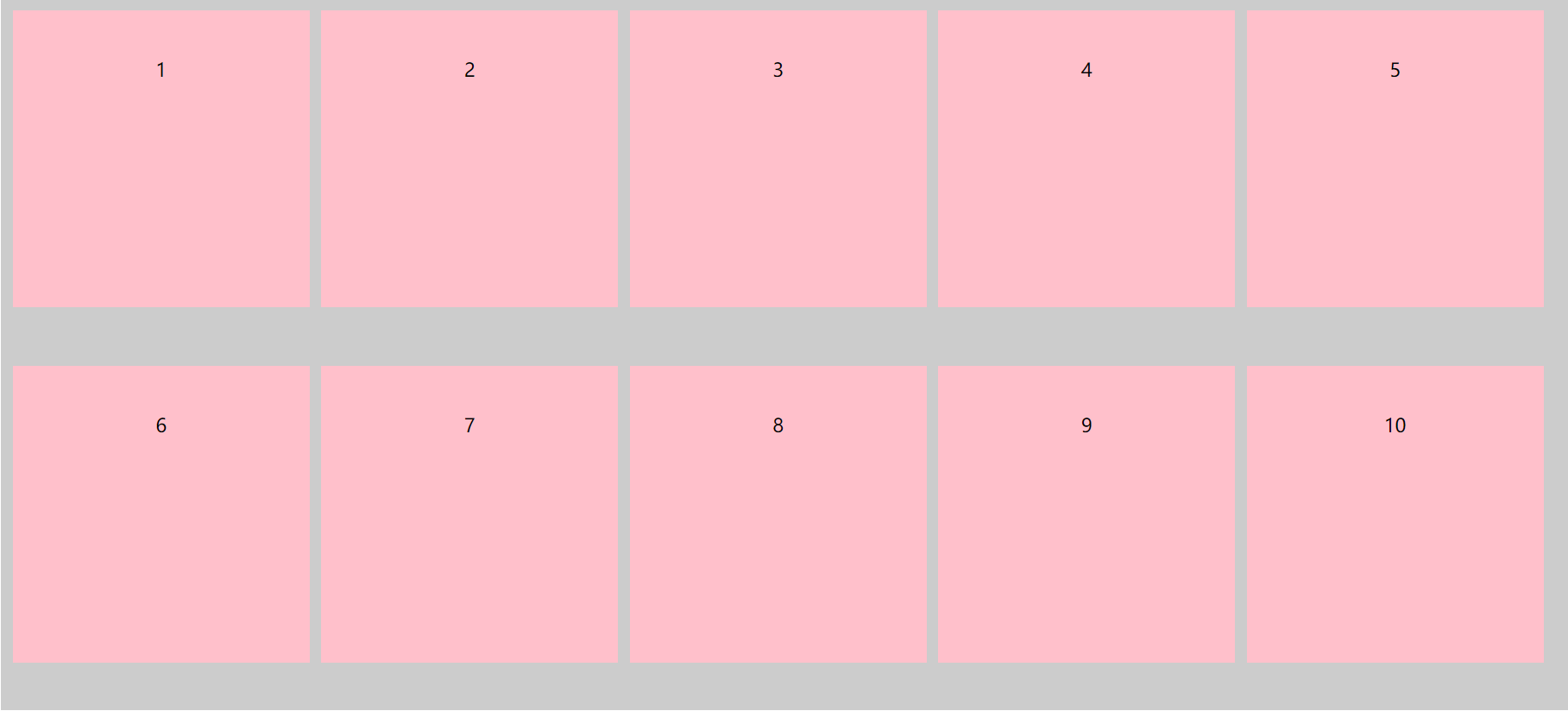
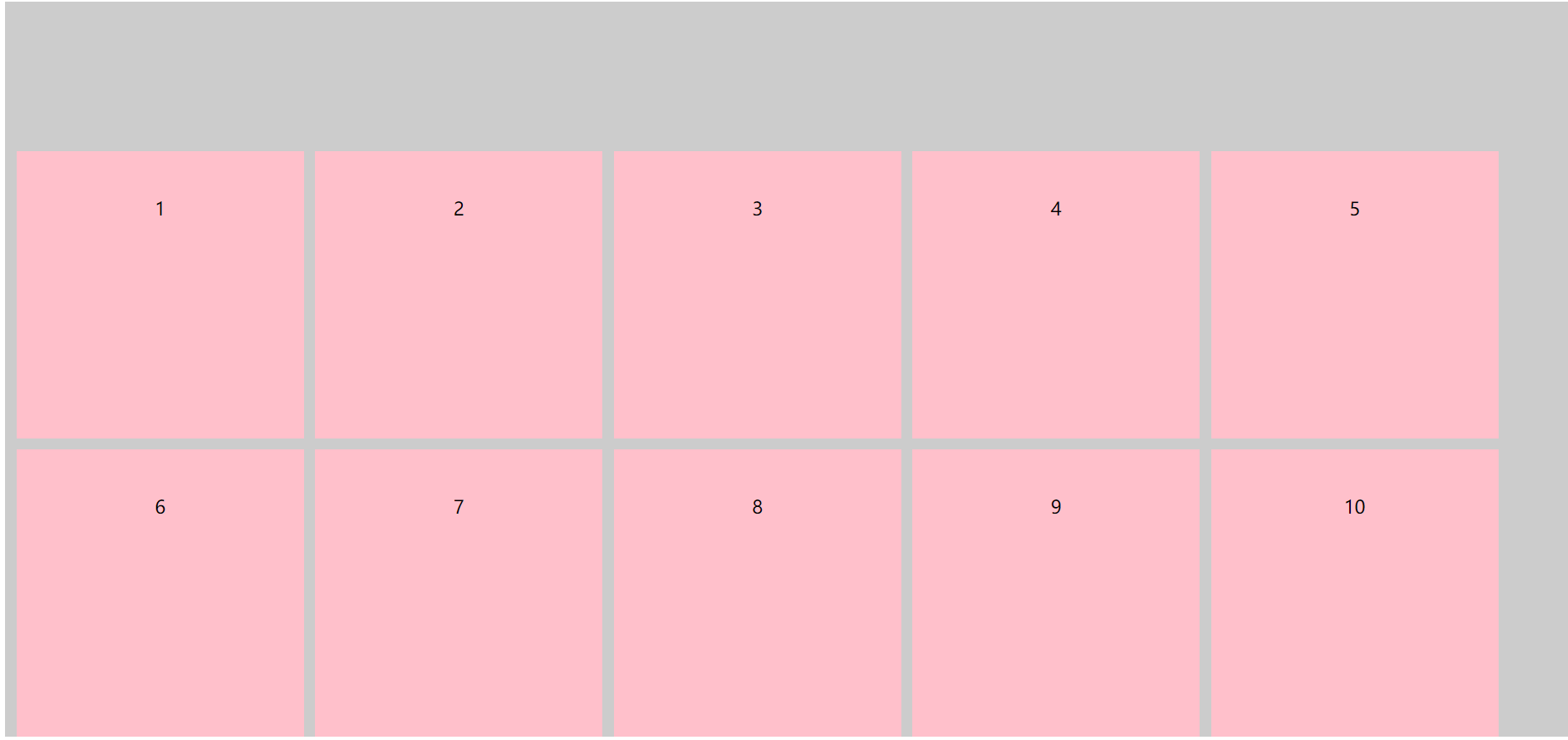
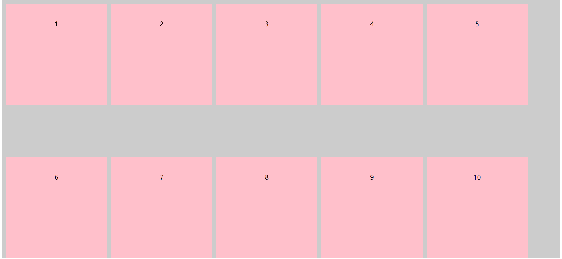
5.align-content - 堆栈排列
堆栈排列,可对应用flex-wrap: wrap后产生的换行进行控制,包括:
- flex-start - 起始点对齐
- flex-end - 终止点对齐
- center - 居中对齐
- space-between - 两端对齐
- **space-around - 四周环绕 **
- stretch - 拉伸
1.align-content : flex-start
css代码:
.box {
	display: flex;
	/* 当内容超出父盒子的宽度换行 */
	flex-wrap: wrap;
	/* 起始点对齐 */
	align-content: flex-start;
	background-color: #ccc;
	width: 100%;
	height: 640px;
}

.box div {
	width: 250px;
	height: 250px;
	text-align: center;
	line-height: 100px;
	background-color: pink;
	margin-left: 10px;
	margin-top: 10px;
}
演示代码:
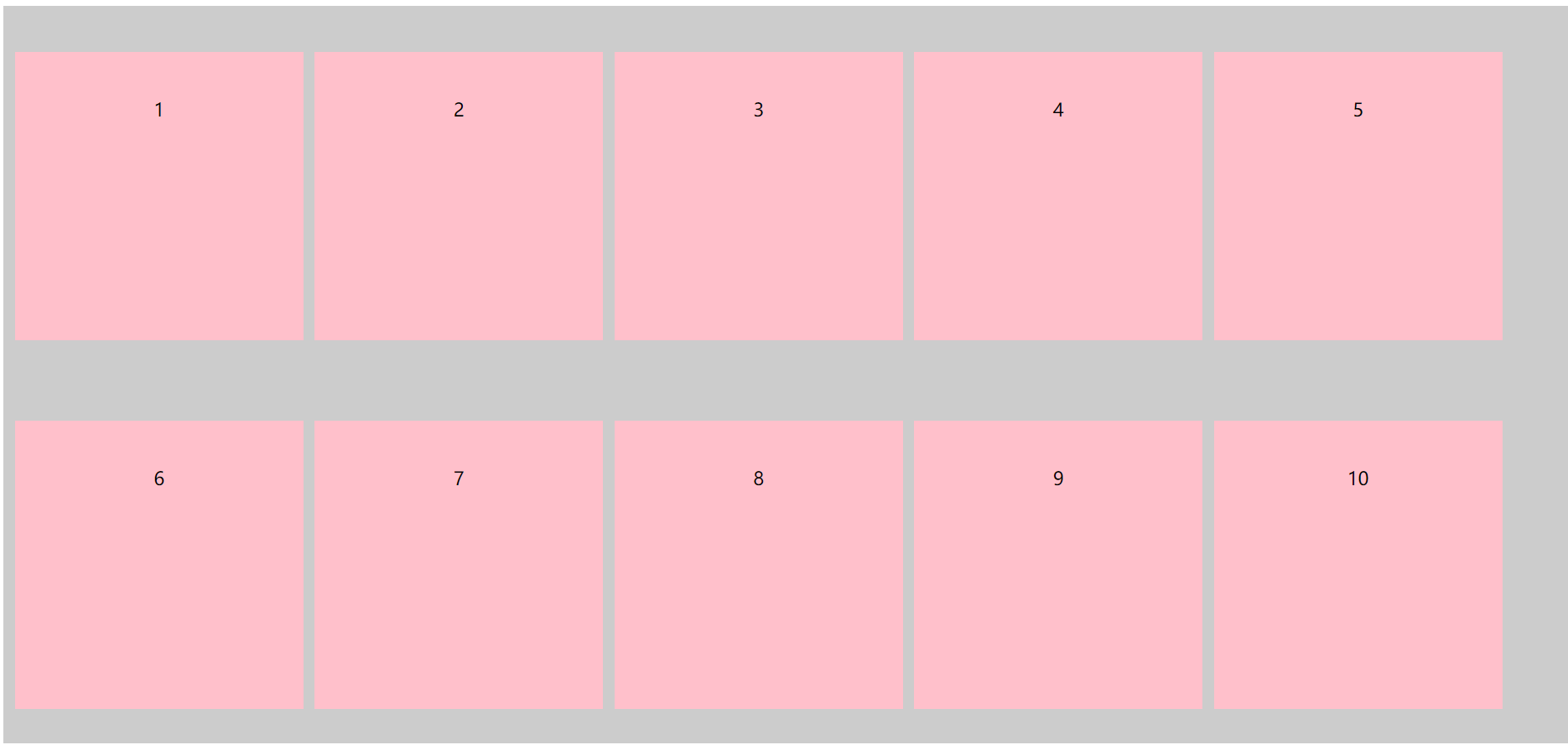
2.align-content : flex-end
css代码:
.box {
	display: flex;
	/* 当内容超出父盒子的宽度换行 */
	flex-wrap: wrap;
	/* 终点对齐 */
	align-content: flex-end;
	background-color: #ccc;
	width: 100%;
	height: 640px;
}

.box div {
	width: 250px;
	height: 250px;
	text-align: center;
	line-height: 100px;
	background-color: pink;
	margin-left: 10px;
	margin-top: 10px;
}
演示代码:
3.align-content : center
css代码:
.box {
	display: flex;
	/* 当内容超出父盒子的宽度换行 */
	flex-wrap: wrap;
	/* 居中对齐 */
	align-content: center;
	background-color: #ccc;
	width: 100%;
	height: 640px;
}

.box div {
	width: 250px;
	height: 250px;
	text-align: center;
	line-height: 100px;
	background-color: pink;
	margin-left: 10px;
	margin-top: 10px;
}
演示代码:
4.align-content : space-between
css代码:
.box {
	display: flex;
	/* 当内容超出父盒子的宽度换行 */
	flex-wrap: wrap;
    /* 两端对齐 */
	align-content: space-between;
	background-color: #ccc;
	width: 100%;
	height: 640px;
}

.box div {
	width: 250px;
	height: 250px;
	text-align: center;
	line-height: 100px;
	background-color: pink;
	margin-left: 10px;
	margin-top: 10px;
}
演示代码:
5.align-content : space-around
css代码:
.box {
	display: flex;
	/* 当内容超出父盒子的宽度换行 */
	flex-wrap: wrap;
    /* 两端对齐 */
	align-content: space-between;
	background-color: #ccc;
	width: 100%;
	height: 640px;
}

.box div {
	width: 250px;
	height: 250px;
	text-align: center;
	line-height: 100px;
	background-color: pink;
	margin-left: 10px;
	margin-top: 10px;
}
演示代码:
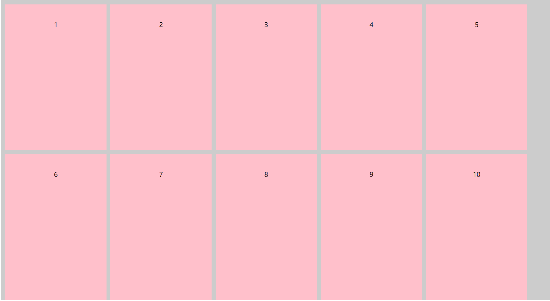
6.align-content : stretch
css代码:
.box {
	display: flex;
	/* 当内容超出父盒子的宽度换行 */
	flex-wrap: wrap;
    /* 拉伸 */
	align-content: stretch;
	background-color: #ccc;
	width: 100%;
	height: 640px;
}

.box div {
	width: 250px;
	/* height: 250px; */
	text-align: center;
	line-height: 100px;
	background-color: pink;
	margin-left: 10px;
	margin-top: 10px;
}
演示代码:
6.flex-flow: flex-direction和flex-wrap的简写形式
flex-direction和flex-wrap的简写形式,可以同时使用flex-direction和flex-wrap里面的属性方法
css代码:
.box {
	display: flex;
	/* 前面是flex-direction方法里面的row属性 默认是水平排列,起点在左端
	   后面是flex-wrap方法里面的wrap-reverse属性 反向进行换行*/
	flex-flow: row wrap-reverse;
	background-color: #ccc;
	width: 100%;
	height: 740px;
}

.box div {
	width: 250px;
	height: 250px;
	text-align: center;
	line-height: 100px;
	background-color: pink;
	margin-left: 10px;
	margin-top: 10px;
}
演示代码:
7.flex - 控制子元素伸缩比例
控制子元素伸缩比例
flex121
flex21
8.align-self - 同align-items可覆盖父元素设置的algin-items
同align-items可覆盖父元素设置的algin-items,包括:
- flex-start - 起始点对齐
- flex-end - 终止点对齐
- center - 居中对齐
- stretch - 拉伸项目
html代码:
<div class="box">
    <div>1</div>
	<div>2</div>
	<div>3</div>
</div>
1.align-items : flex-start
.box {
	display: flex;
	/* 侧轴终点点对齐 */
	align-items: flex-end;
	background-color: #ccc;
	width: 100%;
	height: 500px;
}

.box div {
	/* 侧轴终点点对齐 */
	align-self: flex-end;
	width: 200px;
	/* height: 100px; */
	text-align: center;
	line-height: 100px;
	background-color: pink;
}

.box div:nth-child(2),
.box div:nth-child(3) {
	margin-left: 40px;
}
代码演示:
2.align-items : flex-end
.box {
	display: flex;
	/* 侧轴起始点对齐 */
	align-items: flex-start;
	background-color: #ccc;
	width: 100%;
	height: 500px;
}

.box div {
	/* 侧轴终点点对齐 */
	align-self: flex-end;
	width: 200px;
	/* height: 100px; */
	text-align: center;
	line-height: 100px;
	background-color: pink;
}

.box div:nth-child(2),
.box div:nth-child(3) {
	margin-left: 40px;
}
代码演示:
3.align-items : center
.box {
	display: flex;
	/* 侧轴起始点对齐 */
	align-items: flex-start;
	background-color: #ccc;
	width: 100%;
	height: 500px;
}

.box div {
	/* 侧轴居中对齐 */
	align-self: center;
	width: 200px;
	/* height: 100px; */
	text-align: center;
	line-height: 100px;
	background-color: pink;
}

.box div:nth-child(2),
.box div:nth-child(3) {
	margin-left: 40px;
}
代码演示:
4.align-items : stretch
.box {
	display: flex;
	/* 侧轴起始点对齐 */
	align-items: flex-start;
	background-color: #ccc;
	width: 100%;
	height: 500px;
}

.box div {
	/*  拉伸 */
	align-self: stretch;
	width: 200px;
	/* height: 100px; */
	text-align: center;
	line-height: 100px;
	background-color: pink;
}

.box div:nth-child(2),
.box div:nth-child(3) {
	margin-left: 40px;
}
代码演示:
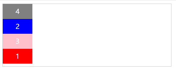
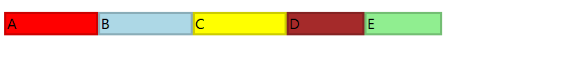
9.order - 控制子元素的顺序
控制子元素的顺序,默认 order 值越小越在排在前面。
默认的order,应该是0。因为order设置为负数的,排序在没设置order的元素之前。order越小,越靠近flex-start的位置。
html:
<div class="box">
	<div class="item">1</div>
	<div class="item">2</div>
	<div class="item">3</div>
	<div class="item">4</div>
</div>
这是默认顺序:

css代码:
.box {
    width: 400px;
    height: 150px;
    border: 1px solid #c3c3c3;
    display: flex;
    flex-direction:column;
}
.item {
    width: 70px;
    height: 36px;
    line-height:36px;
    vertical-align:center;
    color:white;
    text-align:center;
}
.item:nth-child(1){
    background:red;
    order:4;
}
.item:nth-child(2){
    background:blue;
}
.item:nth-child(3){
    background:pink;
    order:1;
}
.item:nth-child(4){
    background:gray;
    order:-1;
}
这是使用了order后的顺序:
10.flex-basis
注意: Internet Explorer 10 及更早版本浏览器不支持 flex-basis 属性。
注意: Safari 6.1 及更新版本通过 -webkit-flex-basis 属性支持该属性。
11.flex-grow
注意: Internet Explorer 10 及更早版本浏览器不支持 flex-grow 属性。
注意: Safari 6.1 及更新版本通过 -webkit-flex-grow 属性支持该属性。
12.flex-shrink
div 总宽度为 500px, flex-basic 为 120px。
A, B, C 设置 flex-shrink:1。 D , E 设置为 flex-shrink:2
D , E 宽度与 A, B, C 不同


 859
859


 被折叠的 条评论
为什么被折叠?
被折叠的 条评论
为什么被折叠?
 到【灌水乐园】发言


