


Vue Flex布局
技术概述:该技术主要用于在开发网页、app、小程序时适配不同的屏幕大小。因为我一开始没有用Flex布局,大小宽度写死,导致在真机测试时屏幕内容就偏移了原本的位置。该技术的难点在于测量组件的大小,估算出百分比。
技术详述:
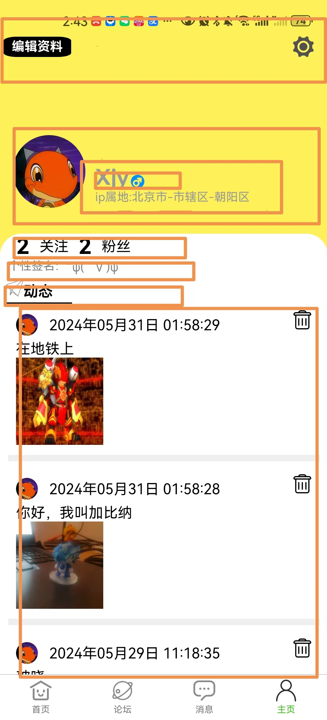
就拿我们小组的app中的个人中心页面来说
从上到下,可以将页面切割成一个一个的长方体view,说明整体看属于垂直布局,flex-direction=vertical,对于第一个矩形框,有两个按钮,是水平布局的,且水平位于长方形框的两侧,则可以设置justify-content为space-between。其中justify-content是主轴的方向,align-items是垂直于主轴的轴的方向。主轴就是flex-direction选择的方向,如图中vertical就是从上往下。以下是静态布局的代码:
<template>
	<view class="content">
		<view class="person-inform">
			<view class="" style="width: 100% ;height:14%;"></view>
			<view class="setter-area" style="width:100%;height: 10%; display: flex;flex-direction:row;justify-content: space-between;align-items: center;">
				<view class="modify-btn" @click="modifyInform" style="display: flex;align-items: center;justify-content: center;">
					编辑资料
				</view>
				<view class="setter" @tap="startSetter" style="width: 15%;height: 100%; display: flex;justify-content: center;align-items: center;">
					<image style="width: 50rpx; height: 50rpx;" src="../../static/setter.png"></image>
				</view>
			</view>
			<view class="" style="width: 100%;height: 31%;"></view>
			<view class="base-inform">
				<view class="" style="width: 30rpx;"></view>
				<view class="head-picture" style="width: 80px;height: 80px;border-radius: 50%;display: flex;align-items: center;justify-content: center;">
					<image style="width: 80px;height: 80px;border-radius: 50%;" :src="headPictureOrDefault" mode=""></image>
				</view>
				<view class="" style="width: 3%;height: 100%;"></view>
				<view class="simpleInform">
					<view class="nickname-address">
						<view class="nickname">
							<view class="">
								{{userInfo.nickname}}
							</view>
							<view class="gender">
								<image style="width: 40rpx; height: 40rpx;" :src="genderImage" mode=""></image>
							</view>
						</view>
						<view class="address">
							ip属地:{{userInfo.address}}
						</view>
					</view>

				</view>
			</view>
			<view class="concern-fan">
				<view class="" style="width: 5%;"></view>
				<view @click="onClickFocus" style="width: auto;font-size: 1.5em;font-weight: bold;">{{socialInfo.followsNum}}</view>
				<view class="" style="margin-left: 20rpx;">
					<view class="" style="width:100% ;height: 90%;" @click="onClickFocus">
						关注
					</view>
				</view>
				<view @click="onClickFans" style="width: auto;font-size: 1.5em;font-weight: bold;margin-left: 20rpx;" >{{socialInfo.fansNum}}</view>
				<view class="" style="margin-left: 20rpx;">
					<view class="" style="width: 100%;height: 90%;" @click="onClickFans">
						粉丝
					</view>
				</view>
			</view>
			<view class="signature" style="padding-left: 20rpx;">
				个性签名:<text>{{userInfo.signature}}</text>
			</view>
			<view class="state-row" style="width: 100%;height: 10%;display: flex;flex-direction: row;background-color: white;align-items: flex-start;">
				<view class="state" style="margin-left: 15rpx; ">
					<image style="width:40rpx;height: 40rpx;" src="../../static/dongtai.png" mode=""></image>
					<text style="font-weight: bold;">动态</text>
				</view>
			</view>
		</view>
		<view class="" style="width: 100%;height:1%;background-color: white"></view>
		<view class="person-history">
			<scroll-view v-if="totalPost.length>0" class="scroll-area" style="width: 100%;height: 100%;" scroll-y="true" show-scrollbar="false">
			    <view class="" v-for="(item,index) in totalPost" :key="index">
			    	<personalupdate :postContent="item.content" :headPicture="userInfo.avatarUrl" :postDetail="item" :nickName="userInfo.nickname" @deletePostSuccess="removePost"></personalupdate>
			    </view>
			</scroll-view>
			<view class="" v-if="totalPost.length==0" style="width: 100%;height: 100%;display: flex;flex-direction: column;justify-content: center;align-items: center;">
				<image src="../../static/null.png" style="width: 400rpx;height: 200rpx;" mode="widthFix"></image>
				<view class="" style="font: 30rpx;color:black">
				   快发帖让更多人了解你吧
				</view>
			</view>
		</view>
	</view>
</template>
<style>
	.content {
		display: flex;
		flex-direction: column;
		align-items: center;
		justify-content: center;
		background-color: #fef157;
		width: 100vw;
        height: 100vh;
	}
	.content .person-inform{
		display: flex;
		flex-direction: column;
		width: 100%;
		height: 45%;
		background:#fef157;
	}


	.content .person-inform .setter-area{
		width: 100%;
		height: 10%;
	}
	 .content .person-inform .setter{
		width: 10%;
	}
	.content .person-inform .modify-btn{
		width:20%;
		height: 75%;
		margin-left:10rpx;
		border:1px solid black ;
		background-color: black;
		color: white;
		border-radius: 20%;
		display: flex;
		justify-items: center;
		align-items: center;
		font-weight: bold;
		font-size:30rpx;
	}
	.content .person-inform .base-inform{
		width: 100%;
		height: 40%;
		display: flex;
		flex-direction: row;
	}
	.content .person-inform .base-inform .head-picture{

	}
	.content .person-inform .base-inform .simpleInform{
		width: auto;
		height: 100%;
		display: flex;
		flex-direction: row;
		align-items: center;
	}
	.content .person-inform .base-inform .simpleInform .nickname-address{
		display: flex;
		flex-direction: column;
		align-items: flex-start;
	    width: auto;
		position: relative;
	}
	.content .person-inform .base-inform .simpleInform .nickname-address .nickname{
		font-size: 1.5em;
		color: #999;
		font-weight: bold;
		display: flex;
	}
	.content .person-inform .base-inform .simpleInform .nickname-address .address{
		font-size: 13px;
		color: #999;
	}
	.content .person-inform .base-inform .simpleInform .nickname-address .gender{
		display: flex;
		align-items: end;
	}
	.content .person-inform .concern-fan{
		width: 100%;
		height:10% ;
		background-color: aqua;
		display: flex;
		flex-direction:row;
		font-size: 1em;
		background-color: white;
		border-radius: 50rpx 50rpx 0 0;
		flex-direction: row;
	}
	.content .person-inform .concern-fan text{
		width: 5%;
		font-size: 1.5em;
		font-weight: bold;
		text-align: center;
	}
	.content .person-inform .concern-fan view{
		width: 10%;
		height: 100%;
		display: flex;
		justify-content: center;
		align-items: center;
	}
	.content .person-inform .signature{
		width: 100%;
		height: 8%;
		background: white;
		font-size: 0.8em;
		color: gray;
		display: flex;
		justify-content: flex-start;
	}
	.content .person-inform .state-row .state{

		background: white;
		height: 95%;
		width: 20%;
		border-bottom: 2px solid black;
	}
	.content .person-history{
		background-color: white;
		width: 100%;
		height: 54%;
		display: flex;
		align-items: center;
		flex-direction: column;
	}

</style>
在编写过程中,我遇到如果一个view里面包裹一个image,应该如何让image处于view的中心的问题,之前用的是让view使用垂直布局,像三明治一样,在里面加两个view,让image夹在中间。后面发现,其实只要让view处于flex布局,再让justify-content和align-items都为center即可


 2740
2740


 被折叠的 条评论
为什么被折叠?
被折叠的 条评论
为什么被折叠?
 到【灌水乐园】发言


