


Seaborn
Matplotlib是Python主要的绘图库。但是不建议你直接使用它,原因与不推荐你使用NumPy是一样的。虽然Matplotlib很强大,它本身就很复杂,你的图经过大量的调整才能变精致。因此,作为替代推荐一开始使用Seaborn。Seaborn 是由斯坦福大学提供的一个python库,简短地描述下seaborn的优点。具体来说,它可以:
- 默认情况下就能创建赏心悦目的图表。(只有一点,默认不是jet colormap)
- 创建具有统计意义的图
- 能理解pandas的DataFrame类型,所以它们一起可以很好地工作。
Dataset
- 数据集births.csv是由National Survey of Family Growth收集了2002年到2003年期间的怀孕,家庭生活等等信息。特征如下:
prglngth – the length of the pregnancy in weeks.
birthord – which child this was for the pregnant mother.
birthwgt_lb1 – the pounds portion of the birth weight.
birthwgt_oz1 – the ounces portion of the birth weight.
agepreg – the mother’s age at the end of the pregnancy, in years.
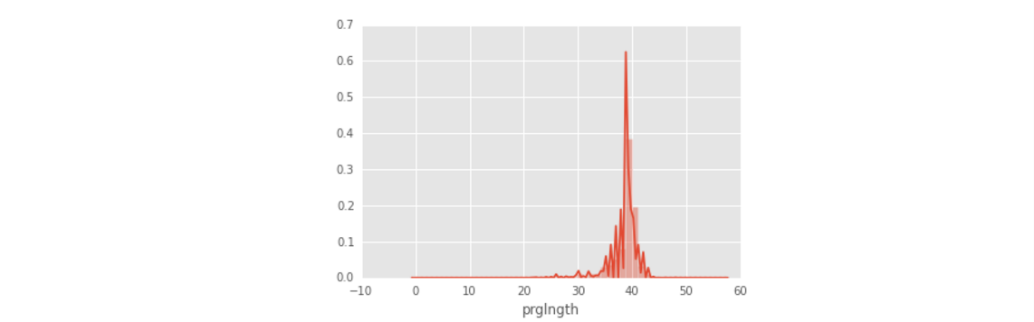
- sns.plt.show()替换掉plt.show(),在matplotlib画直方图的方法是:births.hist(‘prglngth’),而在Seaborn中的方法是:distplot(births[‘prglngth’], kde=False),当然你也可以用sns.plt.show来显示用matplotlib画的直方图。
import pandas as pd
import seaborn as sns
import matplotlib.pyplot as plt

births = pd.read_csv('births.csv')
# kde参数设置为True时表示纵轴显示的是密度
sns.distplot(births['prglngth'], kde=False)
sns.plt.show()

births.hist('prglngth')
plt.show()- 这是Seaborn的直方图,粒度较细。
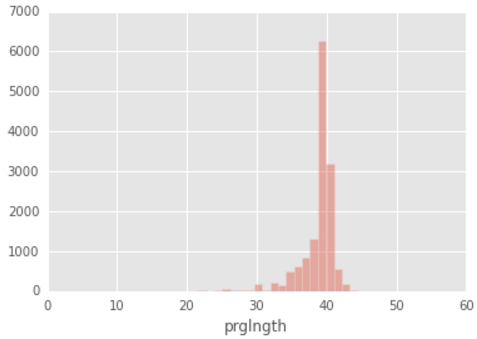
- 这是matplotlib的直方图

将kde = True
Pandas 和Seaborn都是利用Matplotlib 进行可视化,但是他们支架又有若干区别:
- 当可视化时只需要调整少量参数时用Pandas比较合适,因为它主要是用来进行数据探索而不是可视化,如果非要用Pandas 进行自定义可视化,实际上就是用底层的Matplotlib进行绘图,那么需要对Matplotlib 有很深的了解。但是如果画图时需要个性化修改一些图的属性就用Seaborn,因为Seaborn可以利用一些简单的API来直接可视化我们的数据,不用我们进行参数的理解。
- -
当用pandas进行可视化的时候,如果想要个性化某些参数,那么就需要对Matplotlib 有很深的了解,
Boxplots: Boxplot()
- 用sns画一个X轴代表第一几个孩子纵轴代表孕妇的年龄的一个盒图。
births = pd.read_csv('births.csv')
sns.boxplot(x='birthord', y='agepreg', data=births)
sns.plt.show()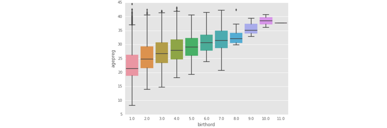
Pair Plot: Pairplot()
对于有n个属性的DataFrame,可以产生n*n个属性的比较图,也可以自己指定要比较的属性个数,然后进行两两比较。
当比较的属性是:var1 vs var2,那么就是var1 是横轴,var2是纵轴,画的是散点图。
当比较的属性是:var1 vs var1,那么画的是var1的直方图。
sns.pairplot(births[['agepreg','prglngth','birthord']])
sns.plt.show()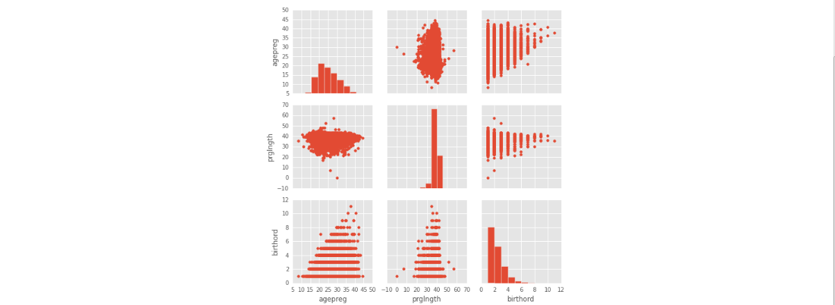


 746
746

 被折叠的 条评论
为什么被折叠?
被折叠的 条评论
为什么被折叠?
 到【灌水乐园】发言


