


CSS3 2D转换(transform)
通过 CSS3 转换,我们能够对元素进行移动、缩放、转动、拉长或拉伸。转换是使元素改变形状、尺寸和位置的一种效果。
CSS 2D具有以下转换方法:
translate() //位移
rotate() //旋转
scale() //缩放
skew() //倾斜转换
matrix() //矩阵转换
1、translate() 方法
通过 translate(x, y) 方法,元素从其当前位置移动,根据给定的 left(x 坐标) 和 top(y 坐标)位置参数x为负数:元素向右移动x像素,x为正数:元素向左移动x像素
y为负数:元素向上移动y像素,y为正数:元素向下移动y像素
实验:两个50px*50px盒子,第一个盒子位置不变,第二个盒子的位置分别往x和y轴各移动50像素
效果:

CSS代码:
div.one {
   width: 200px;
   height: 200px;
   margin: 20px auto;
   background-color: red;
  }
div.two {
   width: 200px;
   height: 200px;
   margin: 20px auto;
   background-color: red;
   transform: translate(50px,50px);
   -ms-transform: translate(50px,50px);	 /* IE 9 */
   -webkit-transform: translate(50px,50px);	/* Safari and Chrome */
   -o-transform: translate(50px,50px);	 /* Opera */
   -moz-transform: translate(50px,50px);	 /* Firefox */
}通过 rotate(deg) 方法,元素顺时针旋转给定的角度。允许负值,元素将逆时针旋转。
参数deg:旋转的角度(单位deg)
实验:两个50px*50px盒子,第一个盒子位置不变,第二个盒子顺时针旋转30度
效果:

CSS代码:
div.one {
   width: 50px;
   height: 50px;
   background-color: red;
  }
div.two {
   width: 50px;
   height: 50px;
   background-color: green;
   transform: rotate(30deg);
   -ms-transform: rotate(30deg);	 /* IE 9 */
   -webkit-transform: rotate(30deg);	/* Safari and Chrome */
   -o-transform: rotate(30deg);	 /* Opera */
   -moz-transform: rotate(30deg);	 /* Firefox */
}
3、scale() 方法
通过 scale(x, y) 方法,根据给定的缩放比例,元素的尺寸会增加或缩少。
参数 x:指定x轴缩放比例
参数 y:指定y轴缩放比例
实验:两个50px*50px盒子,第一个盒子大小不变,第二个盒子的宽和高分别缩放到原有大小的1.2倍
效果:

CSS代码:
div.one {
   width: 50px;
   height: 50px;
   background-color: red;
}
div.two {
   width: 50px;
   height: 50px;
   background-color: green;
   transform: scale(1.2, 1.2);
   -ms-transform: scale(1.2,1.2);	/* IE 9 */
   -webkit-transform: scale(1.2,1.2);	/* Safari 和 Chrome */
   -o-transform: scale(1.2,1.2);	/* Opera */
   -moz-transform: scale(1.2,1.2);	/* Firefox */
}通过 skew(x, y) 方法,元素翻转给定的角度,根据给定x轴和y轴角度
参数x: 围绕x轴翻转的角度
参数y:围绕y轴翻转的角度
实验:两个50px*50px盒子,第一个盒子不变,第二个盒子沿x轴和y轴分别翻转20度
效果:

CSS代码:
div.one {
   width: 50px;
   height: 50px;
   background-color: red;
}
  div.two {
   width: 50px;
   height: 50px;
   margin: 20px 0;
   background-color: green;
   transform: skew(20deg,20deg);
   -ms-transform: skew(20deg,20deg);	/* IE 9 */
   -webkit-transform: skew(20deg,20deg);	/* Safari and Chrome */
   -o-transform: skew(20deg,20deg);	/* Opera */
   -moz-transform: skew(20deg,20deg);	/* Firefox */
}
5、matrix方法
matrix() 方法把所有 2D 转换方法组合在一起。
matrix() 方法需要六个参数,包含数学函数,允许您:旋转、缩放、移动以及倾斜元素。
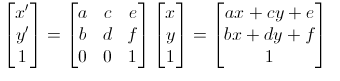
这就是矩阵的运算了,简化为公式:
x’=ax+cy+e
y’=bx+dy+f
所以给定一个matrix矩阵,通过上面的公式变换就可以得到不同的效果,这关系到计算机图形学(省略1w+字..)
css3的transform属性很好用,其实可以变换为matrix矩阵工作,只需要给abcdef附上相应的值就可以了。
比如translate(tx,ty)可以由matrix(1,0,0,1,tx,ty)转换而来,计算方法见公式
scale(sx,sy)可以由matrix(sx,0,0,sy,0,0)转变
rotate(θ)可以有matrix(cosθ,sinθ,-sinθ,cosθ,0,0)转变而来
skew(θx,θy)可以由matrix(1,tan(θy),tan(θx),1,0,0)转变过来


 扫一扫
扫一扫
 725
725

 被折叠的 条评论
为什么被折叠?
被折叠的 条评论
为什么被折叠?
 到【灌水乐园】发言


