


主要记录一些基础组件的使用
文章目录
1. selector
selector 用于解决 组件在不同状态下展示什么的问题
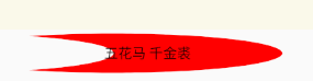
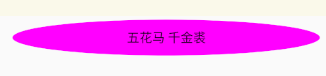
2. 组件阴影设置
android:shadowColor // 阴影颜色
android:shadowRadius // 阴影半径 从视觉效果上 值越大 阴影看起来越模糊 (3.0看起来还行)
android:shadowDx // 阴影相对于原文 在x轴偏移
android:shadowDy // y轴偏移
实际配置
  android:shadowColor="@color/purple_200"
        android:shadowRadius="3.0"
        android:shadowDx="-30"
        android:shadowDy="20"
效果

3. Button 背景颜色设置
android:background # 可设置 按下和非按下时展示的图案
android:backgroundTint # 可设置按下和非按下时展示的颜色
 android:backgroundTint="@color/btn_color"
 android:background="@drawable/btn_presess_draw"
未按下时
按下时
如果发现背景颜色设置不管用:
关于Android中Button的Backgroud背景设置默认为蓝紫色,且无法修改的问题
4. 进度条
    <ProgressBar
        android:id="@+id/pb"
        style="?android:attr/progressBarStyleHorizontal"  # 水平展示
        android:layout_width="200dp"
        android:layout_height="15dp"
        android:max="100" # 进度条最大值
        android:progress="20" #设置初始值
        android:visibility="visible"
        />
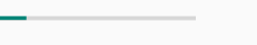
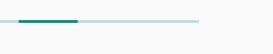
如果设置 indeterminate 为 true (不展示进度)
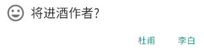
5. Dialog
  new AlertDialog.Builder(getContext())
                .setTitle("将进酒作者?")
                .setIcon(R.drawable.ic_baseline_tag_faces_24)
                .setPositiveButton("李白", new DialogInterface.OnClickListener() {
                    @Override
                    public void onClick(DialogInterface dialogInterface, int i) {
                        //
                    }
                })
                .setNegativeButton("杜甫", new DialogInterface.OnClickListener() {
                    @Override
                    public void onClick(DialogInterface dialogInterface, int i) {
                        //
                    }
                })
                .create().show();
效果
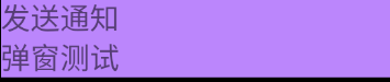
6. 弹窗底部展示
效果
View popupView = getLayoutInflater().inflate(R.layout.popup_test, null);
        PopupWindow popupWindow = new PopupWindow(popupView, ViewGroup.LayoutParams.MATCH_PARENT,
                ViewGroup.LayoutParams.WRAP_CONTENT, true);
        popupWindow.showAtLocation(root, Gravity.BOTTOM, 0, 0); // 控制底部展示
popup_test - xml
<?xml version="1.0" encoding="utf-8"?>
<android.widget.LinearLayout
    xmlns:android="http://schemas.android.com/apk/res/android"
    android:layout_width="match_parent"
    android:layout_height="match_parent"
    android:orientation="vertical"
   >

    <TextView
        android:layout_width="match_parent"
        android:layout_height="wrap_content"
        android:textSize="30sp"
        android:text="发送通知"
        android:background="@color/purple_200"
        android:backgroundTint="@color/purple_200"
        />

    <TextView
        android:layout_width="match_parent"
        android:layout_height="wrap_content"
        android:text="弹窗测试"
        android:background="@color/purple_200"
        android:backgroundTint="@color/purple_200"
        android:textSize="30sp"
        />

</android.widget.LinearLayout>
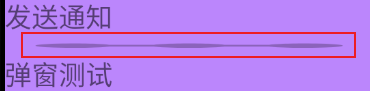
7. LinearLayout 设置分隔线
 android:divider="@drawable/ic_baseline_linear_scale_24"
 android:showDividers="middle"
效果
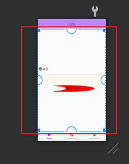
8. ConstraintLayout 设置权重
垂直方向占据剩余空间
android:layout_height="0dp"
可以看到中间组件的大小刚好充满剩余空间


 2005
2005


 被折叠的 条评论
为什么被折叠?
被折叠的 条评论
为什么被折叠?
 到【灌水乐园】发言


