


在 Android 3.0 的时候 ,我们知道可以通过 ActionBar 来创建 tab 实现导航,但是呢,不容易自定义 ,而且现在 ActionBar 被 Toolbar 取代的话,这让很多应用都抛弃了这个 ActionBar 的 tab,选择自己来写一个 tab。不过在 support v4 包中,有个PagerTitleStrip 和 PagerTabStrip,我觉得很丢脸,为何有这么丑的控件出现 ?于是在应用中我们还是选择了自己写一个 tab。今天,在 Android Design Support Library 中有个 TabLayout,可以说能得到开发者认可的控件出现了,所以我们今天来简单的探讨下这个实现。
基本用法
如何添加 tab
mTabLayout.addTab(mTabLayout.newTab().setText("Tab1"));mTabLayout.addTab(mTabLayout.newTab().setText("Tab2"));mTabLayout.addTab(mTabLayout.newTab().setText("Tab3"));
配合ViewPager使用
一般我们会配合ViewPager使用,同时本篇文章也会把 Toolbar 带上一起使用
效果是这样
既然带了 Toolbar ,我们就需要设置 Theme 为 NoActionbar ,具体见我的
上篇文章

首先我们来完成基本控制代码的编写
布局tablayout.xml
<?xml version="1.0" encoding="utf-8"?><LinearLayout xmlns:android="http://schemas.android.com/apk/res/android"xmlns:app="http://schemas.android.com/apk/res-auto"android:layout_width="match_parent"android:layout_height="match_parent"android:orientation="vertical"><android.support.v7.widget.Toolbarandroid:id="@+id/my_toolbar"android:layout_width="match_parent"android:layout_height="?android:attr/actionBarSize"android:background="@color/colorPrimary"android:elevation="4dp" /><android.support.design.widget.TabLayoutandroid:id="@+id/my_tablayout"android:layout_width="match_parent"android:layout_height="wrap_content" /><android.support.v4.view.ViewPagerandroid:id="@+id/my_viewpager"android:layout_width="match_parent"android:layout_height="match_parent" /></LinearLayout>
给 ViewPager 填充数据
mViewPager = (ViewPager) findViewById(R.id.my_viewpager);mAdapter = new MyAdapter(getSupportFragmentManager());mViewPager.setAdapter(mAdapter);
MyAdapter.java
public class MyAdapter extends FragmentPagerAdapter {public MyAdapter(FragmentManager fm) {super(fm);}@Overridepublic Fragment getItem(int position) {MyFragment fragment = MyFragment.newInstance(position);return fragment;}@Overridepublic int getCount() {return 3;}@Overridepublic CharSequence getPageTitle(int position) {return "Tab" + position;}}
MyFragment.java
public class MyFragment extends Fragment {private static final String ARG_POS = "arg_pos";public MyFragment() {}public static MyFragment newInstance(int position) {MyFragment fragment = new MyFragment();Bundle args = new Bundle();args.putInt(ARG_POS, position);fragment.setArguments(args);return fragment;}@Nullable@Overridepublic View onCreateView(LayoutInflater inflater, @Nullable ViewGroup container, @Nullable Bundle savedInstanceState) {View view = inflater.inflate(R.layout.fragment, container, false);TextView textView = (TextView) view.findViewById(R.id.fragment_tv);textView.setText("Fragment" + getArguments().getInt(ARG_POS));return view;}}
fragment.xml
<?xml version="1.0" encoding="utf-8"?><LinearLayout xmlns:android="http://schemas.android.com/apk/res/android"android:orientation="vertical" android:layout_width="match_parent"android:layout_height="match_parent"><TextViewandroid:textSize="28sp"android:gravity="center"android:id="@+id/fragment_tv"android:layout_width="match_parent"android:layout_height="match_parent" /></LinearLayout>
把 TabLayout 和 ViewPager 绑定
mTabLayout = (TabLayout) findViewById(R.id.my_tablayout);mTabLayout.setupWithViewPager(mViewPager);
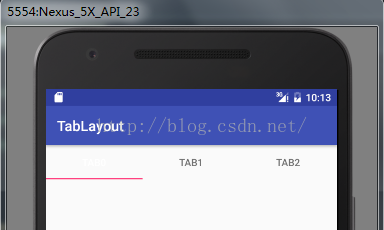
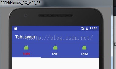
这里可以看到非常简单的一行,mTabLayout.setupWithViewPager(),这样我们滑动 ViewPager 的时候 ,TabLayout 也会随着切换 , 我们切换 TabLayout 的时候 ,ViewPager 也会随着滑动。
现在的效果是这样
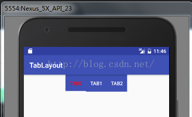
这个效果好像有点差,因为我们加入了 Toolbar 时设置了 Theme,所以现在我们需要调整个 TabLayout 的属性
<android.support.design.widget.TabLayoutandroid:id="@+id/my_tablayout"android:layout_width="match_parent"android:layout_height="wrap_content"app:tabBackground="@color/colorPrimary"app:tabIndicatorColor="@android:color/white"app:tabSelectedTextColor="#ffff0000"app:tabTextColor="#ffffffff" />
tabTextColor 是 tab 上文字的默认颜色 ,设置为白色
tabSelectedTextColor,这个是 tab 被选中的时候 文字的颜色,为了醒目我们设置了红色
tabIndicatorColor ,tab 下面的横条颜色 ,设置了白色
tabBackground ,tab 的背景色,为了配合整体的设计 ,设置了和 toolbar 颜色一致
现在看下效果

已经达到预期了
但是呢,如果我们把屏幕旋转,会发现是这样效果了
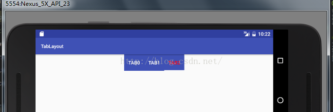
在横屏的时候 , tab 并没有填充整个屏幕的宽度,这是因为 tab 的填充方式导致的,在说填充方式之前,我们先说说 TabLayout 的两种模式
TabLayout.MODE_FIXED:意思就是 tab 数量是固定的,这也是默认的显示方式
TabLayout.MODE_SCROLLABLE:tab 数量太多,需要以滚动的形式显示
看看滚动的显示方式
首先设置滚动显示方式
mTabLayout.setTabMode(TabLayout.MODE_SCROLLABLE);
再在 MyAdapter 中 让 getCount 返回10 (如果页面过多 ,MyAdapter最好继承FragmentStatePagerAdater)
看下效果

由于 TabLayout 是继承自 HorizontalScrollView ,TabLayout 也是可以滚动的。
再看看TabLayout.Tab 的显示模式
TabLayout.GRAVITY_CENTER
TabLayout.GRAVITY_FILL
虽然说是有两种显示模式,但是这个只对TabLayout.MODE_FIXED有效
我们可以看下CENTER显示效果
FILL 效果
其它方面的思考
如果需要显示一个 icon 呢?
TabLayout.Tab.setIcon() 方法可以为 tab 添加 icon
int count = mTabLayout.getTabCount();for (int i = 0; i < count; i++) {mTabLayout.getTabAt(i).setIcon(R.mipmap.ic_launcher);}
看下效果
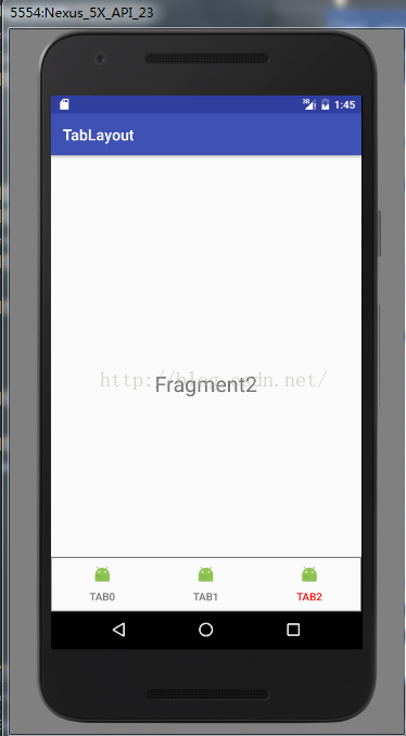
但是,我们不能为 icon 设置位置,这样看起来是不是有点别扭,如果把这个 TabLayout 放到底部是不是更舒服点,毕竟我们经常上微信摇一摇。
我们改改 tablayout 的布局以及属性,这里根布局我放在 RelativeLayout 中
<android.support.design.widget.TabLayoutandroid:id="@+id/my_tablayout"android:layout_width="match_parent"android:layout_height="wrap_content"android:layout_alignParentBottom="true"android:background="@drawable/tab_bg"app:tabIndicatorColor="@android:color/white"app:tabIndicatorHeight="0dp"app:tabSelectedTextColor="#ffff0000"app:tabTextColor="#88000000" />
tab_bg.xml
<?xml version="1.0" encoding="utf-8"?><shape xmlns:android="http://schemas.android.com/apk/res/android" android:shape="rectangle"><strokeandroid:color="#88000000"android:width="1dp" /></shape>
TabLayout 的属性中,去掉了 tabBackground 添加了 background 属性,因为我们要给整体设置效果,而不是单独的 tab 的背景,把 tabIndicatorHeight 设置为 0dp ,也就是不让 indicator 显示。
最后看起来的效果如下
不过 ,像微博样,图标会变色的,咋办,最简单的方式就是用两张 icon,我们也来简单的试试,先看看实现的效果
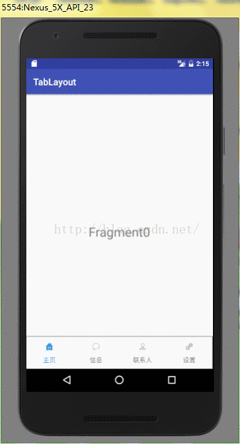
首先是tablayout 属性配置
<android.support.design.widget.TabLayoutandroid:id="@+id/my_tablayout"android:layout_width="match_parent"android:layout_height="wrap_content"android:layout_alignParentBottom="true"android:background="@drawable/tab_bg"app:tabIndicatorColor="@android:color/white"app:tabIndicatorHeight="0dp"app:tabSelectedTextColor="#2a9ff9"app:tabTextColor="#88000000" />
其次 ,默认的 icon 我们要设置上,由于 MyAdapter 中没有复写类似 getPagetIcon 的方法,所以不能在 MyAdapter 中设置默认的 icon ,需要我们自己配置
private int[] mUnselectDrawable = {R.mipmap.tab_home_unselect,R.mipmap.tab_speech_unselect, R.mipmap.tab_contact_unselect, R.mipmap.tab_more_unselect};private int[] mSelectDrawable = {R.mipmap.tab_home_select,R.mipmap.tab_speech_select, R.mipmap.tab_contact_select, R.mipmap.tab_more_select};
private int mSelectedIndex = 0;private void setupTabLayout () {int count = mTabLayout.getTabCount();for (int i = 0; i < count; i++) {if (i == mSelectedIndex) {mTabLayout.getTabAt(i).setIcon(mSelectDrawable[i]);} else {mTabLayout.getTabAt(i).setIcon(mUnselectDrawable[i]);}}}
默认 icon 配置完了,现在需要实现点击 tab 或者 滑动 ViewPager 来实现图片切换 ,我们第一时间会想到 TabLayout.setOnTabSelectedListener() 这个方法,但是这只能满足点击 tab 切换 ,那么 ViewPager 的滑动切换呢,我们再想想,前面 TabLayout.setupWithViewPager 这么方便的方法都有,那么这个 Listener 的实现也有和 ViewPager 相关的吧,确实有
mTabLayout.setOnTabSelectedListener(new TabLayout.ViewPagerOnTabSelectedListener(mViewPager){@Overridepublic void onTabSelected(TabLayout.Tab tab) {super.onTabSelected(tab);tab.setIcon(mSelectDrawable[tab.getPosition()]);}@Overridepublic void onTabUnselected(TabLayout.Tab tab) {super.onTabUnselected(tab);tab.setIcon(mUnselectDrawable[tab.getPosition()]);}@Overridepublic void onTabReselected(TabLayout.Tab tab) {super.onTabReselected(tab);}});
最后呢,我们需要为 mSelectIndex 保存值
@Overridepublic void onSaveInstanceState(Bundle outState, PersistableBundle outPersistentState) {super.onSaveInstanceState(outState, outPersistentState);outState.putInt(ARG_SELECT_INDEX, mSelectedIndex);}
在 Activity 重新创建的时候获取
@Overrideprotected void onCreate(@Nullable Bundle savedInstanceState) {super.onCreate(savedInstanceState);setContentView(R.layout.tablayout);if (savedInstanceState != null) {mSelectedIndex = savedInstanceState.getInt(ARG_SELECT_INDEX, 0);}initViews();setupTabLayout();}
ok,效果已经基本达到 ,不过呢,微信里面下面的 tab,是随着滑动 icon 的颜色和文字是渐变的,这个怎么实现呢,前面已经说过,默认带有 icon 的 tab样式是固定的,所以我们需要自己设置 tab 的 view,也就是 TabLayout.Tab.setCustomView(),我们可以自定义 View ,通过 ViewPager 的滑动监听,来动态的改变 tab 的 icon 和 text 的颜色,这里就不再做举例了。
在写上篇文章 Toolbar 取代 ActionBar 的时候 ,就想到了 ActionBar 的 Tab,在工作中,在部分应用都是自定义自己的 tab ,但是从效果上看 , TabLayout 已经完全可以达到 ,因此觉得还是有必要来写这篇文章强化下认识,如果你喜欢,可能点个赞~


 1011
1011

 被折叠的 条评论
为什么被折叠?
被折叠的 条评论
为什么被折叠?
 到【灌水乐园】发言


