


1. BFC
Block format context(BFC)表示块级格式上下文,它是CSS中的一种布局模式,用来决定块级元素如何布局以及与其他元素的关系。BFC是一个独立的布局环境,BFC内部的元素的渲染不会影响到边界以外的元素,并且BFC中的元素会按照一定的规则进行布局。
2. BFC的布局规则
- BFC中的所有元素垂直排列,即每个元素从上到下排列,元素之间的垂直距离由 margin 决定,同一个 BFC 中的相邻元素之间的 margin 会发生重叠。
- 每个块的左外边框紧贴包含块的左边框。
- 开启了BFC的元素和浮动元素不会重叠,会挨着浮动元素显示。
- BFC是一个独立的渲染区域,内部元素的布局不会影响外部元素的布局。
- 计算BFC高度时,浮动子元素也参与运算。
3. 触发BFC的方式
- HTML根元素自动触发BFC;
- 浮动的元素;
- 定位的元素,
position:absolute,position:fixed; display:inline-block/flex/table-cell-inline-flxe;overflow: hidden。
4. 利用BFC清除浮动
在元素中添加overflow:hidden;样式来清除浮动
<style type="text/css">
    .container{
        background-color: #f1f1f1;
    }
    .left{
        float: left;
    }
    .bfc{
        overflow: hidden;
    }
</style>

<div class="container bfc">
    <img src="https://profile-avatar.csdnimg.cn/default.jpg!1" class="left" style="margin-right: 10px">
    <p class="bfc">我是一段文字。。。</p>
</div>
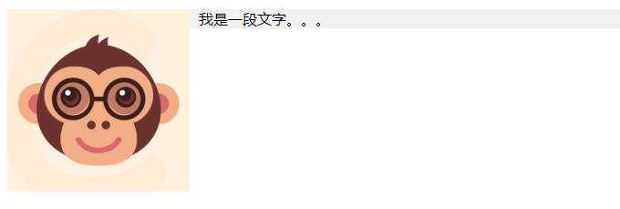
清除浮动前,图片脱离文档流
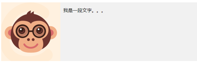
清除浮动后,图片撑开容器
5. BFC解决margin塌陷问题
<style>
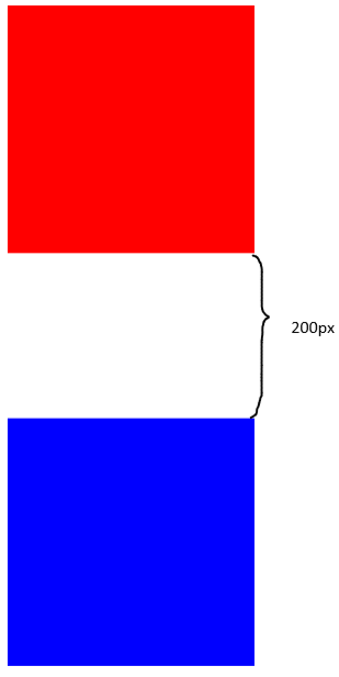
.top{width: 300px; height: 300px; background-color: red; margin-bottom: 100px}
.bottom{width: 300px; height: 300px; background-blue: red; margin-top: 200px}
</style>
<body>
<div class = "top"></div>
<div class = "bottom"></div>
</body>
因为top和bottom这两个div都存在于根html中,所以这两个div处于同一个BFC,它们之间会发生margin塌陷。两个块之间的margin距离为较大的那个margin值,即200px。
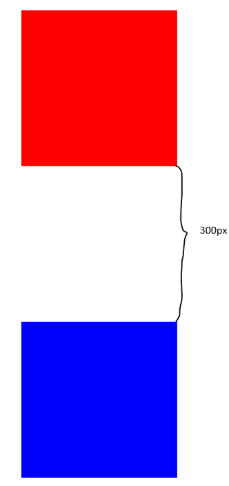
将其中一个块放入另一个开启了BFC的区域中之后,就可以解决margin塌陷问题。
<style>
	.top{width: 300px; height: 300px; background-color: red; margin-bottom: 100px}
	.bottom{width: 300px; height: 300px; background-color: blue; margin-top: 200px}
	.bfc{overflow: hidden}
</style>

<body>
	<div class = "bfc">
		<div class = "top"></div>
	</div>
	<div class = "bottom"></div>
</body>
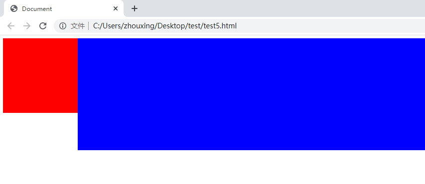
6. 利用BFC实现双栏布局
双栏布局:左边宽度固定,右边宽度自适应(随着屏幕的缩放而缩放)
<style>
	.top{background-color: red; width: 200px; height: 200px; float: left;}
	.bottom{height: 300px; background-color: blue; overflow: hidden;}
</style>

<body>
	<div class = "top"></div>
	<div class = "bottom"></div>
</body>


 1325
1325


 被折叠的 条评论
为什么被折叠?
被折叠的 条评论
为什么被折叠?
 到【灌水乐园】发言


