


以弹性方式布局子组件的容器组件。
说明:
- 该组件从API Version 7开始支持。后续版本如有新增内容,则采用上角标单独标记该内容的起始版本。
- Flex组件在渲染时存在二次布局过程,因此在对性能有严格要求的场景下建议使用Column、Row代替。
- Flex组件主轴默认不设置时撑满父容器,Column、Row组件主轴不设置时默认是跟随子节点大小。
子组件
可以包含子组件。
接口
Flex(value?: FlexOptions)
标准Flex布局容器。具体指南请参考弹性布局。
卡片能力: 从API version 9开始,该接口支持在ArkTS卡片中使用。
原子化服务API: 从API version 11开始,该接口支持在原子化服务中使用。
参数:
| 参数名 | 参数类型 | 必填 | 参数描述 |
|---|---|---|---|
| value | FlexOptions | 否 | 弹性布局子组件参数。 |
FlexOptions对象说明
| 参数名 | 参数类型 | 必填 | 默认值 | 参数描述 |
|---|---|---|---|---|
| direction | FlexDirection | 否 | FlexDirection.Row | 子组件在Flex容器上排列的方向,即主轴的方向。 |
| wrap | FlexWrap | 否 | FlexWrap.NoWrap | Flex容器是单行/列还是多行/列排列。 说明: 在多行布局时,通过交叉轴方向,确认新行堆叠方向。 |
| justifyContent | FlexAlign | 否 | FlexAlign.Start | 所有子组件在Flex容器主轴上的对齐格式。 |
| alignItems | ItemAlign | 否 | ItemAlign.Start | 所有子组件在Flex容器交叉轴上的对齐格式。 |
| alignContent | FlexAlign | 否 | FlexAlign.Start | 交叉轴中有额外的空间时,多行内容的对齐方式。仅在wrap为Wrap或WrapReverse下生效。 |
| space12+ | FlexSpaceOptions | 否 | {main:LengthMetrics.px(0), cross:LengthMetrics.px(0)} | 所有子组件在Flex容器主轴或交叉轴的space。 space为负数、百分比或者justifyContent设置为FlexAlign.SpaceBetween、FlexAlign.SpaceAround、FlexAlign.SpaceEvenly时不生效。 说明: 可选值为大于等于0的数字,或者可以转换为数字的字符串。 |
示例
示例1
// xxx.ets
@Entry
@Component
struct FlexExample1 {
  build() {
    Column() {
      Column({ space: 5 }) {
        Text('direction:Row').fontSize(9).fontColor(0xCCCCCC).width('90%')
        Flex({ direction: FlexDirection.Row }) { // 子组件在容器主轴上行布局
          Text('1').width('20%').height(50).backgroundColor(0xF5DEB3)
          Text('2').width('20%').height(50).backgroundColor(0xD2B48C)
          Text('3').width('20%').height(50).backgroundColor(0xF5DEB3)
          Text('4').width('20%').height(50).backgroundColor(0xD2B48C)
        }
        .height(70)
        .width('90%')
        .padding(10)
        .backgroundColor(0xAFEEEE)

        Text('direction:RowReverse').fontSize(9).fontColor(0xCCCCCC).width('90%')
        Flex({ direction: FlexDirection.RowReverse }) { // 子组件在容器主轴上反向行布局
          Text('1').width('20%').height(50).backgroundColor(0xF5DEB3)
          Text('2').width('20%').height(50).backgroundColor(0xD2B48C)
          Text('3').width('20%').height(50).backgroundColor(0xF5DEB3)
          Text('4').width('20%').height(50).backgroundColor(0xD2B48C)
        }
        .height(70)
        .width('90%')
        .padding(10)
        .backgroundColor(0xAFEEEE)

        Text('direction:Column').fontSize(9).fontColor(0xCCCCCC).width('90%')
        Flex({ direction: FlexDirection.Column }) { // 子组件在容器主轴上列布局
          Text('1').width('100%').height(40).backgroundColor(0xF5DEB3)
          Text('2').width('100%').height(40).backgroundColor(0xD2B48C)
          Text('3').width('100%').height(40).backgroundColor(0xF5DEB3)
          Text('4').width('100%').height(40).backgroundColor(0xD2B48C)
        }
        .height(160)
        .width('90%')
        .padding(10)
        .backgroundColor(0xAFEEEE)

        Text('direction:ColumnReverse').fontSize(9).fontColor(0xCCCCCC).width('90%')
        Flex({ direction: FlexDirection.ColumnReverse }) { // 子组件在容器主轴上反向列布局
          Text('1').width('100%').height(40).backgroundColor(0xF5DEB3)
          Text('2').width('100%').height(40).backgroundColor(0xD2B48C)
          Text('3').width('100%').height(40).backgroundColor(0xF5DEB3)
          Text('4').width('100%').height(40).backgroundColor(0xD2B48C)
        }
        .height(160)
        .width('90%')
        .padding(10)
        .backgroundColor(0xAFEEEE)
      }.width('100%').margin({ top: 5 })
    }.width('100%')
  }
}

示例2
// xxx.ets
@Entry
@Component
struct FlexExample2 {
  build() {
    Column() {
      Column({ space: 5 }) {
        Text('Wrap').fontSize(9).fontColor(0xCCCCCC).width('90%')
        Flex({ wrap: FlexWrap.Wrap }) { // 子组件多行布局
          Text('1').width('50%').height(50).backgroundColor(0xF5DEB3)
          Text('2').width('50%').height(50).backgroundColor(0xD2B48C)
          Text('3').width('50%').height(50).backgroundColor(0xD2B48C)
        }
        .width('90%')
        .padding(10)
        .backgroundColor(0xAFEEEE)

        Text('NoWrap').fontSize(9).fontColor(0xCCCCCC).width('90%')
        Flex({ wrap: FlexWrap.NoWrap }) { // 子组件单行布局
          Text('1').width('50%').height(50).backgroundColor(0xF5DEB3)
          Text('2').width('50%').height(50).backgroundColor(0xD2B48C)
          Text('3').width('50%').height(50).backgroundColor(0xF5DEB3)
        }
        .width('90%')
        .padding(10)
        .backgroundColor(0xAFEEEE)

        Text('WrapReverse').fontSize(9).fontColor(0xCCCCCC).width('90%')
        Flex({ wrap: FlexWrap.WrapReverse , direction:FlexDirection.Row }) { // 子组件反向多行布局
          Text('1').width('50%').height(50).backgroundColor(0xF5DEB3)
          Text('2').width('50%').height(50).backgroundColor(0xD2B48C)
          Text('3').width('50%').height(50).backgroundColor(0xD2B48C)
        }
        .width('90%')
        .height(120)
        .padding(10)
        .backgroundColor(0xAFEEEE)
      }.width('100%').margin({ top: 5 })
    }.width('100%')
  }
}

示例3
// xxx.ets
@Component
struct JustifyContentFlex {
  justifyContent : number = 0;

  build() {
    Flex({ justifyContent: this.justifyContent }) {
      Text('1').width('20%').height(50).backgroundColor(0xF5DEB3)
      Text('2').width('20%').height(50).backgroundColor(0xD2B48C)
      Text('3').width('20%').height(50).backgroundColor(0xF5DEB3)
    }
    .width('90%')
    .padding(10)
    .backgroundColor(0xAFEEEE)
  }
}

@Entry
@Component
struct FlexExample3 {
  build() {
    Column() {
      Column({ space: 5 }) {
        Text('justifyContent:Start').fontSize(9).fontColor(0xCCCCCC).width('90%')
        JustifyContentFlex({ justifyContent: FlexAlign.Start }) // 子组件在容器主轴上首端对齐

        Text('justifyContent:Center').fontSize(9).fontColor(0xCCCCCC).width('90%')
        JustifyContentFlex({ justifyContent: FlexAlign.Center }) // 子组件在容器主轴上居中对齐

        Text('justifyContent:End').fontSize(9).fontColor(0xCCCCCC).width('90%')
        JustifyContentFlex({ justifyContent: FlexAlign.End }) // 子组件在容器主轴上尾端对齐

        Text('justifyContent:SpaceBetween').fontSize(9).fontColor(0xCCCCCC).width('90%')
        JustifyContentFlex({ justifyContent: FlexAlign.SpaceBetween }) // 子组件在容器主轴上均分容器布局,第一个子组件与行首对齐,最后一个子组件与行尾对齐。

        Text('justifyContent:SpaceAround').fontSize(9).fontColor(0xCCCCCC).width('90%')
        JustifyContentFlex({ justifyContent: FlexAlign.SpaceAround }) // 子组件在容器主轴上均分容器布局,第一个子组件到行首的距离和最后一个子组件到行尾的距离是相邻子组件之间距离的一半。

        Text('justifyContent:SpaceEvenly').fontSize(9).fontColor(0xCCCCCC).width('90%')
        JustifyContentFlex({ justifyContent: FlexAlign.SpaceEvenly }) // 子组件在容器主轴上均分容器布局,子组件之间的距离与第一子组件到行首、最后一个子组件到行尾的距离相等
      }.width('100%').margin({ top: 5 })
    }.width('100%')
  }
}

示例4
// xxx.ets
@Component
struct AlignItemsFlex {
  alignItems : number = 0;

  build() {
    Flex({ alignItems: this.alignItems }) {
      Text('1').width('33%').height(30).backgroundColor(0xF5DEB3)
      Text('2').width('33%').height(40).backgroundColor(0xD2B48C)
      Text('3').width('33%').height(50).backgroundColor(0xF5DEB3)
    }
    .size({width: '90%', height: 80})
    .padding(10)
    .backgroundColor(0xAFEEEE)
  }
}

@Entry
@Component
struct FlexExample4 {
  build() {
    Column() {
      Column({ space: 5 }) {
        Text('alignItems:Auto').fontSize(9).fontColor(0xCCCCCC).width('90%')
        AlignItemsFlex({ alignItems: ItemAlign.Auto }) // 子组件在容器交叉轴上首部对齐

        Text('alignItems:Start').fontSize(9).fontColor(0xCCCCCC).width('90%')
        AlignItemsFlex({ alignItems: ItemAlign.Start }) // 子组件在容器交叉轴上首部对齐

        Text('alignItems:Center').fontSize(9).fontColor(0xCCCCCC).width('90%')
        AlignItemsFlex({ alignItems: ItemAlign.Center }) // 子组件在容器交叉轴上居中对齐

        Text('alignItems:End').fontSize(9).fontColor(0xCCCCCC).width('90%')
        AlignItemsFlex({ alignItems: ItemAlign.End }) // 子组件在容器交叉轴上尾部对齐

        Text('alignItems:Stretch').fontSize(9).fontColor(0xCCCCCC).width('90%')
        AlignItemsFlex({ alignItems: ItemAlign.Stretch }) // 子组件在容器交叉轴上拉伸填充

        Text('alignItems:Baseline').fontSize(9).fontColor(0xCCCCCC).width('90%')
        AlignItemsFlex({ alignItems: ItemAlign.Baseline }) // 子组件在容器交叉轴上与文本基线对齐
      }.width('100%').margin({ top: 5 })
    }.width('100%')
  }
}

示例5
// xxx.ets
@Component
struct AlignContentFlex {
  alignContent: number = 0;

  build() {
    Flex({ wrap: FlexWrap.Wrap, alignContent: this.alignContent }) {
      Text('1').width('50%').height(20).backgroundColor(0xF5DEB3)
      Text('2').width('50%').height(20).backgroundColor(0xD2B48C)
      Text('3').width('50%').height(20).backgroundColor(0xD2B48C)
    }
    .size({ width: '90%', height: 90 })
    .padding(10)
    .backgroundColor(0xAFEEEE)
  }
}

@Entry
@Component
struct FlexExample5 {
  build() {
    Column() {
      Column({ space: 5 }) {
        Text('alignContent:Start').fontSize(9).fontColor(0xCCCCCC).width('90%')
        AlignContentFlex({ alignContent: FlexAlign.Start }) // 多行布局下子组件首部对齐

        Text('alignContent:Center').fontSize(9).fontColor(0xCCCCCC).width('90%')
        AlignContentFlex({ alignContent: FlexAlign.Center }) // 多行布局下子组件居中对齐

        Text('alignContent:End').fontSize(9).fontColor(0xCCCCCC).width('90%')
        AlignContentFlex({ alignContent: FlexAlign.End }) // 多行布局下子组件尾部对齐

        Text('alignContent:SpaceBetween').fontSize(9).fontColor(0xCCCCCC).width('90%')
        AlignContentFlex({ alignContent: FlexAlign.SpaceBetween }) // 多行布局下第一行子组件与列首对齐,最后一行子组件与列尾对齐

        Text('alignContent:SpaceAround').fontSize(9).fontColor(0xCCCCCC).width('90%')
        AlignContentFlex({ alignContent: FlexAlign.SpaceAround }) // 多行布局下第一行子组件到列首的距离和最后一行子组件到列尾的距离是相邻行之间距离的一半

        Text('alignContent:SpaceEvenly').fontSize(9).fontColor(0xCCCCCC).width('90%')
        Flex({
          wrap: FlexWrap.Wrap,
          alignContent: FlexAlign.SpaceEvenly
        }) { // 多行布局下相邻行之间的距离与第一行子组件到列首的距离、最后一行子组件到列尾的距离完全一样
          Text('1').width('50%').height(20).backgroundColor(0xF5DEB3)
          Text('2').width('50%').height(20).backgroundColor(0xD2B48C)
          Text('3').width('50%').height(20).backgroundColor(0xF5DEB3)
          Text('4').width('50%').height(20).backgroundColor(0xD2B48C)
          Text('5').width('50%').height(20).backgroundColor(0xF5DEB3)
        }
        .size({ width: '90%', height: 100 })
        .padding({ left: 10, right: 10 })
        .backgroundColor(0xAFEEEE)
      }.width('100%').margin({ top: 5 })
    }.width('100%')
  }
}

示例6
import {LengthMetrics} from '@ohos.arkui.node'

@Entry
@Component
struct FlexExample2 {
  build() {
    Column() {
      Column({ space: 5 }) {
        Text('Wrap').fontSize(9).fontColor(0xCCCCCC).width('90%')
        Flex({ wrap: FlexWrap.Wrap, space: {main: LengthMetrics.px(50), cross: LengthMetrics.px(50)} }) { // 子组件多行布局
          Text('1').width('40%').height(50).backgroundColor(0xF5DEB3)
          Text('2').width('40%').height(50).backgroundColor(0xD2B48C)
          Text('3').width('40%').height(50).backgroundColor(0xD2B48C)
        }
        .width('90%')
        .padding(10)
        .backgroundColor(0xAFEEEE)

        Text('NoWrap').fontSize(9).fontColor(0xCCCCCC).width('90%')
        Flex({ wrap: FlexWrap.NoWrap, space: {main: LengthMetrics.px(50), cross: LengthMetrics.px(50)} }) { // 子组件单行布局
          Text('1').width('50%').height(50).backgroundColor(0xF5DEB3)
          Text('2').width('50%').height(50).backgroundColor(0xD2B48C)
          Text('3').width('50%').height(50).backgroundColor(0xF5DEB3)
        }
        .width('90%')
        .padding(10)
        .backgroundColor(0xAFEEEE)

        Text('WrapReverse').fontSize(9).fontColor(0xCCCCCC).width('90%')
        Flex({ wrap: FlexWrap.WrapReverse, direction:FlexDirection.Row, space: {main: LengthMetrics.px(50), cross: LengthMetrics.px(50)} }) { // 子组件反向多行布局
          Text('1').width('40%').height(50).backgroundColor(0xF5DEB3)
          Text('2').width('40%').height(50).backgroundColor(0xD2B48C)
          Text('3').width('40%').height(50).backgroundColor(0xD2B48C)
        }
        .width('90%')
        .height(120)
        .padding(10)
        .backgroundColor(0xAFEEEE)
      }.width('100%').margin({ top: 5 })
    }.width('100%')
  }
}

最后
有很多小伙伴不知道学习哪些鸿蒙开发技术?不知道需要重点掌握哪些鸿蒙应用开发知识点?而且学习时频繁踩坑,最终浪费大量时间。所以有一份实用的鸿蒙(HarmonyOS NEXT)资料用来跟着学习是非常有必要的。
点击→【纯血版鸿蒙全套最新学习资料】希望这一份鸿蒙学习资料能够给大家带来帮助!~
鸿蒙(HarmonyOS NEXT)最新学习路线
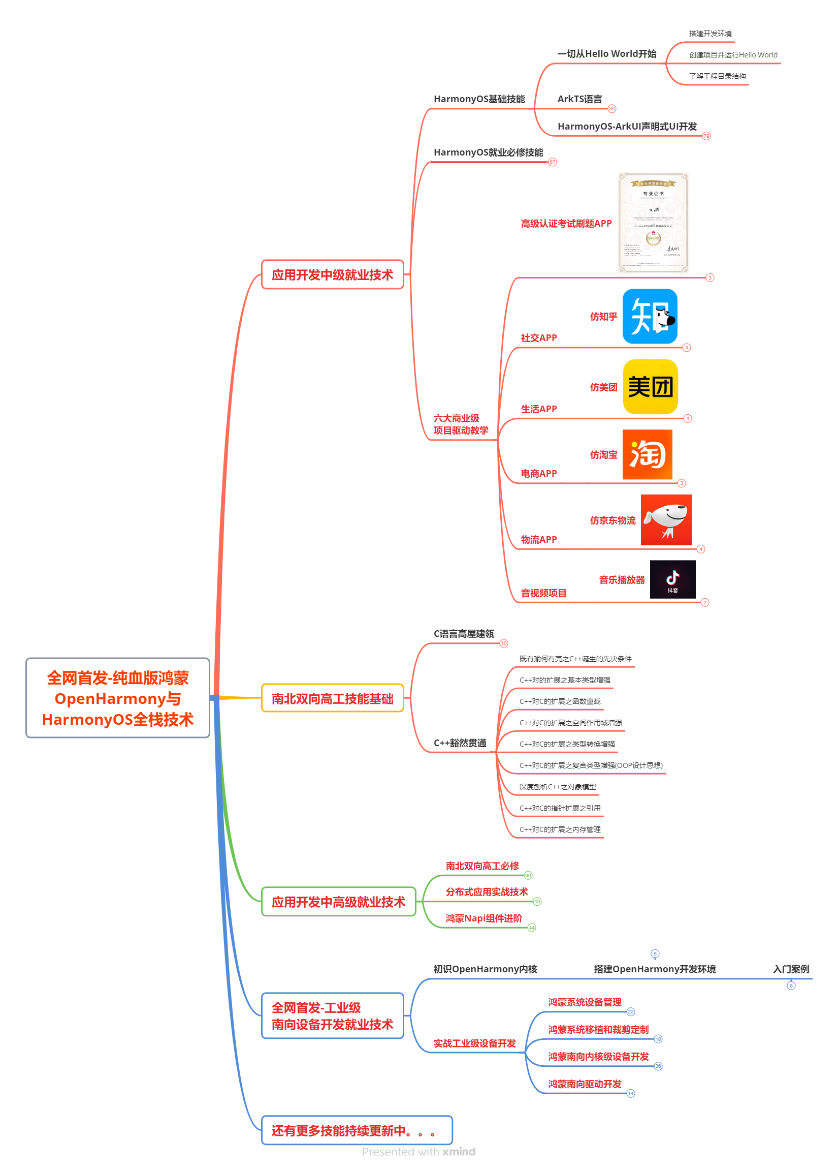
该路线图包含基础技能、就业必备技能、多媒体技术、六大电商APP、进阶高级技能、实战就业级设备开发,不仅补充了华为官网未涉及的解决方案
路线图适合人群:
IT开发人员:想要拓展职业边界
零基础小白:鸿蒙爱好者,希望从0到1学习,增加一项技能。
技术提升/进阶跳槽:发展瓶颈期,提升职场竞争力,快速掌握鸿蒙技术
获取以上完整版高清学习路线,请点击→纯血版全套鸿蒙HarmonyOS学习资料
2.视频学习资料+学习PDF文档
这份鸿蒙(HarmonyOS NEXT)资料包含了鸿蒙开发必掌握的核心知识要点,内容包含了(ArkTS、ArkUI开发组件、Stage模型、多端部署、分布式应用开发、音频、视频、WebGL、OpenHarmony多媒体技术、Napi组件、OpenHarmony内核、(南向驱动、嵌入式等)鸿蒙项目实战等等)鸿蒙(HarmonyOS NEXT)技术知识点。
HarmonyOS Next 最新全套视频教程
《鸿蒙 (OpenHarmony)开发基础到实战手册》
OpenHarmony北向、南向开发环境搭建
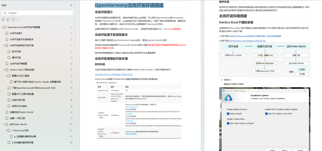
《鸿蒙开发基础》
- ArkTS语言
- 安装DevEco Studio
- 运用你的第一个ArkTS应用
- ArkUI声明式UI开发
- .……

《鸿蒙开发进阶》
《鸿蒙进阶实战》
大厂面试必问面试题
鸿蒙南向开发技术
鸿蒙APP开发必备
点击→纯血版全套鸿蒙HarmonyOS学习资料
总结
总的来说,华为鸿蒙不再兼容安卓,对程序员来说是一个挑战,也是一个机会。只有积极应对变化,不断学习和提升自己,才能在这个变革的时代中立于不败之地。


 503
503

 被折叠的 条评论
为什么被折叠?
被折叠的 条评论
为什么被折叠?
 到【灌水乐园】发言


