


精灵图
-
精灵图主要用于小装饰背景图。原理是将若干小图片放到一张图片上通过移动背景图片位置来实现。


	<head>
		<style type="text/css">
			.xiaodian {
				position: absolute;
				left: 50%;

				width: 16px;
				height: 16px;
				/* background-color: #395D93; */
				background-image: url(images/topfoot-spr.png);
				background-repeat: no-repeat;
				background-position: -380px -64px;
				margin-left: -8px;
				margin-top: 50px;
			}
		</style>
	</head>
	<body>
		<span class="xiaodian"></span>
	</body>
字体图标
-
展示为图标,实际是字体(可设置大小颜色等字体属性)。适用结构样式简单的小图标。
-
进入阿里妈妈选择图标,并保存到新项目中

-
link引入字体图标的css文件
-
给需要字体图标的元素添加字体图标
<head> <link rel="stylesheet" href="//at.alicdn.com/t/font_2657885_6htqbgcqh6e.css"> </head> <body> <p class="iconfont icon-saoyisao"></p> <!--通过选择器实现--> <p class="iconfont"></p> <!--通过unicode实现--> </body>
-
-
字体图标的追加
. 阿里妈妈选择新图标添加到之前项目中,并更新css样式文件
css 三角
-
用css画出三角形(宽高设为0px,边框宽度为三角型的高度)


<head>
	<style type="text/css">
		div {
			position: absolute;
			left: 50%;
			margin-left: -50px;
			margin-top: 50px;

			line-height: 0px;
			font-size: 0px;
			width: 0px;
			height: 0px;
			border: 50px solid transparent;
			/* border-top: 50px solid red;
			border-bottom: 50px solid blue;
			border-left: 50px solid pink; */
			border-right: 50px solid yellow;
		}
	</style>
</head>
<body>
	<div></div>
</body>
css用户界面样式
-
更改用户放到盒子上的鼠标样式 cursor: pointer
<body> <ul> <li style="cursor: default;">第一行</li> <!--默认--> <li style="cursor: pointer;">第二行</li> <!--小手--> <li style="cursor: move;">第三行</li> <!--移动--> <li style="cursor: text;">第四行</li> <!--文本选择--> <li style="cursor: not-allowed;">第五行</li> <!--禁止--> </ul> </body> -
表单轮廓
<input style="outline: 0;" type="text" /> <!-- style="outline: 0; --> -
防止表单域拖拽
<textarea style="outline: none; resize: none;"></textarea> <!-- resize: none; -->
行内块元素与文字垂直对齐
-
vertical-align属性设置行内/行内块元素的垂直对齐方式:
值 描述 baseline 默认,元素放置在父元素的基线上 top 将元素的顶端与行中最高元素的顶端对齐 middle 将元素放置在父元素的中线上 bottom 将元素的底端与行中最低元素的底端对齐 
<body> <div> <img style="vertical-align: bottom;" src="images/2.png" > <!--底部对齐 --> <i style="vertical-align: top;">p123</i> <!--顶部对齐 --> <img style="vertical-align: middle;" src="images/1.jpg" > <!--中部对齐 --> <img style="vertical-align: middle;" src="images/2.png" > <!--中部对齐 --> </div> </body> -
图片底部空白缝隙

<head>
	<style type="text/css">
		div {
			border: 1px solid red;
		}
	</style>
</head>
<body>
	<div>
		<img  src="images/2.png" ><!-- style="vertical-align: bottom;" -->
	</div>
</body>
注意:因为图片默认是与文字基线对齐,下面的缝隙就是文字基线与底线的距离。
- 将图片的垂直对齐设为底边对齐即可解决。
- 将图片设为块级元素,块级元素没有vertical-align属性所以不会基线对齐。
文本溢出显示省略号
-
单行文本溢出

<head>
	<meta charset="utf-8">
	<title></title>
	<style type="text/css">
		div {
			width: 80px;
			height: 60px;
			background-color: skyblue;

			white-space: nowrap;		/*强制不换行*/
			overflow: hidden;			/*溢出部分隐藏*/
			text-overflow: ellipsis;	/*溢出添加省略号*/
		}
	</style>
</head>
<body>
	<div>01234567890123456789</div>
</body>
margin负值运用
-
当有边框的盒子浮动后,相邻边框会叠加。


<head> <style type="text/css"> li { float: left; margin-left: -1px; /*将margin-left设为-值消除边框 */ list-style: none; width: 50px; height: 50px; border: 1px solid skyblue; } li:hover { position: relative; /*鼠标经过提高层级,否则右边框被压住*/ border-color: #f59a3e; /*鼠标经过改变边框颜色*/ } </style> </head> <body> <div> <ul> <li></li> <li></li> <li></li> </ul> </div> </body> -
浮动使文字环绕图片

<head> <style type="text/css"> .box { width: 300px; height: 100px; background-color: skyblue; margin: 0 auto; } img { float: left; width: 70%; } </style> </head> <body> <div class="box"> <img src="images/2.png" alt=""> <p>【热门】从1945年开始的所有地球数据集合</p> </div> </body> -
行内块做页码

<head> <style type="text/css"> * { padding: 0; margin: 0; } a { color: #000000; text-decoration: none; } .box { margin-top: 50px; text-align: center; } .box a { display: inline-block; width: 36px; height: 36px; background-color: #F7F7F7; line-height: 36px; font-size: 14px; border: 1px solid #ccc; } .box .tou, .box .wei { width: 85px; } .box input { height: 36px; width: 45px; border: 1px solid #ccc; outline: 0; } .box button { width: 60px; height: 36px; border: 1px solid #ccc; background-color: #F7F7F7; } </style> </head> <body> <div class="box"> <a href="#" class="tou"><<上一页</a> <a href="#" style="border: 0px; background-color: #fff;">2</a> <a href="#">3</a> <a href="#">4</a> <a href="#">5</a> <a href="#" style="border: 0px; background-color: #fff;">...</a> <a href="#" class="wei">下一页>></a> 到第 <input type="text" name="" id="" value="" /> 页 <button type="button">确定</button> </div> </body>
css三角实现直角三角
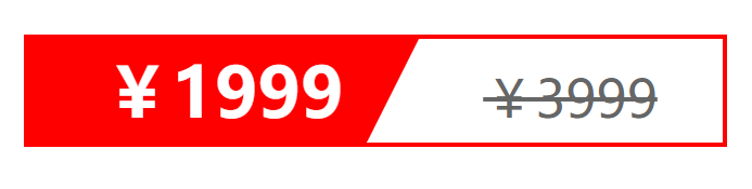
<head>
	<style type="text/css">
	.box {
		width: 160px;
		height: 24px;
		border: 1px solid red;
		text-align: center;
		line-height: 24px;
		margin: 10px auto;
	}

	.box .inner1 {
		position: relative;
		float: left;
		width: 90px;
		height: 100%;
		background-color: red;
		color: #fff;
		font-weight: 700;
	}
	.box .inner2 {
		text-decoration: line-through;
		color: #666;
		font-size: 12px;
	}
	.box .inner1 i {
		position: absolute;
		top: 0px;

		right: 0px;
		width: 0px;
		height: 0px;
		border-top: 24px solid transparent;
		border-right: 12px solid #ffffff;
	}
	</style>
</head>
<body>
	<div class="box">
		<span class="inner1">¥1999<i></i></span>
		<span class="inner2">¥3999</span>
	</div>
</body>
css的初始化
-
不同浏览器对某些标签默认值是不同的,为了浏览器的兼容性我们需要消除HTML文本呈现的差异性。
/* 清除内外边距 */
* {
	padding: 0;
	margin: 0;
}
/* 倾斜字体不倾斜 */
em,
i {
	font-style: normal;
}
/* 清除列表项前的小圆点 */
li {
	list-style: none;
}

img {
	/* 照顾低版本浏览器,图片外包含链接会有边框 */
	border: 0;
	/* 清除图片底部缝隙。中线对齐 */
	vertical-align: middle;
}
button {
	cursor: pointer;
}
/* 链接去掉下划线,颜色为#666 */
a {
	color: #666;
	text-decoration: none;
}
/* 鼠标悬停链接变色 */
a:hover {
	color: skyblue;
}

button,
input {
	font-family: "microsoft yahei", Heiti SC, tohoma, arial, Hiragino Sans GB, "\5B8B\4F53";
}

body {
	-webkit-font-smoothing: antialiased;
	background-color: #fff;
	font: 12px/1.5 "microsoft yahei" Heiti SC, tahoma, arial, Hiragino Sans GB;
	color: #666;
}

/* 隐藏元素 */
.hide,
.none {
	display: none;
}
/* 伪元素-清除浮动 */
.clearfix:after {
	visibility: hidden;
	clear: both;
	display: block;
	content: ".";
	height: 0;

}

.clearfix {
	*zoom: 1;
}


 扫一扫
扫一扫
 2769
2769

 被折叠的 条评论
为什么被折叠?
被折叠的 条评论
为什么被折叠?
 到【灌水乐园】发言


