


大家好,五一快乐啊,希望上海疫情早点过去啊啊啊,好想出去玩,上海不清零周边城市永远结束不了啊…着实有点惨,加油,加油,加油~
这次文章的主题来自于日常的项目,由于Vue3的接受度越来越高,那么实际应用到项目中的时机也越来越成熟,为了做准备,近期做一点点的复盘以前写过的组件,包括基础组件和业务组件,挺累的;
前言
最近在重制一些Vue2项目里用到的各种组件,以便新项目或新产品里可以用到Vue3相关的技术栈,在这个重制的过程中感觉得有必要记录一下,可以作为以后回顾知新时的参考,如果通过本文能有所收获,帮助到别人,那真的就是意外之喜了…
效果
先来看看效果吧,这里只列举了其中4个属性的配置(主要是写本文的时候demo还没有完全写完…抱歉抱歉)
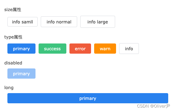
通过配置不同的属性,可以得到不同样式的按钮,基本用法完全可以参照那些市场上的开源UI框架:
<t-button size="large" type="info">info large</t-button>
可能会有小伙伴问,为什么要自己干这种基础组件,毕竟基础组件库如Element Plus,Ant Design,IView等组件库已经非常非常成熟而且好用了,自己从头开发不说时间,就说技术水平,BUG率也远远达不到Element这些开源的UI库…
其实我觉得吧,两个原因:
- 第一个,是市场上的UI组件库在很多时候并不能直接满足项目产品的需求,针对某些特定的且本项目中较为普遍的需求要进行 二次封装,也就是说,虽然我们 不会从头开始开发UI组件,但是我们会拿UI组件进行二次封装,这里面涉及的一些原理、方法是共通的;
- 第二个,就是技术,我个人觉得,因为时间,效率等问题在项目产品中可以不做,但是不能不会…通过学习这些UI开源框架的源码,可以提高自己的技术水平,代码质量以及抽象能力;
设计
在这个阶段要 明确 我们开发的这个组件需要有哪些功能,最终的输出成果是一份 开发阶段时的文字或者图例说明,这份说明的主要作用是可以让人在不通过代码的情况下阅读出这个组件预期的功能有哪些,换句话说就是可以让更多的人(当然也包括领导,主要也是领导)通过这份图例明白开发完的组件将会有哪些功能是可以被将来使用的;
之后,需要拿着这份说明 在项目组内部做一个评审,至少拉上前端的负责人,一些主要的项目组成员,看看这些属性是否能满足各个项目,产品的需求,还是那句话,实际上在现代项目中,很少会有产品或项目会从头开始开发,自己所在项目往往 只是做一些二次封装,通过二次封装达到符合需求的期望;
回到主题,回到我们这个Button组件,属性方便可以参考Element,比如size属性这个属性可以帮助我们控制button的大小,又比如存在type属性,这个属性可以帮助我们可以快速显示按钮的类型(也就是对应的颜色),当然这个组件仅仅是做部分的演示,功能上还远远没有完善,我们只是学习它的封装方法,并不是真的去实现一个组件;
预期功能如下:

接着,我们需要给 每个属性设计对应的值 以及正常情况下的 默认值,通过这个阶段设计实际上已经在一定程度上指引我们写的代码,我们的代码无非就是在实现这些东西而已
| 属性名 | 类型 | 可选值 | 默认值 | 描述 |
|---|---|---|---|---|
| size | string | small,normal,large | normal | 控制button大小 |
| loading | boolean | false,true | false | 显示按钮是否处于loading状态 |
| circle | boolean | false,true | false | 是否为圆形 |
| type | string | primary ,success ,error,info | info | 按钮的类型,也就是实际上的颜色 |
| disabled | boolean | false,true | false | 按钮的点击状态 |
| long | boolean | false,true | false | 横向填充满 |
以上这几种就是我们这个button需要实现的自定义属性,当然,实际上我们的button肯定远不止这个几个属性,具体可以在参照Element,IView这些组件库,另外,根据我们实际的业务可以定制一些特有的属性加入组件;
注册
注册,简单的说就是写完的组件如何使用,博主个人还是比较倾向于Vue2中element的那种写法,也就是将组件的name属性注册为组件名,大致如下
import TButton from './src/index.vue';

TButton.install = (Vue) => {
  Vue.component(TButton.name, TButton);
};

export default TButton;
可能有小伙伴问,这种用法在Vue3中也可以使用吗,其实是可以的,在Vue3中使用use()的时候依然会去调用install方法,因此也就代表可以通过component去全局注册组件;
代码实现
接着,我们就需要开始正式开工了,根据我们上面设计的属性表跟,首先需要实现的是size属性
size
根据设计,这个属性是用来控制按钮的大小的,根据大小的不同一共被分为3级,分别是:small,normal以及最大的large,其中normal是默认值,那么这个时候就很好实现了,无非就是我们设定了3个class,这3个class分别对应small,norma,large这三级,传入哪个size,那么对应的这一级就会被生效,因此代码如下
<template>
    <button
        :class="[
            'btn-style',
            {
                'is-large': size === 'large',
                'is-normal': size === 'normal',
                'is-small': size === 'small'
            }
        ]"
        ><slot></slot
    ></button>
</template>

<script lang="ts" setup>
    import { defineProps, PropType } from 'vue';

    type sizeType = 'normal' | 'small' | 'large';

    defineOptions({
        name: 'TButton'
    });

    defineProps({
        size: {
            type: String as PropType<sizeType>,
            default: 'normal'
        }
    });
</script>

<style scoped lang="less">
    .btn-style {
        position: relative;

        box-sizing: border-box;

        border: none;
        border-radius: 4px;
        background: transparent;
        font-size: 14px;
        cursor: pointer;
    }
    .btn-style.is-normal {
        padding: 8px 18px;
    }
    .btn-style.is-small {
        padding: 6px 14px;
    }
    .btn-style.is-large {
        padding: 10px 22px;
    }
</style>
我们添加了一个属性size,由于是TypeScript编写,因此可以对这个属性的接收值进行限定,并且默认值是normal;
之后便是3个class的编写,我们用三个类名:is-normal,is-small,is-large来分别对应着三个属性,当size的值为哪个时便激活哪个,这样便可以达到我们希望实现的属性功能;
编写完成后,可以测试一下功能是否符合预期
<t-button size="small">primary</t-button>
(PS:这里可能有小伙伴在实践的时候发现defineOptions这个属性报错,可以参考这篇文章:解决Vue3中使用setup如何定义组件的name属性)
type
type属性的写法其实和size属性非常雷同,最大的区别在于写不同的样式名而已,因此type属性的功能大致如下
<template>
    <button
        :class="[
            'btn-style',
            {
                'is-large': size === 'large',
                'is-normal': size === 'normal',
                'is-small': size === 'small',
                'is-primary': type === 'primary',
                'is-success': type === 'success',
                'is-error': type === 'error',
                'is-warn': type === 'warn',
                'is-info': type === 'info'
            }
        ]"
        ><slot></slot
    ></button>
</template>

<script lang="ts" setup>
    import { defineProps, PropType } from 'vue';

    type sizeType = 'normal' | 'small' | 'large';
    type btnType = 'primary' | 'success' | 'error' | 'warn' | 'info';

    defineOptions({
        name: 'TButton'
    });

    const props = defineProps({
        size: {
            type: String as PropType<sizeType>,
            default: 'normal'
        },
        type: {
            type: String as PropType<btnType>,
            default: 'primary'
        }
    });
</script>

<style scoped lang="less">
    .btn-style {
        position: relative;

        box-sizing: border-box;

        border: none;
        border-radius: 4px;
        background: transparent;
        font-size: 14px;
        cursor: pointer;
    }
    .btn-style.is-normal {
        padding: 8px 18px;
    }
    .btn-style.is-small {
        padding: 6px 14px;
    }
    .btn-style.is-large {
        padding: 10px 22px;
    }
    .btn-style.is-primary {
        background-color: #2d8cf0;
        border-color: #2d8cf0;
        color: #ffffff;
    }
    .btn-style.is-success {
        background-color: #47cb89;
        border-color: #47cb89;
        color: #ffffff;
    }
    .btn-style.is-error {
        background-color: #f16643;
        border-color: #f16643;
        color: #ffffff;
    }
    .btn-style.is-warn {
        background-color: #f90;
        border-color: #f90;
        color: #ffffff;
    }
    .btn-style.is-info {
        background-color: #fff;
        border-color: #dcdee2;
        color: #333333;
    }
</style>
同样,由于是TypeScript写法,我们可以限定type的值,‘primary’ , ‘success’ , ‘error’ , ‘warn’ , ‘info’,再编写对应的样式值那么这个属性就完成了,测试一下
<t-button size="small" type="success">primary</t-button>
disabeld
这个属性是用来判断按钮是否可以点击,由于我们的基础组件使用的是原生的button,它自带的就有disabled这个属性,一旦disabled为true时,它本身就不可以再点击了,因此我们需要加工的只有另一块:样式,当disabled为true时,我们期望它能变淡,并且当鼠标移入按钮时,显示不可操作的鼠标样式;
样式为:
<style scoped lang="less">
    .btn-style {
        position: relative;

        box-sizing: border-box;

        border: none;
        border-radius: 4px;
        background: transparent;
        font-size: 14px;
        cursor: pointer;
    }
    .btn-style.is-disabled {
        opacity: 0.5;
        cursor: not-allowed;
    }
</style>
完整代码如下:
<template>
    <button
        :disabled="disabled"
        :class="[
            'btn-style',
            {
                ...
                'is-disabled': disabled
            }
        ]"
        ><slot></slot
    ></button>
</template>

<script lang="ts" setup>
    import { defineProps, PropType } from 'vue';

    type sizeType = 'normal' | 'small' | 'large';
    type btnType = 'primary' | 'success' | 'error' | 'warn' | 'info';

    defineOptions({
        name: 'TButton'
    });

    const props = defineProps({
        size: {
            type: String as PropType<sizeType>,
            default: 'normal'
        },
        type: {
            type: String as PropType<btnType>,
            default: 'primary'
        },
        disabled: {
            type: Boolean,
            default: false
        }
    });
</script>

<style scoped lang="less">
    .btn-style {
        position: relative;

        box-sizing: border-box;

        border: none;
        border-radius: 4px;
        background: transparent;
        font-size: 14px;
        cursor: pointer;
    }
    .btn-style.is-disabled {
        opacity: 0.5;
        cursor: not-allowed;
    }
</style>
同样,自测一下
<t-button size="small" disabled type="success">primary</t-button>
long
这个属性主要的作用是将按钮的width横向拉满,也就是设置成100%,由于button默认不会横向拉满,因此特定新增一个属性改变其宽度;
和上面的做法其实差不多,我们设定了一个属性long,默认是false,不横向拉满,当long的值为True时,触发改变
<template>
    <button
        :disabled="disabled"
        :class="[
            'btn-style',
            {
                'is-long': long
            }
        ]"
        ><slot></slot
    ></button>
</template>

<script lang="ts" setup>
    import { defineProps, PropType } from 'vue';

    type sizeType = 'normal' | 'small' | 'large';
    type btnType = 'primary' | 'success' | 'error' | 'warn' | 'info';

    defineOptions({
        name: 'TButton'
    });

    const props = defineProps({
        size: {
            type: String as PropType<sizeType>,
            default: 'normal'
        },
        type: {
            type: String as PropType<btnType>,
            default: 'primary'
        },
        disabled: {
            type: Boolean,
            default: false
        },
        long: {
            type: Boolean,
            default: false
        }
    });
</script>

<style scoped lang="less">
    .btn-style {
        position: relative;

        box-sizing: border-box;

        border: none;
        border-radius: 4px;
        background: transparent;
        font-size: 14px;
        cursor: pointer;
    }

    .btn-style.is-long {
        width: 100%;
    }
</style>
其它
其它的属性其实都差不多类似的写法,在功能的编写上没有本质的区别,不难看出,仅这边几个属性的实现而言代码 并不复杂,很多初学者经过思考都可以写出来,因此就不一一举例了,如果有问题可以联系博主看看能不能协助到你,或者有更好的实现方法和方式也请浏览告诉博主;
小结
本文主要讲述了在Vue3和TypeScript下如何实现一个简单的Button组件,以及当我们要实现这个组件需要在前期进行功能代码的设计,优秀的设计可以在前期将所有功能点都描述清楚,并且前期的这些文档,图例都可以为以后复盘或修改时留下相关资料,当然设计的用于不仅仅是留档,它在我们正式开发时也可以提供指导性的建议,代码说到底就是在还原设计,将其翻译成电脑能识别的语言而已;


 1105
1105


 被折叠的 条评论
为什么被折叠?
被折叠的 条评论
为什么被折叠?
 到【灌水乐园】发言


