


提示:简单的学习掌握FLEX布局**
文章目录
前言
 Flex布局原理就是: 给父盒子添加flex属性, 来控制子盒子的位置排
列方式从而实现flex布局

  当我们为父盒子设为 flex 布局以后, 子元素的 float、 clear 和
vertical-align 属性将失效。

  Flex布局又叫伸缩布局、 弹性布局、 伸缩盒布局、 弹性盒布局、 flex
布局
提示:以下是本篇文章正文内容,下面案例可供参考
一、flex设置主轴方向
1:说明:
示例Flex布局中默认的主轴是row-- x轴
如果想改变主轴方向可通过设置flex-direction来改变
flex-direction:column;将主轴改为y轴,
纵轴 flex-direction:row; 将主轴改为x轴,
横轴 flex-direction:row- reverse;主轴为x轴, 并且翻转 flex- direction:column- reverse;主轴为y轴, 并且翻转
2:代码
<!DOCTYPE html>
<html lang="en">

<head>
    <meta charset="UTF-8">
    <meta name="viewport" content="width=device-width, initial-scale=1.0">
    <meta http-equiv="X-UA-Compatible" content="ie=edge">
    <title>Document</title>
    <style>
        div {
            display: flex;
            width: 80%;
            height: 300px;
            background-color: pink;
            justify-content: space-around;
        }

        div span {
            /* width: 150px; */
            height: 100px;
            background-color: purple;
            margin-right: 5px;
            flex: 1;
        }
    </style>
</head>

<body>
    <div>
        <span>1</span>
        <span>2</span>
        <span>3</span>
    </div>
</body>

</html>
<style>
        div {
            /* 给父级添加flex属性 */
            display: flex;
            width: 800px;
            height: 300px;
            background-color: pink;
            /* 默认的主轴是 x 轴 行 row  那么y轴就是侧轴喽 */
            /* 我们的元素是跟着主轴来排列的 */
            /* flex-direction: row; */
            /* 简单了解 翻转 */
            /* flex-direction: row-reverse; */
            /* 我们可以把我们的主轴设置为 y轴 那么 x 轴就成了侧轴 */
            flex-direction: column;
        }

        div span {
            width: 150px;
            height: 100px;
            background-color: purple;
        }
3:实例展示
1:效果

2:效果:

二、主轴排序方式
1:说明
代码如下(示例):
justify-content能够设置主轴子元素排列形式
- 值为flex-start 所有子元素在主轴头部显示
- 值为flex-end 所有子元素在主轴尾部显示
- 值为flex-center 所有子元素在主轴居中对齐
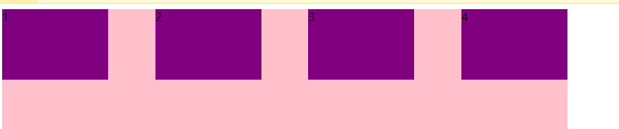
- 值为space-around 所有子元素平分剩余空间
- 值为space-between 所有子元素先两边贴边在平分剩余空间
import numpy as np
import pandas as pd
import matplotlib.pyplot as plt
import seaborn as sns
import warnings
warnings.filterwarnings('ignore')
import  ssl
ssl._create_default_https_context = ssl._create_unverified_context
2.代码
代码如下(示例):
div {
            display: flex;
            width: 800px;
            height: 300px;
            background-color: pink;
            /* 默认的主轴是 x 轴 row */
            flex-direction: row;
            /* justify-content: 是设置主轴上子元素的排列方式 */
            /* justify-content: flex-start; */
            /* justify-content: flex-end; */
            /* 让我们子元素居中对齐 */
            /* justify-content: center; */
            /* 平分剩余空间 */
            /* justify-content: space-around; */
            /* 先两边贴边, 在分配剩余的空间 */
            justify-content: space-between;
        }

        div span {
            width: 150px;
            height: 100px;
            background-color: purple;
        }
    </style>
3. 实例展示
三,换行
1:说明
flex布局后默认为不换行 如果想要换行效果设置flex-wrap: wrap
/* 把设置主轴方向和是否换行(换列)简写 */
flex-flow: column wrap;
2:代码
<style>
        div {
            display: flex;
            width: 600px;
            height: 400px;
            background-color: pink;
            /* flex布局中,默认的子元素是不换行的, 如果装不开,会缩小子元素的宽度,放到父元素里面  */
            /* flex-wrap: nowrap; */
            flex-wrap: wrap;
        }

        div span {
            width: 150px;
            height: 100px;
            background-color: purple;
            color: #fff;
            margin: 10px;
        }
    </style>
</head>

<body>
    <div>
        <span>1</span>
        <span>2</span>
        <span>3</span>
        <span>4</span>
        <span>5</span>
    </div>
    </body>
3:实例展示

四, 侧轴排序方式
1:说明
利用align-items能够设置侧轴元素对齐的方式在子项为单项( 单行) 的时候使用
| 值 | 含义 |
|---|---|
| flex-start | 从头部开始显示 |
| flex-end | 从尾部开始显示 |
| center | 居中显示 |
| stretch | 将子元素拉伸 |
2:代码
div {
            display: flex;
            width: 800px;
            height: 400px;
            background-color: pink;
            /* 默认的主轴是 x 轴 row */
            flex-direction: column; //垂直是主轴
            /* justify-content: center; */
            /* 我们需要一个侧轴居中 */
            /* 拉伸,但是子盒子不要给高度 */
            align-items: stretch;
            /* align-items: center; */
            /* align-content: center; */
        }

        div span {
            width: 150px;
            height: 100px;
            background-color: purple;
            color: #fff;
            margin: 10px;
        }
3:结果

五:份数
1:说明
子项所占的份数
2:代码
<style>
        section {
            display: flex;
            width: 60%;
            height: 150px;
            background-color: pink;
            margin: 0 auto;
        }

        section div:nth-child(1) {
            width: 100px;
            height: 150px;
            background-color: red;
        }

        section div:nth-child(2) {
            flex: 1;
            background-color: green;
        }

        section div:nth-child(3) {
            width: 100px;
            height: 150px;
            background-color: blue;
        }

        p {
            display: flex;
            width: 60%;
            height: 150px;
            background-color: pink;
            margin: 100px auto;
        }

        p span {
            flex: 1;
        }

        p span:nth-child(2) {
            flex: 2;
            background-color: purple;
        }
    </style>
</head>

<body>
    <section>
        <div></div>
        <div></div>
        <div></div>
    </section>
    <p>
        <span>1</span>
        <span>2</span>
        <span>3</span>
    </p>
3 案例展示


 2万+
2万+


 被折叠的 条评论
为什么被折叠?
被折叠的 条评论
为什么被折叠?
 到【灌水乐园】发言


