


简介
精美的界面是由控件组成的,要让控件美观的摆放在界面上离不开布局,布局规范着空间的位置,与此同时,布局中可以放布局,嵌套的实现能表现一些更加复杂的界面
四种基本布局
Android中最基本的四种布局分别为线性布局,相对布局,帧布局,百分比布局,下面我们依依详细解释一下。
线性布局
线性布局就是我们常用的LinearLayout,将控件在线性方向依次排列
一个最基本的线性布局代码示例:
<?xml version="1.0" encoding="utf-8"?>
<LinearLayout xmlns:android="http://schemas.android.com/apk/res/android"
    android:orientation="vertical"
    android:layout_width="match_parent"
    android:layout_height="match_parent">


    <Button
        android:id="@+id/button1"
        android:layout_width="wrap_content"
        android:layout_height="wrap_content"
        android:text="线性布局"/>
    <Button
        android:id="@+id/button2"
        android:layout_width="wrap_content"
        android:layout_height="wrap_content"
        android:text="线性布局"/>
    <Button
        android:id="@+id/button3"
        android:layout_width="wrap_content"
        android:layout_height="wrap_content"
        android:text="线性布局"/>
</LinearLayout>
这里可以看到android:orientation指定了排列方向是垂直,运行出来的结果就是
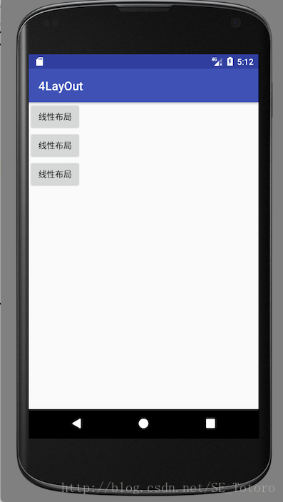
可以看到按钮是垂直排列的,当改成horizontal就是水平排列了。
控件也可以添加布局对齐方式的属性通过android:layout_gravity指定。
button中增加新属性后
<Button
        android:id="@+id/button1"
        android:layout_width="wrap_content"
        android:layout_height="wrap_content"
        android:layout_gravity="top"
        android:text="线性布局"/>
    <Button
        android:id="@+id/button2"
        android:layout_width="wrap_content"
        android:layout_height="wrap_content"
        android:layout_gravity="center"
        android:text="线性布局"/>
    <Button
        android:id="@+id/button3"
        android:layout_width="wrap_content"
        android:layout_height="wrap_content"
        android:layout_gravity="bottom"
        android:text="线性布局"/>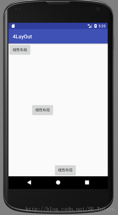
可以看到按钮的排列方式发生了改变
其实线性布局还有一个很重要的属性,那就是android:layout_weight
这个属性可以使用比例方式指定控件大小
比如我们写一个消息发送界面
<?xml version="1.0" encoding="utf-8"?>
<LinearLayout xmlns:android="http://schemas.android.com/apk/res/android"
    android:orientation="horizontal"
    android:layout_width="match_parent"
    android:layout_height="match_parent">

    <EditText
        android:id="@+id/edit_message"
        android:layout_width="0dp"
        android:layout_height="wrap_content"
        android:layout_weight="1"
        android:hint="what do u want"/>
    <Button
        android:id="@+id/button1"
        android:layout_width="wrap_content"
        android:layout_height="wrap_content"
        android:layout_gravity="top"
        android:text="线性布局"/>

</LinearLayout>
效果如下
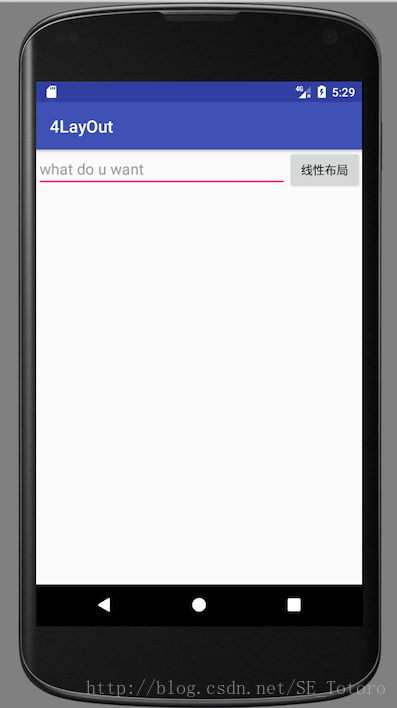
可以看到通过比例划分屏幕展现出来的效果更好合理的利用了一行
相对布局
RelativeLayout是一种相对定位方式让控件出现在布局的任何位置布局方式。
修改之前的代码:
<?xml version="1.0" encoding="utf-8"?>
<RelativeLayout xmlns:android="http://schemas.android.com/apk/res/android"
    android:layout_width="match_parent"
    android:layout_height="match_parent">


    <Button
        android:id="@+id/button1"
        android:layout_width="wrap_content"
        android:layout_height="wrap_content"
        android:layout_centerInParent="true"
        android:text="居中"/>
    <Button
        android:id="@+id/button2"
        android:layout_width="wrap_content"
        android:layout_height="wrap_content"
        android:layout_above="@id/button1"
        android:layout_toLeftOf="@id/button1"
        android:text="左上"/>
    <Button
        android:id="@+id/button3"
        android:layout_width="wrap_content"
        android:layout_height="wrap_content"
        android:layout_above="@id/button1"
        android:layout_toRightOf="@id/button1"
        android:text="右上"/>
    <Button
        android:id="@+id/button4"
        android:layout_width="wrap_content"
        android:layout_height="wrap_content"
        android:layout_below="@id/button1"
        android:layout_toLeftOf="@id/button1"
        android:text="左下"/>
    <Button
        android:id="@+id/button5"
        android:layout_width="wrap_content"
        android:layout_height="wrap_content"
        android:layout_below="@id/button1"
        android:layout_toRightOf="@id/button1"
        android:text="右下"/>

</RelativeLayout>
效果如下
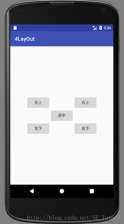
确实是很相对的一种布局吧,通过定义一个控件的位置,其他控件相继引用它的位置就能实现相对的布局
帧布局
FrameLayout没有方便的定位方式,所有的控件都会默认摆在左上角,不过我们可以使用layout_gravity来指定控件的布局方式,修改activity_main.xml中的代码
<?xml version="1.0" encoding="utf-8"?>
<FrameLayout xmlns:android="http://schemas.android.com/apk/res/android"
    android:layout_width="match_parent"
    android:layout_height="match_parent">


    <Button
        android:id="@+id/button4"
        android:layout_width="wrap_content"
        android:layout_height="wrap_content"
        android:layout_gravity="left"
        android:text="帧布局"/>
    <Button
        android:id="@+id/button5"
        android:layout_width="wrap_content"
        android:layout_height="wrap_content"
        android:layout_gravity="right"
        android:text="帧布局"/>
    <ImageView
        android:layout_width="wrap_content"
        android:layout_height="wrap_content"
        android:layout_gravity="center"
        android:src="@mipmap/ic_launcher"/>

</>
这里我们用了一个android自带的小图标来展示效果如下
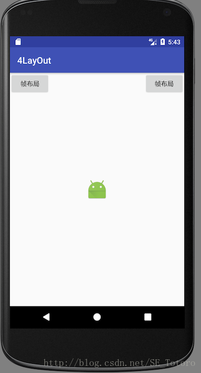
由于定位方式的不足,导致帧布局并不常用。
百分比布局
百分比布局允许直接指定控件在布局中所占的百分比,这样控件可以轻松平分布局甚至是任意比例分割布局
百分比布局分为PercentFrameLayout和PercentRelativeLayout专门为帧布局和相对布局进行拓展。
由于百分比布局属于新增布局,所以需要在项目的build.gradle中添加依赖来保证兼容性
在dependecies闭包中引入百分比布局
dependencies {
    compile fileTree(dir: 'libs', include: ['*.jar'])
    androidTestCompile('com.android.support.test.espresso:espresso-core:2.2.2', {
        exclude group: 'com.android.support', module: 'support-annotations'
    })
    compile 'com.android.support:appcompat-v7:25.3.1'
    compile 'com.android.support.constraint:constraint-layout:1.0.0-alpha7'
    compile 'com.android.support:percent:25.3.1'
    testCompile 'junit:junit:4.12'
}
之后开始我们的百分比布局代码
<?xml version="1.0" encoding="utf-8"?>
<android.support.percent.PercentFrameLayout xmlns:android="http://schemas.android.com/apk/res/android"
    xmlns:app="http://schemas.android.com/apk/res-auto"
    android:layout_width="match_parent"
    android:layout_height="match_parent">


    <Button
        android:id="@+id/button4"
        android:layout_width="wrap_content"
        android:layout_height="wrap_content"
        android:layout_gravity="left|top"
        app:layout_widthPercent="50%"
        app:layout_heightPercent="50%"
        android:text="百分比帧布局"/>


</android.support.percent.PercentFrameLayout>
可以看到效果如下
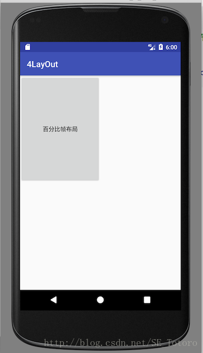
使用app:layout_widthPercent与app:layout_heightPercent属性将按钮的宽度高度指定为布局的50%这样就能够合理的安排控件的位置了。
总结
以上就是最常见的四种布局了,通过这次的学习,能够更加灵活的排列空间了。
参考书目—-《第一行代码》郭霖


 2095
2095


 被折叠的 条评论
为什么被折叠?
被折叠的 条评论
为什么被折叠?
 到【灌水乐园】发言


