


转自:
http://www.2cto.com/kf/201402/281215.html
效果: http://thecodeplayer.com/walkthrough/make-an-accordian-style-slider-in-css3
这样我们就完成了整个效果,为了优化效果,我们增加了hover前后的图像滤镜,不幸的是这个效果只有webkit内核认识,为了代码的未来兼容性我们还是增加了标准属性(虽说现在暂时没有用),代码如下。
好的,整个CSS文件如下。
效果: http://thecodeplayer.com/walkthrough/make-an-accordian-style-slider-in-css3
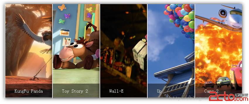
今天来看一个使用hover触发的一个手风琴效果,鼠标hover时改变图像宽度,配合transition实现动画,效果如下图所示。大家也可以到我的codepen在线编辑、下载收藏。
感谢TheCodePlayer的图片和灵感。

下面来看看html,我们用ul、li来布局案例,我们需要一个图像盒子和一个图像描述的盒子。
<div class="accordian">
    <ul>
        <li>
            <div class="image_title">
                KungFu Panda
            </div>

                <img src="http://www.2cto.com/uploadfile/Collfiles/20140225/20140225085908528.jpg" style="width: 630px; height: 315px; ">

        </li>
        <li>
            <div class="image_title">
                Toy Story 2
            </div>

                <img src="http://www.2cto.com/uploadfile/Collfiles/20140225/20140225085909529.jpg" style="width: 630px; height: 315px; ">

        </li>
        <li>
            <div class="image_title">
                Wall-E
            </div>

                <img src="http://www.2cto.com/uploadfile/Collfiles/20140225/20140225085909530.jpg" style="width: 630px; height: 315px; ">

        </li>
        <li>
            <div class="image_title">
                Up
            </div>

                <img src="http://www.2cto.com/uploadfile/Collfiles/20140225/20140225085910531.jpg" style="width: 630px; height: 315px; ">

        </li>
        <li>
            <div class="image_title">
                Cars 2
            </div>

                <img src="http://www.2cto.com/uploadfile/Collfiles/20140225/20140225085911532.jpg" style="width: 630px; height: 315px; ">

        </li>
    </ul>
</div>/* 让顶盒子居中显示 */
.accordian{
width:850px;
/* 850=(800+2)*5+20*2 */
margin:100px auto;
}
/* 配置li */
.accordian li{
list-style:none;
width:160px;
height: 320px;
float:left;
position:relative;
overflow:hidden;
border-left:2px solid rgba(255,255,255,.8);
}
/* 配置图像信息盒子 */
.accordian li .image_title{
position:absolute;
width:100%;
height:50px;
background-color:rgba(0,0,0,.5);
text-indent:2em;
line-height:50px;
bottom:0px;
left:0
}
/* 改变链接 */
.accordian a{
color:#fff;
text-decoration:none;
}/* hover之后所有的li宽改为40px */
.accordian ul:hover li{
width:40px;
}
/* hover之后激活的li宽为640px,注意这两个设置有先后顺序 */
.accordian ul li:hover{
width:640px;
}.accordian li{
/* 之前的代码省略 */
/* 新增transition属性 */
transition:all 2s;
}这样我们就完成了整个效果,为了优化效果,我们增加了hover前后的图像滤镜,不幸的是这个效果只有webkit内核认识,为了代码的未来兼容性我们还是增加了标准属性(虽说现在暂时没有用),代码如下。
.accordian ul:hover li{
  width:40px;
  -webkit-filter:grayscale(.8);
  filter:grayscale(.8);
}
.accordian ul li:hover{
  width:640px;
  -webkit-filter:grayscale(0) hue-rotate(300deg);
  filter:grayscale(0) hue-rotate(300deg);
}
好的,整个CSS文件如下。
.accordian{
  width:850px;
  margin:100px auto;
}
.accordian li{
  float:left;
  list-style:none;
  width:160px;
  height:320px;
  transition:all 2s;
  position:relative;
  overflow:hidden;
  border-left:2px solid rgba(255,255,255,.8);
  box-shadow:0px 0px 20px rgba(0,0,0,0.8);
}
.accordian ul:hover li{
  width:40px;
  -webkit-filter:grayscale(.8);
  filter:grayscale(.8);
}
.accordian ul li:hover{
  width:640px;
  -webkit-filter:grayscale(0) hue-rotate(300deg);
  filter:grayscale(0) hue-rotate(300deg);
}
.accordian li .image_title{
  position:absolute;
  width:100%;
  height:50px;
  background-color:rgba(0,0,0,.5);
  text-indent:2em;
  line-height:50px;
  bottom:0px;
  left:0
}
.accordian a{
  color:#fff;
  text-decoration:none;
}//图像个数
@imageN:5;
//图像hover之前的总宽度
@w:800px;
//图像hover之后的宽度
@imageL:640px;
//图像hover之前的宽度
@imageS:@w/@imageN;
//边框宽度
@bdWidth:2px;
//阴影宽度
@shadowWidth:20px;
.accordian{
width:@w + @bdWidth * @imageN + @shadowWidth*2;
margin:100px auto;
ul li{
float:left;
list-style:none;
width:@imageS;
transition:all 2s;
position:relative;
overflow:hidden;
border-left:1px solid rgba(255,255,255,.8);
border-left-width:@bdWidth;
box-shadow:0px 0px 20px rgba(0,0,0,0.8);
.image_title{
position:absolute;
width:100%;
height:50px;
background-color:rgba(0,0,0,.5);
text-indent:2em;
line-height:50px;
bottom:0px;
left:0
a{
color:#fff;
text-decoration:none;
}
}
}
ul:hover li{
width:@imageS - @imageL/@imageN;
-webkit-filter:grayscale(.8);
filter:grayscale(.8);
}
ul li:hover{
width:@imageL;
-webkit-filter:grayscale(0) hue-rotate(300deg);
filter:grayscale(0) hue-rotate(300deg);
}
}


 1927
1927


 被折叠的 条评论
为什么被折叠?
被折叠的 条评论
为什么被折叠?
 到【灌水乐园】发言


