


 本文介绍了一款自定义控件ToggleSwitch,它模仿了旧版iOS风格的Switch,并提供了多种配置选项,如设置按钮文本、背景颜色等。该控件支持多位置切换,并通过返回当前位置来指示状态。
转载请注明出处:王亟亟的大牛之路
早上上了个很6的图片选择器 GalleryFinal 如果没有看的同学 可以看下,东西很不错哦,传送门:http://blog.csdn.net/ddwhan0123/article/details/50817152
这一篇上一个自定义控件ToggleSwitch
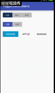
效果图:

第一眼看上去感觉就像旧版的iOS风格的Switch。
How to use?
Grade:
dependencies {
    compile 'us.belka:androidtoggleswitch:1.1.1'
}
Maven:
<dependency>
  <groupId>us.belka</groupId>
  <artifactId>androidtoggleswitch</artifactId>
  <version>1.0</version>
  <type>pom</type>
</dependency>
Eclipse:
Copy下图圈出来的部分就好了
如何设置?(这边拿Eclipse Copy完为例)
  <sample.wjj.toggle_switchdemo.ToggleSwitch
        android:id="@+id/aTo"
        android:layout_width="wrap_content"
        android:layout_height="wrap_content"
        custom:textToggleLeft="打开"
        custom:textToggleRight="关闭" />
上图中第2个效果就是 这样的

 如果要3个那就再加一个
 custom:textToggleCenter="默认"
 第一个效果就是添加后的效果
那如果你又许多个?不止三个?
那就在业务的Activity中获取控件对象,再传入一个 ArrayList就行了
像这样
ToggleSwitch toggleSwitch = (ToggleSwitch) findViewById(R.id.multiple_switches);
ArrayList<String> labels = new ArrayList<>();
labels.add("AND");
labels.add("OR");
labels.add("XOR");
labels.add("NOT");
labels.add("OFF");
toggleSwitch.setLabels(labels);
效果如下:

因为他不是继承于Switch所以,也就没有所谓的true false2个返回值的概念,全部都由 position返回,也就是从最左边->最右边,从0开始递增就是所被点击的那个position
那么如何获取position呢?
  aTo = (ToggleSwitch) findViewById(R.id.aTo);
 aTo.setOnToggleSwitchChangeListener(new ToggleSwitch.OnToggleSwitchChangeListener() {
            @Override
            public void onToggleSwitchChangeListener(int position) {
                Toast.makeText(MainActivity.this,position+"被点击",Toast.LENGTH_SHORT).show();
            }
        });
例子中的土司也就是这么实现的。
那如果你要初始化设置某个为默认项,就设置下position 像这样
toggleSwitch.setCheckedTogglePosition(position);
要获取就这样
int position = toggleSwitch.getCheckedTogglePosition();还有些设置内容下面也罗列一下,主要是字体大小啊,颜色啊,间距什么的
| Option Name | Format | Description |
|---|---|---|
| android:textSize | dimension | Text size of each button |
| custom:activeBgColor | color | Background color of the checked button |
| custom:activeTextColor | color | Text color of the checked button |
| custom:inactiveBgColor | color | Background color of the inactive buttons |
| custom:inactiveTextColor | color | Text color of the inactive buttons |
| custom:separatorColor | color | Color of the vertical separator between inactive buttons |
| custom:toggleWidth | dimension | Width of each button |
总体使用起来和源生控件一样,没什么区别,实现难度也不高,大家可以适当的学习下,自己页写写 会有长进。
源码地址:https://github.com/BelkaLab/Android-Toggle-Switch/archive/master.zip


 扫一扫
扫一扫


 被折叠的 条评论
为什么被折叠?
被折叠的 条评论
为什么被折叠?
 到【灌水乐园】发言


