


前面学习了android中的基本组件的使用,这一篇,我将总结下android中布局的使用,详细的看下面。
1.LinearLayout
LinearLayoutyot又称线性布局,是一种常用的布局,它又可以有水平方向的和垂直方向的布局方式。前面一篇博文基本使用的是线性布局中的垂直布局,这个垂直布局的的方式是有属性android:orientation="vertical"控制的。如果把值指定为horizontal则控件就会在水平方向上排列了。下面我进行实战的操作吧。
新建一个android项目,项目名为UILayout,其他的基本采用默认的方式。
修改下布局文件,代码如下:
<LinearLayout xmlns:android="http://schemas.android.com/apk/res/android"
    xmlns:tools="http://schemas.android.com/tools"
    android:layout_width="match_parent"
    android:layout_height="match_parent"
    android:orientation="vertical"
    >

    <Button
        android:id="@+id/button1"
        android:layout_width="wrap_content"
        android:layout_height="wrap_content"
        android:text="button 1"
        />

    <Button
        android:id="@+id/button1"
        android:layout_width="wrap_content"
        android:layout_height="wrap_content"
        android:text="button 2"
        />

    <Button
        android:id="@+id/button1"
        android:layout_width="wrap_content"
        android:layout_height="wrap_content"
        android:text="button 3"
        />


</LinearLayout>
运行程序,结果如下:
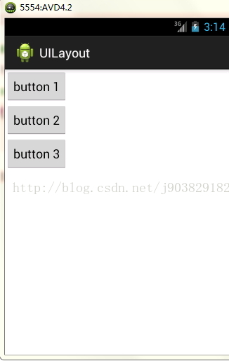
可见三个按钮都是自适应的大小,在垂直方向排列。
现在我们在修改下线性布局的的属性值,修改后代码如下:
<LinearLayout xmlns:android="http://schemas.android.com/apk/res/android"
    xmlns:tools="http://schemas.android.com/tools"
    android:layout_width="match_parent"
    android:layout_height="match_parent"
    <span style="color:#ff0000;">android:orientation="horizontal"</span>
    >

    <Button
        android:id="@+id/button1"
        android:layout_width="wrap_content"
        android:layout_height="wrap_content"
        android:text="button 1"
        />

    <Button
        android:id="@+id/button1"
        android:layout_width="wrap_content"
        android:layout_height="wrap_content"
        android:text="button 2"
        />

    <Button
        android:id="@+id/button1"
        android:layout_width="wrap_content"
        android:layout_height="wrap_content"
        android:text="button 3"
        />


</LinearLayout>
运行结果如下图:
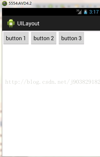
如果不指定android:orientation的属性值,则默认的方式就是horizontal,水平的。
注意:如果LinearLayout的排列方式是horizontal的,内部的控件绝对不能将宽度指定为match_parent,因为这样的话单独一个控件就会将整个水平方向占满,其他的控件就没的可放置的位置了。同样如果LinearLayout的排列方式是vertical,内部的控件就不能将高度指定为match_parent。
下面接触几个常用的控件和布局的属性
android:layout_gravity:用于指定控件在布局中的对齐方式
android:gravity:是用于指定文字在控件中的对齐方式
android:layout_gravity和android:gravity的可选值差不多,不过要注意,LinearLayout的排列方向是horizontal时,只有垂直方向的对齐方式才会生效因为此时水平方向上的长度是不固定的,每添加一个控件,水平方向的长度都会改变,因而无法指定该方向的对齐方式。同样的道理,LinearLayout的排列方向是vervitcal时,只有水平方向的对齐方式才会生效。
修改布局文件,修改后代码如下:
<LinearLayout xmlns:android="http://schemas.android.com/apk/res/android"
    xmlns:tools="http://schemas.android.com/tools"
    android:layout_width="match_parent"
    android:layout_height="match_parent"
    android:orientation="horizontal"
    >

    <Button
        android:id="@+id/button1"
        android:layout_width="wrap_content"
        android:layout_height="wrap_content"
        android:text="button 1"
        android:layout_gravity="top"
        />

    <Button
        android:id="@+id/button1"
        android:layout_width="wrap_content"
        android:layout_height="wrap_content"
        android:text="button 2"
        android:layout_gravity="center_horizontal"
        />

    <Button
        android:id="@+id/button1"
        android:layout_width="wrap_content"
        android:layout_height="wrap_content"
        android:text="button 3"
        android:layout_gravity="bottom"
        />


</LinearLayout>
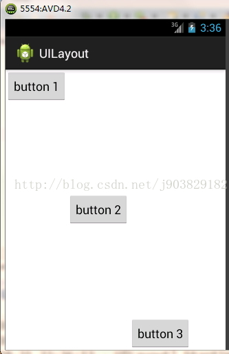
运行程序,结果如下图:
android:layout_weight:这个属性允许我们使用比例的方式来指定控件的大小,它在手机屏幕的适配方面可以起到非常重要的作用。
修改布局文件如下:
<LinearLayout xmlns:android="http://schemas.android.com/apk/res/android"
    xmlns:tools="http://schemas.android.com/tools"
    android:layout_width="match_parent"
    android:layout_height="match_parent"
    android:orientation="horizontal"
    >

    <EditText
        android:id="@+id/input_message"
        android:layout_width="0dp"
        android:layout_height="wrap_content"
        android:layout_weight="1"
        android:hint="type something"
        />

    <Button
        android:id="@+id/send"
        android:layout_width="0dp"
        android:layout_height="wrap_content"
        android:layout_weight="1"
        android:text="Send"
        />

</LinearLayout>
运行程序显示如下:
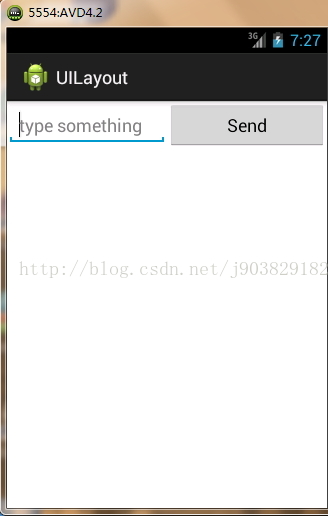
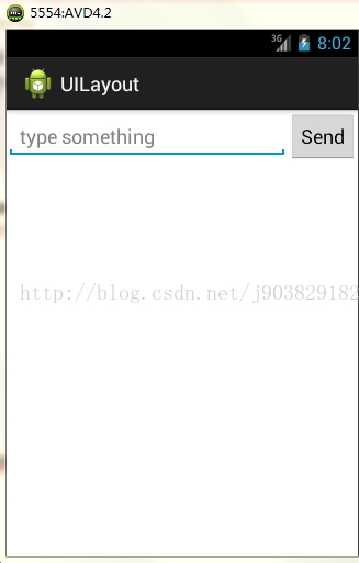
看上面的代码,EditText和Button的宽度都指定成了0,这里使用了android:layout_weight属性,此时的控件的宽度不应该由andorid:layout_width来决定,这里指定为0是一种比较规范的写法。然后我们我们把EditText和Button的属性android:layout_weight的值都设置为1,这表示EditText和Button将在水平方向平分宽度。
为什么android:layout_weight属性的值为1就会平分屏幕宽度?系统会把LinearLayout下所有控件指定的layout_weight值相加,得到一个总值,然后每个控件所占的比例就是该控件的layout_weight值除以算出来的总值。
下面在修改下布局的文件,代码如下:
<LinearLayout xmlns:android="http://schemas.android.com/apk/res/android"
    xmlns:tools="http://schemas.android.com/tools"
    android:layout_width="match_parent"
    android:layout_height="match_parent"
    android:orientation="horizontal"
    >

    <EditText
        android:id="@+id/input_message"
        android:layout_width="0dp"
        android:layout_height="wrap_content"
        android:layout_weight="1"
        android:hint="type something"
        />

    <Button
        android:id="@+id/send"
        android:layout_width="wrap_content"
        android:layout_height="wrap_content"
        android:text="Send"
        />

</LinearLayout>
这里我们指定了EditText的android:layout_weight="1"属性,并将Button的宽度改回wrap_content。这表示Button的宽度仍然按照 wrap_content来计算,而EditText则会占满屏幕所有剩余空间。
运行结果如下:
2.RelativeLayout相对布局
修改布局文件,代码如下:
<RelativeLayout xmlns:android="http://schemas.android.com/apk/res/android"
    xmlns:tools="http://schemas.android.com/tools"
    android:layout_width="match_parent"
    android:layout_height="match_parent"
    >
    <Button
        android:id="@+id/button1"
        android:layout_width="wrap_content"
        android:layout_height="wrap_content"
        android:text="button 1"
        android:layout_alignParentLeft="true"
        android:layout_alignParentTop="true"
        />


    <Button
        android:id="@+id/button2"
        android:layout_width="wrap_content"
        android:layout_height="wrap_content"
        android:text="button 2"
        android:layout_alignParentRight="true"
        android:layout_alignParentTop="true"
        />


    <Button
        android:id="@+id/button3"
        android:layout_width="wrap_content"
        android:layout_height="wrap_content"
        android:text="button 3"
        android:layout_centerInParent="true"
        />


    <Button
        android:id="@+id/button4"
        android:layout_width="wrap_content"
        android:layout_height="wrap_content"
        android:text="button 4"
        android:layout_alignParentLeft="true"
        android:layout_alignParentBottom="true"
        />

    <Button
        android:id="@+id/button5"
        android:layout_width="wrap_content"
        android:layout_height="wrap_content"
        android:text="button 5"
        android:layout_alignParentRight="true"
        android:layout_alignParentBottom="true"
        />


</RelativeLayout>
运行结果如下:
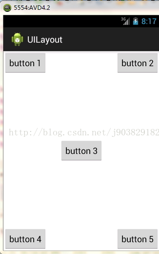
上面的相对布局都是相对父容器进行布局的,见名知意了。
下面在修改下布局文件,让控件相对与控件进行布局:
<RelativeLayout xmlns:android="http://schemas.android.com/apk/res/android"
xmlns:tools="http://schemas.android.com/tools"
android:layout_width="match_parent"
android:layout_height="match_parent"
>
<Button
android:id="@+id/button3"
android:layout_width="wrap_content"
android:layout_height="wrap_content"
android:text="button 3"
android:layout_centerInParent="true"
/>
<Button
android:id="@+id/button1"
android:layout_width="wrap_content"
android:layout_height="wrap_content"
android:text="button 1"
android:layout_above="@id/button3"
android:layout_toLeftOf="@id/button3"
/>
<Button
android:id="@+id/button2"
android:layout_width="wrap_content"
android:layout_height="wrap_content"
android:text="button 2"
android:layout_above="@id/button3"
android:layout_toRightOf="@id/button3"
/>
<Button
android:id="@+id/button4"
android:layout_width="wrap_content"
android:layout_height="wrap_content"
android:text="button 4"
android:layout_below="@id/button3"
android:layout_toLeftOf="@id/button3"
/>
<Button
android:id="@+id/button5"
android:layout_width="wrap_content"
android:layout_height="wrap_content"
android:text="button 5"
android:layout_below="@id/button3"
android:layout_toRightOf="@id/button3"
/>
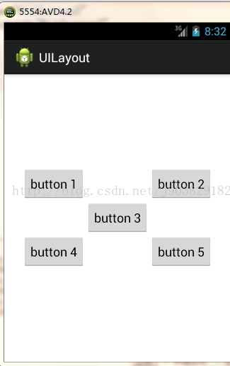
</RelativeLayout>
运行结果如下:
注意:当一个控件去引用另一个控件的id时,该控件一定要定义在引用控件的后面,不然会出现找不到id的情况。
3.FrameLayout
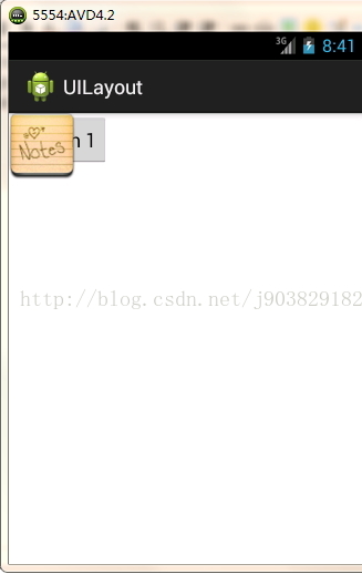
FrameLayout没有任何的定位方式,所有的控件都会摆放在布局的左上角。
修改布局文件的代码,代码如下:
<FrameLayout xmlns:android="http://schemas.android.com/apk/res/android"
    xmlns:tools="http://schemas.android.com/tools"
    android:layout_width="match_parent"
    android:layout_height="match_parent"
    >

    <Button
        android:id="@+id/button1"
        android:layout_width="wrap_content"
        android:layout_height="wrap_content"
        android:text="Button 1"
        />

    <ImageView
        android:id="@+id/image_view"
        android:layout_width="wrap_content"
        android:layout_height="wrap_content"
        android:src="@drawable/note1"
        />


</FrameLayout>
运行结果如下:
4.TableLayout
TableLayout允许我们使用表格的方式来排列控件,这种布局不是很常用。
修改布局文件代码如下:
<TableLayout xmlns:android="http://schemas.android.com/apk/res/android"
    xmlns:tools="http://schemas.android.com/tools"
    android:layout_width="match_parent"
    android:layout_height="match_parent"
    >

    <TableRow >
        <TextView
            android:layout_height="wrap_content"
            android:text="Account:"
            />
        <EditText
            android:id="@+id/account"
            android:layout_height="wrap_content"
            android:hint="Input your account"
            />
    </TableRow>

    <TableRow >
        <TextView
            android:layout_height="wrap_content"
            android:text="Password:"
            />
        <EditText
            android:id="@+id/password"
            android:layout_height="wrap_content"
            android:inputType="textPassword"
            />
    </TableRow>

    <TableRow >
        <Button
            android:id="@+id/login"
            android:layout_height="wrap_content"
            android:layout_span="2"
            android:text="Login"
            />
    </TableRow>

</TableLayout>TableLayout中每加入一个TableRow就表示在表格中添加了一列,然后在TableRow每加入一个控件,就表示在该行中加入了一列,TableRow中的控件是不能指定宽度的。
android:inputType="textPassword"属性让输入框变成密码输入框
android:layout_span="2"属性表示该控件占据两列。
运行结果如下
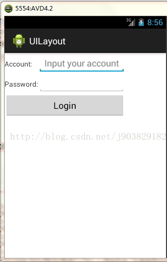
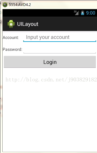
看运行结果可以发现右边有很多的空白处,界面不美观,我们可以对第二列进行拉伸,使充满右边的空白地方,所以给TableLayout添加android:stretchColumns="1"属性,值为1表示拉伸第二列,值为0表示拉伸第1列。
在运行程序如下,结果如下:
4中基本布局的使用就讲解到这了,下面会讲解自定义控件。
转载请注明:http://blog.csdn.net/j903829182/article/details/40663303


 2303
2303

 被折叠的 条评论
为什么被折叠?
被折叠的 条评论
为什么被折叠?
 到【灌水乐园】发言


