简单天猫导航的实现
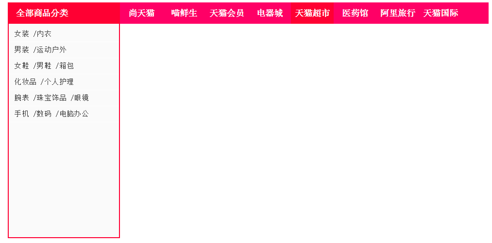
效果展示
代码实现
<!DOCTYPE html>
<html>
<head>
<title> new document </title>
<meta charset="utf-8" />
<style>
#top{
width:900px;
height:40px;
margin:auto;
background:#ff0066;
}
#top p{
width:210px;
height:40px;
background:#ff0033;
}
#top p a{
float:left;
color:#fff;
text-decoration:none;
line-height:40px;
padding-left:15px;
font-weight:bold;
}
p,ul,li,h3{
margin:0px;
padding:0px;
list-style:none;
}
#top p{
float:left;
}
#top ul{
float:left;
}
#top ul li {
float:left;
}
#top ul li a{
display:block;
width:80px;
height:40px;
text-decoration:none;
text-align:center;
line-height:40px;
color:#fff;
font-weight:900;
}
#top ul li a:hover{
background:#ff0033;
}
#category{
width:900px;
margin:auto;
}
#main_category{
width:206px;
border:2px solid #ff0033;
border-top:none;
background:#fafafa;
height:400px;
}
#main_category ul li a{
font-size:14px;
color:#333;
text-decoration:none;
font-weight:normal;
line-height:28px;
}
#main_category ul li h3{
width:186px;
padding-left:10px;
border:1px solid transparent;
border-left:none;
border-right:none;
}
#main_category ul li h3:hover{
border:1px solid #ddd;
border-left:none;
border-right:none;
background:#fff;
}
#main_category ul li{
border-bottom:1px solid #fff;
}
#main_category ul{
padding-top:5px;
}
</style>
</head>
<body>
<div id="top">
<p>
<a href="#">全部商品分类</a>
</p>
<ul>
<li>
<a href="#">尚天猫</a>
</li>
<li>
<a href="#">喵鲜生</a>
</li>
<li>
<a href="#">天猫会员</a>
</li>
<li>
<a href="#">电器城</a>
</li>
<li>
<a href="#">天猫超市</a>
</li>
<li>
<a href="#">医药馆</a>
</li>
<li>
<a href="#">阿里旅行</a>
</li>
<li>
<a href="#">天猫国际</a>
</li>
</ul>
</div>
<div id="category">
<div id="main_category">
<ul>
<li>
<h3>
<a href="#">女装 /内衣</a>
</h3>
</li>
<li>
<h3>
<a href="#">男装 /运动户外</a>
</h3>
</li>
<li>
<h3>
<a href="#">女鞋 /男鞋 /箱包</a>
</h3>
</li>
<li>
<h3>
<a href="#">化妆品 /个人护理</a>
</h3>
</li>
<li>
<h3>
<a href="#">腕表 /珠宝饰品 /眼镜</a>
</h3>
</li>
<li>
<h3>
<a href="#">手机 /数码 /电脑办公</a>
</h3>
</li>
</ul>
</div>
</div>
</body>
</html>


 扫一扫
扫一扫
 5064
5064

 被折叠的 条评论
为什么被折叠?
被折叠的 条评论
为什么被折叠?
 到【灌水乐园】发言


