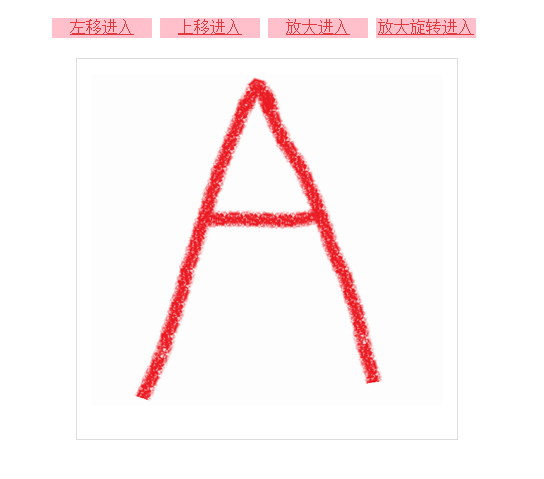
Demo14:图片渐入

利用css动画实现图片渐入的功能

实现效果

点击文字实现相应的效果
图片渐入

代码实现

<!DOCTYPE html>
<html>
    <head>
        <title> 图片渐入效果的实现 </title>
        <meta charset="utf-8"/>
        <style>
            a{
                display:inline-block;
                width:100px;
                height:20px;
                color:#e4393c;
                background:pink;
                text-align:center;
                position:relative;
                z-index:20;
            }
            #d1{
                width:430px;
                margin:20px auto;
            }
            #d2{
                width:350px;
                height:350px;
                padding:15px;
                border:1px solid #ddd;
                margin-top:30px;
                position:relative;
                z-index:9;
                margin:0px auto;

            }
            img{
                display:none;
                position:absolute;
            }
            @keyframes img1{
                from{
                    transform:translate(-350px);
                }
                to{
                    transform:translate(0px);
                }
            }
            @-webkit-keyframes img1{
                from{
                    transform:translate(-350px);
                }
                to{
                    transform:translate(0px);
                }
            }
            #img1:target{
                display:block;
                z-index:10;
                animation:img1 5s linear;
                -webkit-animation:img1 5s linear;
                -webkit-animation-fill-mode:forwards;
            }           
            @keyframes img2{
                from{
                    transform:translate(0px,350px);
                }
                to{
                    transform:translate(0px,0px);
                }
            }
            @-webkit-keyframes img2{
                from{
                    transform:translate(0px,350px);
                }
                to{
                    transform:translate(0px,0px);
                }
            }
            #img2:target{
                display:block;
                z-index:11;
                animation:img2 5s linear;
                -webkit-animation:img2 5s linear;
                -webkit-animation-fill-mode:forwards;
            }
            @keyframes img3{
                from{
                    transform:scale(0.1);
                }
                to{
                    transform:scale(1);
                }
            }
            @-webkit-keyframes img3{
                from{
                    transform:scale(0.1);
                }
                to{
                    transform:scale(1);
                }
            }
            #img3:target{
                display:block;
                z-index:12;
                animation:img3 5s linear;
                -webkit-animation:img3 5s linear;
                -webkit-animation-fill-mode:forwards;
            }   
            @keyframes img4{
                from{
                    transform:scale(0.1) rotate(0deg);

                }
                to{
                    transform:scale(1) rotate(720deg);

                }
            }
            @-webkit-keyframes img4{
                from{
                    transform:scale(0.1) rotate(0deg);

                }
                to{
                    transform:scale(1) rotate(720deg);

                }
            }
            #img4:target{
                display:block;
                z-index:13;
                animation:img4 5s linear;
                -webkit-animation:img4 5s linear;
                -webkit-animation-fill-mode:forwards;
            }
        </style>
    </head>
    <body>
        <div id="d1">
            <a href="#img1">左移进入</a>
            <a href="#img2">上移进入</a>
            <a href="#img3">放大进入</a>
            <a href="#img4">放大旋转进入</a>
        </div>
        <div id="d2">
            <img src="a.png" id ="img1" />
            <img src="b.png" id ="img2" />
            <img src="c.png" id ="img3" />
            <img src="d.png" id ="img4" />
        </div>
    </body>
</html>
  • 1
    点赞
  • 1
    收藏
    觉得还不错? 一键收藏
  • 0
    评论

“相关推荐”对你有帮助么?

  • 非常没帮助
  • 没帮助
  • 一般
  • 有帮助
  • 非常有帮助
提交
评论
添加红包

请填写红包祝福语或标题

红包个数最小为10个

红包金额最低5元

当前余额3.43前往充值 >
需支付:10.00
成就一亿技术人!
领取后你会自动成为博主和红包主的粉丝 规则
hope_wisdom
发出的红包
实付
使用余额支付
点击重新获取
扫码支付
钱包余额 0

抵扣说明:

1.余额是钱包充值的虚拟货币,按照1:1的比例进行支付金额的抵扣。
2.余额无法直接购买下载,可以购买VIP、付费专栏及课程。

余额充值