


基本的用法我们在 【万里征程——Windows App开发】页面布局和基本导航中已经讲过了,这里继续补充关于应用栏的更多用法。
Icon
在之前的学习中,我们知道Icon属性中有很多很多系统预定义,但也许这些还是不够的,现在就来增加几种用法咯。
字符集应用
<AppBarToggleButton Label="Sigma" Click="AppBarButton_Click">
<AppBarToggleButton.Icon>
<FontIcon Glyph="Σ"/>
</AppBarToggleButton.Icon>
</AppBarToggleButton>那么什么是字符集应用呢?请参阅维基百科。
PathIcon
我们也可以用路径来绘制一个属于自己的图形哦,下面的图形大概就是9点钟的样子啦。
<AppBarToggleButton Label="Time" Click="AppBarButton_Click">
    <AppBarToggleButton.Icon>
        <PathIcon Data="F1 M 20,20 21,1L 21,21L 8,21"/>
    </AppBarToggleButton.Icon>
</AppBarToggleButton>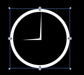
如何适应不同的分辨率
如何适应不同的分辨率这也是值得我们去解决的问题,毕竟不论是从8英寸的平板还是25英寸的台式机,甚至还有4英寸至7英寸的手机,在应用栏按钮太多而屏幕不够大时,多余的按钮该怎么办呢?
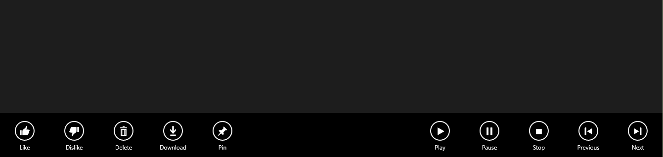
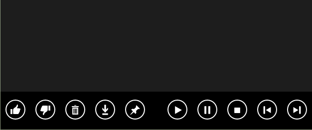
默认情况下,应用栏图标的宽度都是确定好的100像素哦。那么我们先来看两张图片好了,由于Windows 10是可以直接调整Modern应用的大小的(而不是windows 8那种只能全屏显示),所以我直接拉伸Modern大小以模拟分辨率的概率啦。
    <Page.BottomAppBar>
        <AppBar x:Name="bottomAppBar" IsSticky="True">
            <Grid>
                <StackPanel x:Name="leftBottomAppBar"
                            Orientation="Horizontal">
                    <AppBarButton Label="Like" Icon="Like"/>
                    <AppBarButton Label="Dislike" Icon="Dislike"/>
                    <AppBarButton Label="Delete" Icon="Delete"/>
                    <AppBarButton Label="Download" Icon="Download"/>
                    <AppBarButton Label="Pin" Icon="Pin"/>
                </StackPanel>
                <StackPanel x:Name="rightBottomAppBar"
                        Orientation="Horizontal" HorizontalAlignment="Right">
                    <AppBarButton Label="Play" Icon="Play"/>
                    <AppBarButton Label="Pause" Icon="Pause"/>
                    <AppBarButton Label="Stop" Icon="Stop"/>
                    <AppBarButton Label="Previous" Icon="Previous"/>
                    <AppBarButton Label="Next" Icon="Next"/>
                </StackPanel>
            </Grid>
        </AppBar>
    </Page.BottomAppBar>
这里为了调试更加方便,所以使用了IsSticky属性。AppBarButton还有一个很重要的属性哟,之前用不到,不过这里就是核心成员了呢,它就是IsCompact。这个属性可以让应用栏按钮只显示图标而不显示文字,也就是Label啦。那么我们的工作就要围绕这个属性来展开了。
我们可以这样假设,有一个函数,它有一个布尔变量的参数,参数为真的话呢,那么所有的这些AppBarButton的IsCompact属性也为真。在以下这段代码中,我们先将bottomAppBar的自对象选取为root,这样一来的话呢,如果应用中还有顶部的应用栏,就不会相互干扰啦。然后逐步取出root和panel中的自对象就好咯。
private void AppBarButtonCompact(bool isCompact)
{
Panel root = bottomAppBar.Content as Panel;
if(root!=null)
{
foreach(Panel panel in root.Children)
{
foreach (ICommandBarElement child in panel.Children)
{
child.IsCompact = isCompact;
}
}
}
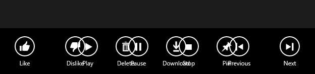
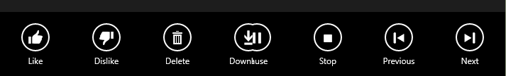
}接下来还需要判断到底需不需要启用IsCompact,那这又是由什么决定的呢,既然前面提到是因为屏幕的分辨率,也就是所应用所占用的宽度会导致应用栏发生重叠,那么答案就毫无疑问了。看到下面的代码相信大家都明白了,至于为何是宽度的界限在1000呢,那是因为有10个AppBarButton,前面也说了它们的宽度是100。(不带Label的话呢,就只需要60像素啦。)
     void AppSizeChanged(object sender, SizeChangedEventArgs e)
        {
            if (e.NewSize.Width != e.PreviousSize.Width)
            {
                if (e.NewSize.Width < 1000)
                {
                    AppBarButtonCompact(true);
                }
                else
                {
                    AppBarButtonCompact(false);
                }
            }
        }
来张图片以示搞定这个问题了吧。
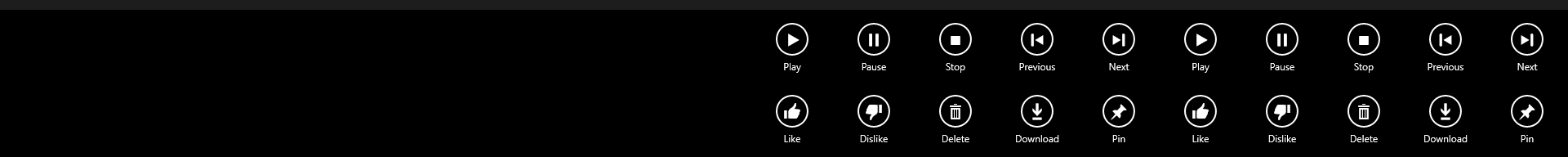
但是像我这么钻牛角尖的人,10个AppBarButton用这种方式搞定了,那20个呢?我们就来演示一下,把之前XAML中的AppBarButton复制粘贴一番。如果是2K、4K的屏幕应对20个没问题啊,但我这1920X1080的屏幕就放不下了。

那么这又有什么办法可以解决的吗?当然有啦,将这20个图标切成2列就好啦。我们首先在Grid中添加一行。
<Grid.RowDefinitions>
    <RowDefinition Height="auto"/>
    <RowDefinition Height="auto"/>
</Grid.RowDefinitions>
再通过下面这张方式来调整它处于哪一行,以及在水平方向的右侧还是左侧。这里我将两行都设置在右侧啦。
leftBottomAppBar.SetValue(Grid.RowProperty, 1);
leftBottomAppBar.SetValue(HorizontalAlignmentProperty, HorizontalAlignment.Right);
当然了,这样一来就可以放40个AppBarButton啦,如果缩小应用的大小的话为了容纳更多还可以用IsCompact属性呢。不过没有哪个应用做成这样吧^_^
另外呢,如果把应用栏设计成这样的话。
<Page.BottomAppBar>
   <AppBar x:Name="bottomAppBar" IsSticky="True">
      <Grid>
         <Grid.ColumnDefinitions>
             <ColumnDefinition Width="*"/>
             <ColumnDefinition Width="*"/>
         </Grid.ColumnDefinitions>
         <StackPanel Grid.Column="0" x:Name="leftBottomAppBar"  Orientation="Horizontal" HorizontalAlignment="Left">
             <AppBarButton Label="Like" Icon="Like"/>
             <AppBarButton Label="Dislike" Icon="Dislike"/>
             <AppBarButton Label="Delete" Icon="Delete"/>
             <AppBarButton Label="Download" Icon="Download"/>
             <AppBarButton Label="Pin" Icon="Pin"/>
         </StackPanel>
         <StackPanel Grid.Column="1" x:Name="rightBottomAppBar" Orientation="Horizontal" HorizontalAlignment="Right">
             <AppBarButton Label="Play" Icon="Play"/>
             <AppBarButton Label="Pause" Icon="Pause"/>
             <AppBarButton Label="Stop" Icon="Stop"/>
             <AppBarButton Label="Previous" Icon="Previous"/>
             <AppBarButton Label="Next" Icon="Next"/>
         </StackPanel>
      </Grid>
   </AppBar>
</Page.BottomAppBar>
那么对于Windows 10,在拉伸的过程中,中间部分的控件就会慢慢消失啦。以下这张图片呢,是我在拉伸到中间有2个控件刚好重叠的时候啦。至于把AppBarButton设计成这样是好是坏大家自己决定咯,我反正觉得这样不好呢。不过有意思的是,即便如此,它们彼此的Click事件还都是有效的噢,会区分左右两部分,而不会叠在一起。
当然啦,这个的应用远不是应用栏这么简单哟,对于其他的前景,比如有两个TextBlock在屏幕左右两侧,当应用把收缩变小之后也可以让这个TextBlock叠成2层在屏幕的一边。
在应用栏上添加菜单
我们都见过有菜单的应用栏按钮对吧,这个的实现其实也挺简单的。用Flyout属性就好啦。
<Page.BottomAppBar>
    <CommandBar>
        <AppBarButton Icon="Rotate" Label="Rotate">
            <AppBarButton.Flyout>
                <MenuFlyout>
                   <MenuFlyoutItem Text="Rotate 90" Click="MenuFlyoutItem_Click" Tag="Rotate90"/>
                   <MenuFlyoutItem Text="Rotate 180" Click="MenuFlyoutItem_Click" Tag="Rotate180"/>
                   <MenuFlyoutItem Text="Rotate 270" Click="MenuFlyoutItem_Click" Tag="Rotate270"/>
               </MenuFlyout>
           </AppBarButton.Flyout>
       </AppBarButton>
   </CommandBar>
</Page.BottomAppBar>
Tag属性嘛,既然童鞋们在看CSDN博客,那自然就知道Tag啦。下面这段代码就让Flyout菜单发挥作用啦。
private void MenuFlyoutItem_Click(object sender, RoutedEventArgs e)
{
    MenuFlyoutItem selectedItem = sender as MenuFlyoutItem;

    if (selectedItem != null)
    {
        if (selectedItem.Tag.ToString() == "Rotate90")
        {
            DoRotate(90);
        }
        else if (selectedItem.Tag.ToString() == "Rotate180")
        {
            DoRotate(180);
        }
        else if (selectedItem.Tag.ToString() == "Rotate270")
        {
            DoRotate(270);
        }
    }
}
感谢访问,希望对您有所帮助。 欢迎关注或收藏、评论或点赞。
为使本文得到斧正和提问,转载请注明出处:
http://blog.csdn.net/nomasp


 2397
2397


 被折叠的 条评论
为什么被折叠?
被折叠的 条评论
为什么被折叠?
 到【灌水乐园】发言


