


Android5.0的10大新特性
全新Material Design设计风格
支持多种设备
全新的通知中心设计
支持64位ART虚拟机
Project Volta电池续航改进计划
全新的“最近应用程序”
改进安全性
不同数据独立保存
改进搜索
新的API支持,蓝牙4.1、USB Audio、多人分享等其它特性
在这些新特性中,Material Design显得尤为突出,在2015年掀起一阵热潮。Material Design,谷歌推出的全新设计语言,这种设计语言旨在为手机、平板电脑、台式机和“其他平台”提供更一致、更广泛的“外观和感觉”在基本元素的处理上,借鉴了传统的印刷设计,字体版式、网格系统、空间、比例、配色、图像使用等这些基础的平面设计规范。现在市面上比较多的APP都采用了该风格设计,我们常看到的就是状态栏的颜色随着界面的切换而改变,让整个界面看起来更和谐。除此之外,Material Design提供更多的风格
主题
Material Design默认的3个主题
Theme.Material:黑色主题
Theme.Material.Light:明亮主题
Theme.Material.Light.DarkActionBar:明亮主题带黑色的ActionBar
在使用这些默认主题的时候只要在style.xml中修改theme即可
        <resources>

            <!-- Base application theme. -->
            <style name="AppTheme" parent="android:Theme.Material.Light.DarkActionBar">
                <!-- Customize your theme here. -->

            </style>

        </resources>
支持自定义主题
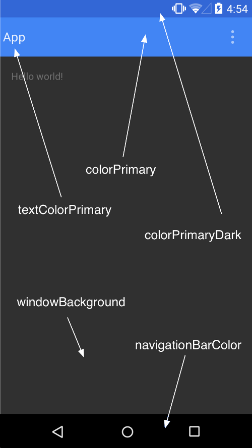
如图,Material Design把一个界面元素进行了划分,各元素的颜色可以自己定义,常用的有。
android:colorPrimaryDark :通知栏颜色
android:colorPrimary:actionBar的颜色
android:windowBackground:内容窗体颜色
android:navigationBarColor:底部操作栏颜色
其它的还有
android:textColorPrimary 应用的主要文字颜色,actionBar的标题文字默认使用该颜色
android:statusBarColor 状态栏颜色,默认使用colorPrimaryDark
android:colorForeground 应用的前景色,ListView的分割线,switch滑动区默认使用该颜色
android:colorBackground 应用的背景色,popMenu的背景默认使用该颜色
android:colorAccent 一般控件的选中效果默认采用该颜色
android:colorControlNormal 控件的默认色调
android:colorControlHighlight 控件按压时的色调
android:colorControlActivated 控件选中时的颜色,默认使用colorAccent
android:colorButtonNormal 默认按钮的背景颜色
android:textColor Button,textView的文字颜色
android:textColorPrimaryDisableOnly RadioButton checkbox等控件的文字
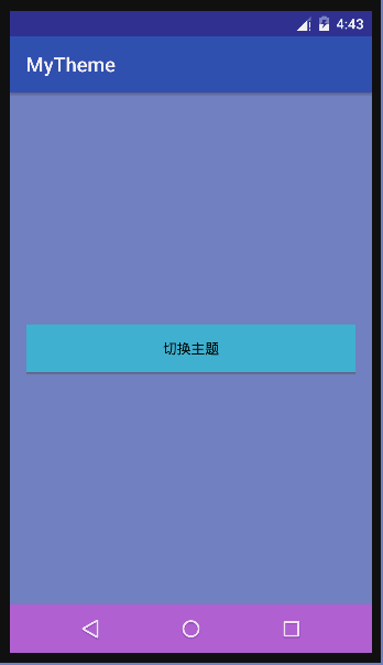
使用自定义主题
- 自定义2种主题,并进行切换
    <resources>

        <!-- Base application theme. -->
        <style name="AppTheme" parent="android:Theme.Material.Light.DarkActionBar">
            <!-- Customize your theme here. -->
            <item name="android:colorPrimaryDark">@color/colorPrimaryDark</item>
            <item name="android:colorPrimary">@color/colorPrimary</item>
            <item name="android:windowBackground">@color/windowBackground</item>
            <item name="android:navigationBarColor">@color/navigationBarColor</item>
        </style>
        <style name="MyTheme" parent="android:Theme.Material.Light.DarkActionBar">
            <!-- Customize your theme here. -->
            <item name="android:colorPrimaryDark">@color/mColorPrimaryDark</item>
            <item name="android:colorPrimary">@color/mColorPrimary</item>
            <item name="android:windowBackground">@color/mWindowBackground</item>
            <item name="android:navigationBarColor">@color/mNavigationBarColor</item>
        </style>

</resources>- 在MainActivity中调用setTheme(int id)进行主题切换
 protected void onCreate(Bundle savedInstanceState) {
        super.onCreate(savedInstanceState);
        int id=getIntent().getIntExtra("themeID",0);
        if(id!=0){
            //设置主题的方法一定要在setContentView或inflate之前调用
            setTheme(id);
        }
        setContentView(R.layout.activity_main);
    }

    public void changeTheme(View view) {
        finish();
        //设置Activity切换时无动画效果
        overridePendingTransition(0,0);
        Intent intent = new Intent(this, MainActivity.class);
        intent.putExtra("themeID", R.style.MyTheme);
        startActivity(intent);
        overridePendingTransition(0,0);
    }
Material Design主题的使用要在SDK21以上版本使用,如果要在5.0以下系统使用,需要导入兼容库。
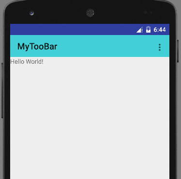
Toobar
Toobar是Android5.0推出的新控件,是Actionbar的升级版,可作为APP内容的标题栏使用,比Actionbar更灵活、自由。
使用Toobar
为了兼容5.0以下系统,建议使用v7包下的Toobar
<android.support.v7.widget.Toolbar
    xmlns:android="http://schemas.android.com/apk/res/android"
    android:layout_width="match_parent"
    android:layout_height="50dp"
    android:background="#dd29cad2">
</android.support.v7.widget.Toolbar>
普通的Toobar
- 通过 setSupportActionBar(toobar)将Toobar变成Actionbar,使用Toobar的Activity要继承自AppCompatActivity/ActionbarActivity,Theme要使用AppCompat下的NOActionBar
public class MainActivity extends AppCompatActivity {
    private Toolbar toobar;
    @Override
    protected void onCreate(Bundle savedInstanceState) {
        super.onCreate(savedInstanceState);
        setContentView(R.layout.activity_main);
        initView();
    }
    private void initView(){
        toobar=(Toolbar) findViewById(R.id.toobar);
        setSupportActionBar(toobar);
    }

    @Override
    public boolean onCreateOptionsMenu(Menu menu) {
       // return super.onCreateOptionsMenu(menu);
        getMenuInflater().inflate(R.menu.main,menu);
        return true;
    }

    @Override
    public boolean onOptionsItemSelected(MenuItem item) {
        return super.onOptionsItemSelected(item);
    }
}
变成Actionbar的Toobar
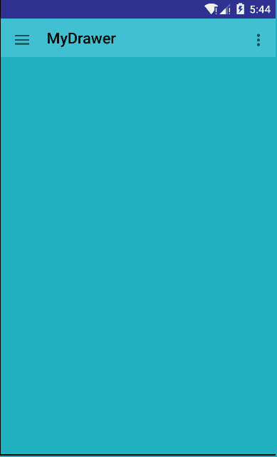
Toobar与抽屉Drawer的集成
创建布局,使用V4包下的DrawerLayout
    <?xml version="1.0" encoding="utf-8"?>
    <LinearLayout
        xmlns:android="http://schemas.android.com/apk/res/android"
        android:layout_width="match_parent"
        android:layout_height="match_parent"
        android:orientation="vertical">

        <android.support.v7.widget.Toolbar
            android:id="@+id/toolbar"
            android:layout_width="match_parent"
            android:layout_height="50dp"
            android:background="#dd29cad2">
        </android.support.v7.widget.Toolbar>

        <android.support.v4.widget.DrawerLayout
            android:id="@+id/drawer"
            android:layout_width="match_parent"
            android:layout_height="match_parent">

        <FrameLayout
            android:id="@+id/menu"
            android:layout_width="250dp"
            android:layout_height="match_parent"
            android:layout_gravity="left"
            android:background="#70b65f">
        </FrameLayout>
            <FrameLayout
                android:id="@+id/content"
                android:layout_width="match_parent"
                android:layout_height="match_parent"
                android:background="#27b3c2">
            </FrameLayout>
        </android.support.v4.widget.DrawerLayout>

</LinearLayout>- 集成ActionBarDrawerToggle图标
 protected void onCreate(Bundle savedInstanceState) {
        super.onCreate(savedInstanceState);
        setContentView(R.layout.activity_main);
        initView();
    }

    private void initView() {
        Toolbar toolbar = (Toolbar) findViewById(R.id.toolbar);
        setSupportActionBar(toolbar);
        //抽屉菜单
        DrawerLayout drawer = (DrawerLayout) findViewById(R.id.drawer);
        //箭头图标
        ActionBarDrawerToggle toggle = new ActionBarDrawerToggle(this,drawer,toolbar,R.string.open,R.string.close);
       //设置状态同步
        toggle.syncState();
        drawer.setDrawerListener(toggle);
    }
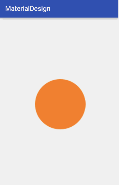
新的Selector定义方式:使用一张图片就可以做点击的状态效果
selector.xml
<?xml version="1.0" encoding="utf-8"?>
<selector xmlns:android="http://schemas.android.com/apk/res/android">
    <item android:drawable="@drawable/press" android:state_pressed="true"></item>
    <item android:drawable="@mipmap/circle_orange"></item>
</selector>- press.xml
<?xml version="1.0" encoding="utf-8"?>
<bitmap xmlns:android="http://schemas.android.com/apk/res/android"
        android:src="@mipmap/circle_orange"
        android:tint="#e9bd7b"
        android:tintMode="multiply"
    >

</bitmap>
android:tint :设置另外一种颜色渲染
android:tintMode :设置颜色渲染的模式
xml文件可以设置6种:
- MULTIPLY :取两层绘制交集
- SCREEN :上下层都显示
- SRC_OVER :正常绘制显示,上下层绘制叠盖
- SRC_IN :取两层绘制交集,显示上层
- SRC_ATOP 取下层非交集部分与上层交集部分
- ADD:与SCREEN 类似
在代码中还可以设置:
- PorterDuff.Mode.CLEAR 所绘制不会提交到画布上。
- PorterDuff.Mode.SRC 显示上层绘制图片
-PorterDuff.Mode.DST 显示下层绘制图片 - PorterDuff.Mode.DST_OVER 上下层都显示。下层居上显示。
- PorterDuff.Mode.DST_IN 取两层绘制交集。显示下层。
- PorterDuff.Mode.DST_OUT 取下层绘制非交集部分。
- PorterDuff.Mode.SRC_OUT :取上层绘制非交集部分。
- PorterDuff.Mode.DST_ATOP 取上层非交集部分与下层交集部分
- PorterDuff.Mode.XOR 取两层绘制非交集。两层绘制非交集。
- PorterDuff.Mode.DARKEN 上下层都显示。变暗
- PorterDuff.Mode.LIGHTEN 上下层都显示。变亮
View的阴影轮廓效果
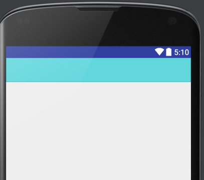
Material Design给View添加了一个新的属性elevation,通过设置elevation的值可以给View添加阴影效果,如图中的View,给人一种重叠的层次感。
    <View
        android:layout_width="200dp"
        android:layout_height="200dp"
        android:background="#0000ff"
        android:elevation="10dp"/>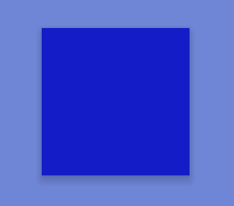
如果是图片要使用阴影轮廓,可以通过android:outlineProvider属性来指定,属性值有:
none :即使设置了elevation属性,也不会产生阴影
background :会按照背景来设置阴影形状
bounds :会按照View的大小来描绘阴影
paddedBounds 和bounds类似,不过阴影会稍微向右偏移
也可以在代码中设置特殊图片的阴影轮廓
ViewOutlineProvider viewOutlineProvider = new ViewOutlineProvider() {
    public void getOutline(View view, Outline outline) {
        // 可以指定圆形,矩形,圆角矩形的阴影轮廓
        outline.setOval(0, 0, view.getWidth(), view.getHeight());
    }
};
imageView.setOutlineProvider(viewOutlineProvider );- 当设置图片的阴影效果比图片本身小时,并不能看见阴影,这时,可以通过setClipToOutline(Boolean boolean)方法对图片进行裁剪,裁剪前必须先设置阴影,即先要调用setOutlineProvider方法,剪裁不会改变View的测量大小和布局大小,也不会改变View的触摸区域。
ViewOutlineProvider viewOutlineProvider = new ViewOutlineProvider() {
    public void getOutline(View view, Outline outline) {
    //阴影区域比图片实际大小小15px
        outline.setOval(0, 0, view.getWidth()-15, view.getHeight()-15);
    }
};
imageView.setOutlineProvider(viewOutlineProvider );
//设置进行裁剪
imageView.setClipToOutline(true);


 扫一扫
扫一扫
 1737
1737

 被折叠的 条评论
为什么被折叠?
被折叠的 条评论
为什么被折叠?
 到【灌水乐园】发言


