


简介
shape drawable主要是指我们自定义的外形drawable,我们可以自定义这个drawable的各种形状,以及它对应的颜色大小等,
根属性
<?xml version="1.0" encoding="utf-8"?>
<shape xmlns:android="http://schemas.android.com/apk/res/android"
    android:shape="rectangle">

</shape>
xmlns代表的是命名空间
android:shape代表的是shape的类型,在android中,主要有4种类型:
- rectangle:矩形
- oval:椭圆
- line:线
- ring:圆环
当我们的shape为ring时,才可以设置下面的几种属性
- android:innerRadius:圆环内部的半径的宽度
dimension,比如dp,sp等,也可以传入dimension 资源,这种资源文件的xml如下
resources>
    <!-- Default screen margins, per the Android Design guidelines. -->
    <dimen name="inner_radius">16dp</dimen>

</resources>
Example:
android:innerRadius = "@dimen/inner_radius"这样实际上也就相当于我们设置圆环内部半径
- android:innerRadiusRatio:float型,代表圆环内部半径占整个shape宽度的几分之一,相当于等分整个shape宽度,然后圆环内部半径只占一份,默认值为9,而且当android:innerRadius有值的时候,android:innerRadiusRatio是无效的,
Example:
android:innerRadiusRatio = "5"//代表圆环内部半径为整个shape宽度的1/5
android:innerRadiusRatio = "2"//代表圆环内部半径为整个shape宽度的1/2
android:thinkness:代表圆环的厚度,指的是最外圈的宽度,dimension或者dimension 资源
android:thinknessRatio:float,代表圆环厚度占整个shape宽度的几分之一,跟android:innerRadiusRatio是差不多的android:useLevel:boolean,如果当前定义的drawable的是用在LevelListDrawable则设为true,否则设为false,如果不设置这个属性的话,圆环不会显示出来
下面讲解其他的几个element
1、corner
corner主要是定义这个外形drawable的几个角的半径,属性如下
android:radius    //dimension或者dimension resource ,设置上下左右四个角的半径,
android:topLeftRadius  //左上角半径
android:topRightRadius   //右上角半径
android:bottomLeftRadius  //左下角半径
android:bottomRightRadius   //右小角半径
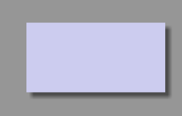
Example:当我们不设置这个属性,xml文件:
<?xml version="1.0" encoding="utf-8"?>
<shape xmlns:android="http://schemas.android.com/apk/res/android"
    android:shape="rectangle">

    <size
        android:height="50dp"
        android:width="100dp"/>
    <solid
        android:color="#ccccef"/>

</shape>
效果如图
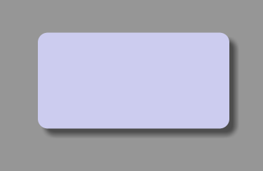
当我们设置这个属性后,xml:
<?xml version="1.0" encoding="utf-8"?>
<shape xmlns:android="http://schemas.android.com/apk/res/android"
    android:shape="rectangle">

    <corners
        android:radius="5dp"/>
    <size
        android:height="50dp"
        android:width="100dp"/>
    <solid
        android:color="#ccccef"/>

</shape>
图片:
2、size
size主要指定了整个shape的宽和高,同时shape会按照我们设置的宽高等比例的在父布局里面缩放,
比如我们设了一个imageview:
<ImageView
        android:src="@drawable/myshape"
        android:layout_centerInParent="true"
        android:layout_width="300dp"
        android:layout_height="200dp"

        />
然后我们的shape的宽高设为
<size
        android:height="50dp"
        android:width="100dp"/>
这时的结果为
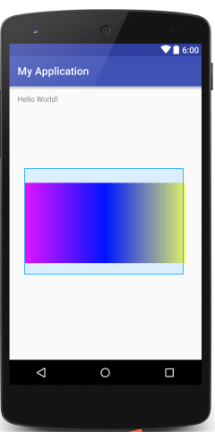
说明shape会按照宽高比2:1放大,当宽填满父布局时,高为150dp,父布局为200dp,所以呈现出了图片的结果,如果我们不想让shape缩放 ,以imageview为例,我们可以设置
android:scaleType="center"这时的效果如图:
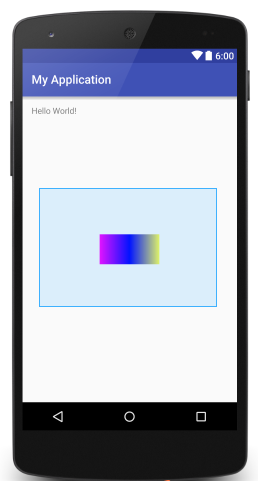
android:layout_height   //高
android:layout_width    //宽
3、padding
padding主要指的是整个shape布局与容器布局的边距,但是我尝试了一下发现设置这个属性好像并没有起作用,这个还有待验证
android:left
android:right
android:top
android:bottom
4、solid
solid主要定义的是我们的shape的填充颜色
android:color5、stroke
stroke主要定义的是shape的边框属性,包括边框的宽度,边框的颜色等
android:width //画边框的线条的宽度
android:color   //线条的颜色
android:dashGap   //线条之间的距离,
android:dashWidth   //线条的长度,只有当android:dashGap设置后才生效
这里还是以个rectangle为例
首先没设置后面两个属性
<stroke
        android:width="1dp"
        android:color="#00f0de"/>
效果如下:
当我们改变布局
<stroke
        android:width="1dp"
        android:color="#00f0de"
        android:dashGap="1dp"
        android:dashWidth="10dp"
        />
效果变化如下:
6、gradient
gradient允许我们自定义整个shape颜色的渐变,
android:angle  //0表示从左向右渐变,90表示从下往上,必须是45度的整数,默认值是0
android:centerX  //定义整个shape的x轴中心位置,方便后续的centerColor,0-1.0
android:centerY  //定义整个shape的y轴中心位置
android:startColor  //shape的开始颜色
android:centerColor  //shape的中心的颜色
android:endColor   //shape结束时候的颜色
android:type    // 颜色渐变的类型
                    linear:线性
                    radial:从中间往四周发散型,个人发现api19不能正常显示,api21  23可以正常显示
                    sweep:扫描式顺时针发散,
                //具体可以看后面的例子

android:useLevel  //当用在LevelListDrawable时需要设置为true
android:gradientRadius   //只有当type为radial时,这个属性才生效,指的是圆的半径
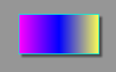
类型为linear:
<gradient
        android:startColor="#d00dff"
        android:centerColor="#0000ff"
        android:gradientRadius="25dp"
        android:type="linear"
        android:endColor="#dcff00"/>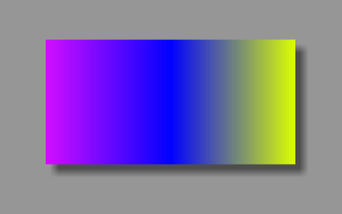
类型为radial:
<gradient
        android:startColor="#d00dff"
        android:centerColor="#0000ff"
        android:gradientRadius="25dp"
        android:type="radial"
        android:endColor="#dcff00"/>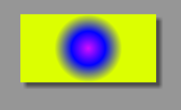
类型为sweep:顺时针从0度开始
<gradient
        android:startColor="#d00dff"
        android:centerColor="#0000ff"
        android:gradientRadius="25dp"
        android:type="sweep"
        android:endColor="#dcff00"/>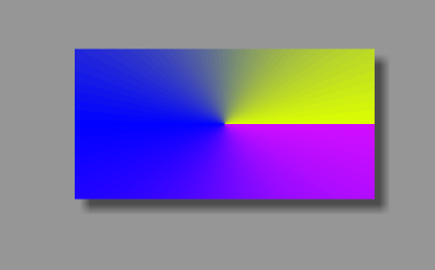
结语
通过上诉自定义drawable,我们能制作很多好看的resources,比如圆角图片,渐变线条等等。


 578
578


 被折叠的 条评论
为什么被折叠?
被折叠的 条评论
为什么被折叠?
 到【灌水乐园】发言


