


谷歌官方Android最新滑动选项导航卡SlidingTabLayout和SlidingTabStrip
在最新版的谷歌官方Android SDK(Android 5.0+以上的SDK)中,已经废弃过往过选项导航卡的支持,取而代之以最新的SlidingTabLayout和SlidingTabStrip结合ViewPager实现选项导航卡滑动切换的样式。
SlidingTabLayout代表可以盛放选项导航卡的布局“容器”具体,SlidingTabLayout中存放的每一个子元素(导航卡中的每一个‘卡片’)由SlidingTabStrip实现。
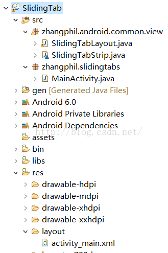
现在给出一个完整的例子加以说明,随后将谷歌官方SlidingTabLayout和SlidingTabStrip实现的源代码全部贴出,具体的使用方法:可以直接把SlidingTabLayout和SlidingTabStrip这两个类文件放到自己项目的源代码中,作为普通的类文件使用。在我给出的演示代码中,代码存放结构如图所示:
测试用的主Activity MainActivity.java文件:
package zhangphil.slidingtabs;

import android.app.Activity;
import android.os.Bundle;
import android.support.v4.view.PagerAdapter;
import android.support.v4.view.ViewPager;
import android.view.Gravity;
import android.view.View;
import android.view.ViewGroup;
import android.widget.TextView;
import zhangphil.android.common.view.SlidingTabLayout;
import zhangphil.slidingtabs.R;


public class MainActivity extends Activity {

    @Override
    protected void onCreate(Bundle savedInstanceState) {
        super.onCreate(savedInstanceState);
        setContentView(R.layout.activity_main);

        ViewPager mViewPager = (ViewPager) findViewById(R.id.viewpager);
        mViewPager.setAdapter(new MyPagerAdapter(this));

        SlidingTabLayout mSlidingTabLayout = (SlidingTabLayout) findViewById(R.id.sliding_tabs);
        mSlidingTabLayout.setViewPager(mViewPager);
    }

    private	class MyPagerAdapter extends PagerAdapter {

    	private	Activity mActivity;

    	public	MyPagerAdapter(Activity mActivity){
    		this.mActivity=mActivity;
    	}

        @Override
        public boolean isViewFromObject(View view, Object o) {
            return o == view;
        }

        @Override
        public CharSequence getPageTitle(int pos) {
            return "选项卡" +pos;
        }

        @Override
        public Object instantiateItem(ViewGroup container, int pos) {
        	TextView tv=new TextView(mActivity);
        	tv.setText(pos+"");
        	tv.setTextSize(50.0f);
        	tv.setGravity(Gravity.CENTER);
        	container.addView(tv);

            return tv;
        }

        @Override
        public void destroyItem(ViewGroup container, int position, Object object) {
            container.removeView((View) object);
        }

        @Override
        public int getCount() {
            return 10;
        }
    }
}
MainActivity.java需要的布局文件 activity_main.xml :
<?xml version="1.0" encoding="utf-8"?>
<LinearLayout xmlns:android="http://schemas.android.com/apk/res/android"
    android:layout_width="match_parent"
    android:layout_height="match_parent"
    android:orientation="vertical" >

    <zhangphil.android.common.view.SlidingTabLayout
        android:id="@+id/sliding_tabs"
        android:layout_width="match_parent"
        android:layout_height="wrap_content" />

    <android.support.v4.view.ViewPager
        android:id="@+id/viewpager"
        android:layout_width="match_parent"
        android:layout_height="0px"
        android:layout_weight="1" />

</LinearLayout>
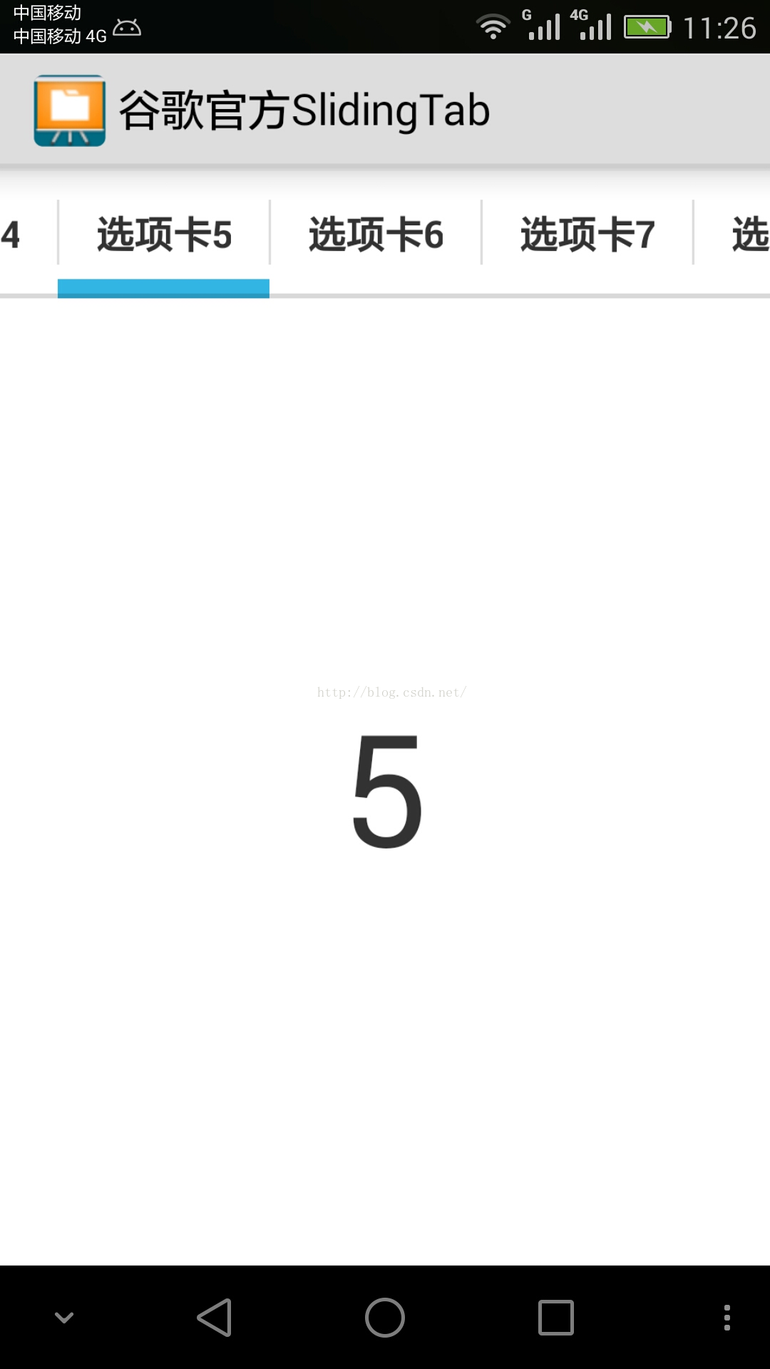
代码运行结果如图:
以下是谷歌官方Android实现的SlidingTabLayout.java全部源代码:
package zhangphil.android.common.view;


import android.content.Context;
import android.graphics.Typeface;
import android.os.Build;
import android.support.v4.view.PagerAdapter;
import android.support.v4.view.ViewPager;
import android.util.AttributeSet;
import android.util.TypedValue;
import android.view.Gravity;
import android.view.LayoutInflater;
import android.view.View;
import android.widget.HorizontalScrollView;
import android.widget.TextView;

/**
 * To be used with ViewPager to provide a tab indicator component which give constant feedback as to
 * the user's scroll progress.
 * <p>
 * To use the component, simply add it to your view hierarchy. Then in your
 * {@link android.app.Activity} or {@link android.support.v4.app.Fragment} call
 * {@link #setViewPager(ViewPager)} providing it the ViewPager this layout is being used for.
 * <p>
 * The colors can be customized in two ways. The first and simplest is to provide an array of colors
 * via {@link #setSelectedIndicatorColors(int...)} and {@link #setDividerColors(int...)}. The
 * alternative is via the {@link TabColorizer} interface which provides you complete control over
 * which color is used for any individual position.
 * <p>
 * The views used as tabs can be customized by calling {@link #setCustomTabView(int, int)},
 * providing the layout ID of your custom layout.
 */

public class SlidingTabLayout extends HorizontalScrollView {

    /**
     * Allows complete control over the colors drawn in the tab layout. Set with
     * {@link #setCustomTabColorizer(TabColorizer)}.
     */
    public interface TabColorizer {

        /**
         * @return return the color of the indicator used when {@code position} is selected.
         */
        int getIndicatorColor(int position);

        /**
         * @return return the color of the divider drawn to the right of {@code position}.
         */
        int getDividerColor(int position);

    }

    private static final int TITLE_OFFSET_DIPS = 24;
    private static final int TAB_VIEW_PADDING_DIPS = 16;
    private static final int TAB_VIEW_TEXT_SIZE_SP = 12;

    private int mTitleOffset;

    private int mTabViewLayoutId;
    private int mTabViewTextViewId;

    private ViewPager mViewPager;
    private ViewPager.OnPageChangeListener mViewPagerPageChangeListener;

    private final SlidingTabStrip mTabStrip;

    public SlidingTabLayout(Context context) {
        this(context, null);
    }

    public SlidingTabLayout(Context context, AttributeSet attrs) {
        this(context, attrs, 0);
    }

    public SlidingTabLayout(Context context, AttributeSet attrs, int defStyle) {
        super(context, attrs, defStyle);

        // Disable the Scroll Bar
        setHorizontalScrollBarEnabled(false);
        // Make sure that the Tab Strips fills this View
        setFillViewport(true);

        mTitleOffset = (int) (TITLE_OFFSET_DIPS * getResources().getDisplayMetrics().density);

        mTabStrip = new SlidingTabStrip(context);
        addView(mTabStrip, LayoutParams.MATCH_PARENT, LayoutParams.WRAP_CONTENT);
    }

    /**
     * Set the custom {@link TabColorizer} to be used.
     *
     * If you only require simple custmisation then you can use
     * {@link #setSelectedIndicatorColors(int...)} and {@link #setDividerColors(int...)} to achieve
     * similar effects.
     */
    public void setCustomTabColorizer(TabColorizer tabColorizer) {
        mTabStrip.setCustomTabColorizer(tabColorizer);
    }

    /**
     * Sets the colors to be used for indicating the selected tab. These colors are treated as a
     * circular array. Providing one color will mean that all tabs are indicated with the same color.
     */
    public void setSelectedIndicatorColors(int... colors) {
        mTabStrip.setSelectedIndicatorColors(colors);
    }

    /**
     * Sets the colors to be used for tab dividers. These colors are treated as a circular array.
     * Providing one color will mean that all tabs are indicated with the same color.
     */
    public void setDividerColors(int... colors) {
        mTabStrip.setDividerColors(colors);
    }

    /**
     * Set the {@link ViewPager.OnPageChangeListener}. When using {@link SlidingTabLayout} you are
     * required to set any {@link ViewPager.OnPageChangeListener} through this method. This is so
     * that the layout can update it's scroll position correctly.
     *
     * @see ViewPager#setOnPageChangeListener(ViewPager.OnPageChangeListener)
     */
    public void setOnPageChangeListener(ViewPager.OnPageChangeListener listener) {
        mViewPagerPageChangeListener = listener;
    }

    /**
     * Set the custom layout to be inflated for the tab views.
     *
     * @param layoutResId Layout id to be inflated
     * @param textViewId id of the {@link TextView} in the inflated view
     */
    public void setCustomTabView(int layoutResId, int textViewId) {
        mTabViewLayoutId = layoutResId;
        mTabViewTextViewId = textViewId;
    }

    /**
     * Sets the associated view pager. Note that the assumption here is that the pager content
     * (number of tabs and tab titles) does not change after this call has been made.
     */
    public void setViewPager(ViewPager viewPager) {
        mTabStrip.removeAllViews();

        mViewPager = viewPager;
        if (viewPager != null) {
            viewPager.setOnPageChangeListener(new InternalViewPagerListener());
            populateTabStrip();
        }
    }

    /**
     * Create a default view to be used for tabs. This is called if a custom tab view is not set via
     * {@link #setCustomTabView(int, int)}.
     */
    protected TextView createDefaultTabView(Context context) {
        TextView textView = new TextView(context);
        textView.setGravity(Gravity.CENTER);
        textView.setTextSize(TypedValue.COMPLEX_UNIT_SP, TAB_VIEW_TEXT_SIZE_SP);
        textView.setTypeface(Typeface.DEFAULT_BOLD);

        if (Build.VERSION.SDK_INT >= Build.VERSION_CODES.HONEYCOMB) {
            // If we're running on Honeycomb or newer, then we can use the Theme's
            // selectableItemBackground to ensure that the View has a pressed state
            TypedValue outValue = new TypedValue();
            getContext().getTheme().resolveAttribute(android.R.attr.selectableItemBackground,
                    outValue, true);
            textView.setBackgroundResource(outValue.resourceId);
        }

        if (Build.VERSION.SDK_INT >= Build.VERSION_CODES.ICE_CREAM_SANDWICH) {
            // If we're running on ICS or newer, enable all-caps to match the Action Bar tab style
            textView.setAllCaps(true);
        }

        int padding = (int) (TAB_VIEW_PADDING_DIPS * getResources().getDisplayMetrics().density);
        textView.setPadding(padding, padding, padding, padding);

        return textView;
    }

    private void populateTabStrip() {
        final PagerAdapter adapter = mViewPager.getAdapter();
        final View.OnClickListener tabClickListener = new TabClickListener();

        for (int i = 0; i < adapter.getCount(); i++) {
            View tabView = null;
            TextView tabTitleView = null;

            if (mTabViewLayoutId != 0) {
                // If there is a custom tab view layout id set, try and inflate it
                tabView = LayoutInflater.from(getContext()).inflate(mTabViewLayoutId, mTabStrip,
                        false);
                tabTitleView = (TextView) tabView.findViewById(mTabViewTextViewId);
            }

            if (tabView == null) {
                tabView = createDefaultTabView(getContext());
            }

            if (tabTitleView == null && TextView.class.isInstance(tabView)) {
                tabTitleView = (TextView) tabView;
            }

            tabTitleView.setText(adapter.getPageTitle(i));
            tabView.setOnClickListener(tabClickListener);

            mTabStrip.addView(tabView);
        }
    }

    @Override
    protected void onAttachedToWindow() {
        super.onAttachedToWindow();

        if (mViewPager != null) {
            scrollToTab(mViewPager.getCurrentItem(), 0);
        }
    }

    private void scrollToTab(int tabIndex, int positionOffset) {
        final int tabStripChildCount = mTabStrip.getChildCount();
        if (tabStripChildCount == 0 || tabIndex < 0 || tabIndex >= tabStripChildCount) {
            return;
        }

        View selectedChild = mTabStrip.getChildAt(tabIndex);
        if (selectedChild != null) {
            int targetScrollX = selectedChild.getLeft() + positionOffset;

            if (tabIndex > 0 || positionOffset > 0) {
                // If we're not at the first child and are mid-scroll, make sure we obey the offset
                targetScrollX -= mTitleOffset;
            }

            scrollTo(targetScrollX, 0);
        }
    }

    private class InternalViewPagerListener implements ViewPager.OnPageChangeListener {
        private int mScrollState;

        @Override
        public void onPageScrolled(int position, float positionOffset, int positionOffsetPixels) {
            int tabStripChildCount = mTabStrip.getChildCount();
            if ((tabStripChildCount == 0) || (position < 0) || (position >= tabStripChildCount)) {
                return;
            }

            mTabStrip.onViewPagerPageChanged(position, positionOffset);

            View selectedTitle = mTabStrip.getChildAt(position);
            int extraOffset = (selectedTitle != null)
                    ? (int) (positionOffset * selectedTitle.getWidth())
                    : 0;
            scrollToTab(position, extraOffset);

            if (mViewPagerPageChangeListener != null) {
                mViewPagerPageChangeListener.onPageScrolled(position, positionOffset,
                        positionOffsetPixels);
            }
        }

        @Override
        public void onPageScrollStateChanged(int state) {
            mScrollState = state;

            if (mViewPagerPageChangeListener != null) {
                mViewPagerPageChangeListener.onPageScrollStateChanged(state);
            }
        }

        @Override
        public void onPageSelected(int position) {
            if (mScrollState == ViewPager.SCROLL_STATE_IDLE) {
                mTabStrip.onViewPagerPageChanged(position, 0f);
                scrollToTab(position, 0);
            }

            if (mViewPagerPageChangeListener != null) {
                mViewPagerPageChangeListener.onPageSelected(position);
            }
        }

    }

    private class TabClickListener implements View.OnClickListener {
        @Override
        public void onClick(View v) {
            for (int i = 0; i < mTabStrip.getChildCount(); i++) {
                if (v == mTabStrip.getChildAt(i)) {
                    mViewPager.setCurrentItem(i);
                    return;
                }
            }
        }
    }

}
谷歌官方Android实现的SlidingTabStrip.java全部源代码:
package zhangphil.android.common.view;

import android.R;
import android.content.Context;
import android.graphics.Canvas;
import android.graphics.Color;
import android.graphics.Paint;
import android.util.AttributeSet;
import android.util.TypedValue;
import android.view.View;
import android.widget.LinearLayout;

class SlidingTabStrip extends LinearLayout {

    private static final int DEFAULT_BOTTOM_BORDER_THICKNESS_DIPS = 2;
    private static final byte DEFAULT_BOTTOM_BORDER_COLOR_ALPHA = 0x26;
    private static final int SELECTED_INDICATOR_THICKNESS_DIPS = 8;
    private static final int DEFAULT_SELECTED_INDICATOR_COLOR = 0xFF33B5E5;

    private static final int DEFAULT_DIVIDER_THICKNESS_DIPS = 1;
    private static final byte DEFAULT_DIVIDER_COLOR_ALPHA = 0x20;
    private static final float DEFAULT_DIVIDER_HEIGHT = 0.5f;

    private final int mBottomBorderThickness;
    private final Paint mBottomBorderPaint;

    private final int mSelectedIndicatorThickness;
    private final Paint mSelectedIndicatorPaint;

    private final int mDefaultBottomBorderColor;

    private final Paint mDividerPaint;
    private final float mDividerHeight;

    private int mSelectedPosition;
    private float mSelectionOffset;

    private SlidingTabLayout.TabColorizer mCustomTabColorizer;
    private final SimpleTabColorizer mDefaultTabColorizer;

    SlidingTabStrip(Context context) {
        this(context, null);
    }

    SlidingTabStrip(Context context, AttributeSet attrs) {
        super(context, attrs);
        setWillNotDraw(false);

        final float density = getResources().getDisplayMetrics().density;

        TypedValue outValue = new TypedValue();
        context.getTheme().resolveAttribute(R.attr.colorForeground, outValue, true);
        final int themeForegroundColor =  outValue.data;

        mDefaultBottomBorderColor = setColorAlpha(themeForegroundColor,
                DEFAULT_BOTTOM_BORDER_COLOR_ALPHA);

        mDefaultTabColorizer = new SimpleTabColorizer();
        mDefaultTabColorizer.setIndicatorColors(DEFAULT_SELECTED_INDICATOR_COLOR);
        mDefaultTabColorizer.setDividerColors(setColorAlpha(themeForegroundColor,
                DEFAULT_DIVIDER_COLOR_ALPHA));

        mBottomBorderThickness = (int) (DEFAULT_BOTTOM_BORDER_THICKNESS_DIPS * density);
        mBottomBorderPaint = new Paint();
        mBottomBorderPaint.setColor(mDefaultBottomBorderColor);

        mSelectedIndicatorThickness = (int) (SELECTED_INDICATOR_THICKNESS_DIPS * density);
        mSelectedIndicatorPaint = new Paint();

        mDividerHeight = DEFAULT_DIVIDER_HEIGHT;
        mDividerPaint = new Paint();
        mDividerPaint.setStrokeWidth((int) (DEFAULT_DIVIDER_THICKNESS_DIPS * density));
    }

    void setCustomTabColorizer(SlidingTabLayout.TabColorizer customTabColorizer) {
        mCustomTabColorizer = customTabColorizer;
        invalidate();
    }

    void setSelectedIndicatorColors(int... colors) {
        // Make sure that the custom colorizer is removed
        mCustomTabColorizer = null;
        mDefaultTabColorizer.setIndicatorColors(colors);
        invalidate();
    }

    void setDividerColors(int... colors) {
        // Make sure that the custom colorizer is removed
        mCustomTabColorizer = null;
        mDefaultTabColorizer.setDividerColors(colors);
        invalidate();
    }

    void onViewPagerPageChanged(int position, float positionOffset) {
        mSelectedPosition = position;
        mSelectionOffset = positionOffset;
        invalidate();
    }

    @Override
    protected void onDraw(Canvas canvas) {
        final int height = getHeight();
        final int childCount = getChildCount();
        final int dividerHeightPx = (int) (Math.min(Math.max(0f, mDividerHeight), 1f) * height);
        final SlidingTabLayout.TabColorizer tabColorizer = mCustomTabColorizer != null
                ? mCustomTabColorizer
                : mDefaultTabColorizer;

        // Thick colored underline below the current selection
        if (childCount > 0) {
            View selectedTitle = getChildAt(mSelectedPosition);
            int left = selectedTitle.getLeft();
            int right = selectedTitle.getRight();
            int color = tabColorizer.getIndicatorColor(mSelectedPosition);

            if (mSelectionOffset > 0f && mSelectedPosition < (getChildCount() - 1)) {
                int nextColor = tabColorizer.getIndicatorColor(mSelectedPosition + 1);
                if (color != nextColor) {
                    color = blendColors(nextColor, color, mSelectionOffset);
                }

                // Draw the selection partway between the tabs
                View nextTitle = getChildAt(mSelectedPosition + 1);
                left = (int) (mSelectionOffset * nextTitle.getLeft() +
                        (1.0f - mSelectionOffset) * left);
                right = (int) (mSelectionOffset * nextTitle.getRight() +
                        (1.0f - mSelectionOffset) * right);
            }

            mSelectedIndicatorPaint.setColor(color);

            canvas.drawRect(left, height - mSelectedIndicatorThickness, right,
                    height, mSelectedIndicatorPaint);
        }

        // Thin underline along the entire bottom edge
        canvas.drawRect(0, height - mBottomBorderThickness, getWidth(), height, mBottomBorderPaint);

        // Vertical separators between the titles
        int separatorTop = (height - dividerHeightPx) / 2;
        for (int i = 0; i < childCount - 1; i++) {
            View child = getChildAt(i);
            mDividerPaint.setColor(tabColorizer.getDividerColor(i));
            canvas.drawLine(child.getRight(), separatorTop, child.getRight(),
                    separatorTop + dividerHeightPx, mDividerPaint);
        }
    }

    /**
     * Set the alpha value of the {@code color} to be the given {@code alpha} value.
     */
    private static int setColorAlpha(int color, byte alpha) {
        return Color.argb(alpha, Color.red(color), Color.green(color), Color.blue(color));
    }

    /**
     * Blend {@code color1} and {@code color2} using the given ratio.
     *
     * @param ratio of which to blend. 1.0 will return {@code color1}, 0.5 will give an even blend,
     *              0.0 will return {@code color2}.
     */
    private static int blendColors(int color1, int color2, float ratio) {
        final float inverseRation = 1f - ratio;
        float r = (Color.red(color1) * ratio) + (Color.red(color2) * inverseRation);
        float g = (Color.green(color1) * ratio) + (Color.green(color2) * inverseRation);
        float b = (Color.blue(color1) * ratio) + (Color.blue(color2) * inverseRation);
        return Color.rgb((int) r, (int) g, (int) b);
    }

    private static class SimpleTabColorizer implements SlidingTabLayout.TabColorizer {
        private int[] mIndicatorColors;
        private int[] mDividerColors;

        @Override
        public final int getIndicatorColor(int position) {
            return mIndicatorColors[position % mIndicatorColors.length];
        }

        @Override
        public final int getDividerColor(int position) {
            return mDividerColors[position % mDividerColors.length];
        }

        void setIndicatorColors(int... colors) {
            mIndicatorColors = colors;
        }

        void setDividerColors(int... colors) {
            mDividerColors = colors;
        }
    }
}


 4213
4213


 被折叠的 条评论
为什么被折叠?
被折叠的 条评论
为什么被折叠?
 到【灌水乐园】发言


