


 文章详细介绍了如何在uniapp项目中集成vantweapp组件库,包括安装依赖、创建wxcomponents文件夹、复制dist文件、配置样式和按需引入组件的方法,并提供了示例代码展示使用引入的vant按钮和圆圈组件。
1、首先要有uniapp项目,根据vant官方文档使用yarn或npm安装依赖:
1、 yarn init 或 npm init

2、 # 通过 npm 安装
    npm i @vant/weapp -S --production

    # 通过 yarn 安装
    yarn add @vant/weapp --production

    # 安装 0.x 版本
    npm i vant-weapp -S --production
安装完依赖如下:
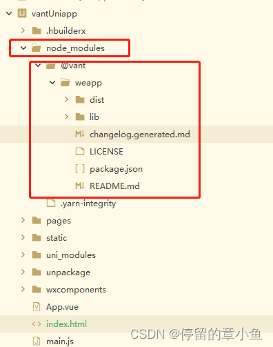
2、在uniapp项目根目录下(也可以指定目录)本案例在根目录下新建:wxcomponents文件夹
!!!!必须是wxcomponents文件夹!
!!!!必须是wxcomponents文件夹!
!!!!必须是wxcomponents文件夹!
(原因:和微信开发者工具内部编译文件名一致,具体原因不详)
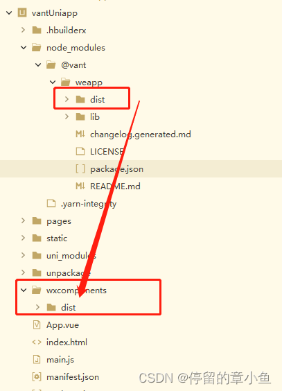
3、将node_modules/@vant/weapp/下的dist文件夹复制粘贴到wxcomponents文件夹下(wxcomponents/dist)或者(wxcomponents/vant/dist)等等确保文件正确
截图如下:
4、配置样式在App.vue文件中:
<style lang="scss">
	/*每个页面公共css */
/* #ifdef MP-WEIXIN */
	@import "/wxcomponents/dist/common/index.wxss"; //路径要确保正确!!!!
/* #endif */
</style>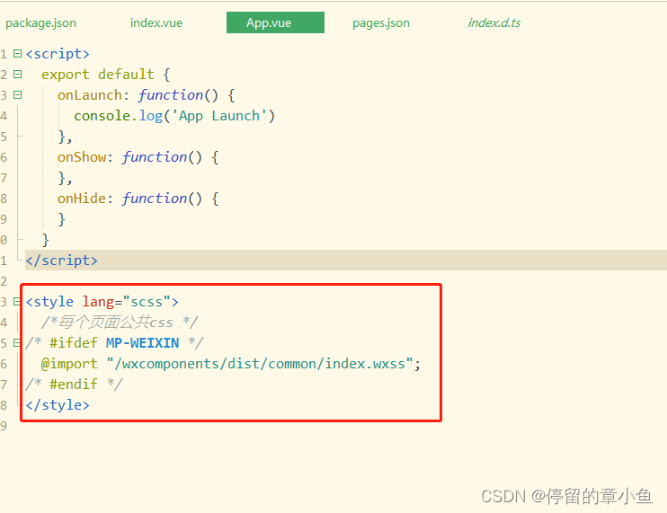
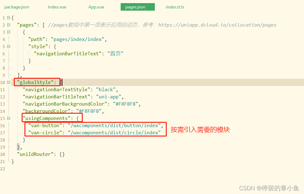
5、配置按需引入vant组件模块在pages.json文件夹中:
"globalStyle": {
		"navigationBarTextStyle": "black",
		"navigationBarTitleText": "uni-app",
		"navigationBarBackgroundColor": "#F8F8F8",
		"backgroundColor": "#F8F8F8",
		"usingComponents": {
			"van-button": "/wxcomponents/dist/button/index",
			"van-circle": "/wxcomponents/dist/circle/index"
		}
}, 
6、使用引入的模块:
运行结果:
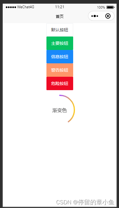
代码:
<template>
	<view class="content">
		<van-button type="default">默认按钮</van-button>
		<van-button type="primary">主要按钮</van-button>
		<van-button type="info">信息按钮</van-button>
		<van-button type="warning">警告按钮</van-button>
		<van-button type="danger">危险按钮</van-button>
		<view style="margin-top: 30rpx;">
			<van-circle :value="value" :color="gradientColor" text="渐变色" />
		</view>
	</view>
</template>

<script>
	export default {
		data() {
			return {
				value: 0, //进度
				gradientColor: { //渐变色
					'0%': '#ffd01e',
					'50%': '#aa55ff',
					'100%': '#ee0a24',
				},
				item: null,
			}
		},
		onUnload() {
			clearInterval(this.item)
			this.item = null
		},
		onLoad() {
			this.item = setInterval(() => {
				if (this.value >= 100) {
					this.value = 0
					return
				} else {
					this.value += 10
				}
			}, 1000)
		},
		methods: {

		}
	}
</script>

<style>
	.content {
		display: flex;
		flex-direction: column;
		align-items: center;
		justify-content: center;
	}
</style>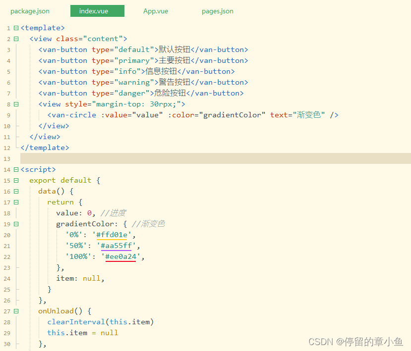


 扫一扫
扫一扫


 4986
4986


 到【灌水乐园】发言


