


目录
缩放:dataZoom:{show:true} (在工具栏toolbox)
dataZoom:[{
                type:'inside',
                show:true,
                start:0,
                end:100,
            }
            ],
修改图的大小radius
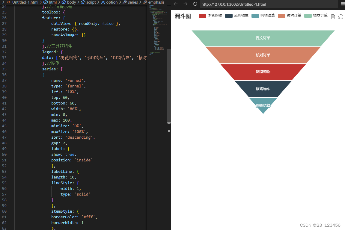
1、标准漏斗图
将type类型改为funnel
type: 'funnel',<!DOCTYPE html>
<html>
<head>
<meta charset="utf-8">
<!--引入ECharts脚本-->
<script src="js/echarts.js"></script>
</head>
<body>
<!---为ECharts准备一个具备大小(宽高)的DOM-->
<div id="main" style="width: 600px; height: 400px"></div>
<script type="text/javascript">
//基于准备好的DOM,初始化ECharts图表
var myChart = echarts.init(document.getElementById("main"));
//指定图表的配置项和数据
var option = {
title: {
text: '漏斗图'
},
tooltip: {
trigger: 'item',
formatter: '{a} <br/>{b} : {c}%'
},//详情提示框
toolbox: {
feature: {
dataView: { readOnly: false },
restore: {},
saveAsImage: {}
}
},//工具箱组件
legend: {
data: ['浏览购物', '添购物车', '购物结算', '核对订单', '提交订单']
},//图例
series: [
{
name: 'Funnel',
type: 'funnel',
left: '10%',
top: 60,
bottom: 60,
width: '80%',
min: 0,
max: 100,
minSize: '0%',
maxSize: '100%',
sort: 'descending',
gap: 2,
label: {
show: true,
position: 'inside'
},
labelLine: {
length: 10,
lineStyle: {
width: 1,
type: 'solid'
}
},
itemStyle: {
borderColor: '#fff',
borderWidth: 1
},
emphasis: {
label: {
fontSize: 25
}
}, //高亮样式
data: [
{ value: 60, name: '浏览购物' },
{ value: 40, name: '添购物车' },
{ value: 20, name: '购物结算' },
{ value: 80, name: '核对订单' },
{ value: 100, name: '提交订单' }
]
}
]
};
//使用刚指定的配置项和数据显示图表
myChart.setOption(option);
</script>
</body>
</html>
高亮样式
emphasis: {
label: {
fontSize: 20
}
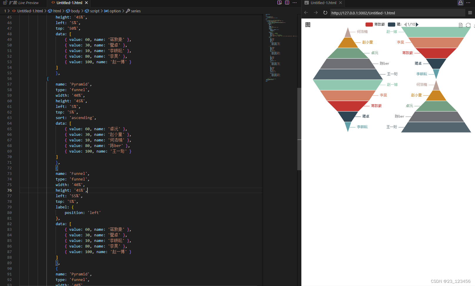
}, //高亮样式2、绘制多漏斗图或多金字塔
<!DOCTYPE html>
<html>

<head>
    <meta charset="utf-8">
    <!--引入ECharts脚本-->
    <script src="js/echarts.js"></script>
</head>

<body>
    <!---为ECharts准备一个具备大小(宽高)的DOM-->
    <div id="main" style="width: 600px; height: 400px"></div>
    <script type="text/javascript">
        //基于准备好的DOM,初始化ECharts图表
        var myChart = echarts.init(document.getElementById("main"));
        //指定图表的配置项和数据
        var option = {
            title: {
            text: '图'
            },
            tooltip: {
            trigger: 'item',
            formatter: '{a} <br/>{b} : {c}%'
            },//详情提示框
            toolbox: {
            feature: {
                dataView: { readOnly: false },
                restore: {},
                saveAsImage: {}
            }
            },//工具箱组件
            legend: {
                height: 20, // 图片的高度
                width: 20,   // 图片的宽度
                type: 'scroll',
                width: '30%',       // 设置图例的宽度
                orient: 'horizontal' ,// 设置图例水平排列
                data: ['蒋敦豪', '鹭卓', '李耕耘', '李昊', '赵一博','卓沅','赵小童','何浩楠','陈ber','王一珩']
            },//图例
            series: [
            {
                name: 'Funnel',
                type: 'funnel',
                width: '40%',
                height: '45%',
                left: '5%',
                top: '50%',
                data: [
                    { value: 60, name: '蒋敦豪' },
                    { value: 30, name: '鹭卓' },
                    { value: 10, name: '李耕耘' },
                    { value: 80, name: '李昊' },
                    { value: 100, name: '赵一博' }
                ]
                },
            {
                name: 'Pyramid',
                type: 'funnel',
                width: '40%',
                height: '45%',
                left: '5%',
                top: '5%',
                sort: 'ascending',
                data: [
                    { value: 60, name: '卓沅' },
                    { value: 30, name: '赵小童' },
                    { value: 10, name: '何浩楠' },
                    { value: 80, name: '陈ber' },
                    { value: 100, name: '王一珩' }
                ]
                },
                {
                name: 'Funnel',
                type: 'funnel',
                width: '40%',
                height: '45%',
                left: '55%',
                top: '5%',
                label: {
                    position: 'left'
                },
                data: [
                    { value: 60, name: '蒋敦豪' },
                    { value: 30, name: '鹭卓' },
                    { value: 10, name: '李耕耘' },
                    { value: 80, name: '李昊' },
                    { value: 100, name: '赵一博' }
                ]
                },
                {
                name: 'Pyramid',
                type: 'funnel',
                width: '40%',
                height: '45%',
                left: '55%',
                top: '50%',
                sort: 'ascending',
                label: {
                    position: 'left'
                },
                data: [
                    { value: 60, name: '卓沅' },
                    { value: 30, name: '赵小童' },
                    { value: 10, name: '何浩楠' },
                    { value: 80, name: '陈ber' },
                    { value: 100, name: '王一珩' }
                ]
                }
            ]
        };
  //使用刚指定的配置项和数据显示图表
  myChart.setOption(option);
    </script>
</body>
</html>
2、雷达图
类型为radar
type: 'radar',雷达图坐标系组件
radar: [{ // 配置雷达图坐标系组件,只适用于雷达图
				center: ['50%', '56%'], // 设置中心坐标,数组的第1项是横坐标,第2项是纵坐标
				radius: 160, // 设置圆的半径,数组的第一项是内半径,第二项是外半径
				startAngle: 90, // 设置坐标系起始角度,也就是第一个指示器轴的角度
				name: { // 设置(圆外的标签)雷达图每个指示器名称
					formatter: '{value}',
					textStyle: {
						fontSize: 15,
						color: '#000'
					}
				},
				nameGap: 2, // 设置指示器名称和指示器轴的距离,默认为15
				splitNumber: 2, // 设置指示器轴的分割段数,default
				// shape:'circle',  // 设置雷达图绘制类型,支持'polygon','circle'
				// 设置坐标轴轴线设置
				axisLine: {
					lineStyle: {
						color: '#fff',
						width: 1,
						type: 'solid',
					}
				},
				// 设置坐标轴在grid区域中的分隔线
				splitLine: {
					lineStyle: {
						color: '#fff',
						width: 1,
					}
				},
				splitArea: {
					show: true,
					areaStyle: {
						color: ['#abc', '#abc', '#abc', '#abc']
					}
				}, // 设置分隔区域的样式
                indicator: [ // 配置雷达图指示器,指定雷达图中的多个变量,跟data中value对应
					{
						name: '销售',
						max: 100
					}, {
						name: '沟通',
						max: 100
					},
					{
						name: '服务',
						max: 100
					}, {
						name: '协作',
						max: 100
					},
					// 设置指示器的名称,最大值,标签的颜色
					{
						name: '培训',
						max: 100
					}
				]
			}],
<!DOCTYPE html>
<html>
<head>
<meta charset="utf-8">
<!--引入ECharts脚本-->
<script src="js/echarts.js"></script>
</head>
<body>
<!---为ECharts准备一个具备大小(宽高)的DOM-->
<div id="main" style="width: 600px; height: 400px"></div>
<script type="text/javascript">
//基于准备好的DOM,初始化ECharts图表
var myChart = echarts.init(document.getElementById("main"));
//指定图表的配置项和数据
var option = {
title: {
text: 'Basic Radar Chart'
},
legend: {
data: ['十个勤天', '种地吧']
},
tooltip:{
confirm:true,
enterable:true,
},
radar: {
// shape: 'circle',
center: ['50%', '56%'], // 设置中心坐标,数组的第1项是横坐标,第2项是纵坐标
radius: 160, // 设置圆的半径,数组的第一项是内半径,第二项是外半径
startAngle: 90, // 设置坐标系起始角度,也就是第一个指示器轴的角度
name: { // 设置(圆外的标签)雷达图每个指示器名称
formatter: '{value}',
textStyle: {
fontSize: 15,
color: '#000'
}
},
nameGap: 2, // 设置指示器名称和指示器轴的距离,默认为15
splitNumber: 2, // 设置指示器轴的分割段数,default
// shape:'circle', // 设置雷达图绘制类型,支持'polygon','circle'
// 设置坐标轴轴线设置
axisLine: {
lineStyle: {
color: '#fff',
width: 1,
type: 'solid',
}
},
// 设置坐标轴在grid区域中的分隔线
splitLine: {
lineStyle: {
color: '#fff',
width: 1,
}
},
splitArea: {
show: true,
areaStyle: {
color: ['#abc', '#abc', '#abc', '#abc']
}
}, // 设置分隔区域的样式
indicator: [
{ name: 'Sales', max: 6500 },
{ name: 'Administration', max: 16000 },
{ name: 'Information Technology', max: 30000 },
{ name: 'Customer Support', max: 38000 },
{ name: 'Development', max: 52000 },
{ name: 'Marketing', max: 25000 }
]
},
series: [
{
name: 'Budget vs spending',
type: 'radar',
symbol:'triangle',
itemStyle: {
normal: {
lineStyle: {
width: 1
},
opacity: 0.2
}, // 设置普通状态时的样式
emphasis: {
lineStyle: {
width: 5
},
opacity: 1
} // 设置高亮时的样式
}, // 设置折线拐点标志的样式
data: [
{
value: [4200, 3000, 20000, 35000, 50000, 18000],
name: '十个勤天'
},
{
value: [5000, 14000, 28000, 26000, 42000, 21000],
name: '种地吧'
},
]
},
]
};
//使用刚指定的配置项和数据显示图表
myChart.setOption(option);
</script>
</body>
</html>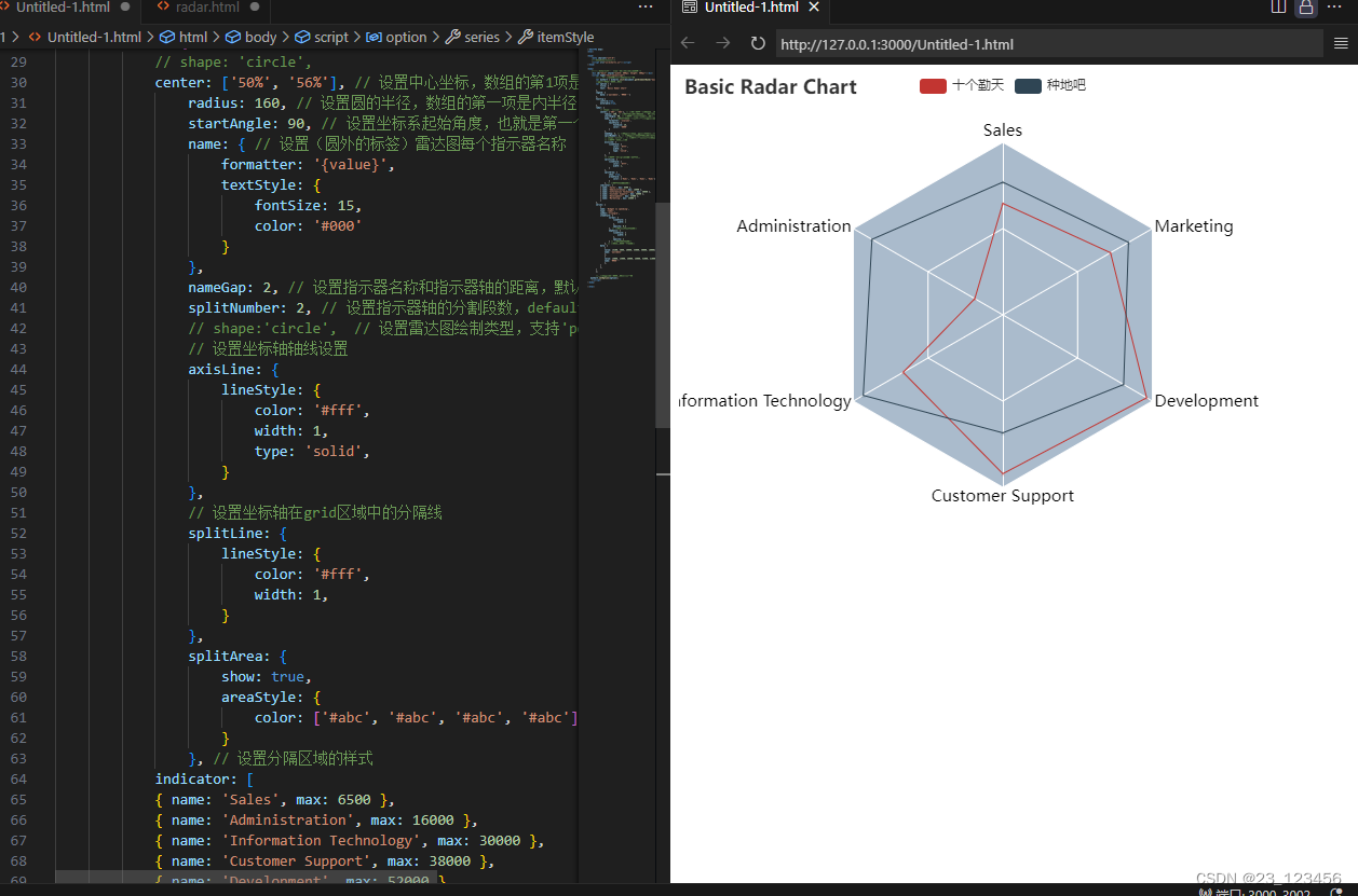
3、复杂雷达图
<!DOCTYPE html>
<html>

<head>
    <meta charset="utf-8">
    <!--引入ECharts脚本-->
    <script src="js/echarts.js"></script>
</head>

<body>
    <!---为ECharts准备一个具备大小(宽高)的DOM-->
    <div id="main" style="width: 600px; height: 400px"></div>
    <script type="text/javascript">
        //基于准备好的DOM,初始化ECharts图表
        var myChart = echarts.init(document.getElementById("main"));
        //指定图表的配置项和数据
        var option = {
            title: {
            text: 'Basic Radar Chart'
        },
        legend: {
            type: 'scroll',
            bottom: 10,
            data: (function () {
            var list = [];
            for (var i = 1; i <= 28; i++) {
                list.push(i + 2000 + '');
            }
            return list;
            })()
        },
        tooltip:{
            confirm:true,
            enterable:true,
        },
        visualMap:{
            top:'47%',
            right:20,
            color:['red','yellow'],
            calculable:true,
        },
        radar: {
            // shape: 'circle',
            center: ['50%', '56%'], // 设置中心坐标,数组的第1项是横坐标,第2项是纵坐标
				radius: 160, // 设置圆的半径,数组的第一项是内半径,第二项是外半径
				startAngle: 90, // 设置坐标系起始角度,也就是第一个指示器轴的角度
				name: { // 设置(圆外的标签)雷达图每个指示器名称
					formatter: '{value}',
					textStyle: {
						fontSize: 15,
						color: '#000'
					}
				},
				nameGap: 2, // 设置指示器名称和指示器轴的距离,默认为15
				splitNumber: 2, // 设置指示器轴的分割段数,default
				// shape:'circle',  // 设置雷达图绘制类型,支持'polygon','circle'
				// 设置坐标轴轴线设置
				axisLine: {
					lineStyle: {
						color: '#fff',
						width: 1,
						type: 'solid',
					}
				},
				// 设置坐标轴在grid区域中的分隔线
				splitLine: {
					lineStyle: {
						color: '#fff',
						width: 1,
					}
				},
				splitArea: {
					show: true,
					areaStyle: {
						color: ['#abc', '#abc', '#abc', '#abc']
					}
				}, // 设置分隔区域的样式

                indicator: [
                { text: 'IE8-', max: 400 },
                { text: 'IE9+', max: 400 },
                { text: 'Safari', max: 400 },
                { text: 'Firefox', max: 400 },
                { text: 'Chrome', max: 400 }
                ]
            },
            series: (function () {
            var series = [];
            for (var i = 1; i <= 28; i++) {
            series.push({
                type: 'radar',
                symbol: 'none',
                lineStyle: {
                width: 1
                },
                emphasis: {
                areaStyle: {
                    color: 'rgba(0,250,0,0.3)'
                }
                },
                data: [
                {
                    value: [
                    (40 - i) * 10,
                    (38 - i) * 4 + 60,
                    i * 5 + 10,
                    i * 9,
                    (i * i) / 2
                    ],
                    name: i + 2000 + ''
                }
                ]
            });
            }
            return series;
        })()
        };

        //使用刚指定的配置项和数据显示图表
   myChart.setOption(option);
    </script>
</body>

</html>
4、词云图
引入ECharts文件
<script type="text/javascript" src = "http://echarts.baidu.com/build/dist/echarts.js"></script>require(
[
'echarts',
'echarts/chart/wordCloud',
],
function(ec){
var myChart = ec.init(document.getElementById('main'));
function createRandomItemStyle(){//创建随机颜色
return{
normal:{
color:'rgb('+[
Math.round(Math.random()*255),
Math.round(Math.random()*255),
Math.round(Math.random()*255)
].join(',')+')'
}
};
}<!DOCTYPE html>
<html>
<head>
<meta charset="utf-8">
<title>词云图</title>
<!-- 引入ECharts文件 -->
<script type="text/javascript" src = "http://echarts.baidu.com/build/dist/echarts.js"></script>
<script type="text/javascript" src="/js/echarts.js"></script>
</head>
<body>
<div id="main" style="width: 80%;height: 400px;border: 1px solid black"></div>
</body>
<script type="text/javascript">
// 使用模块化加载方式
require.config({
paths:{echarts:'http://echarts.baidu.com/build/dist'}
})
require(
        [
            'echarts',
            'echarts/chart/wordCloud',
        ],
        function(ec){
            var myChart = ec.init(document.getElementById('main'));
            function createRandomItemStyle(){//创建随机颜色
                return{
                    normal:{
                        color:'rgb('+[
                            Math.round(Math.random()*255),
                            Math.round(Math.random()*255),
                            Math.round(Math.random()*255)
                    ].join(',')+')'
                    }
                };
            }
option = {
title:{
text:'种地吧',
link:'',
},
backgroundColor:'rgba(128,128,128,0.1)',
tooltip:{show:true},
series:[{
name:'p1',
type:'wordCloud',
sizeRange:[100,50000],//最大最小值
size:['95%','95%'],//词云图大小
textRotation:[0,45,90,135,-45,-90],//词的倾斜角度
textPadding:4,
autoSize:{enable:true,minSize:2},
data:[//词云名称,词云大小,颜色
{name:'数据可视化',value:16884,itemStyle:{normal:{color:'red'}}},
{name:'数据分析',value:8844,itemStyle:createRandomItemStyle()},
{name:'数据收集',value:16644,itemStyle:createRandomItemStyle()},
{name:'数据清洗',value:2244,itemStyle:createRandomItemStyle()},
{name:'数据结构',value:14844,itemStyle:createRandomItemStyle()},
{name:'数据价值',value:2244,itemStyle:createRandomItemStyle()},
{name:'java',value:1688,itemStyle:createRandomItemStyle()},
{name:'c',value:15552,itemStyle:createRandomItemStyle()},
{name:'C++',value:8848,itemStyle:createRandomItemStyle()},
{name:'python',value:6677,itemStyle:createRandomItemStyle()},
{name:'mysql',value:5240,itemStyle:createRandomItemStyle()},
{name:'Sql',value:12244,itemStyle:createRandomItemStyle()},
{name:'R',value:7749,itemStyle:createRandomItemStyle()},
{name:'数据价值',value:2244,itemStyle:createRandomItemStyle()},
{name:'ECharts',value:11044,itemStyle:createRandomItemStyle()},
{name:'html',value:6749,itemStyle:createRandomItemStyle()},
{name:'数据',value:50000,itemStyle:createRandomItemStyle()},
{name:'spark',value:5349,itemStyle:createRandomItemStyle()},
{name:'scala',value:7789,itemStyle:createRandomItemStyle()},
{name:'hadoop',value:6189,itemStyle:createRandomItemStyle()},
{name:'hive',value:8782,itemStyle:createRandomItemStyle()},
{name:'',value:10049,itemStyle:createRandomItemStyle()},
]
}]
};
myChart.setOption(option);
}
);
</script>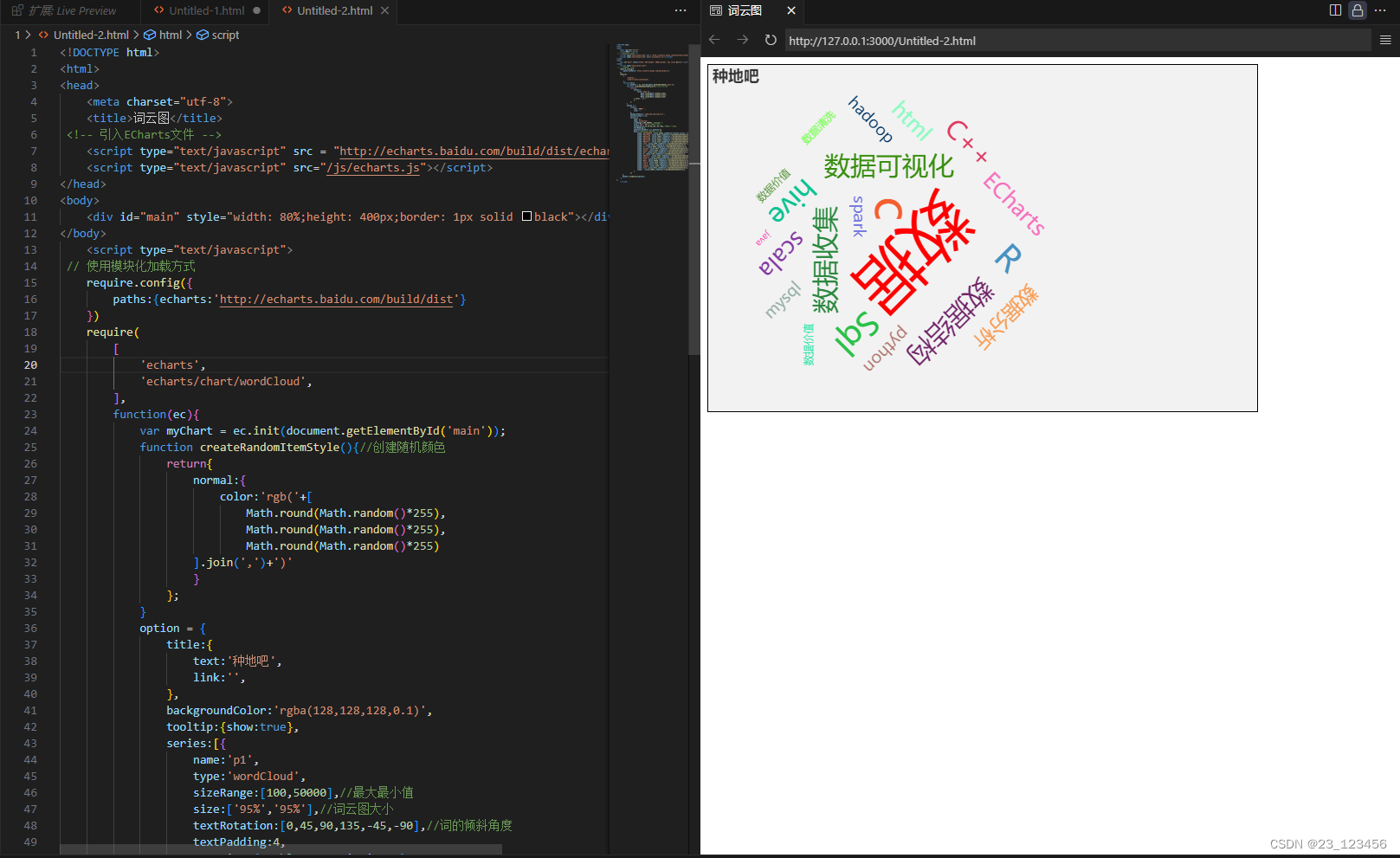
5、矩形树图
type: 'treemap',leves:getLevelOption(),<!DOCTYPE html>
<html>
<head>
<meta charset="utf-8">
<!-- 引入 ECharts 文件 -->
<script src="js/echarts.js"></script>
</head>
<body>
<!---为ECharts准备一个具备大小(宽高)的DOM--->
<div id="main" style="width: 1000px; height: 600px"></div>
<script type="text/javascript">
// 基于准备好的DOM,初始化ECharts图表
var myChart = echarts.init(document.getElementById("main"));
// 指定图表的配置项和数据
var option = {
toolbox: {
show: true,
orient: 'vertical',
x: 'right',
y: 'center',
feature: {
mark: { show: true },
dataView: { show: true, readOnly: false },
magicType: { show: true, type: ['line', 'bar', 'stack', 'tiled'] },
restore: { show: true },
saveAsImage: { show: true }
}
},
tooltip: {
trigger: 'axis',
axisPointer: { //设置坐标轴指示器,坐标轴触发有效
type: 'shadow' //设置坐标轴默认为直线,可选为:'line'|'shadow'
}
},
series: [
{
type: 'treemap',
data: [
{
name: 'nodeA',
value: 10,
children: [
{
name: 'nodeAa',
value: 4
},
{
name: 'nodeAb',
value: 6
}
]
},
{
name: 'nodeB',
value: 20,
children: [
{
name: 'nodeBa',
value: 20,
children: [
{
name: 'nodeBa1',
value: 20
}
]
}
]
}
]
}
]
};
// 使用刚指定的配置项和数据显示图表
myChart.setOption(option);
</script>
</body>
</html>


 523
523


 被折叠的 条评论
为什么被折叠?
被折叠的 条评论
为什么被折叠?
 到【灌水乐园】发言


