


参考文献:matplotlib中文网 https://www.matplotlib.org
参考subplots函数:
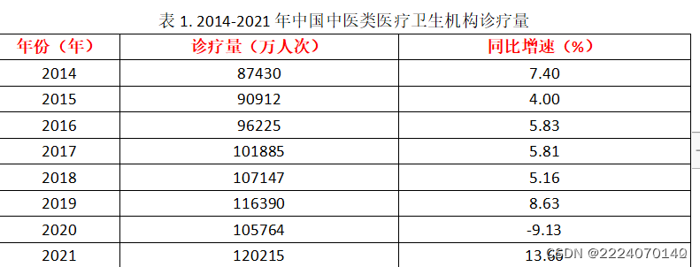
参考数据:
# matplotlib中文网 https://www.matplotlib.org
# % matplotlibnotebook
import numpy as np
import matplotlib.pyplot as plt
plt.rcParams["font.sans-serif"] = ["SimHei"]
plt.rcParams["axes.unicode_minus"] = False
# 1.准备数据
year_x = np.arange(1, 9, 1) # X轴刻度值(1-12)
data_1 = np.array([7.40, 4.00, 5.83, 5.81, 5.16, 8.63, # 平均气温
-9.13, 13.66])
data_2 = np.array([87430, 90912, 96225, 101885, 107147, 116390, # 降水量
105764, 120215])
# 2.创建第一个坐标系实例
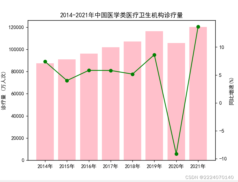
fig, ax = plt.subplots() # 默认为1行1列
ax.set_ylabel('诊疗量 (万人次)')
bar_ev = ax.bar(year_x, data_2, color='pink',
tick_label=['2014年', '2015年', '2016年', '2017年', '2018年', '2019年',
'2020年', '2021年'])
# 4.创建共享x轴的第二个坐标系实例
ax_right = ax.twinx()
# 5.在第二个坐标系实例绘制折线图
line = ax_right.plot(year_x, data_1, 'go-')
ax_right.set_ylabel(r'同比增速(%)')
plt.title("2014-2021年中国医学类医疗卫生机构诊疗量")
# 6.展示图表
plt.show()运行结果如下 :


 被折叠的 条评论
为什么被折叠?
被折叠的 条评论
为什么被折叠?
 到【灌水乐园】发言


